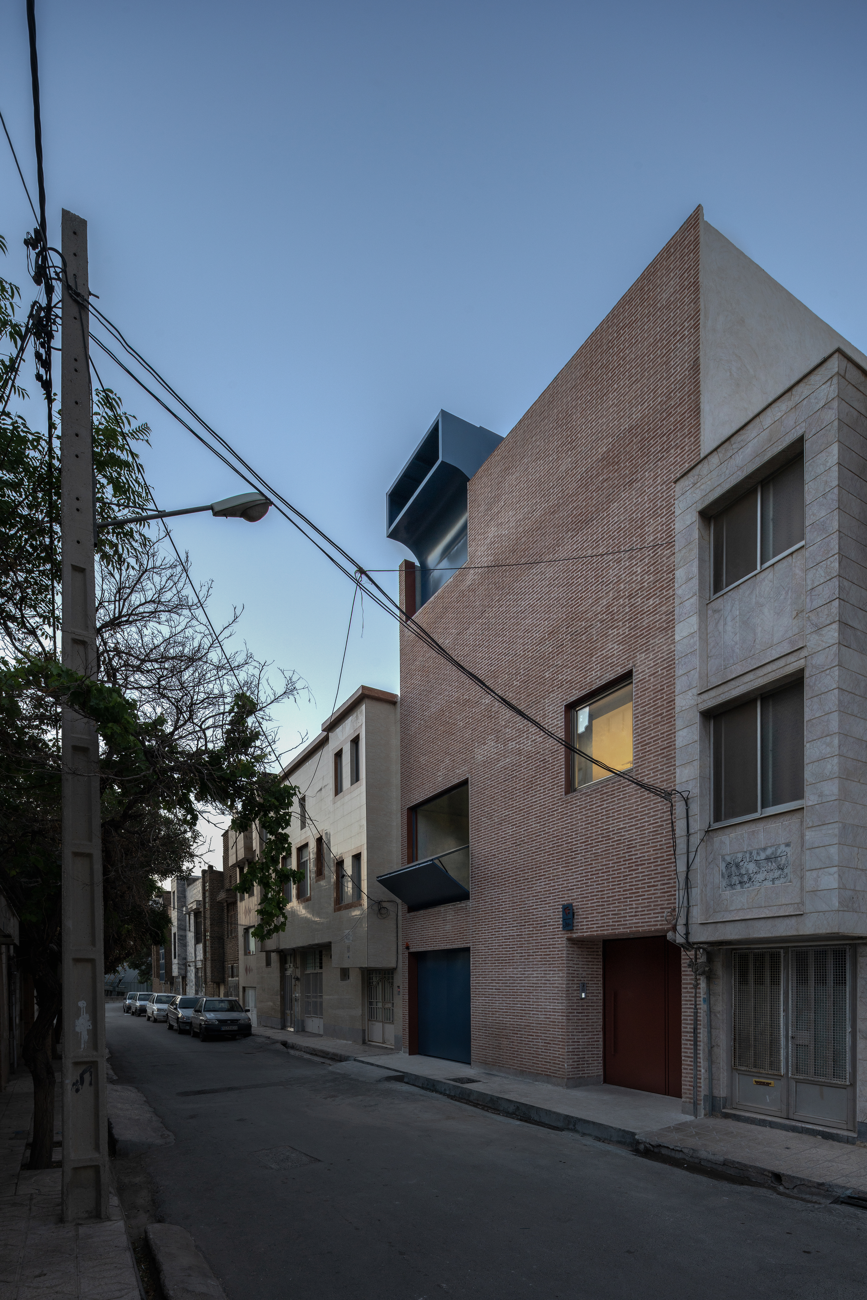
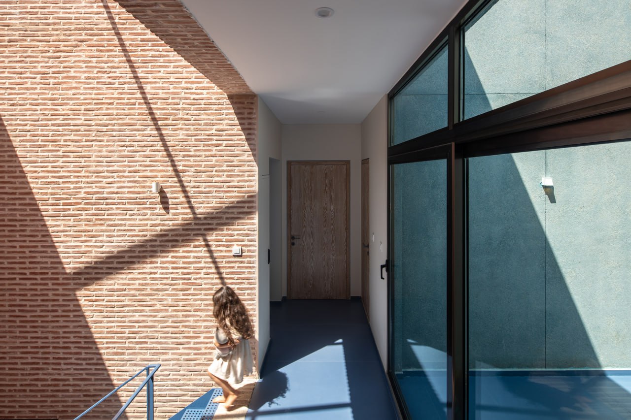
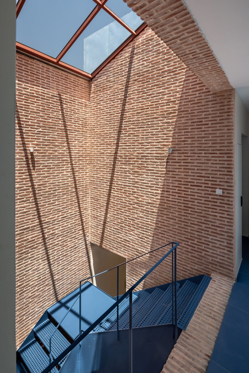
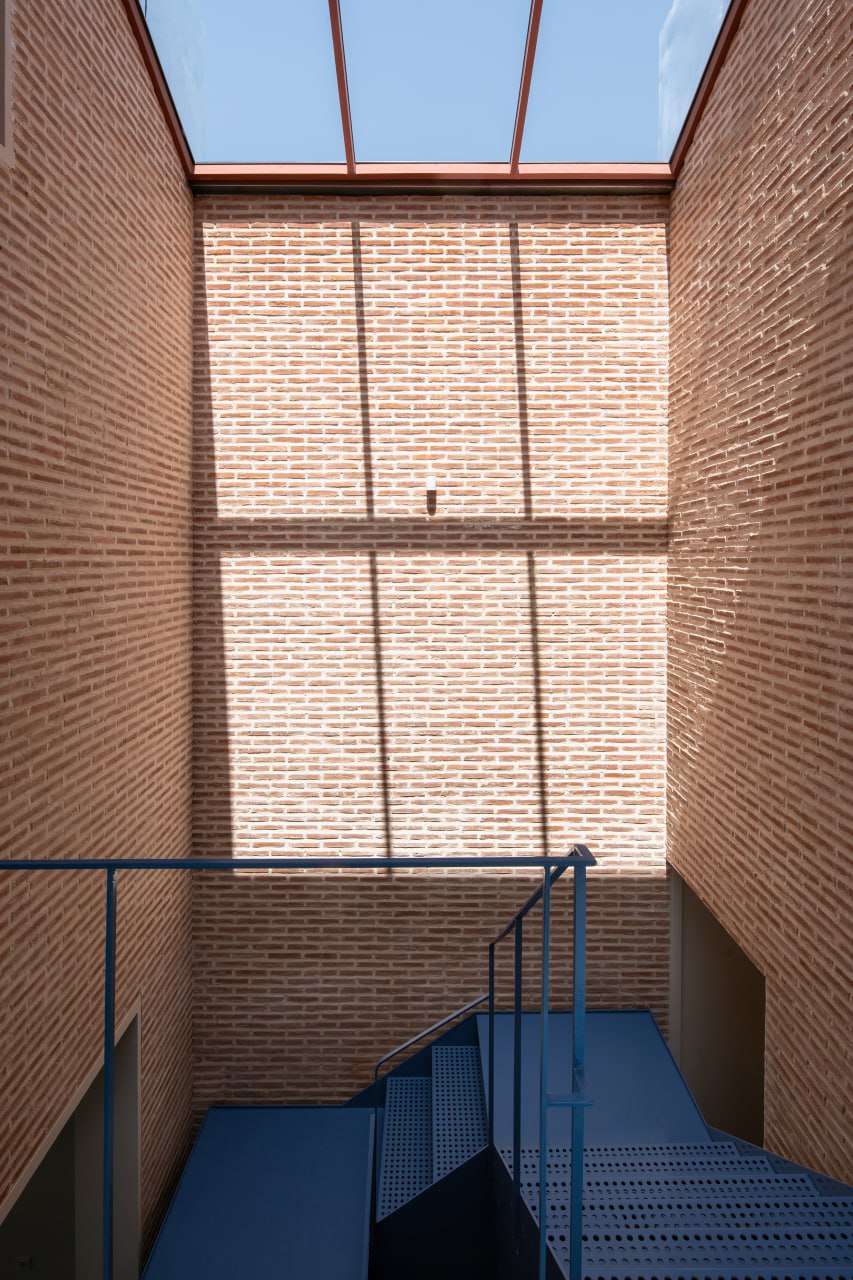
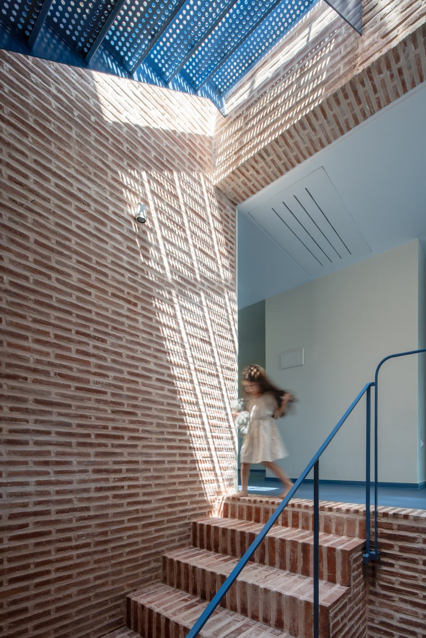
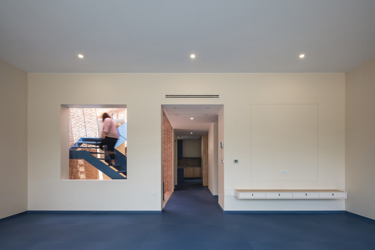
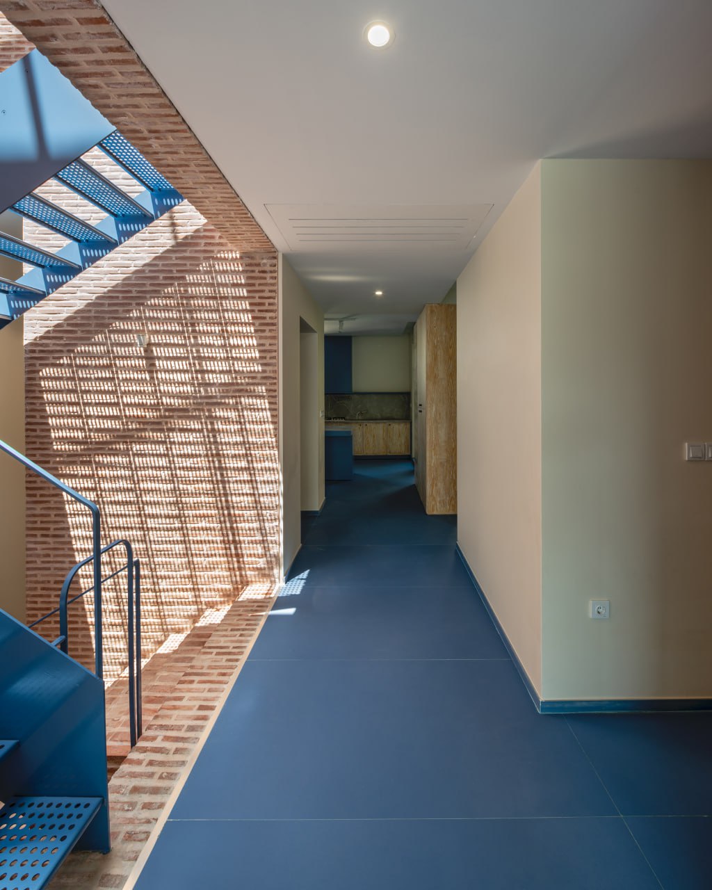
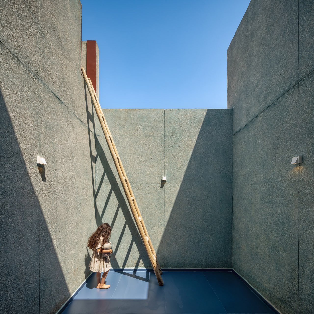
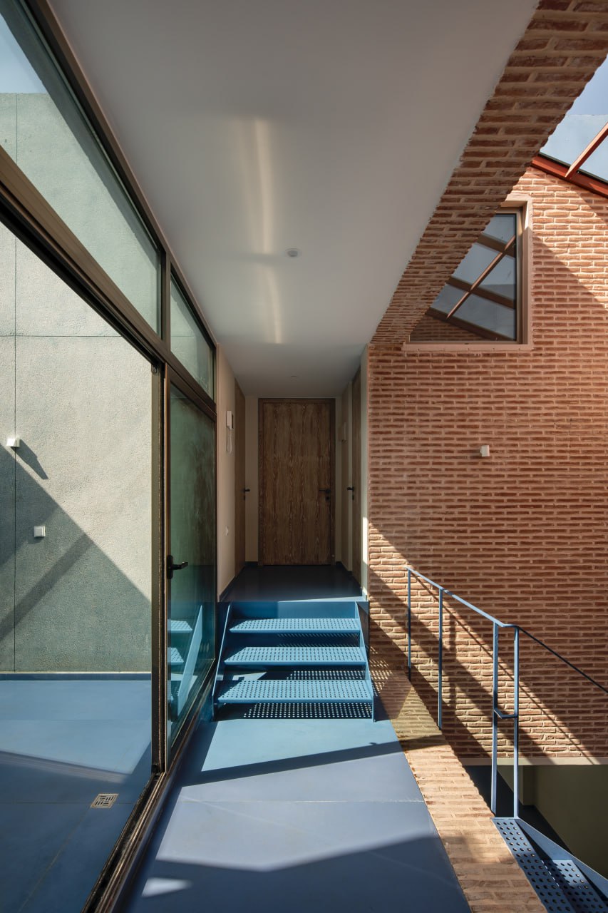
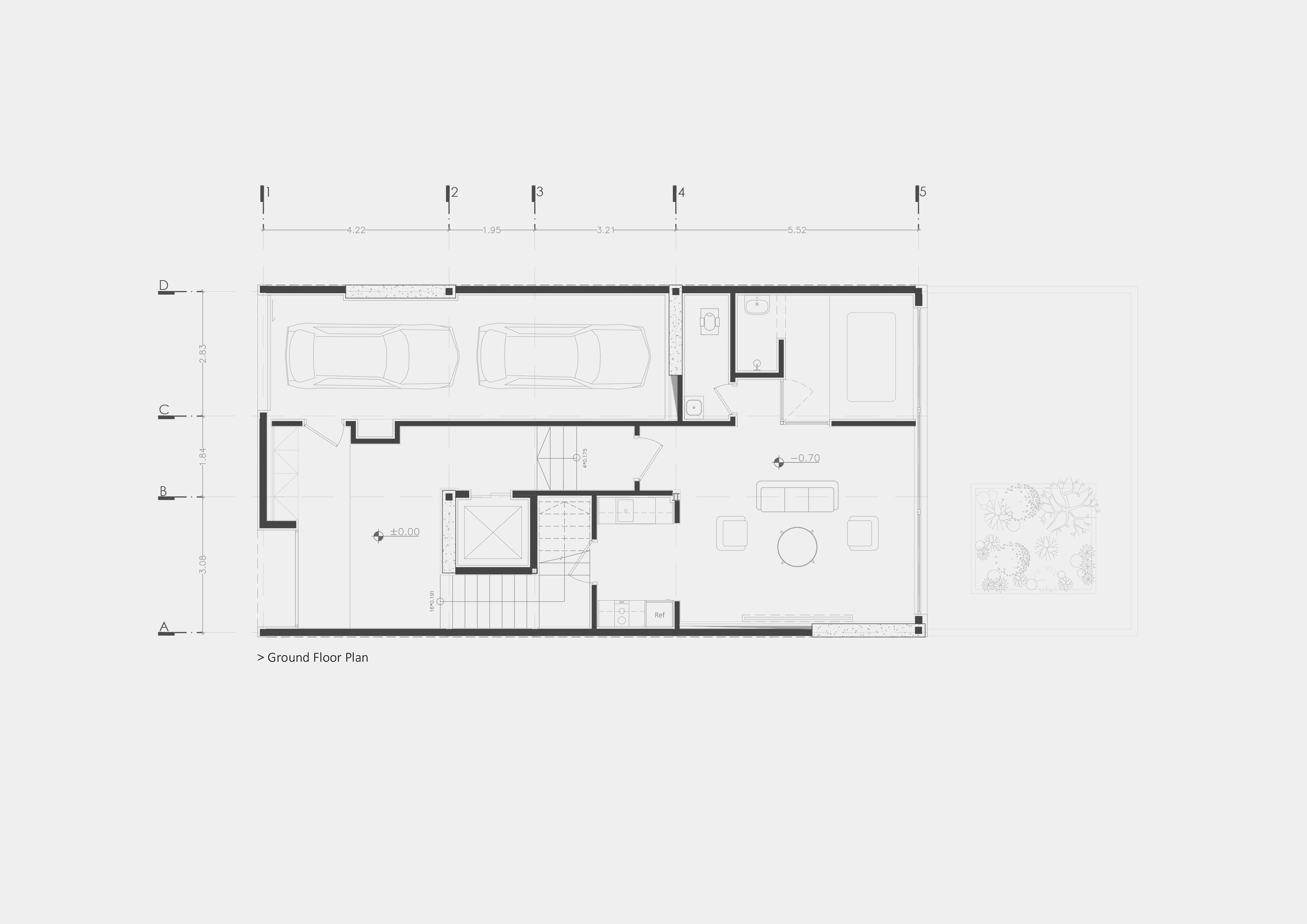
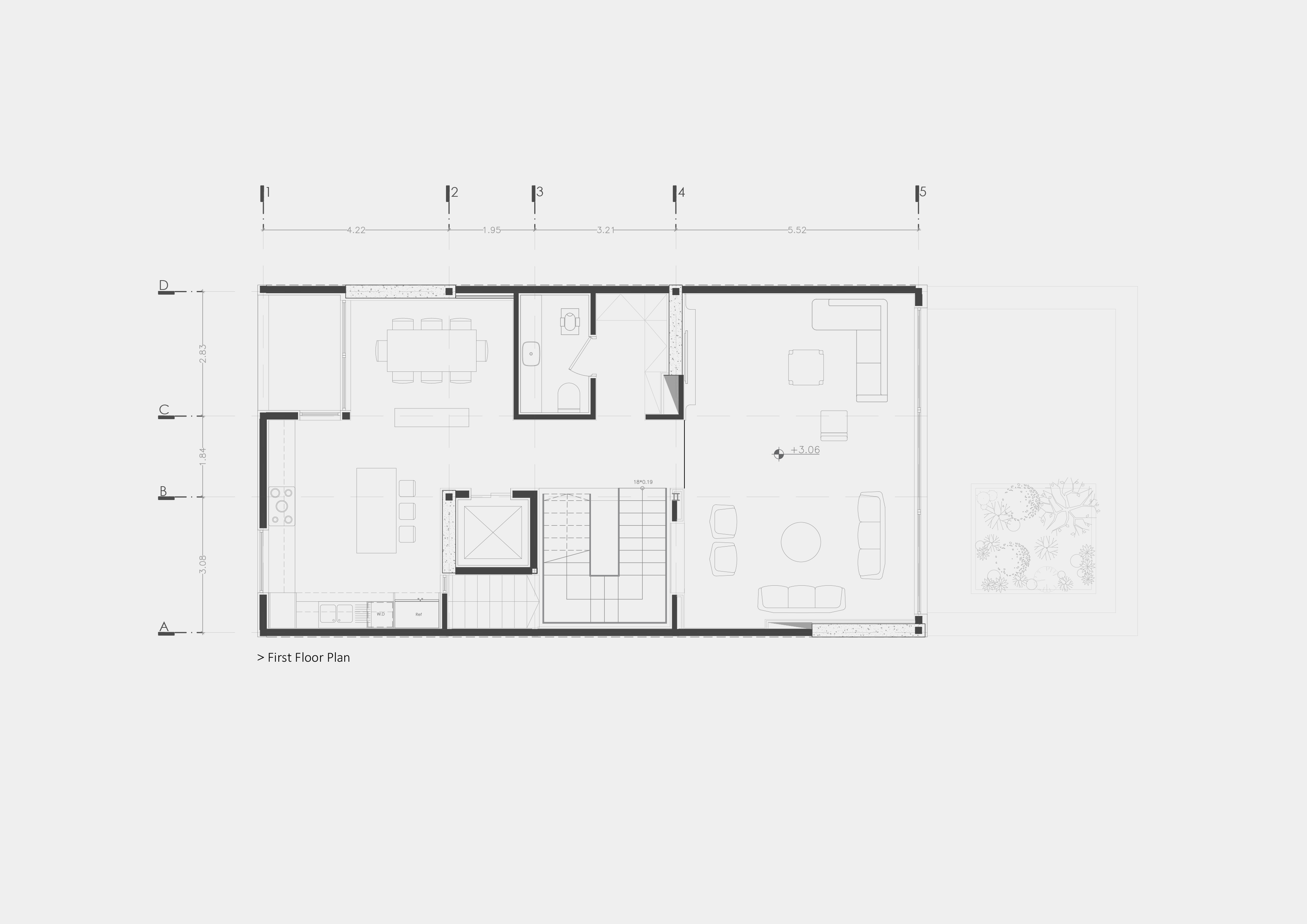
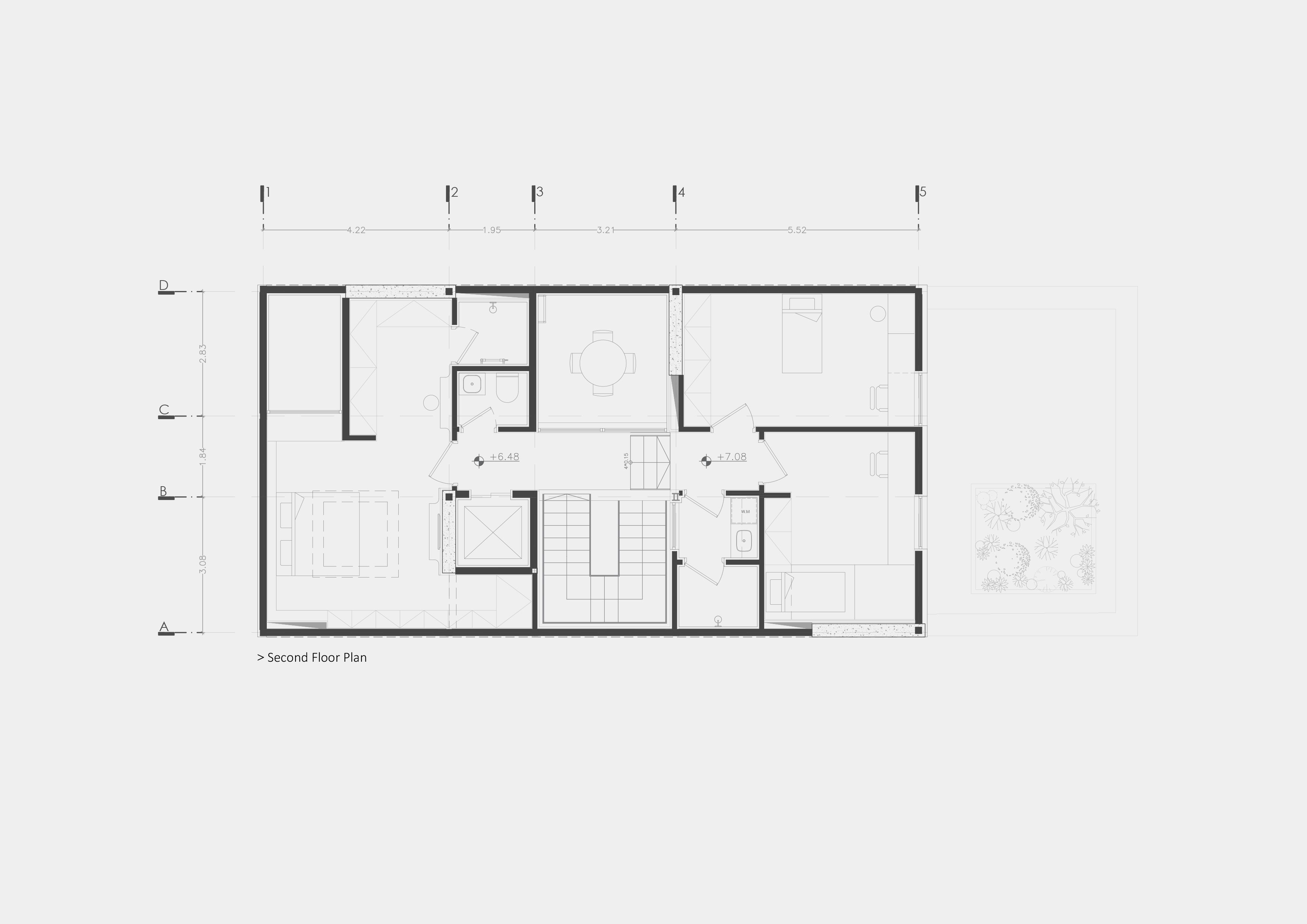
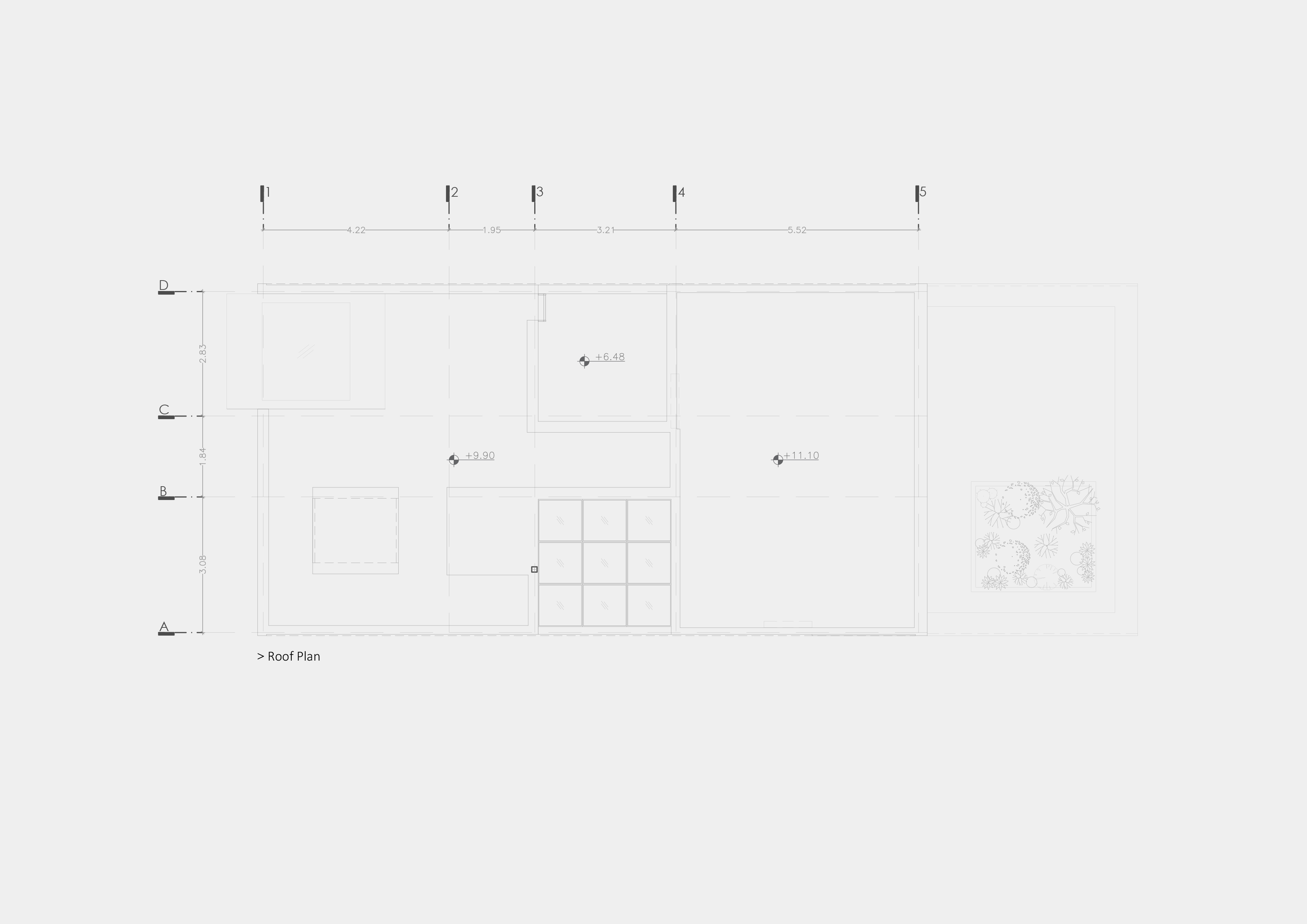
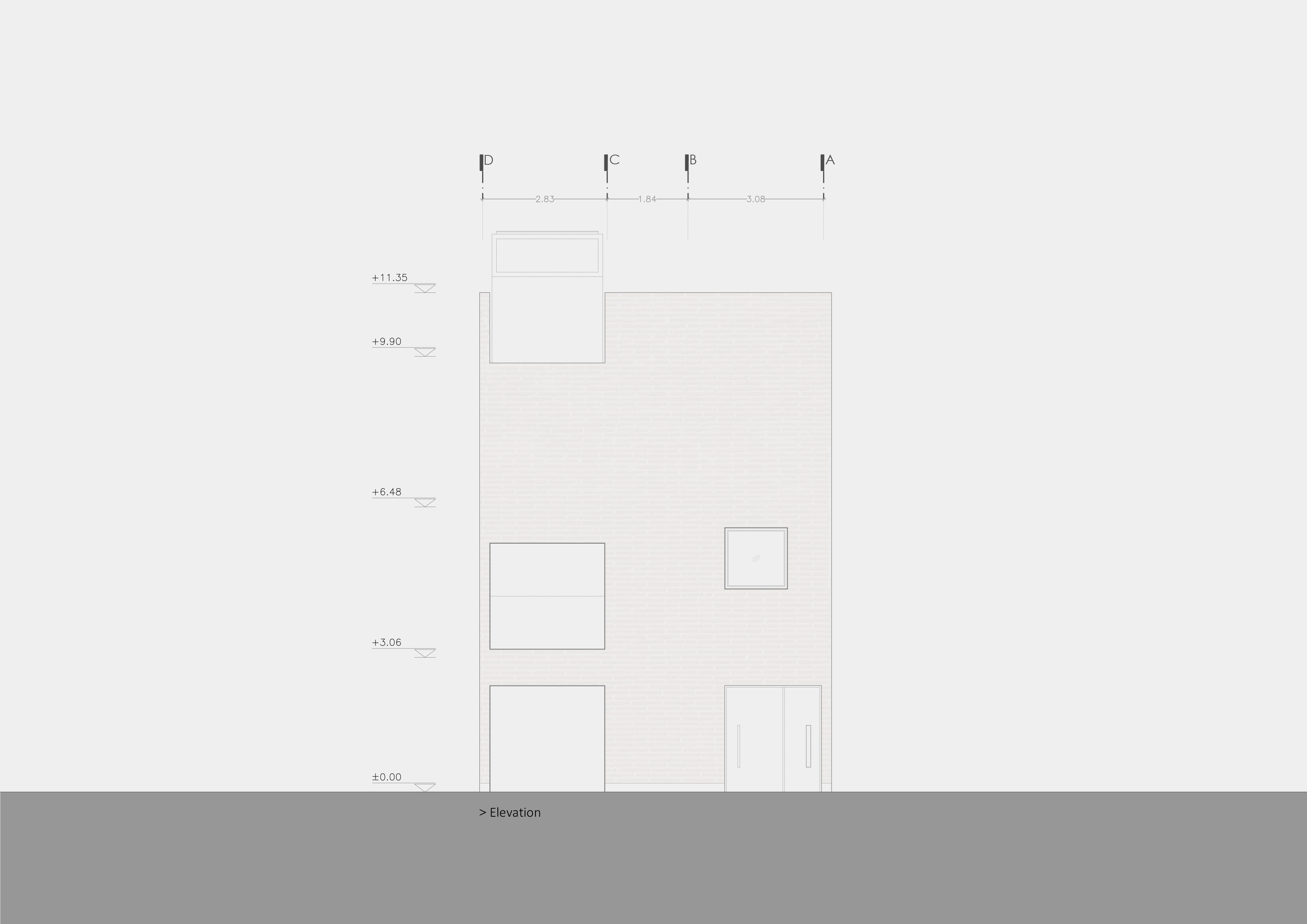
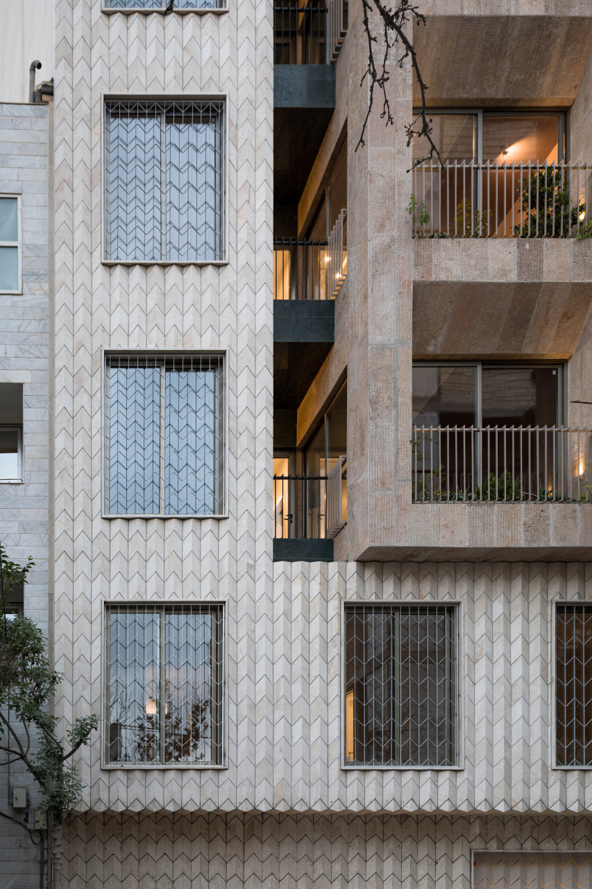
Initially, while designing this house, we aimed to resolve a fundamental question: how can we revise the architectural approaches of past decades (specifically, the architecture of 1970s Iranian houses in this project (. While avoiding nostalgic value judgments that result in fleeting emotions, we wanted to find a solution to revive and utilize elements that have become obsolete due to the expansion of mass production or economic and market forces, such as elements that have significantly contributed to durability, proper functionality, and resistance to erosion. A specific example in this project is the appropriate separation of functional spaces, replacing synthetic and resin-based materials with forgotten materials like washed cement, which requires skilled craftsmen’s artistry, and using materials with small tiles that perform better against contraction and expansion.
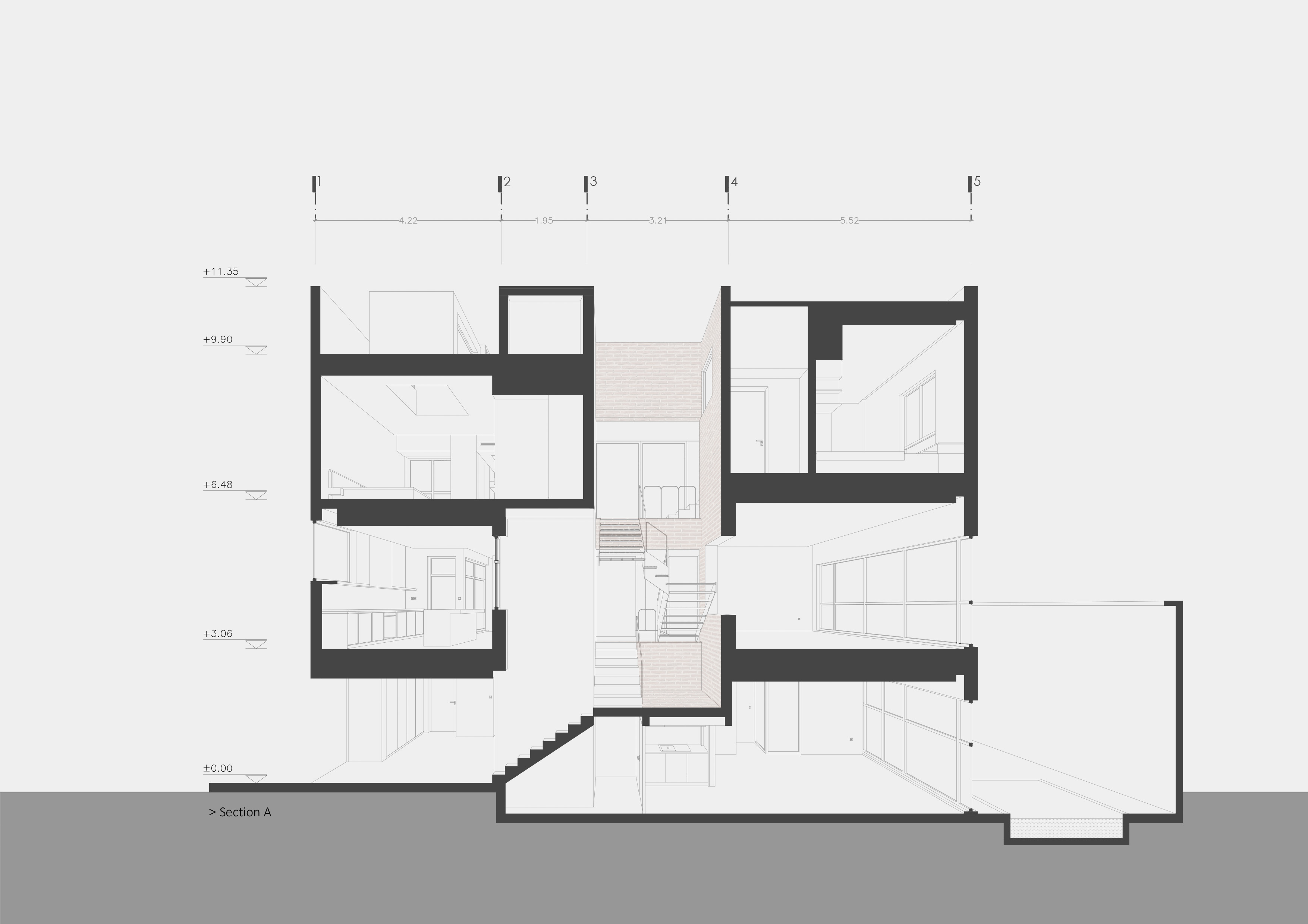
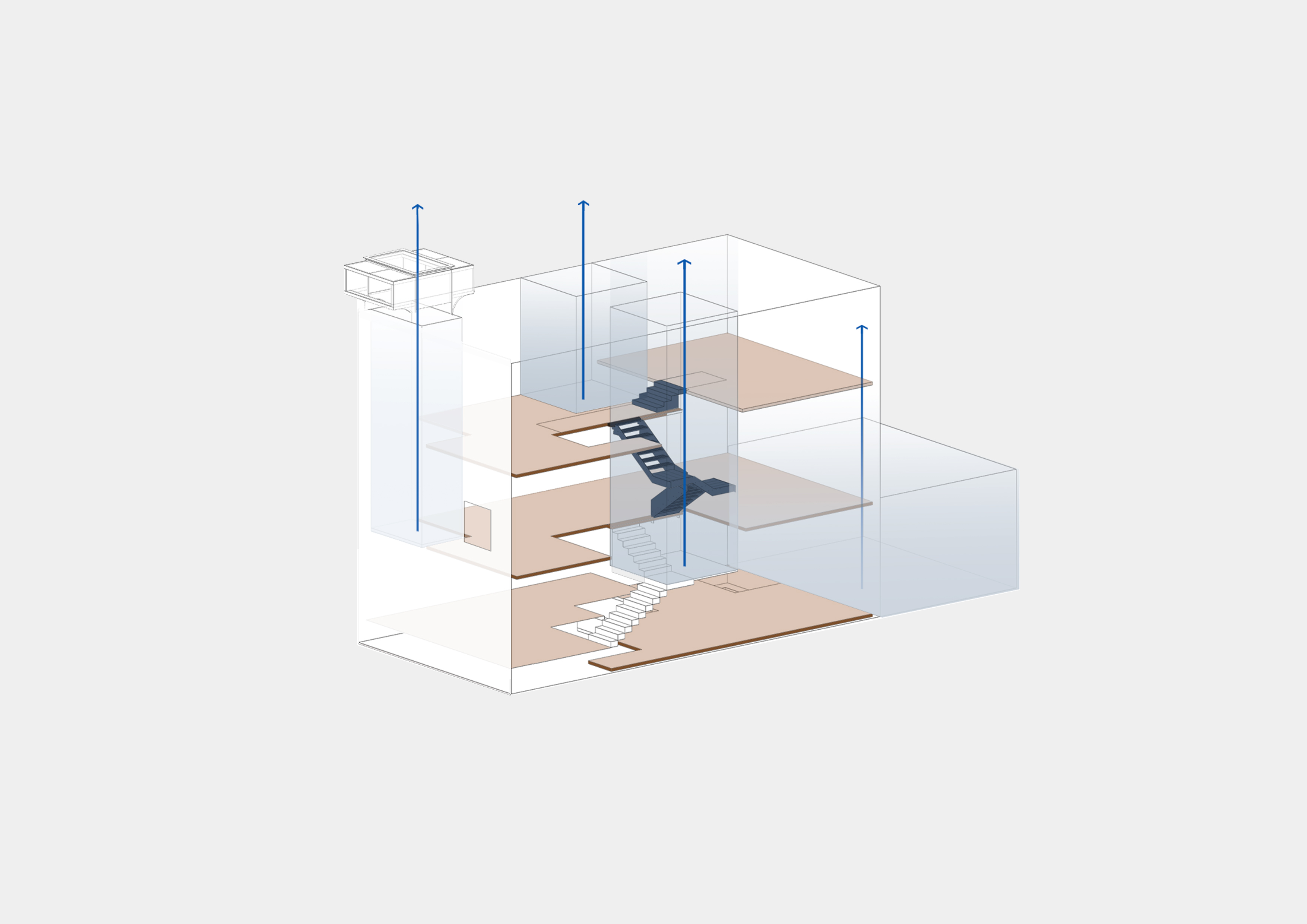
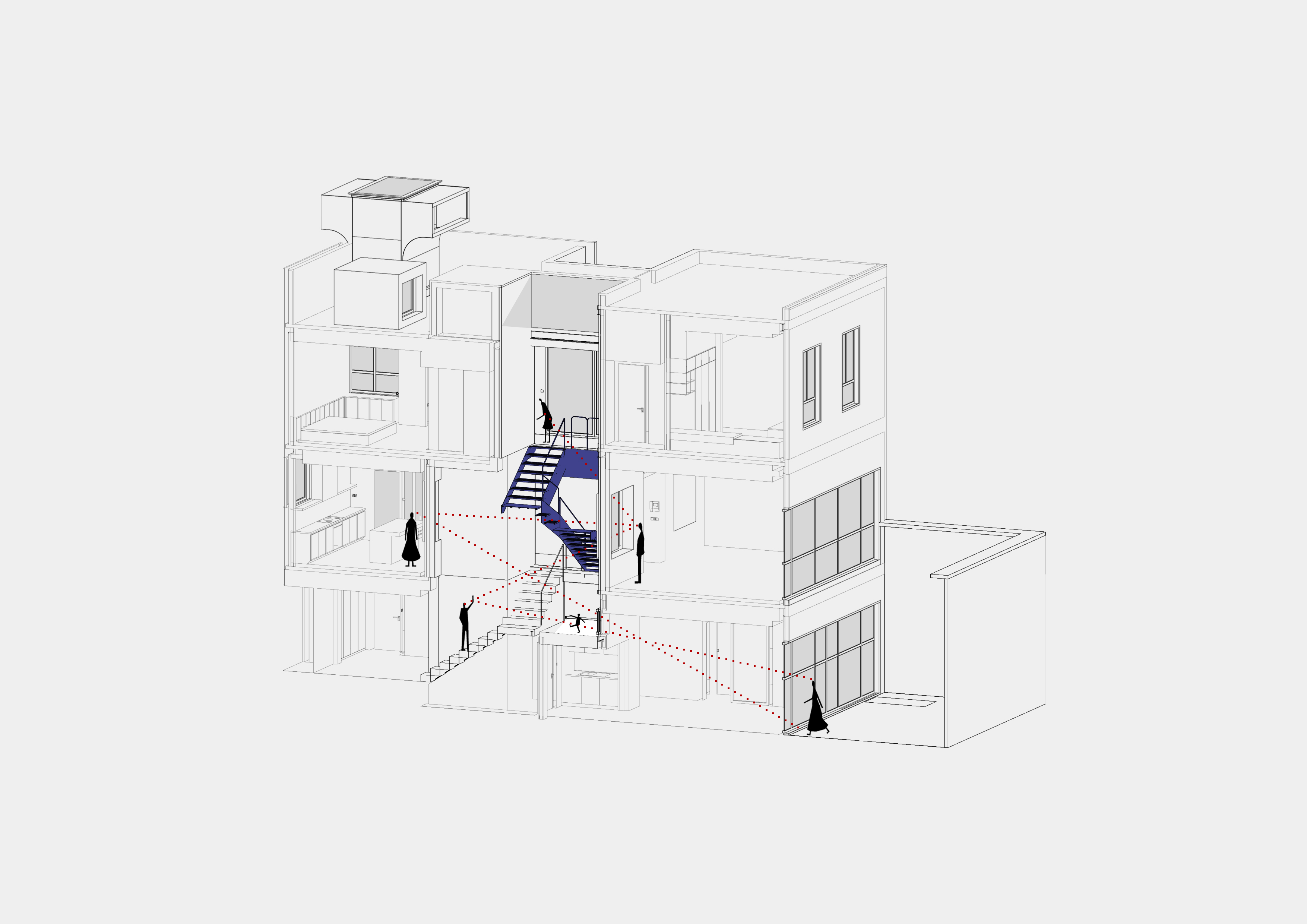
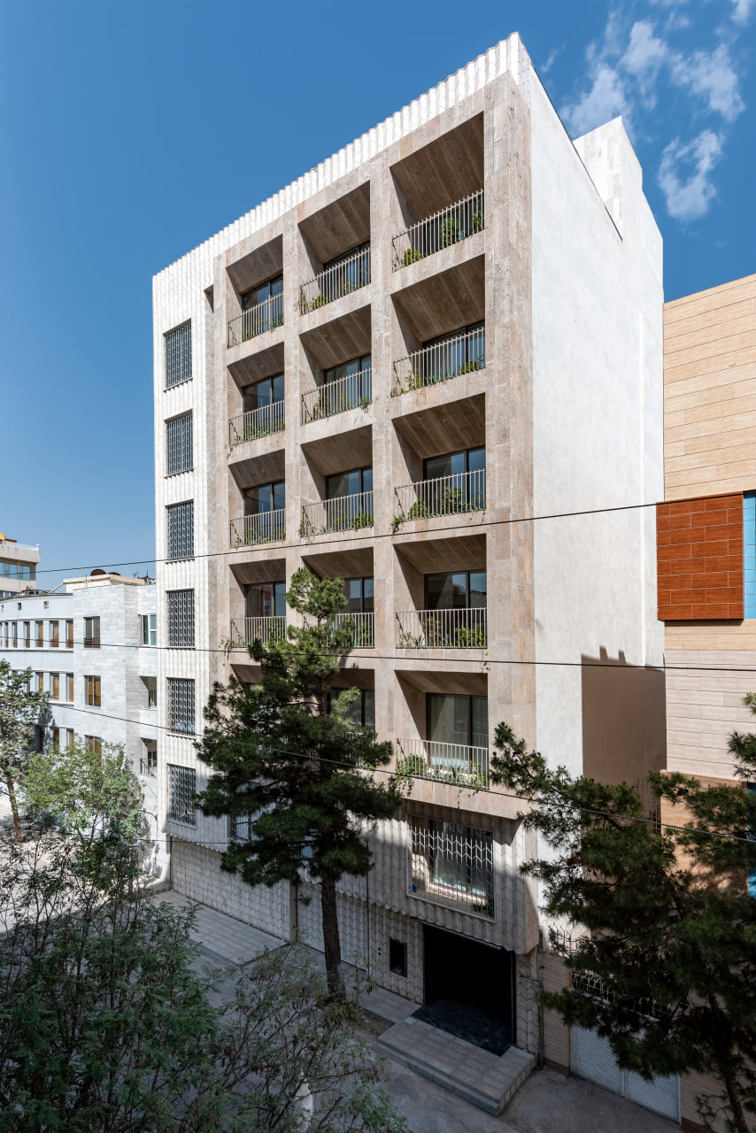
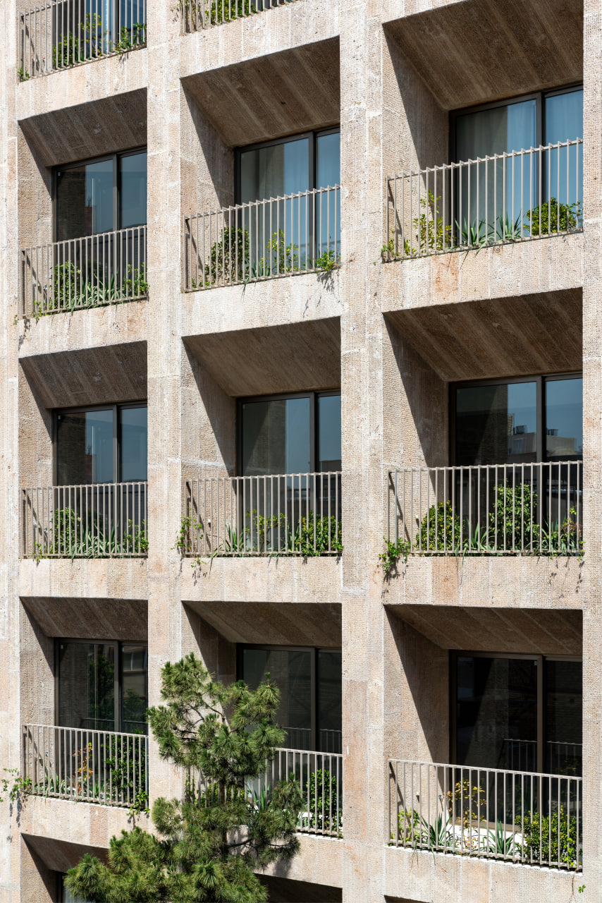
Afterward, we focused on the contextual necessities of the project. This house is in the “Nakhrisi neighborhood” of Mashhad, an economically underdeveloped area. Given the characteristics of this neighborhood and the project site, it became clear that considering the disjointed and unattractive urban landscape and the narrow alley width, eliminating the view from inside to outside and maximizing the closure of the facade could enhance security and reduce visual chaos within. This decision led to the formation of three main elements in this house: ensuring adequate natural light and ventilation, creating internal views, and organizing spatial connections. The common thread among these three elements is the activation of the Z-axis functionality in the house, originating from the various height levels within the project:
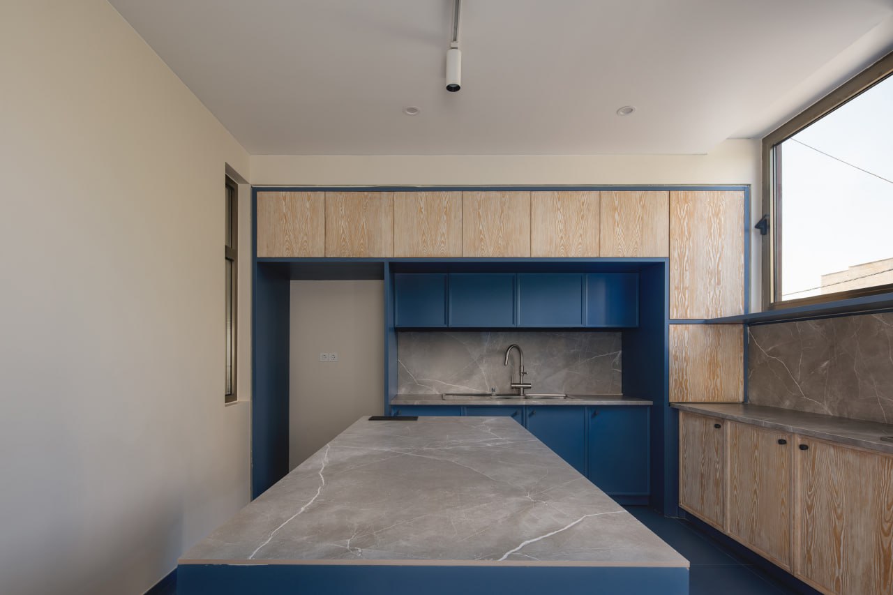
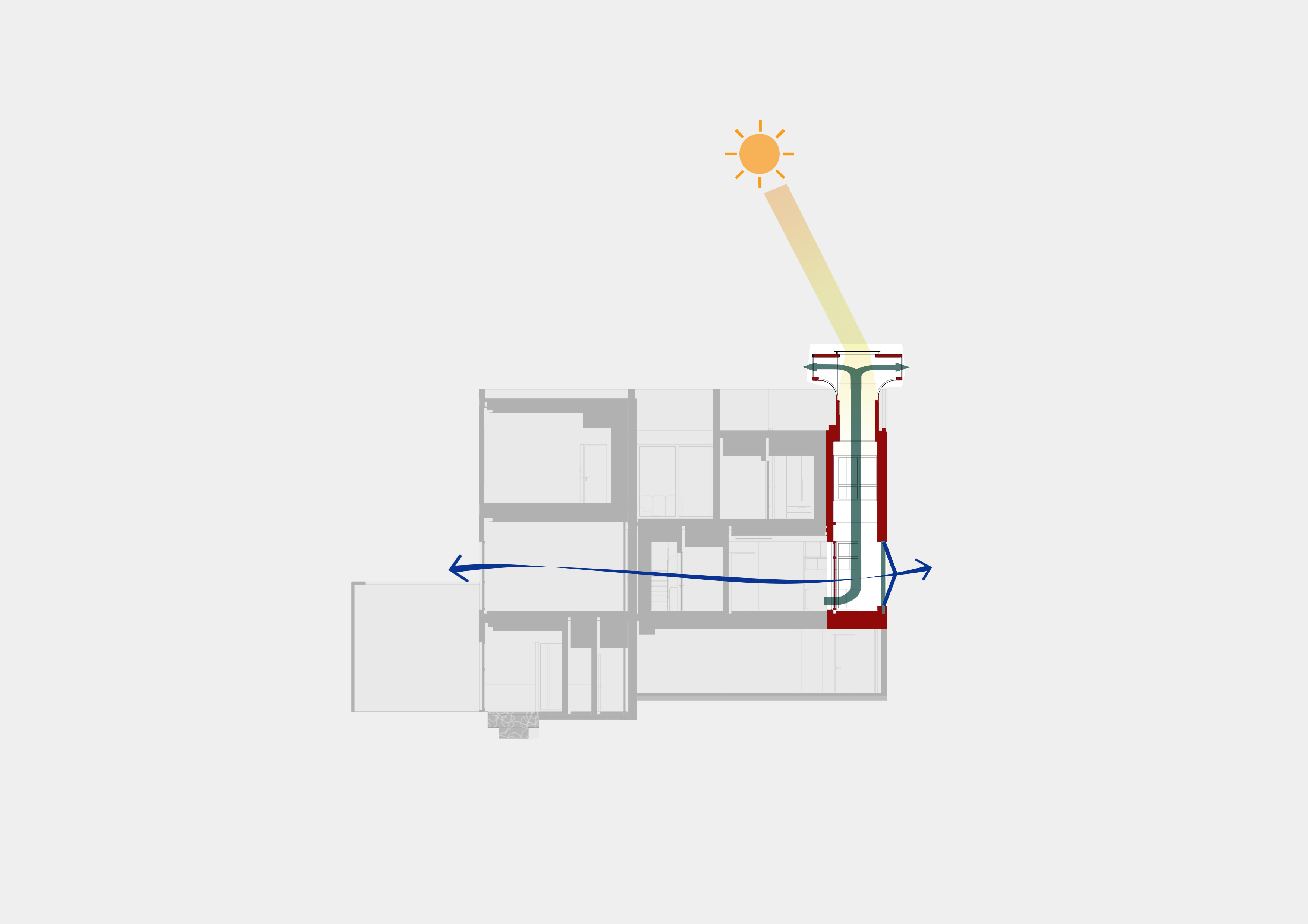
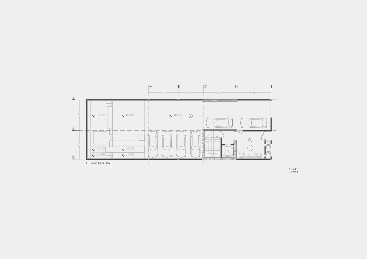
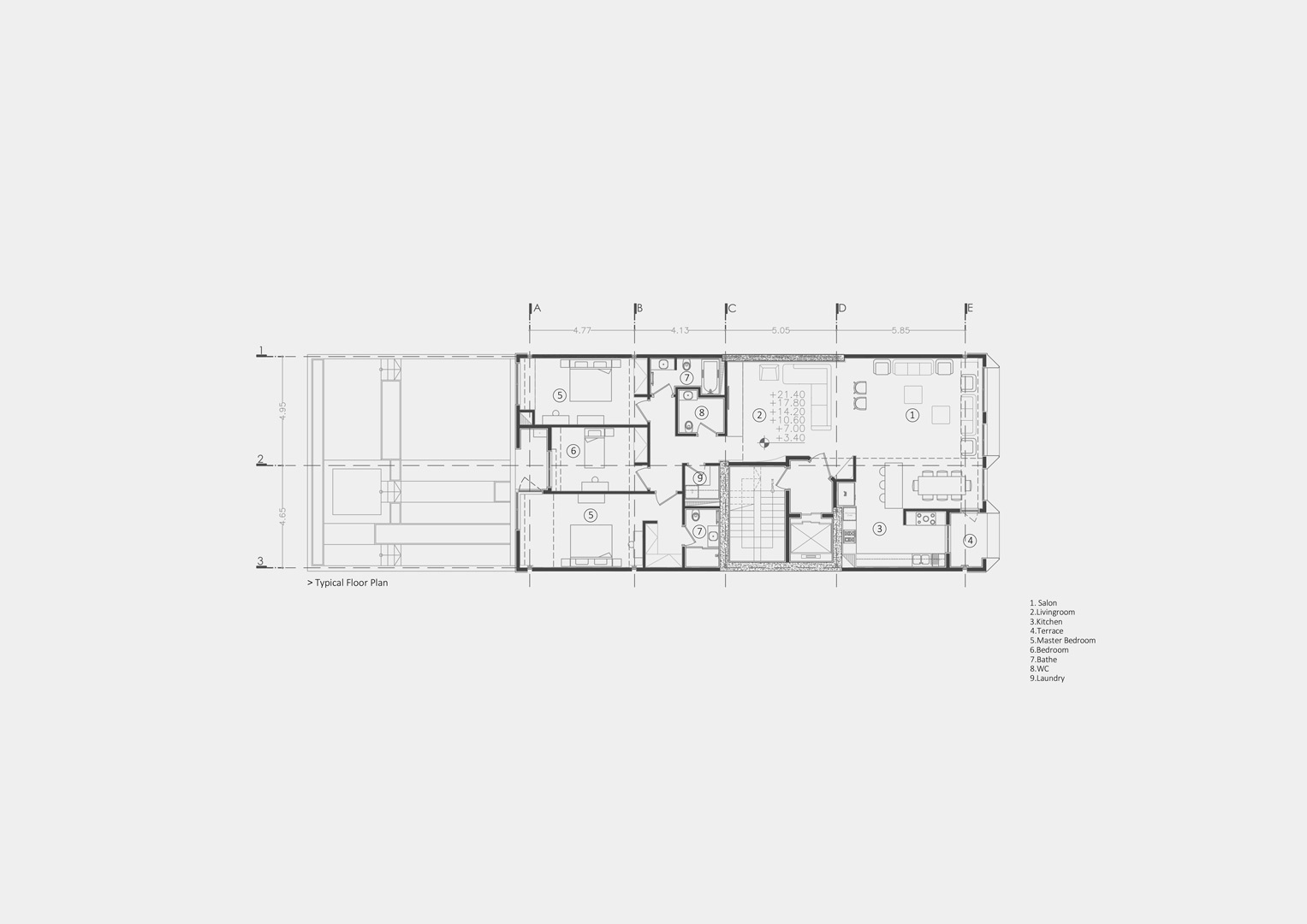
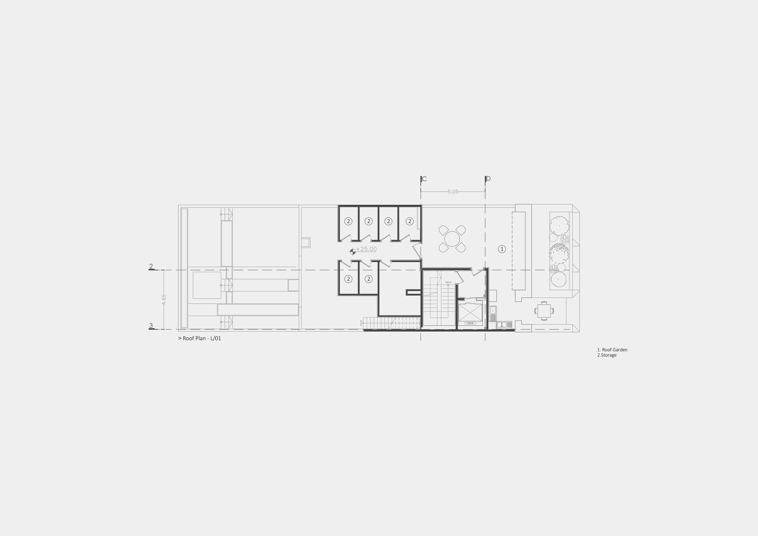
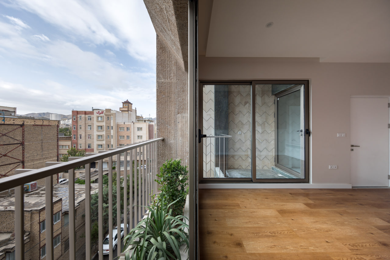
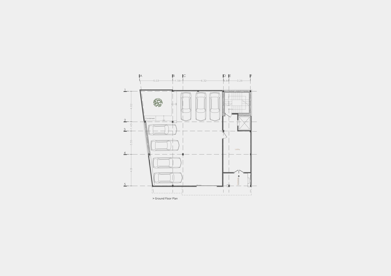
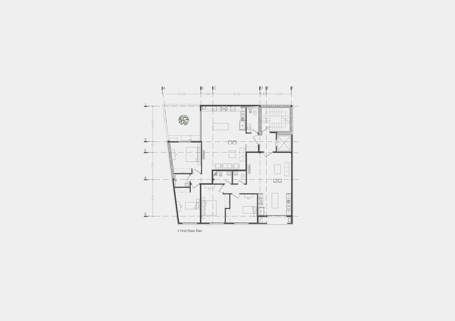
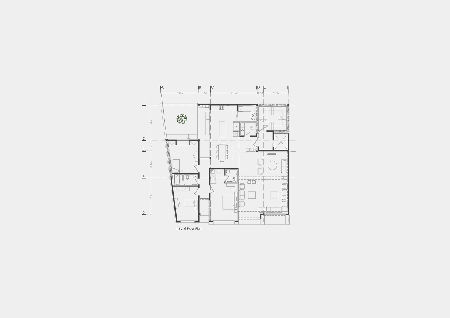
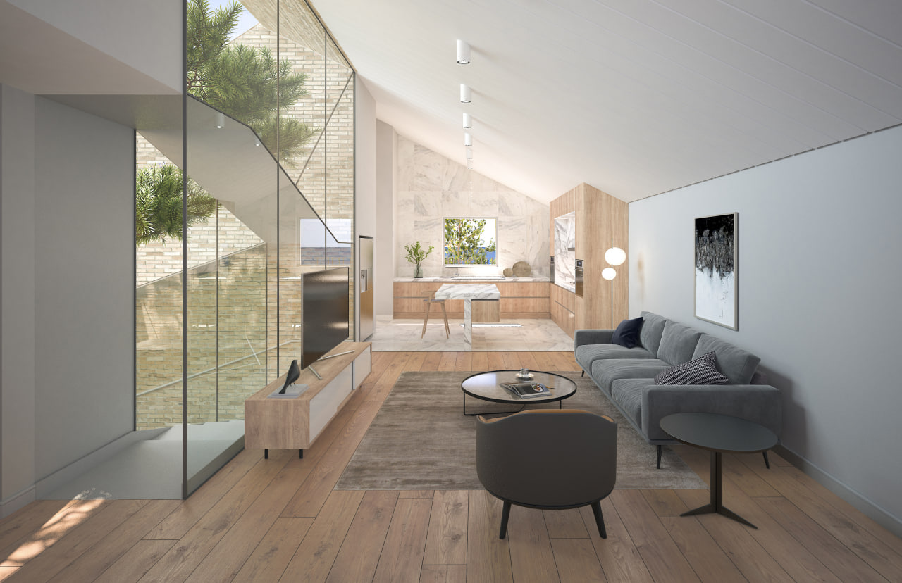
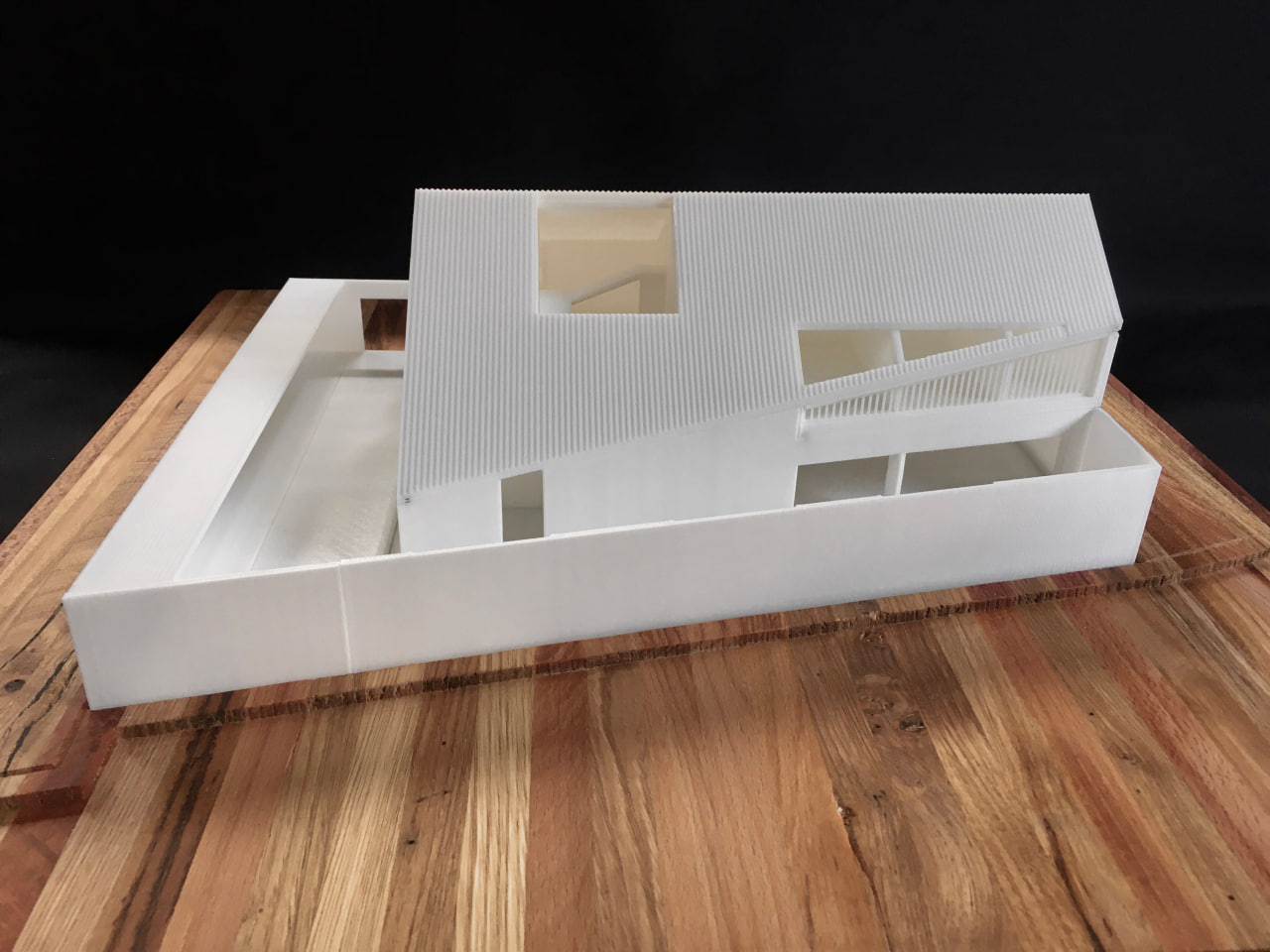
1. Terrace-Exhaust: For the kitchen, which is located behind the facade, and the adjacent dining area, we designed a double-height terrace and placed a T-shaped structure above it, allowing light to pour down from the glass on top and air to ventilate (according to its form). Additionally, to control the ambient light and optimize airflow, a folding door was installed on its outer edge so that this terrace, with its multifunctional capabilities, can enhance spatial quality.
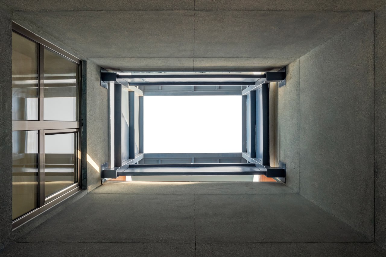
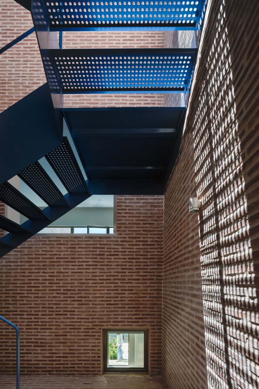
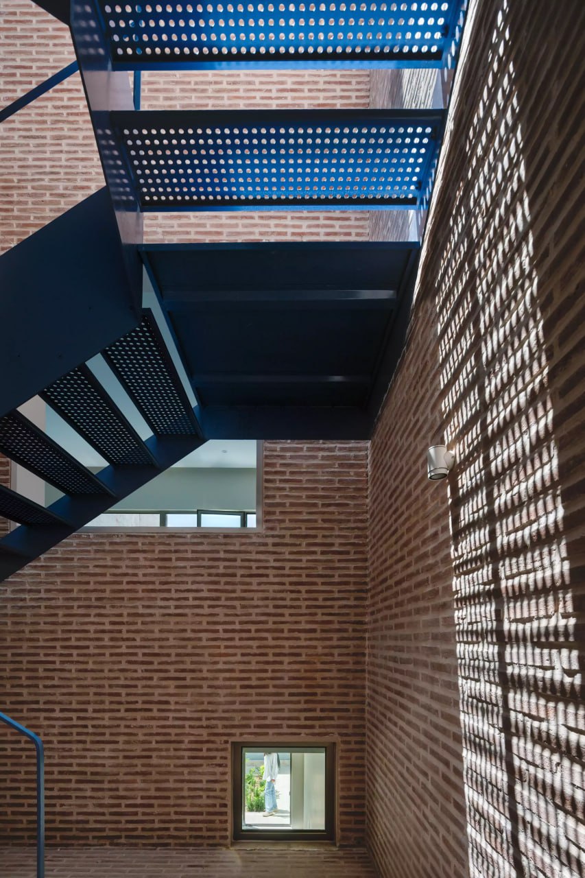
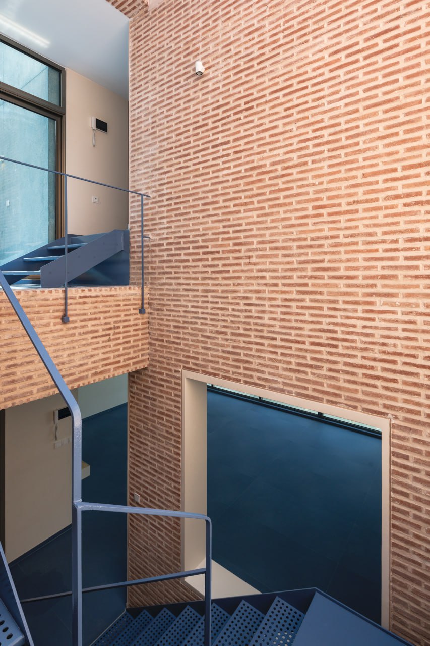
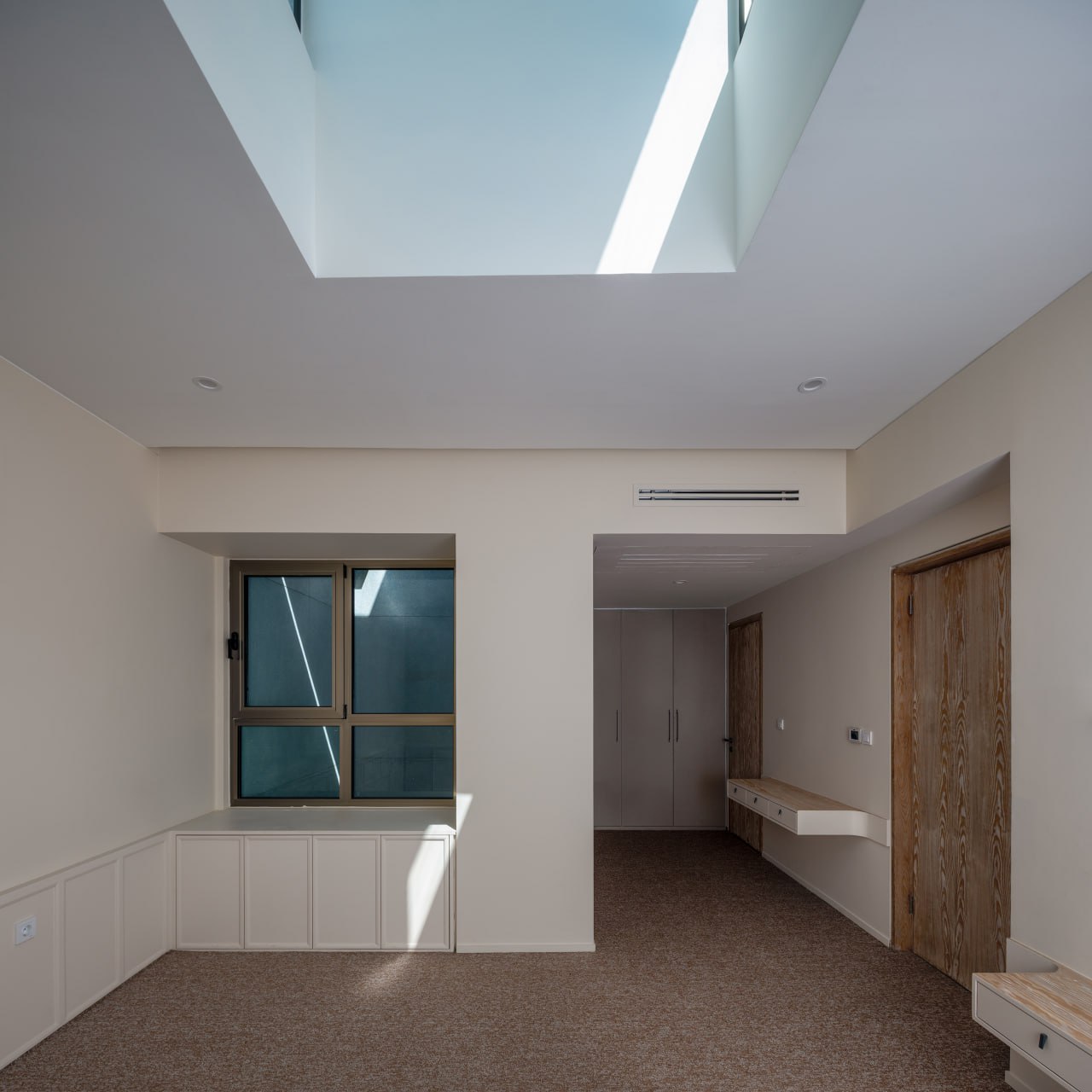
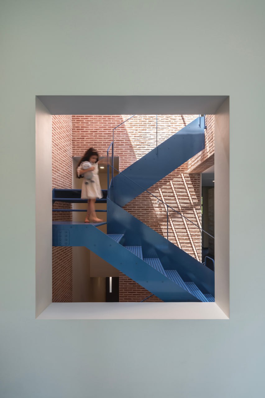
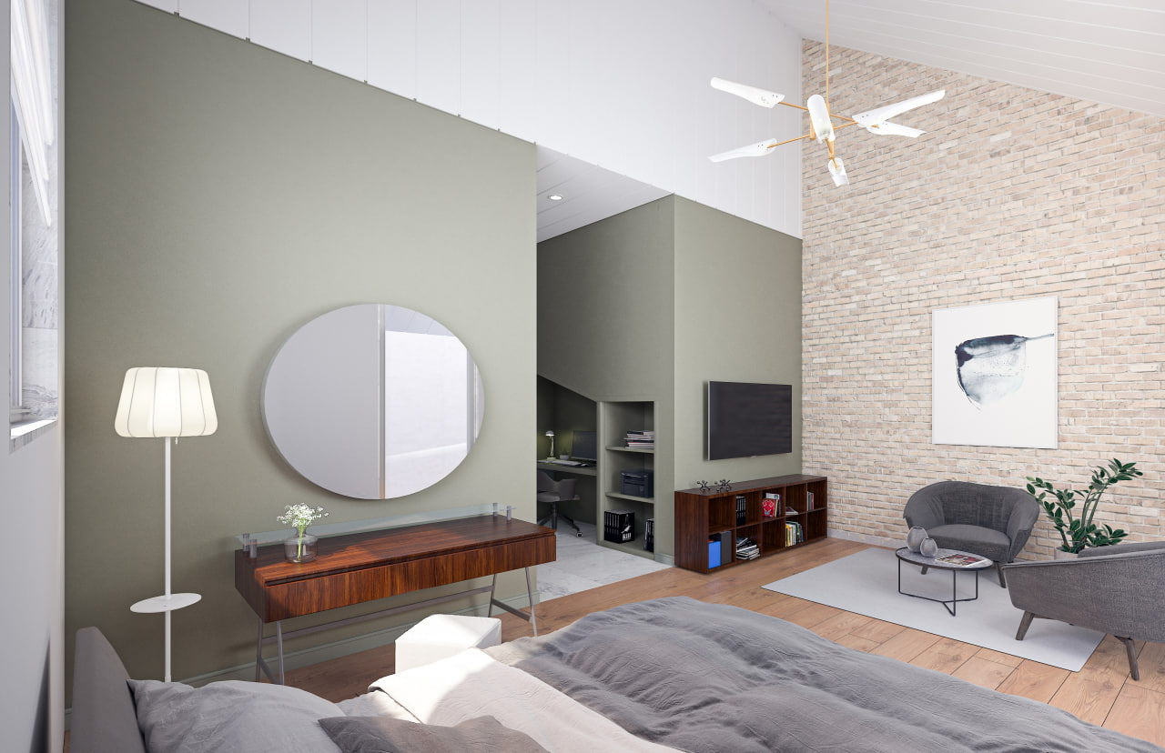
2. Void-overlook: This void in the center of the building not only brings a piece of the sky, light, and the passage of time into the house but also contains two important elements of the house. The main staircase connects the living, dining, and kitchen areas to the bedrooms, and the openings known as snooping windows are common in the architecture of the 1970s, which I prefer to call overlooks. The main feature of these overlooks is that they create a shadowed oversight from one space to another without compromising the independence of the spaces.
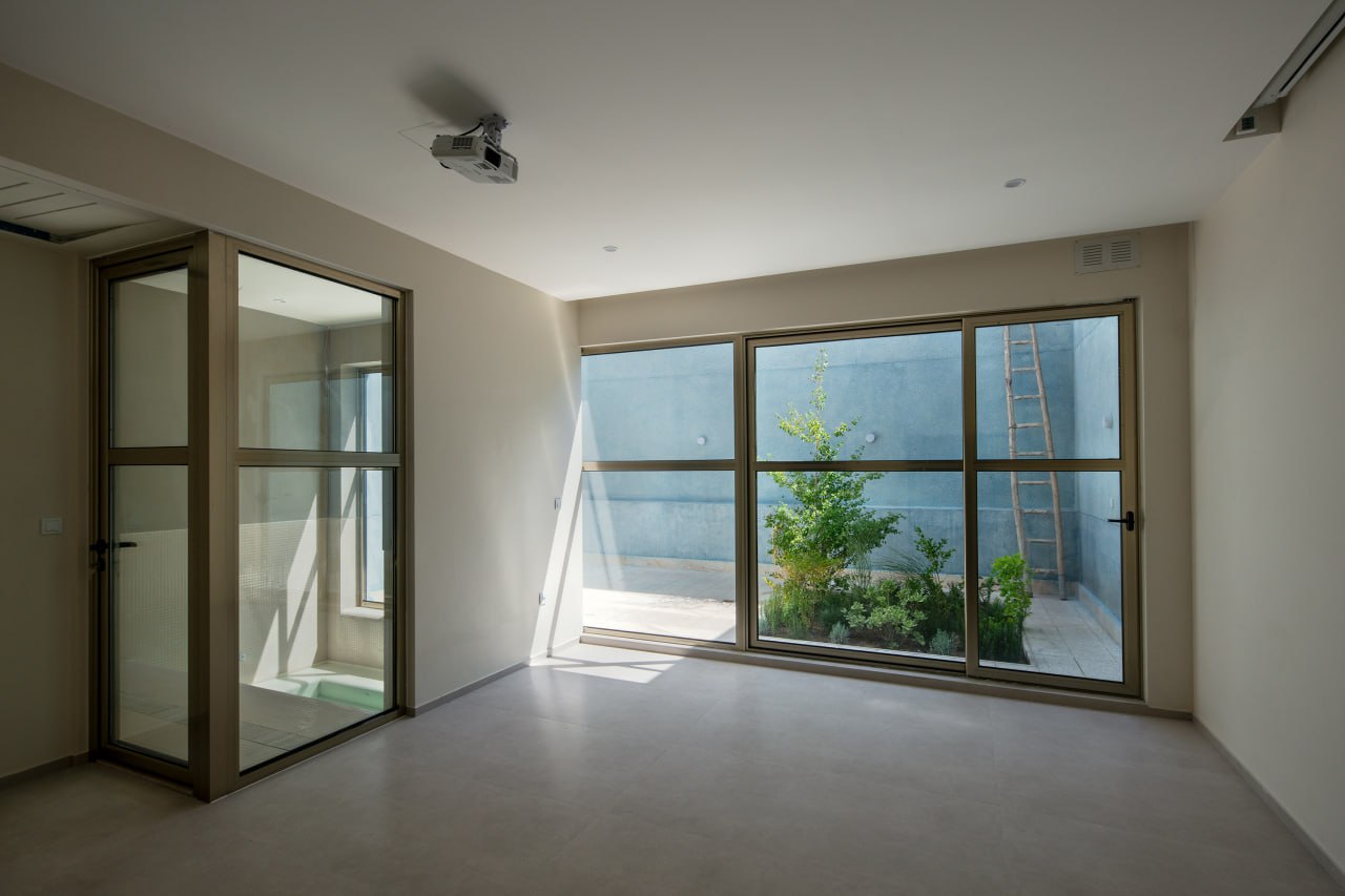
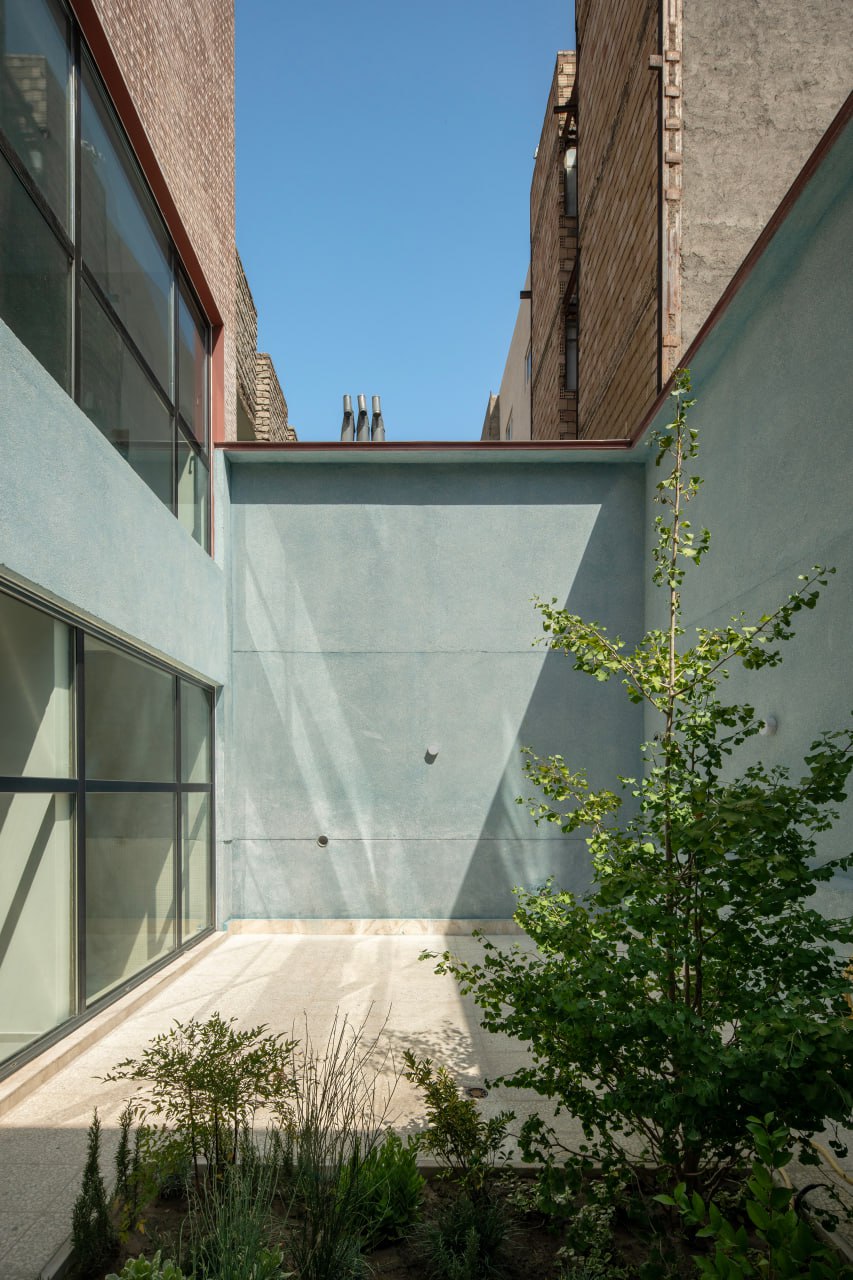
3. Two courtyards: one on the southern side of the property and another terrace-courtyard in the middle of the second floor, serving as a sitting area with privacy.
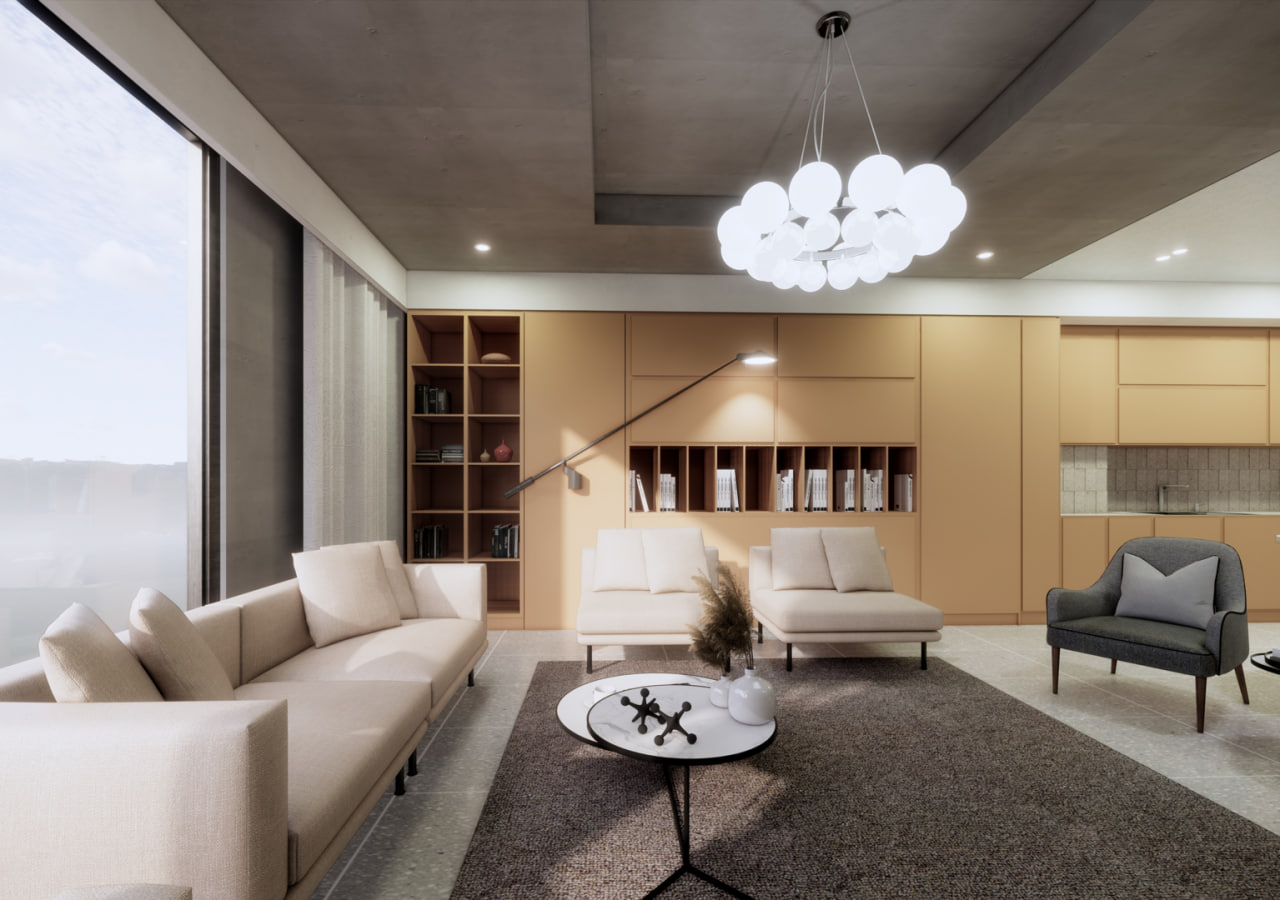
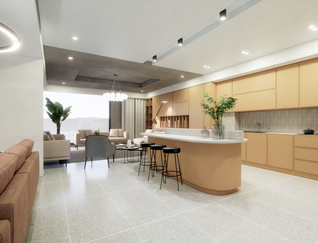
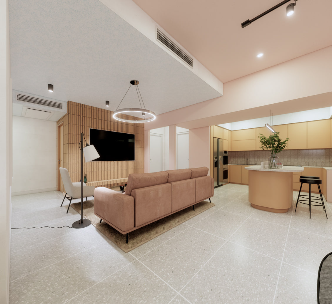
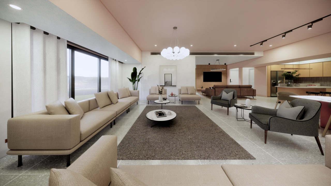
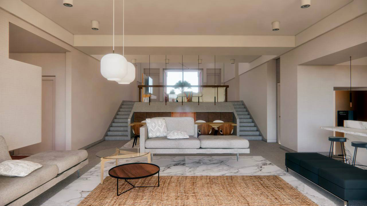
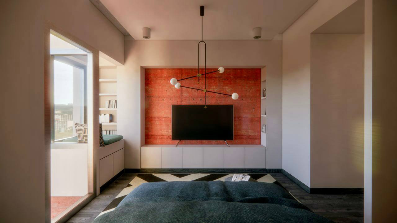
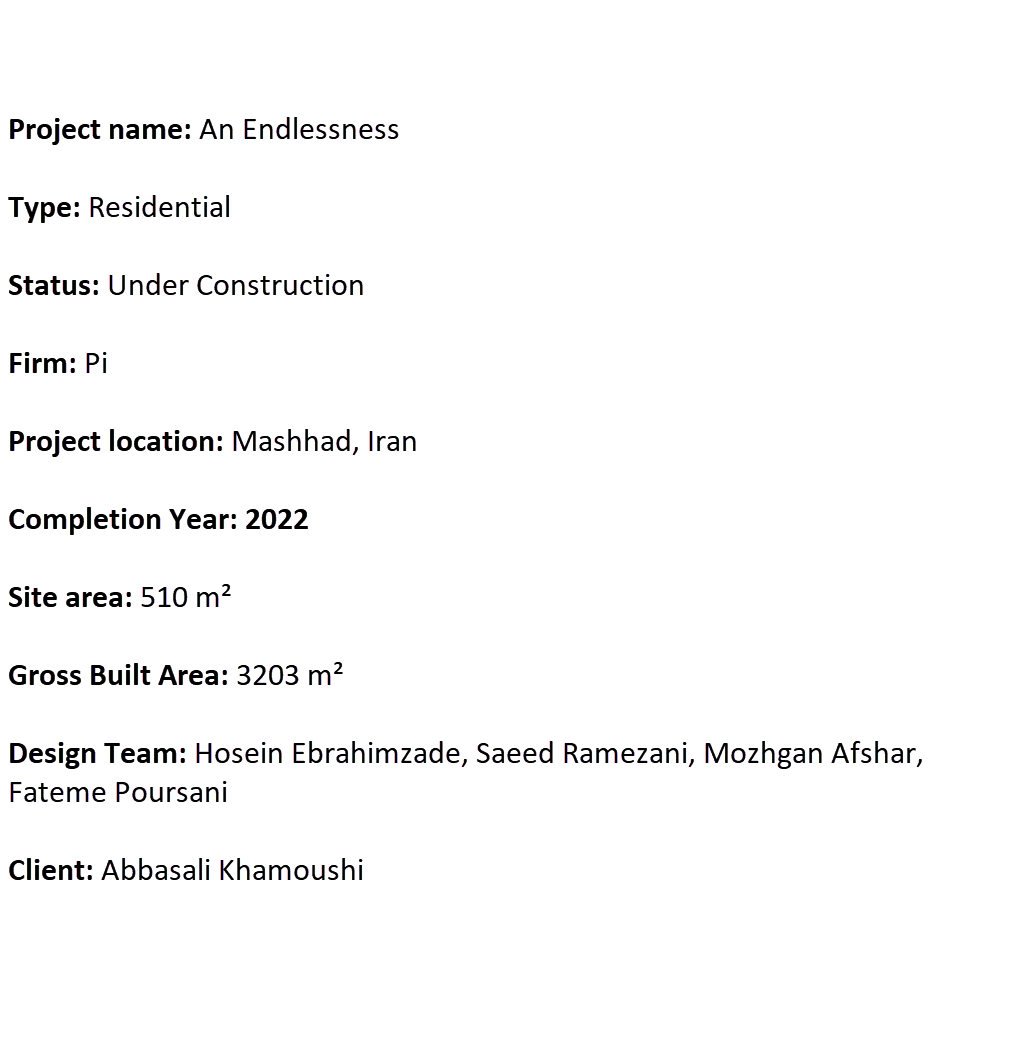
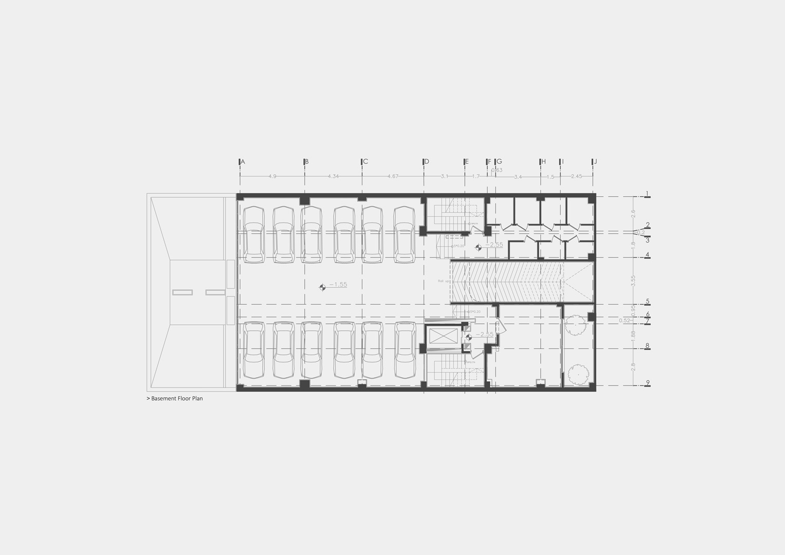
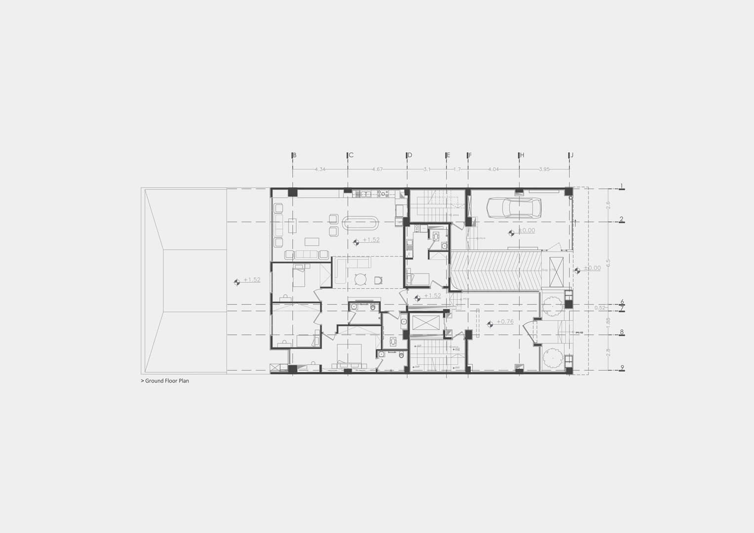
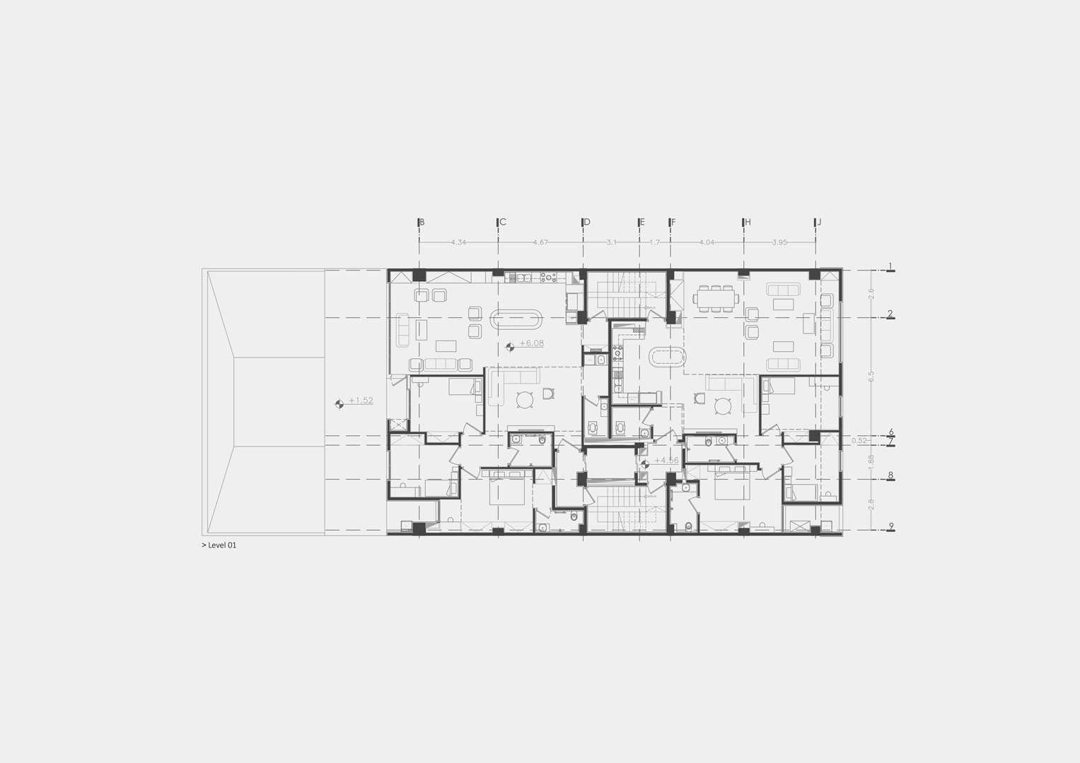
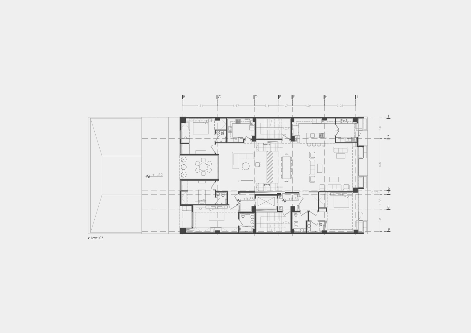

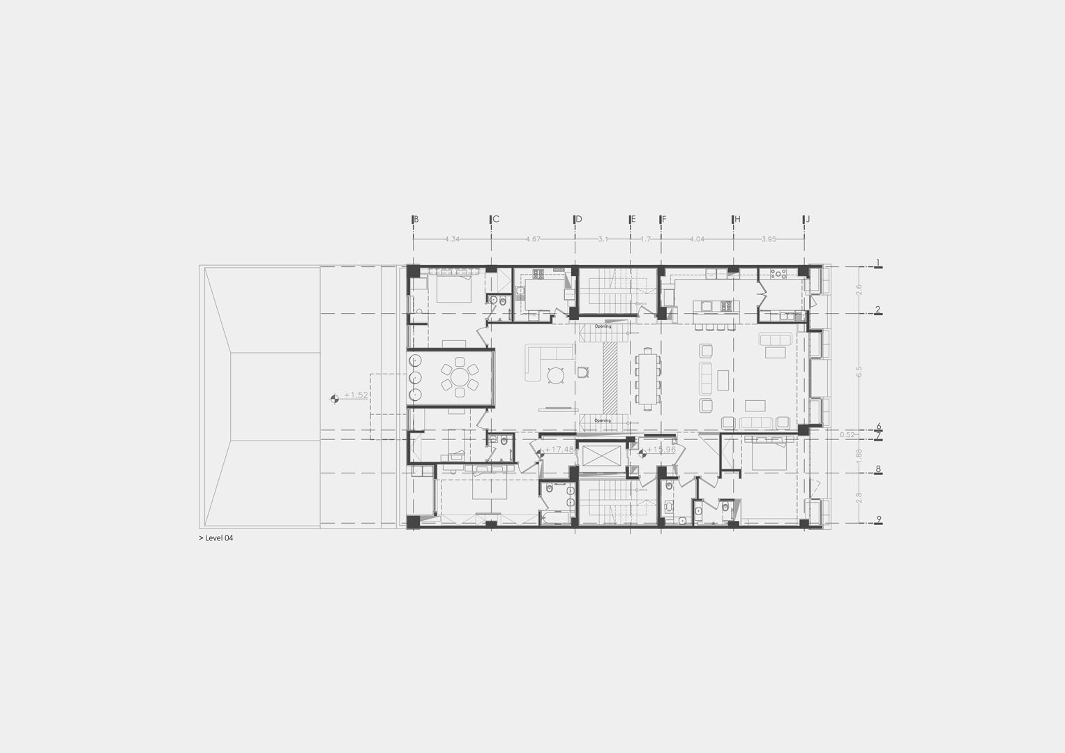
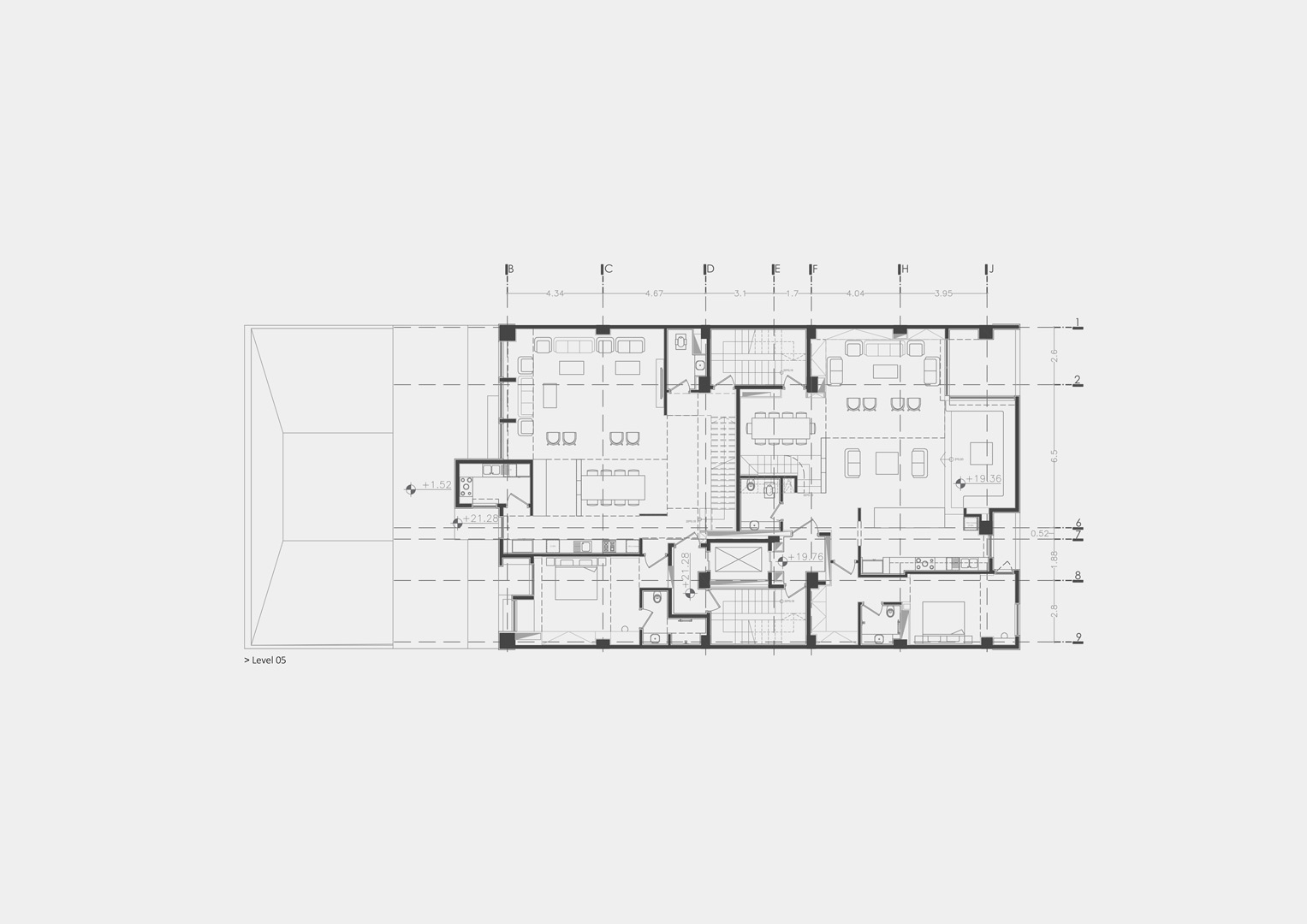
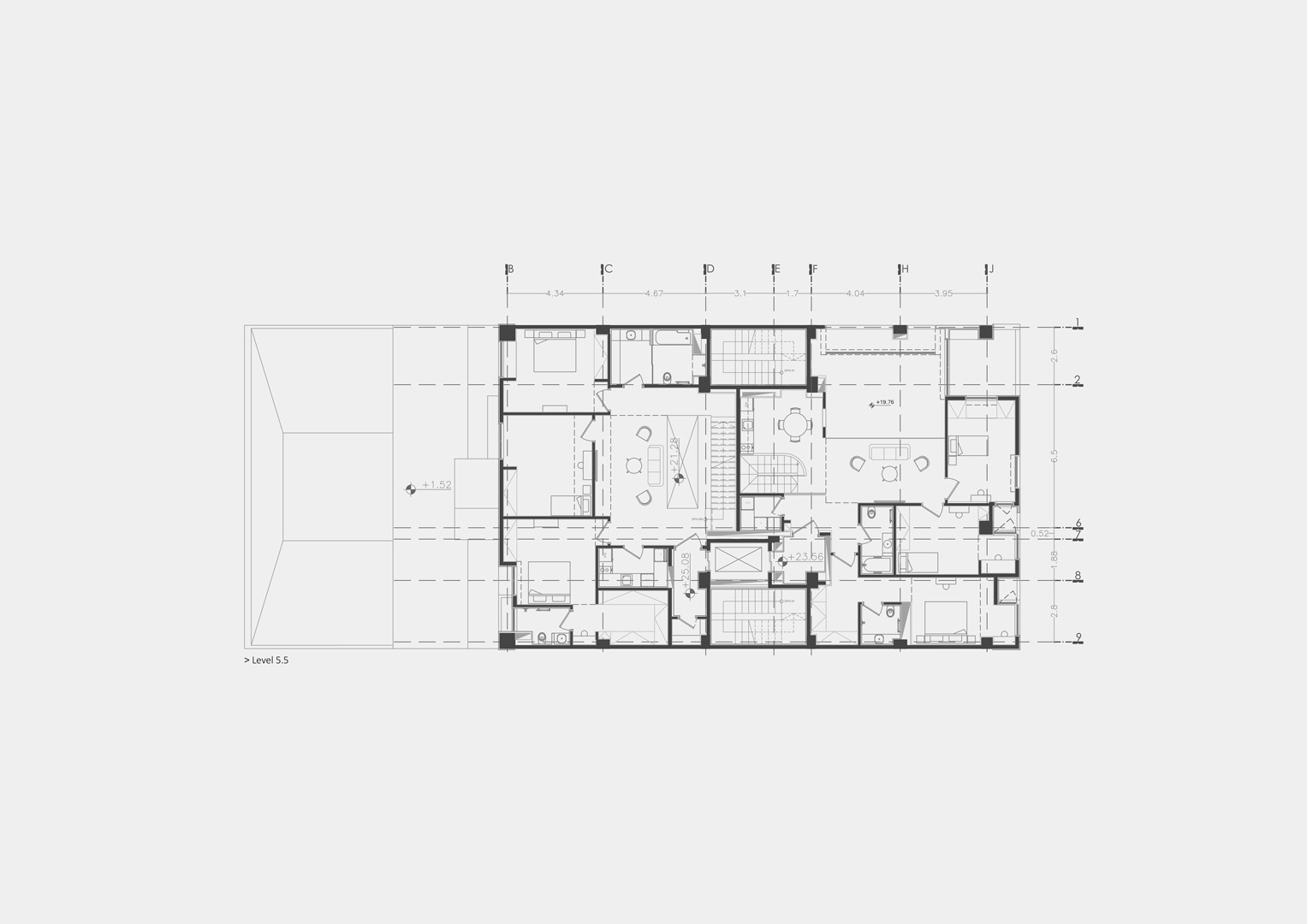
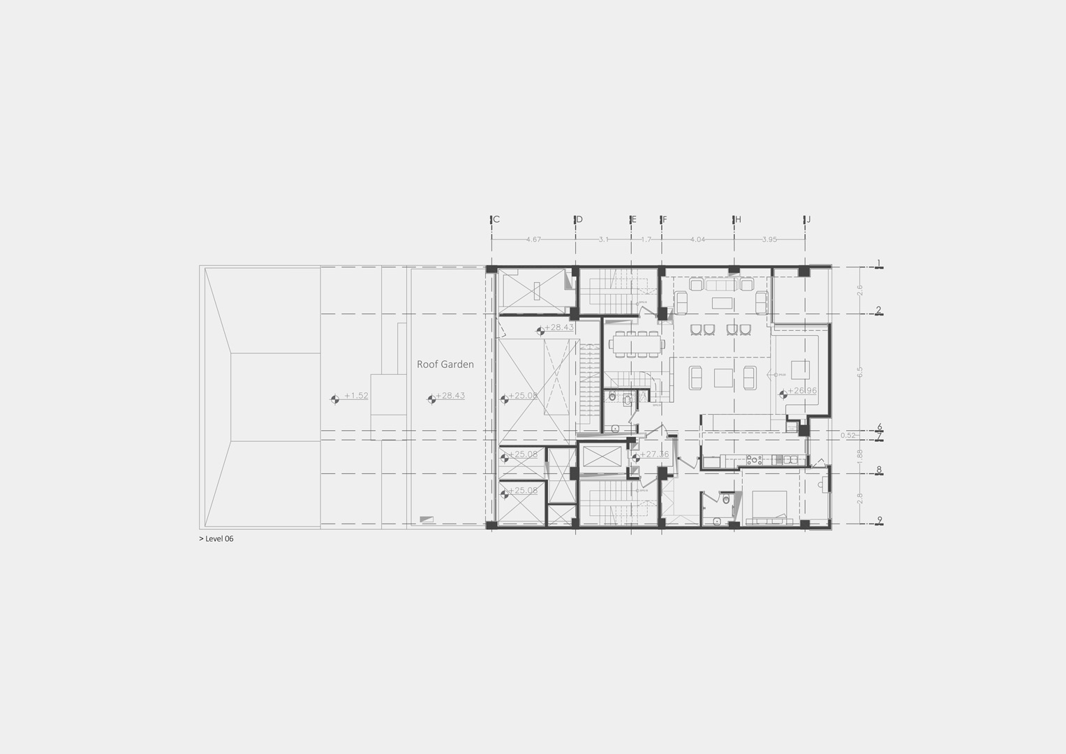
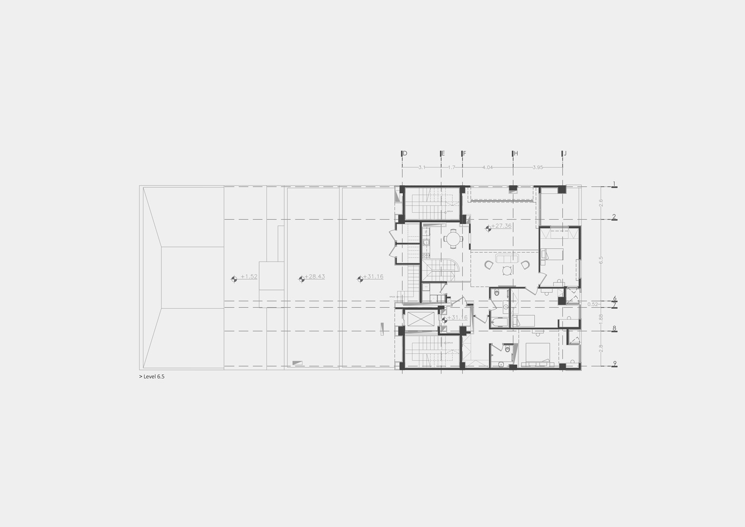
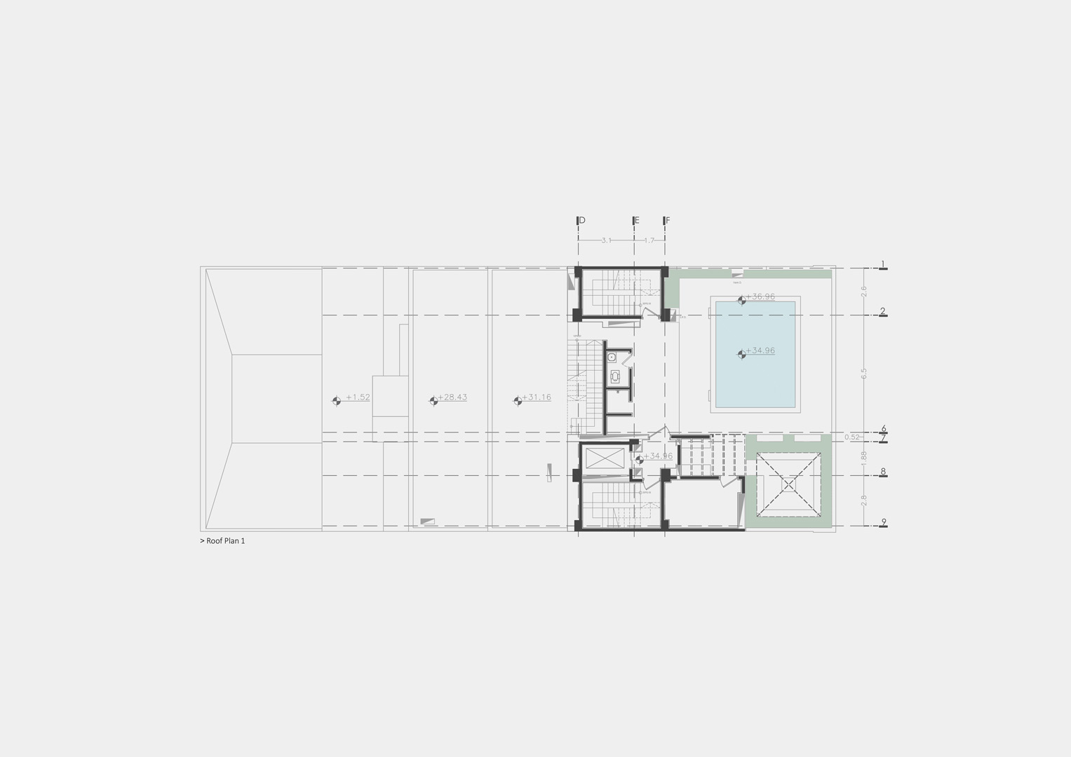
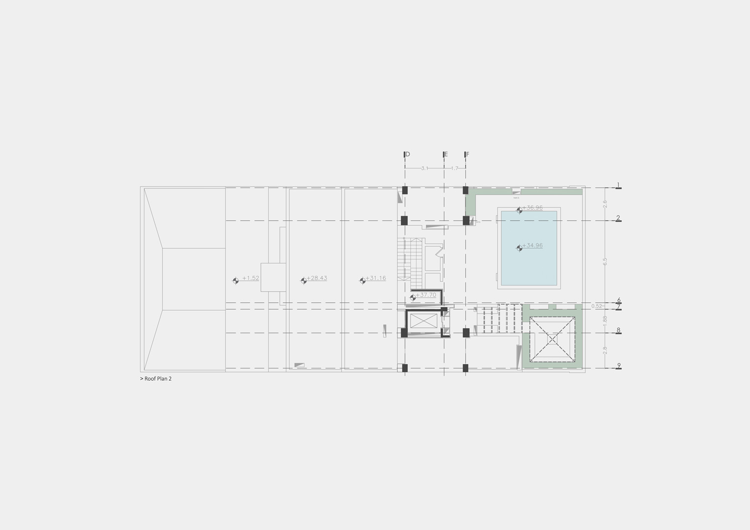
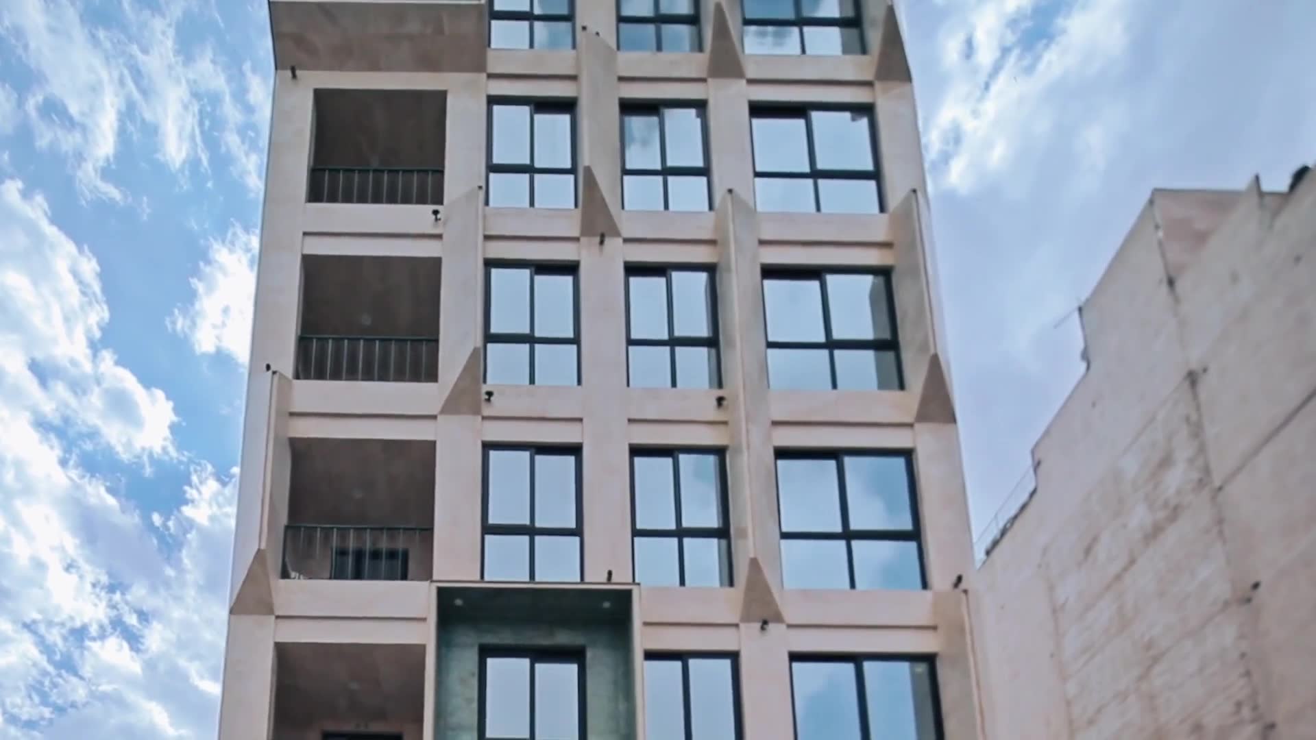
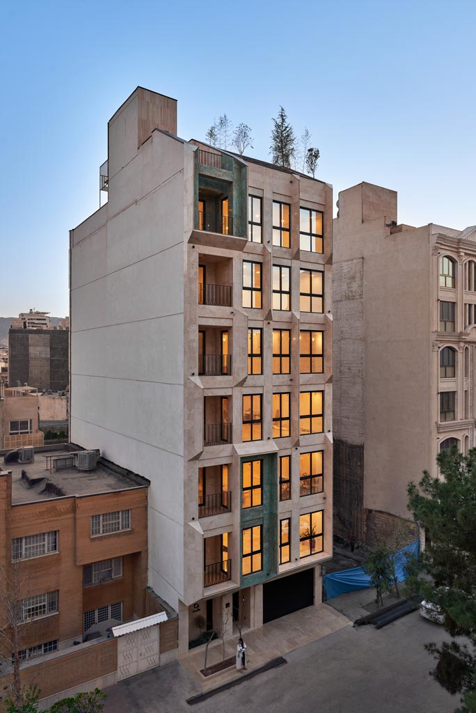
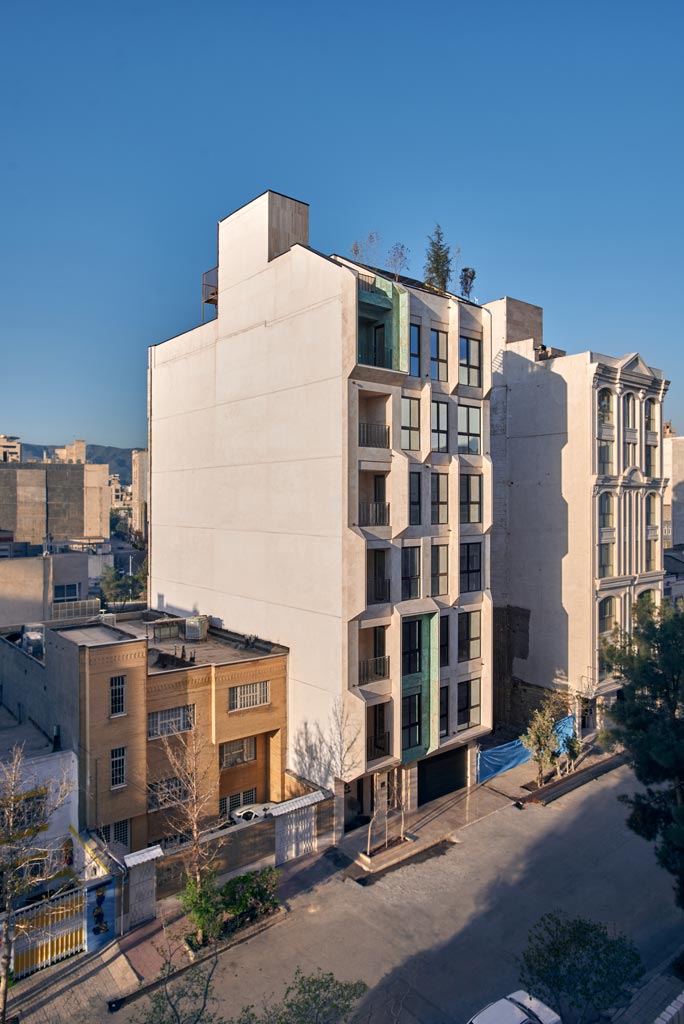
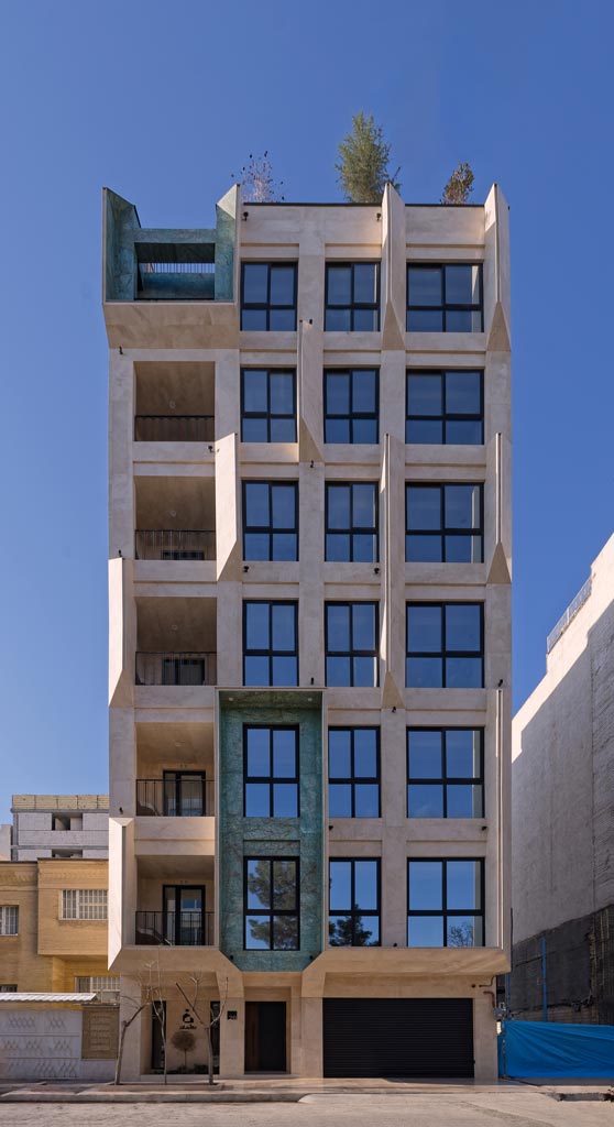
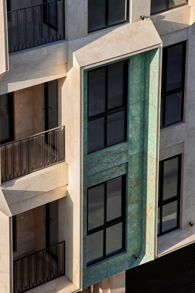
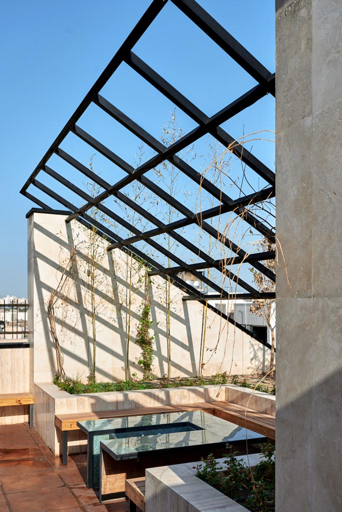
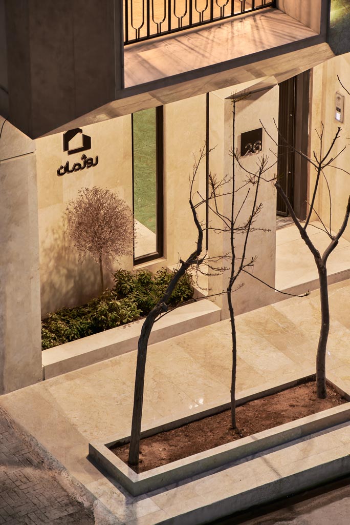
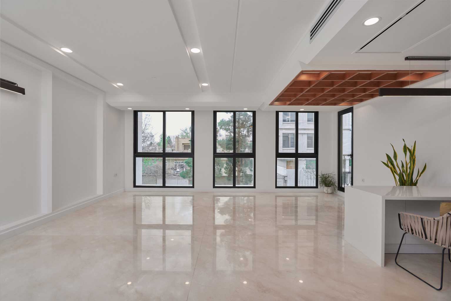
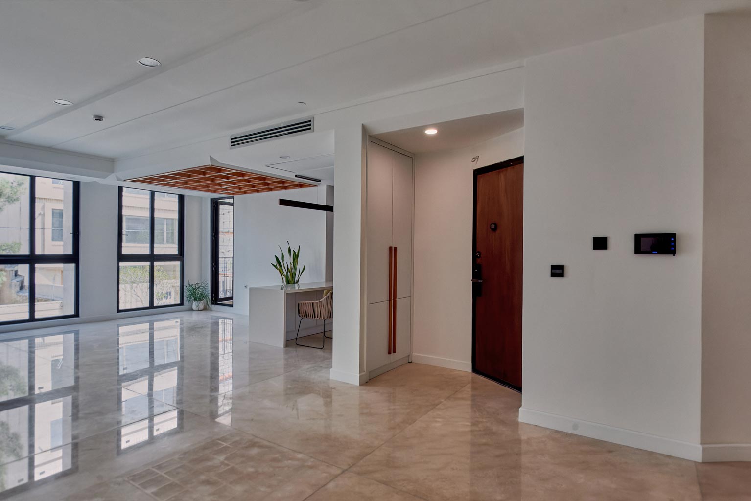
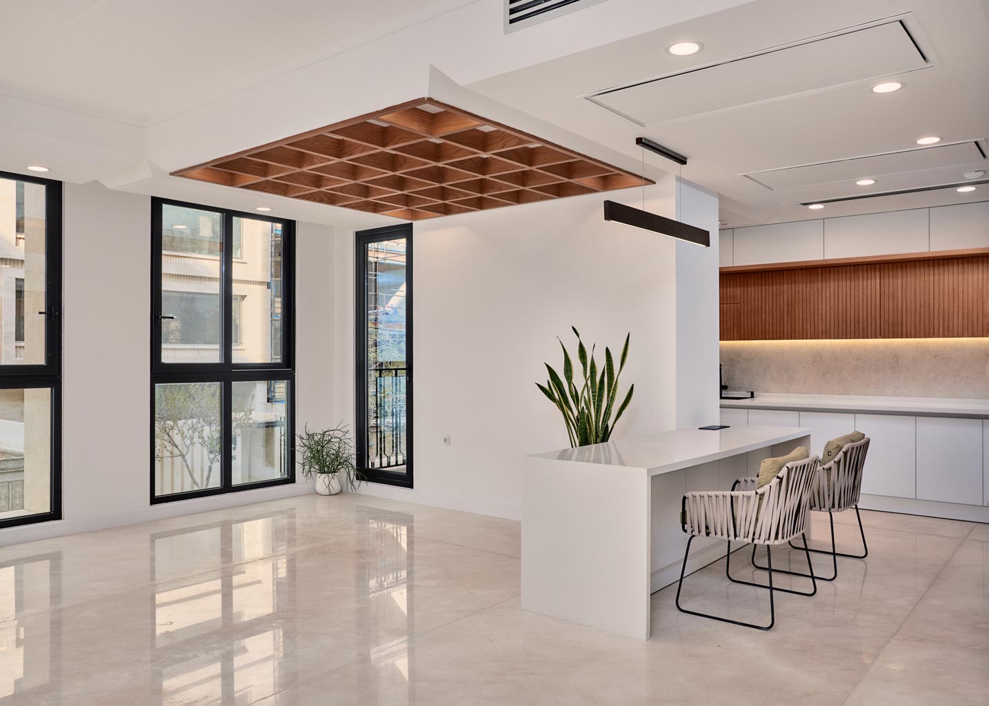
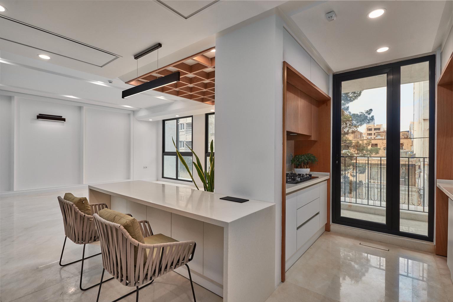
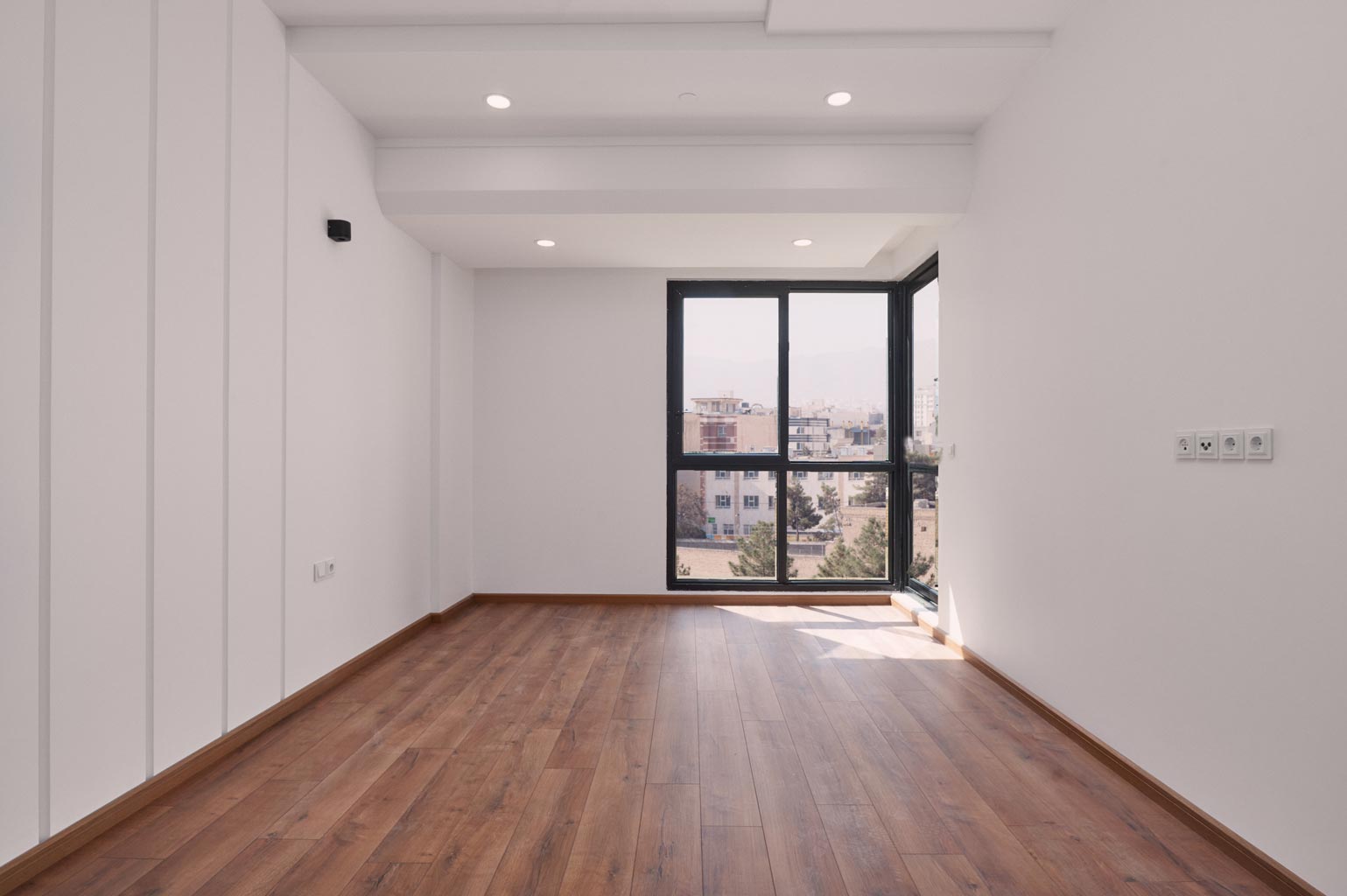
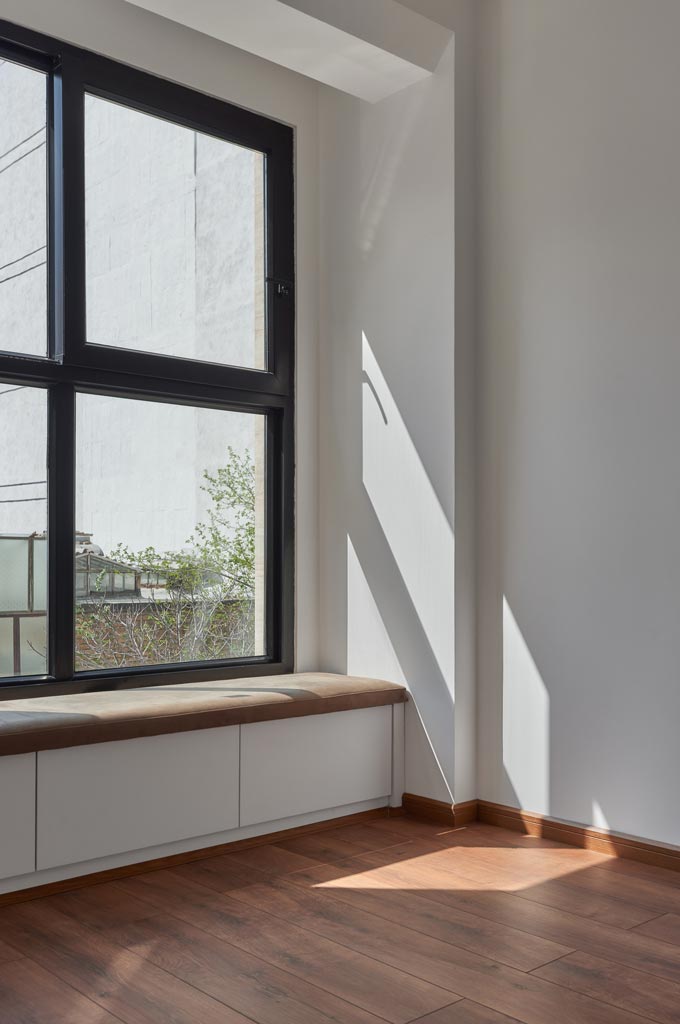
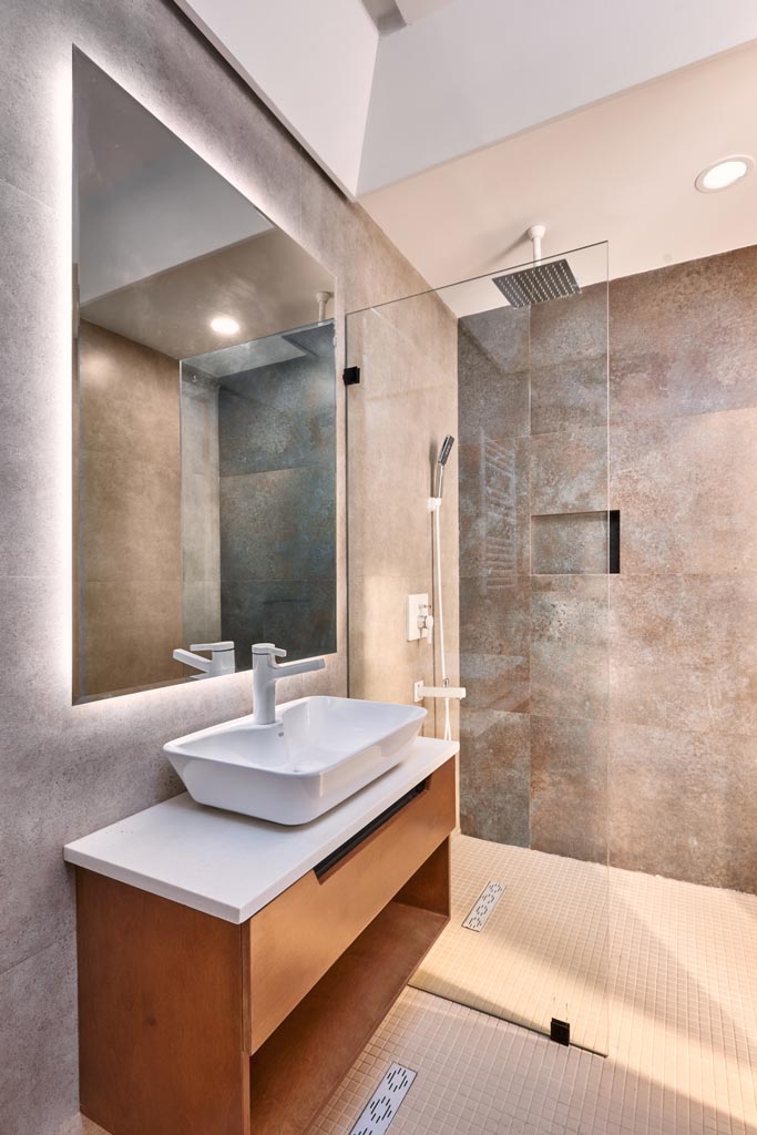


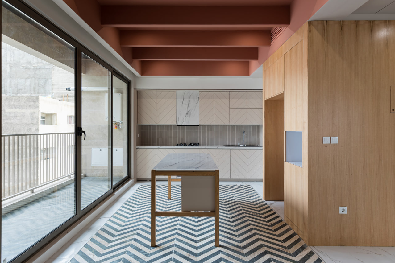
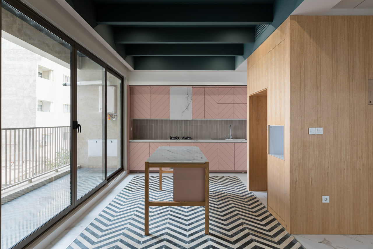

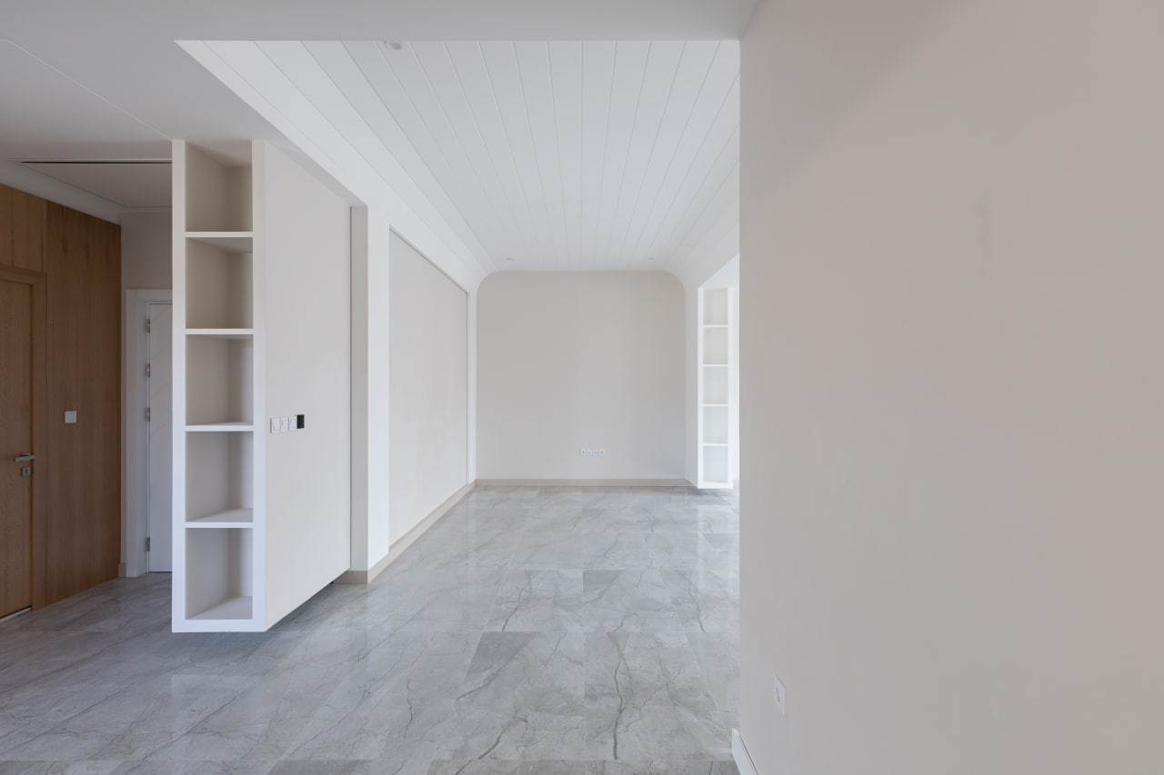
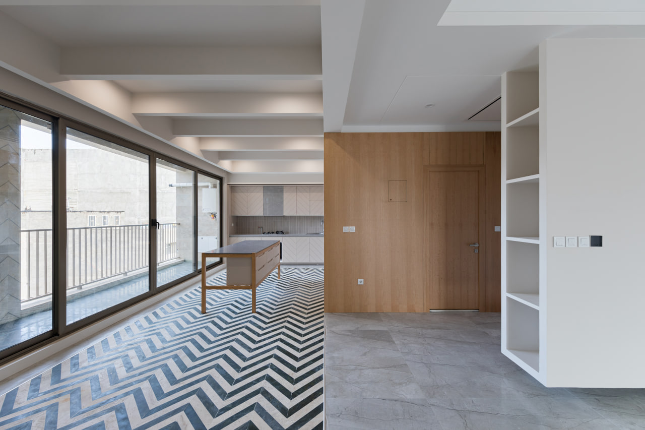
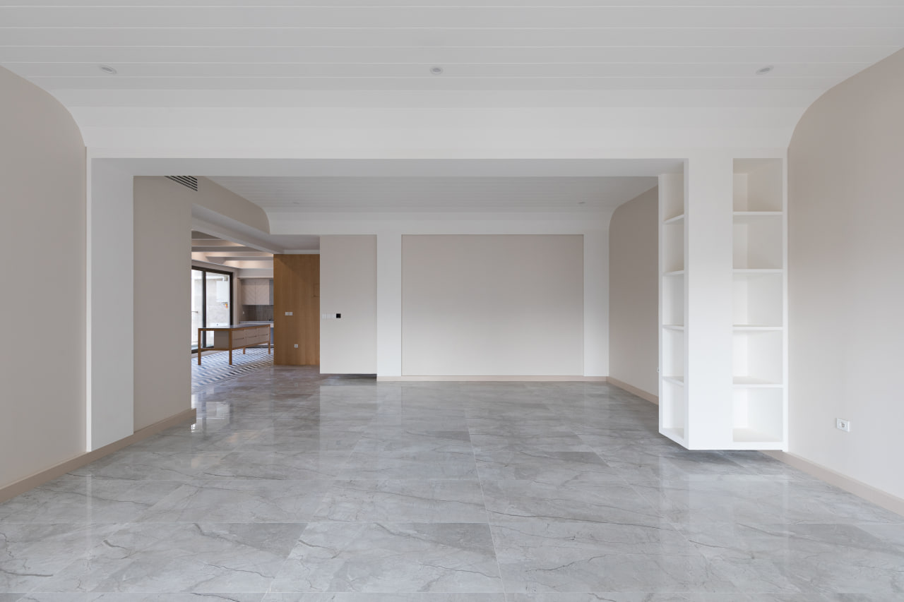
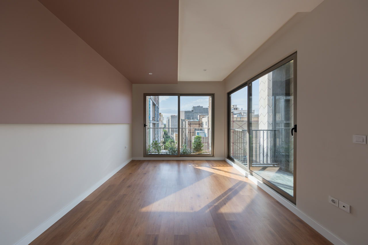
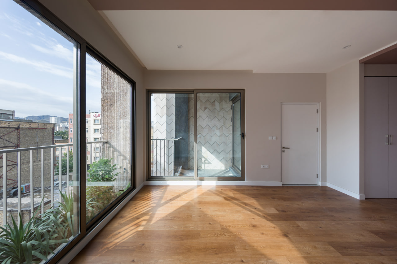

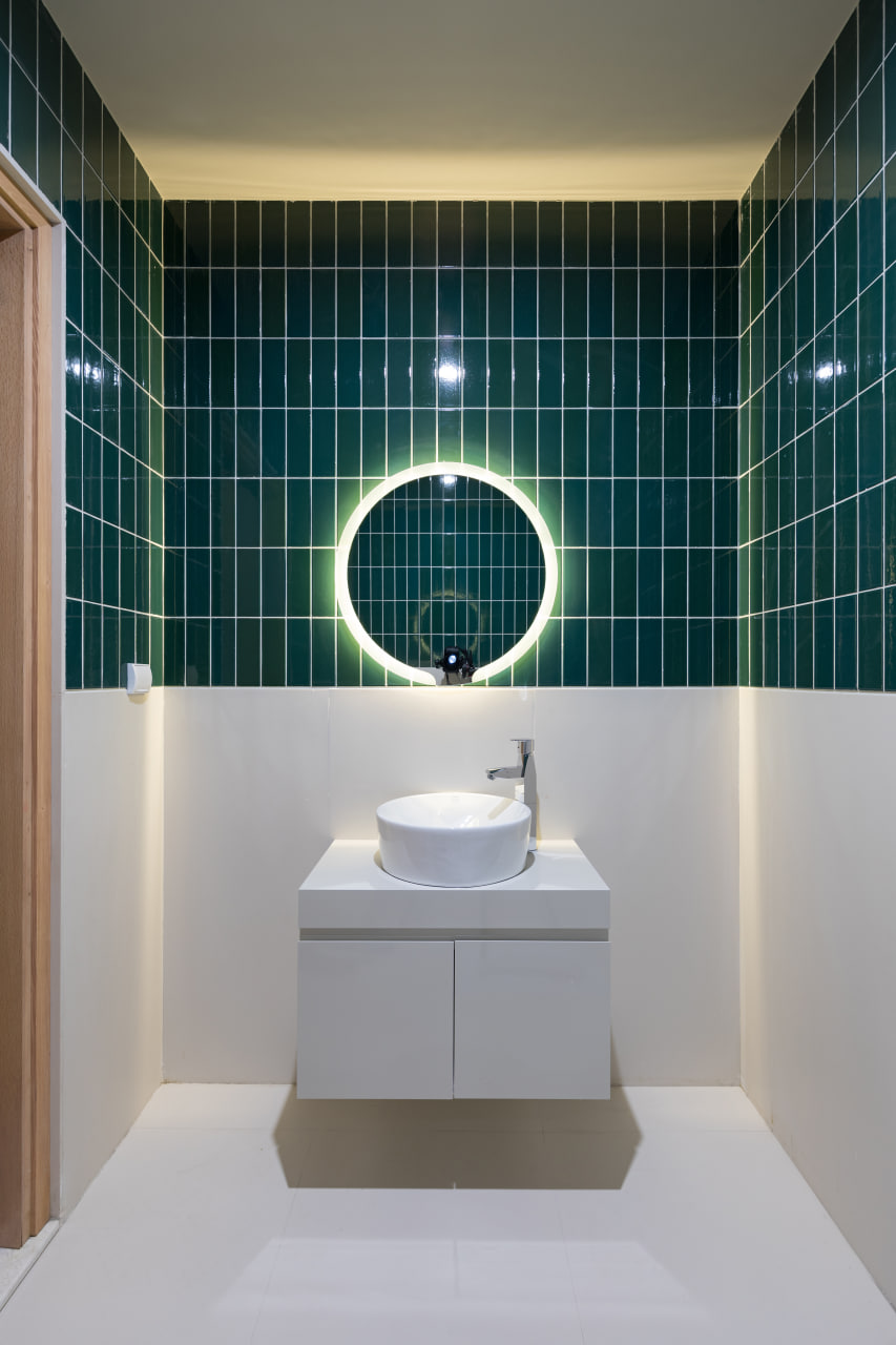
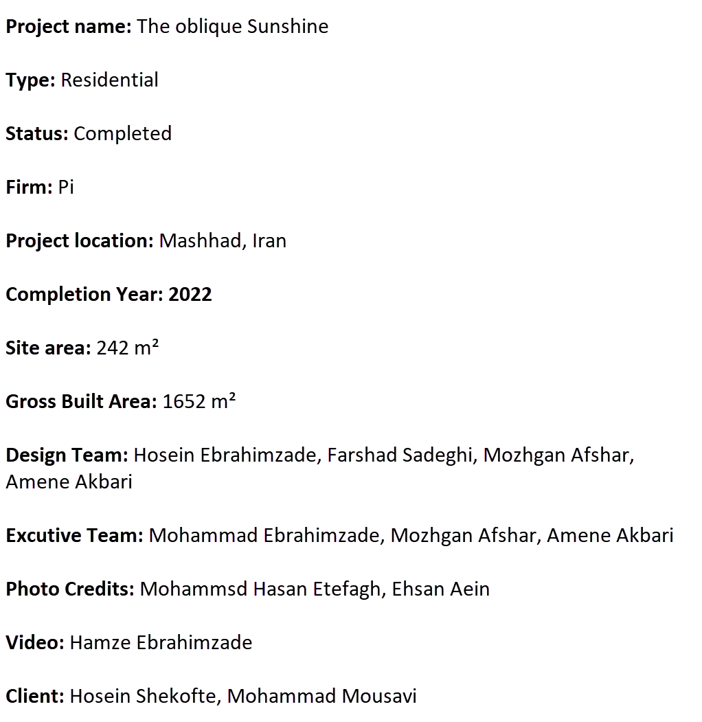
The topic of this project diverges from the usual subjects in the field of architecture. It’s true that prior to this project, we had experienced entering the design and construction process as investors in a small part of a building. However, the motivation for independent construction spurred us to utilize our capabilities via a construction participation contract. This kind of contract, which is common in Iran, allows the landowner to provide land to a construction group or individual, in exchange for a certain share of the constructed infrastructure. Following the project’s completion, despite the satisfaction of the landowners, our office encountered serious challenges that led to fundamental changes in its structure.
The primary challenge was finding a satisfactory answer to this question:
Do the architectural solutions and the value of the plans from the architectural office seem the same under the pressure of numerous legal and financial issues of the project, as what we had experienced before assuming this role?
Although the answer to this question isn’t simple, it can be said that this experience has the potential to alter our perspective on our work.
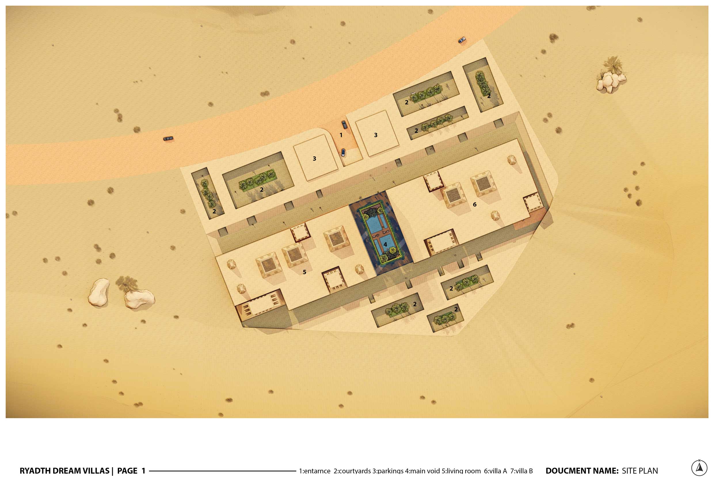
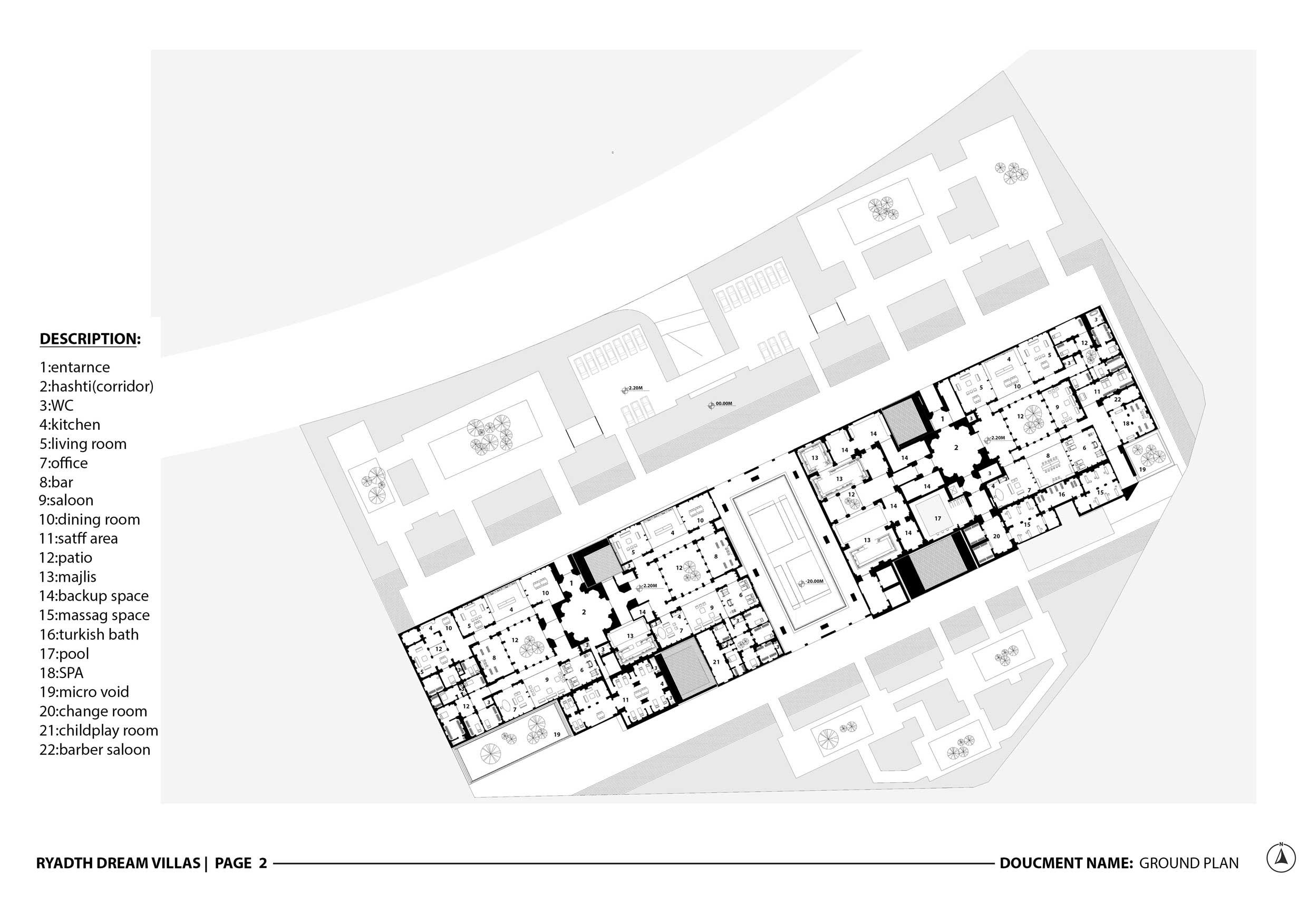
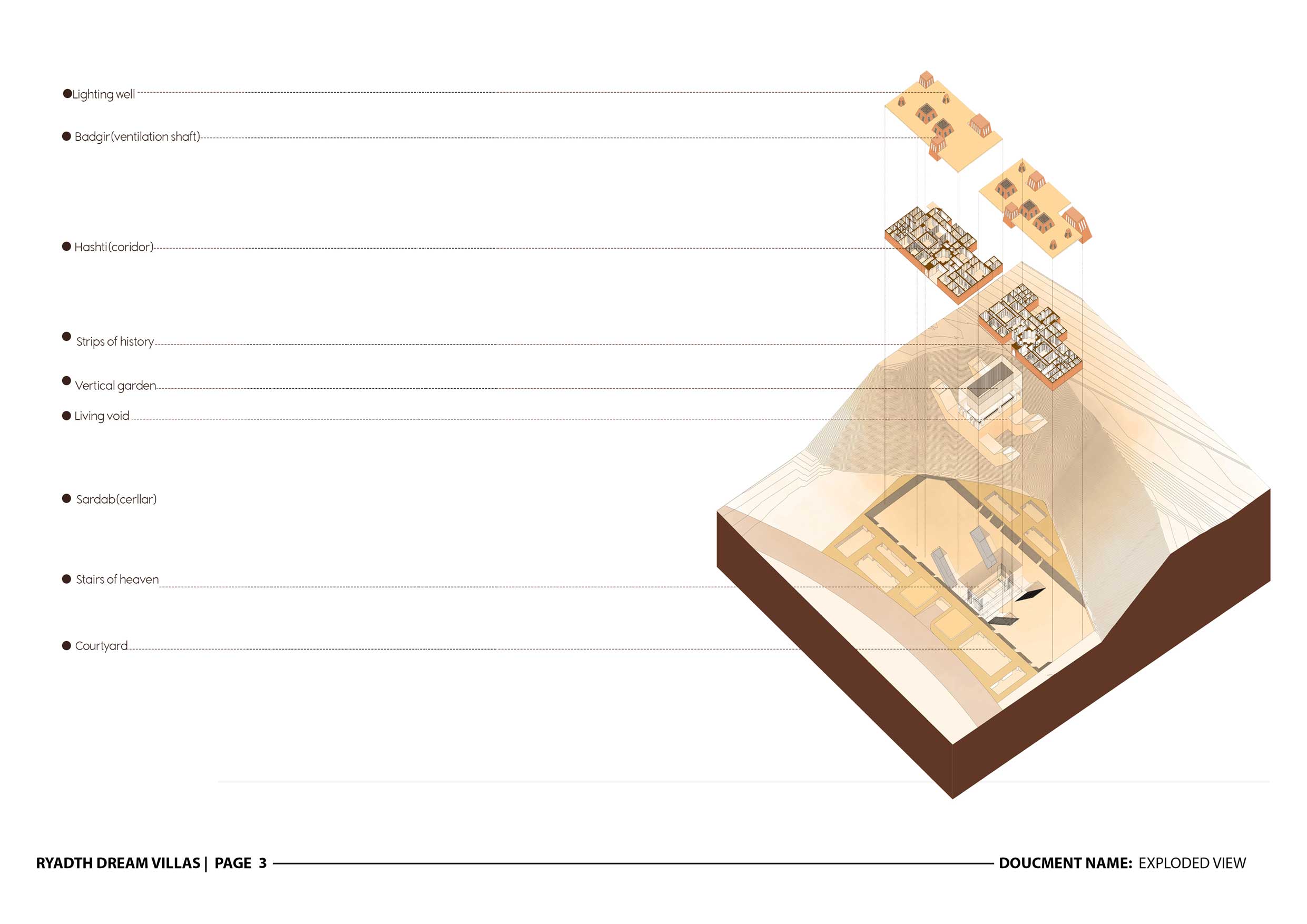
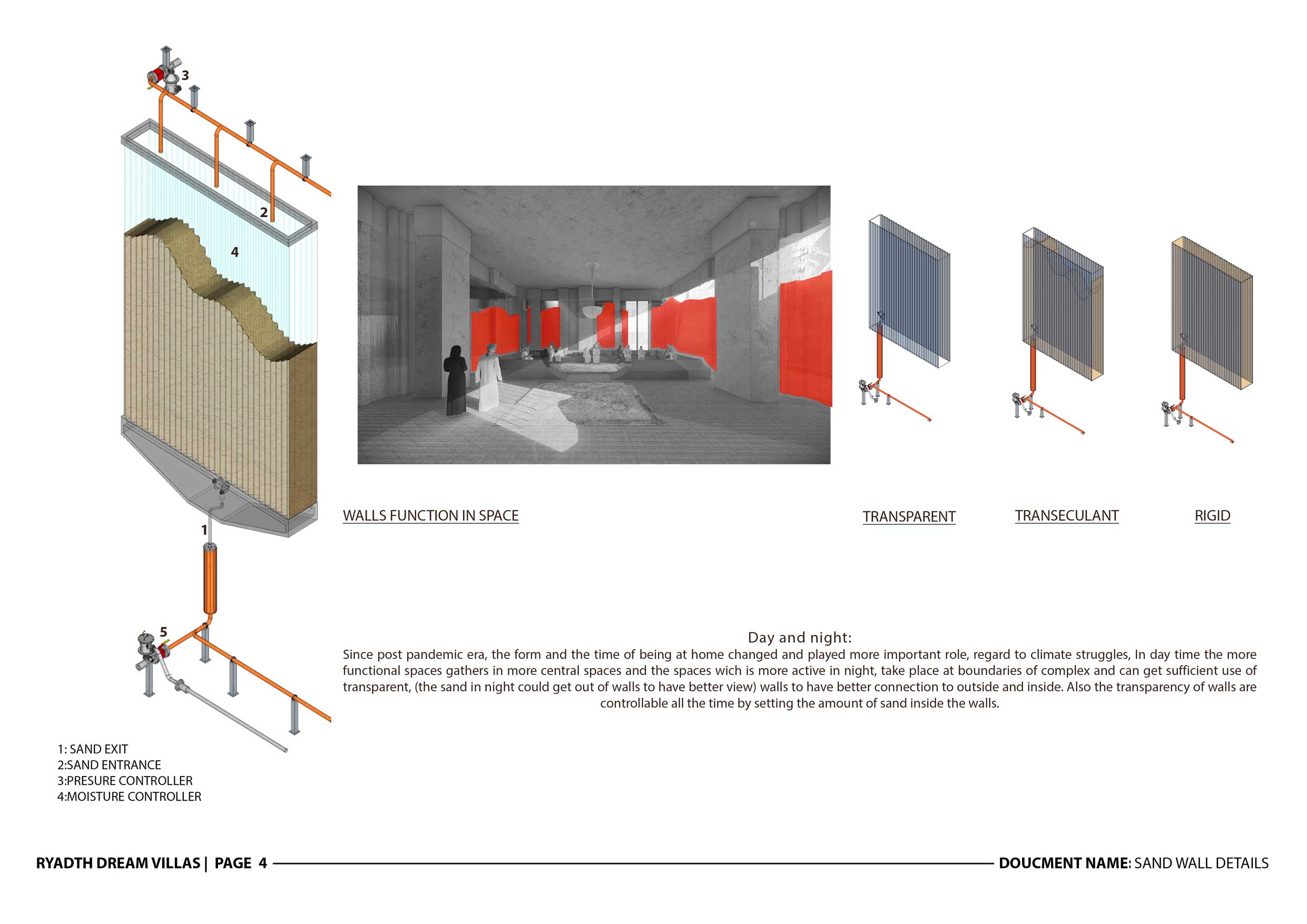
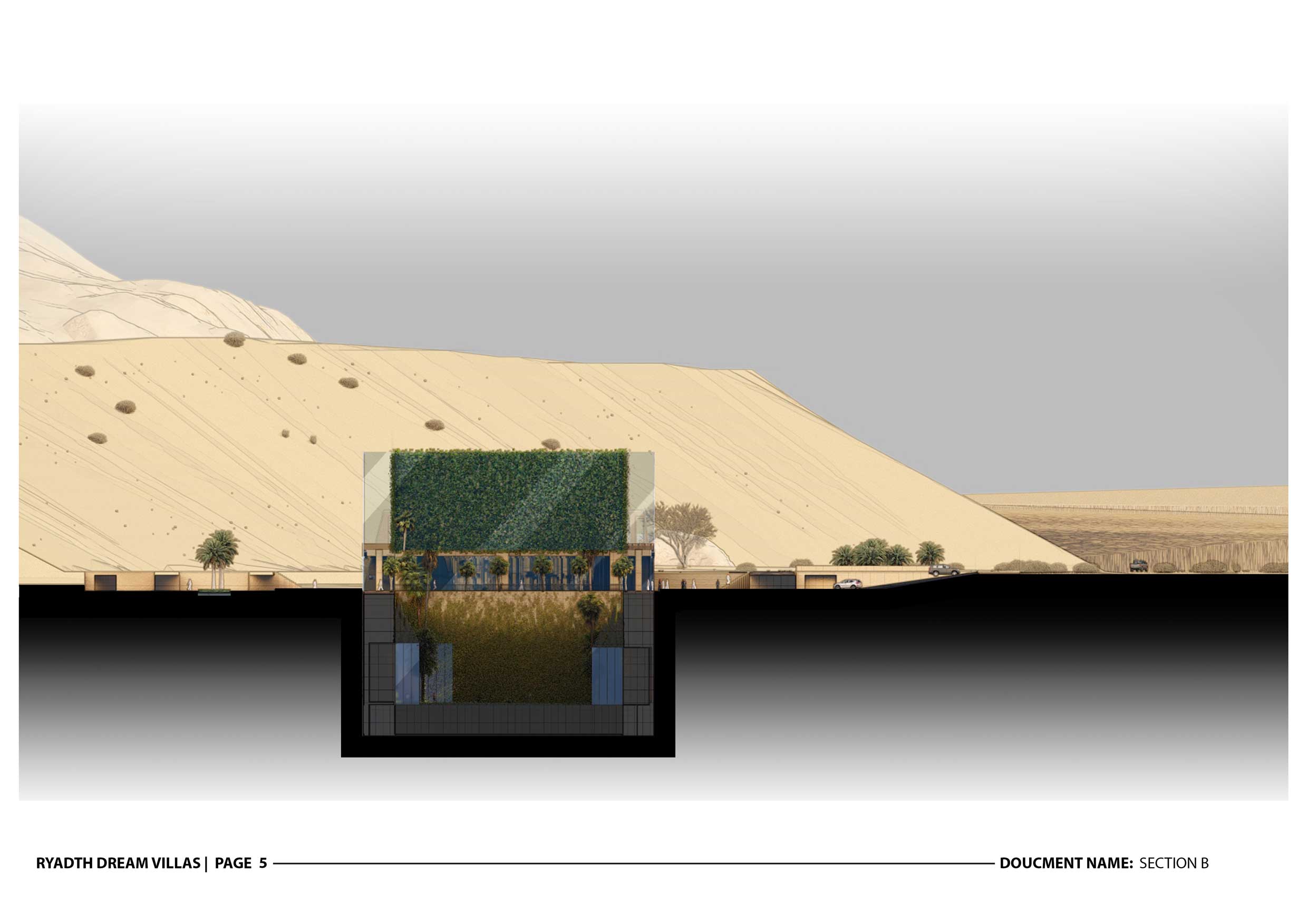
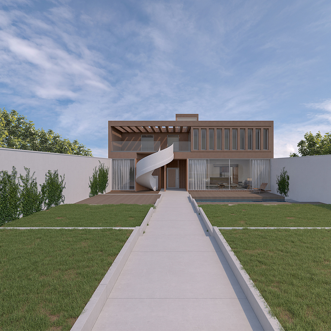
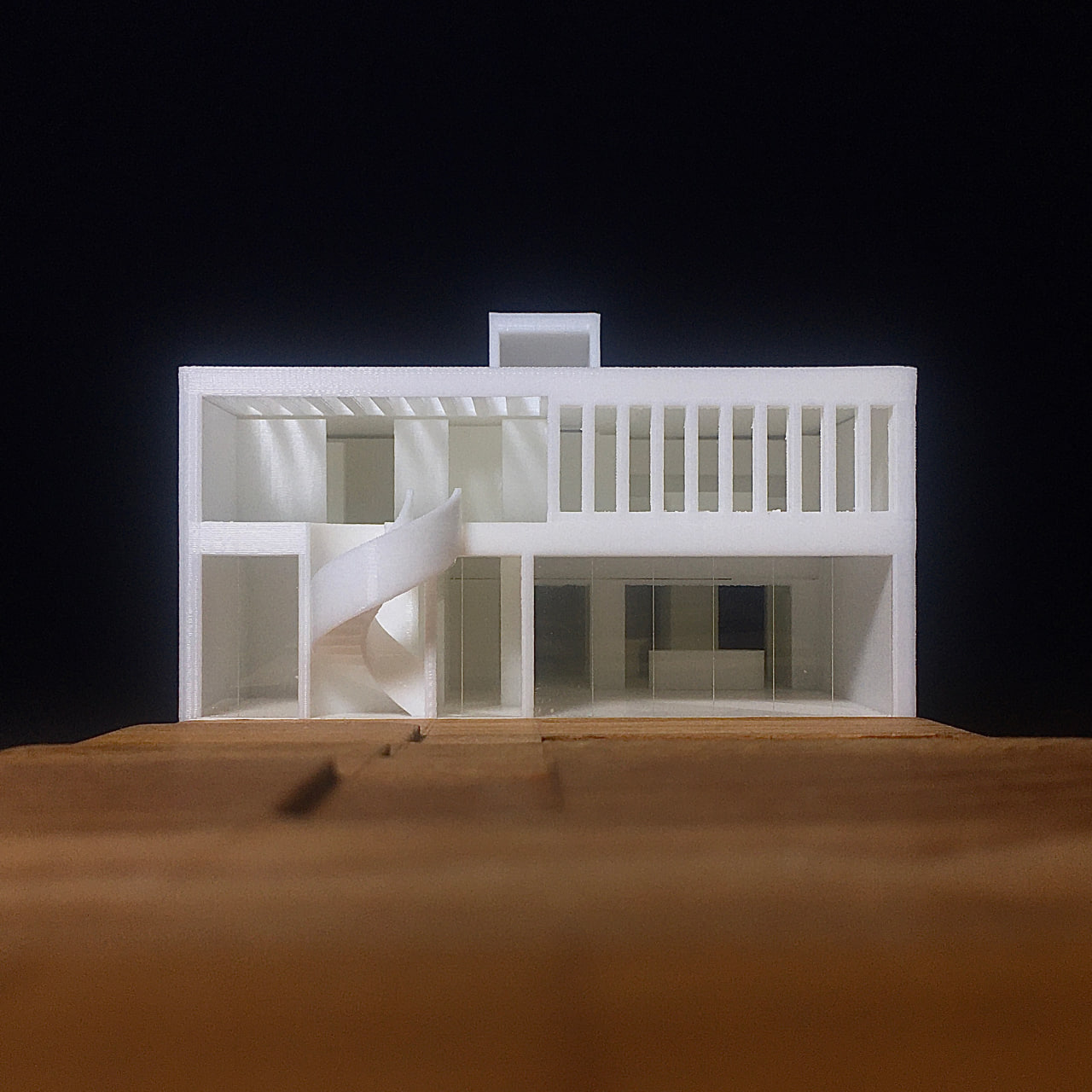
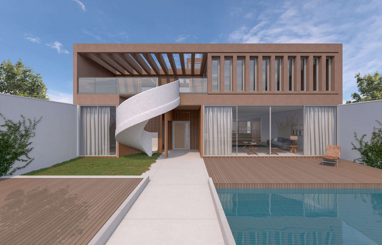
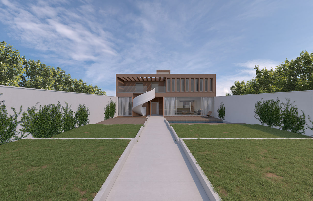
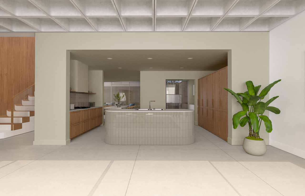
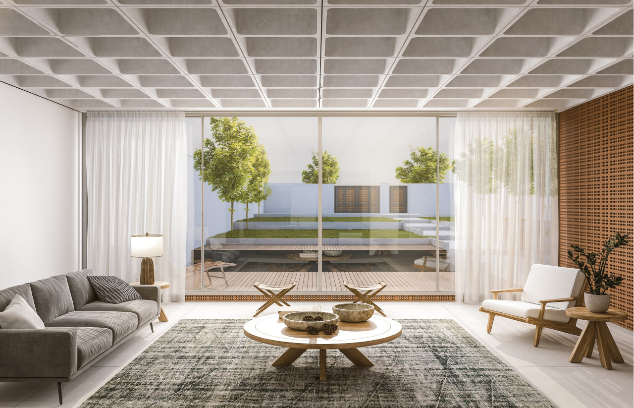
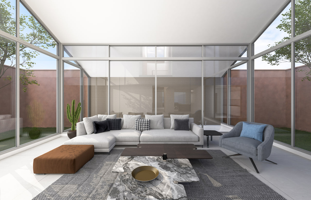
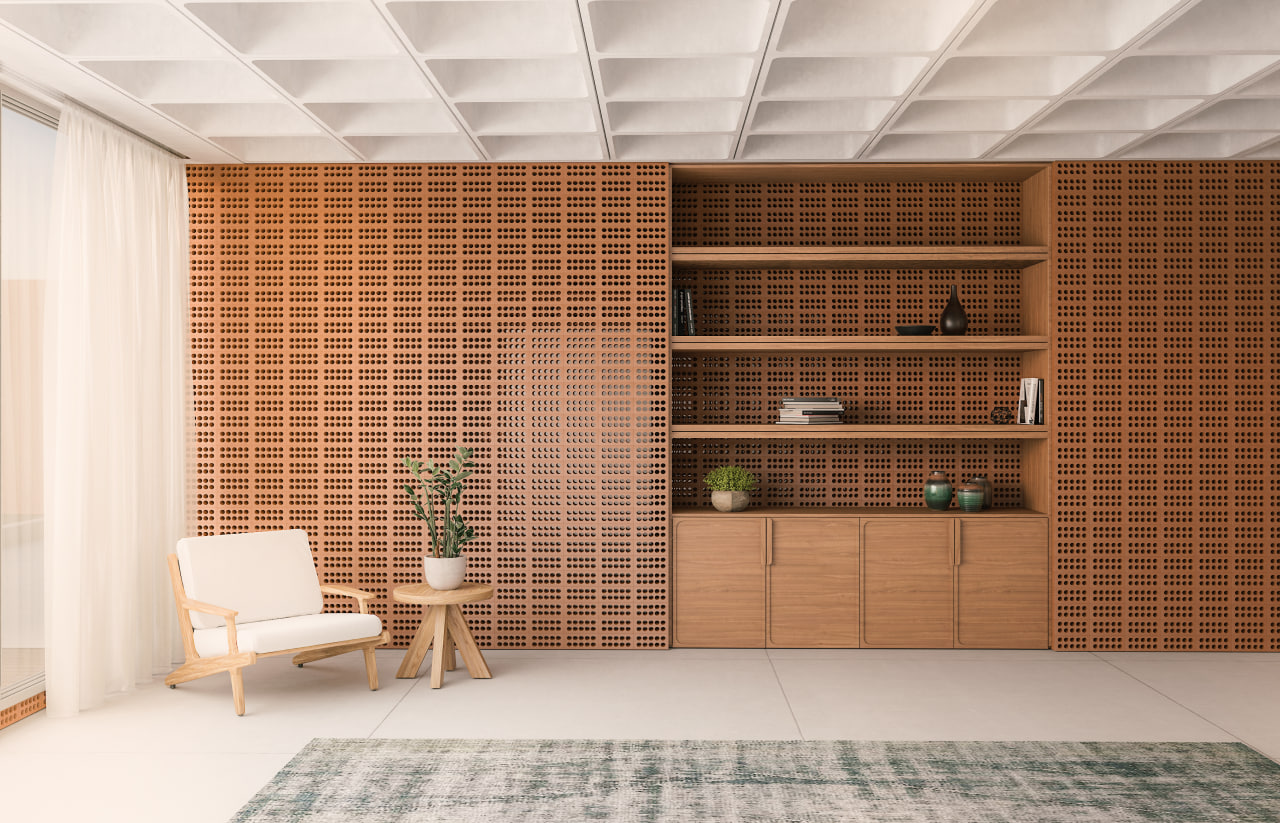
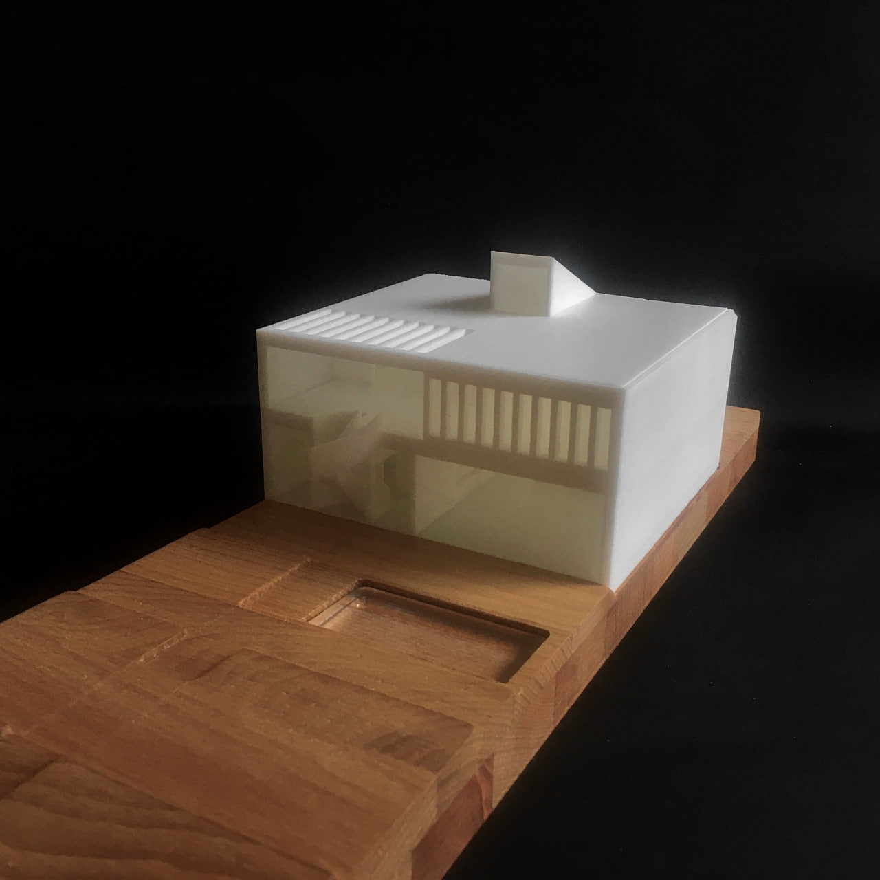
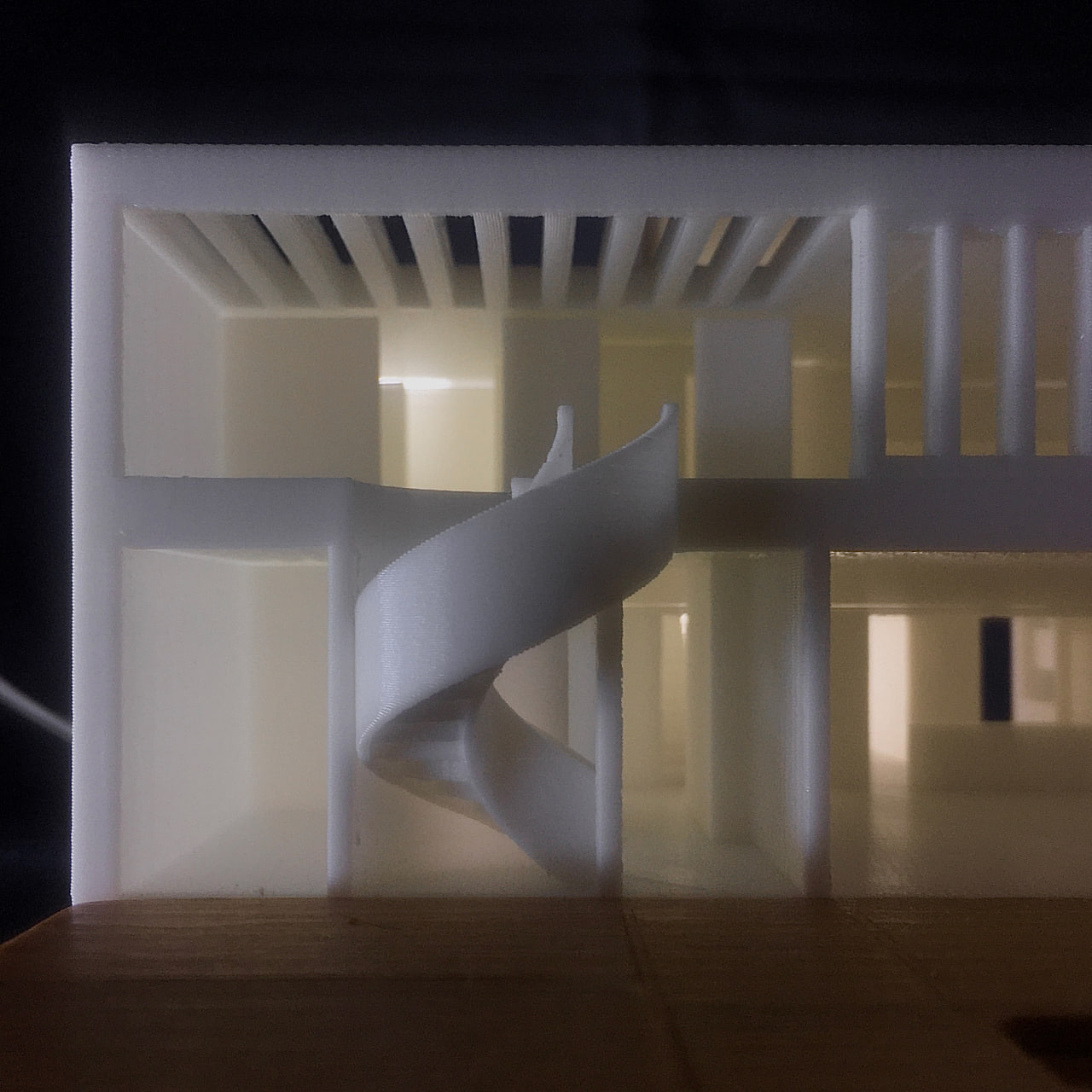
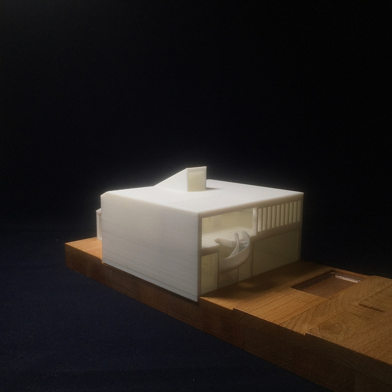
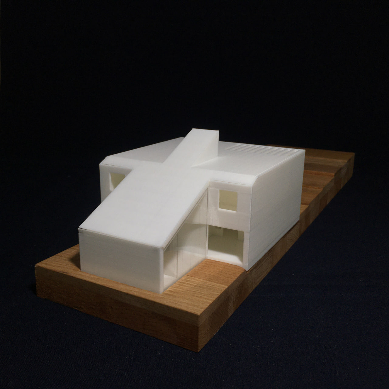

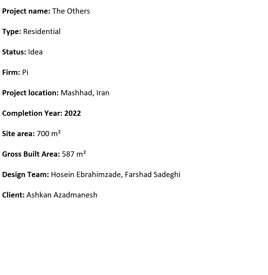
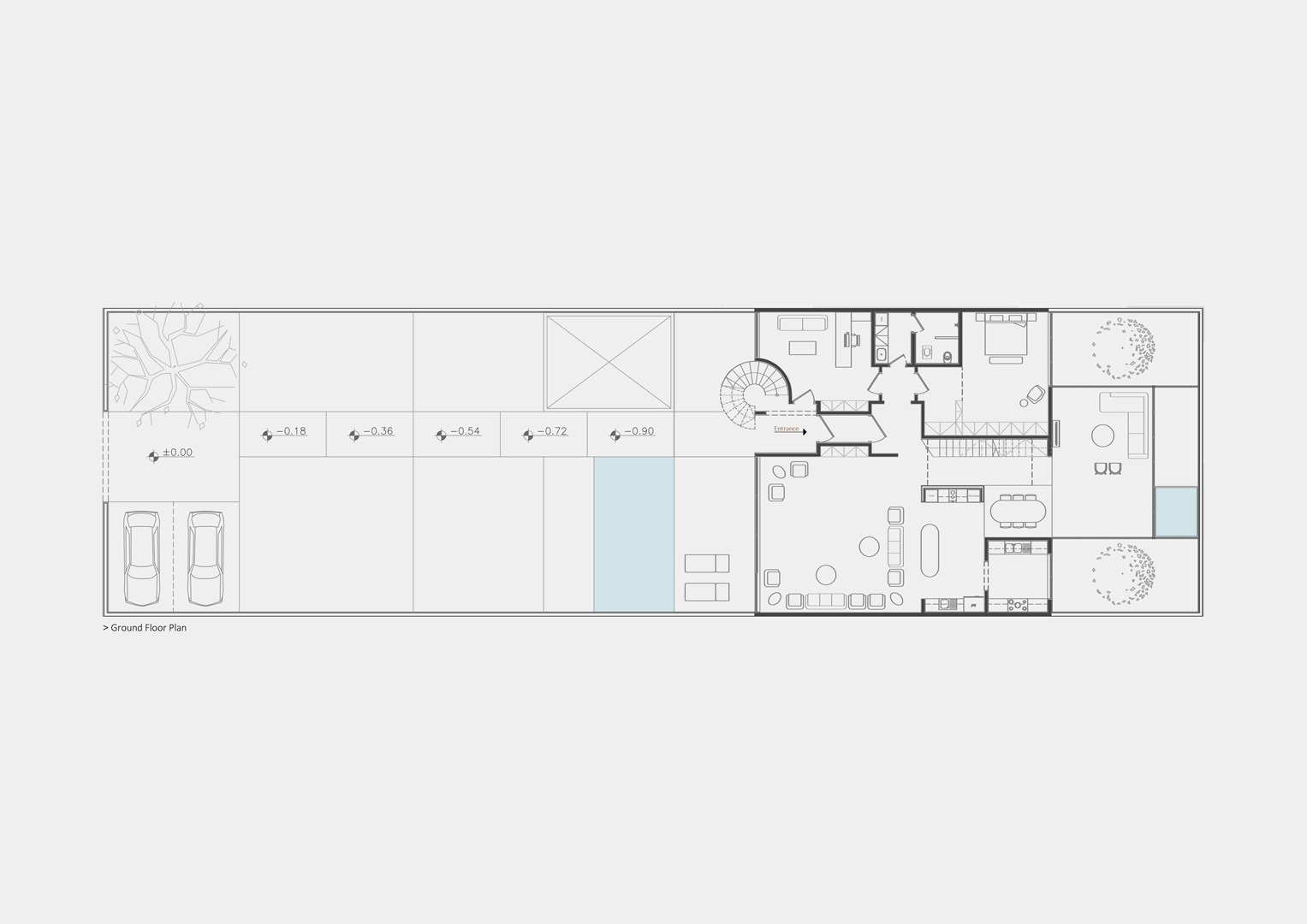
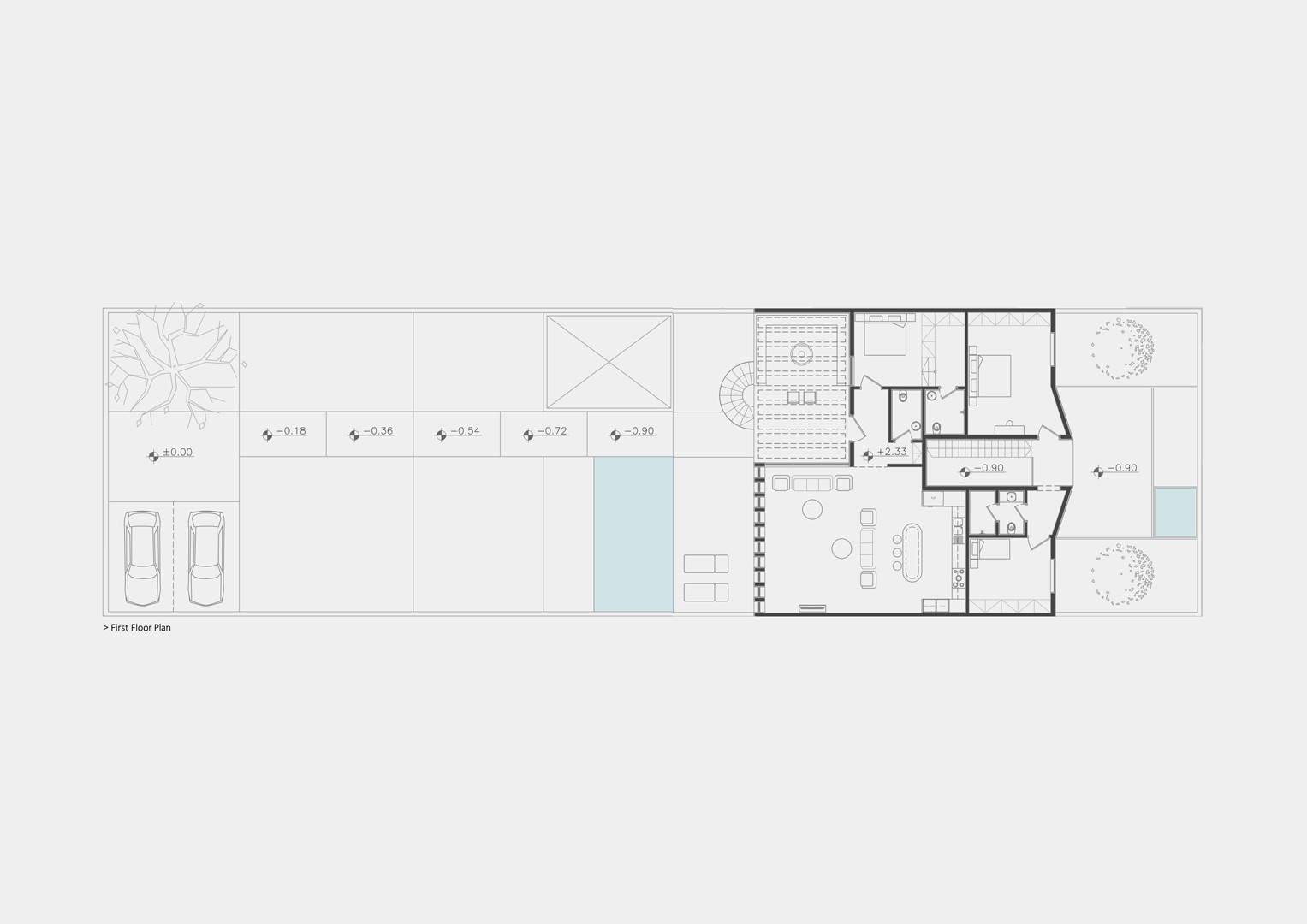
This project is designed on a land with an area of 700 square meters located in the suburbs of Mashhad.
Mr. Pourshafei is scheduled to settle with his wife and daughter as permanent residents, and his other daughter, son-in-law and grandson (who currently live in two apartments in a building in Mashhad) as temporary residents (weekends).
As a result, the project is planned of two units with separated accesses but interconnected simultaneously.
Mr. Pourshafei (who teaches history at the university and is very humble and quiet) spends most of his time in the room next to the entrance (which also has a separate entrance) and welcomes his guests, and Ms. Pourshafei, who is busy with housework and parties, spends a lot of time in the kitchen.
Ashkan and Parisa (their son-in-law and daughter), not only have contact with their parents, but also throw weekend parties and fun at the villa. The word fun-loving can be a good statement to express them.
This project tries to be similar to its inhabitants.
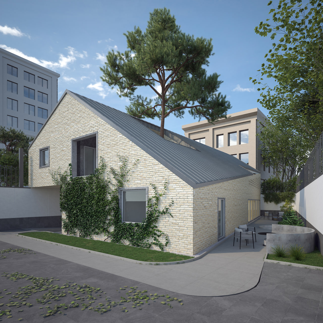
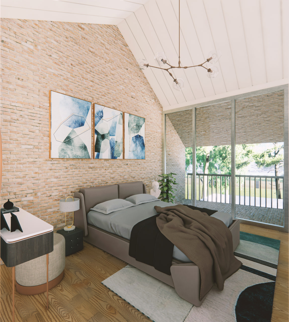
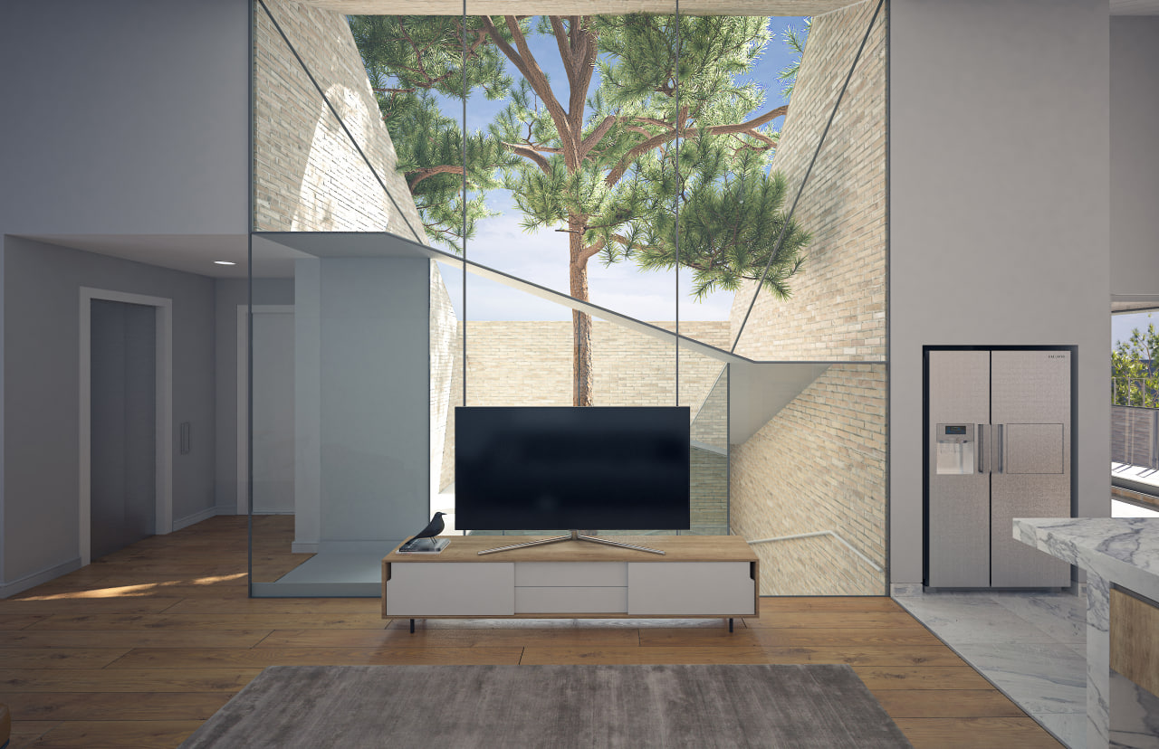
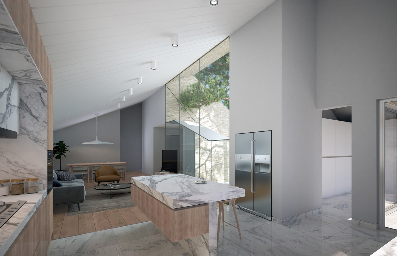



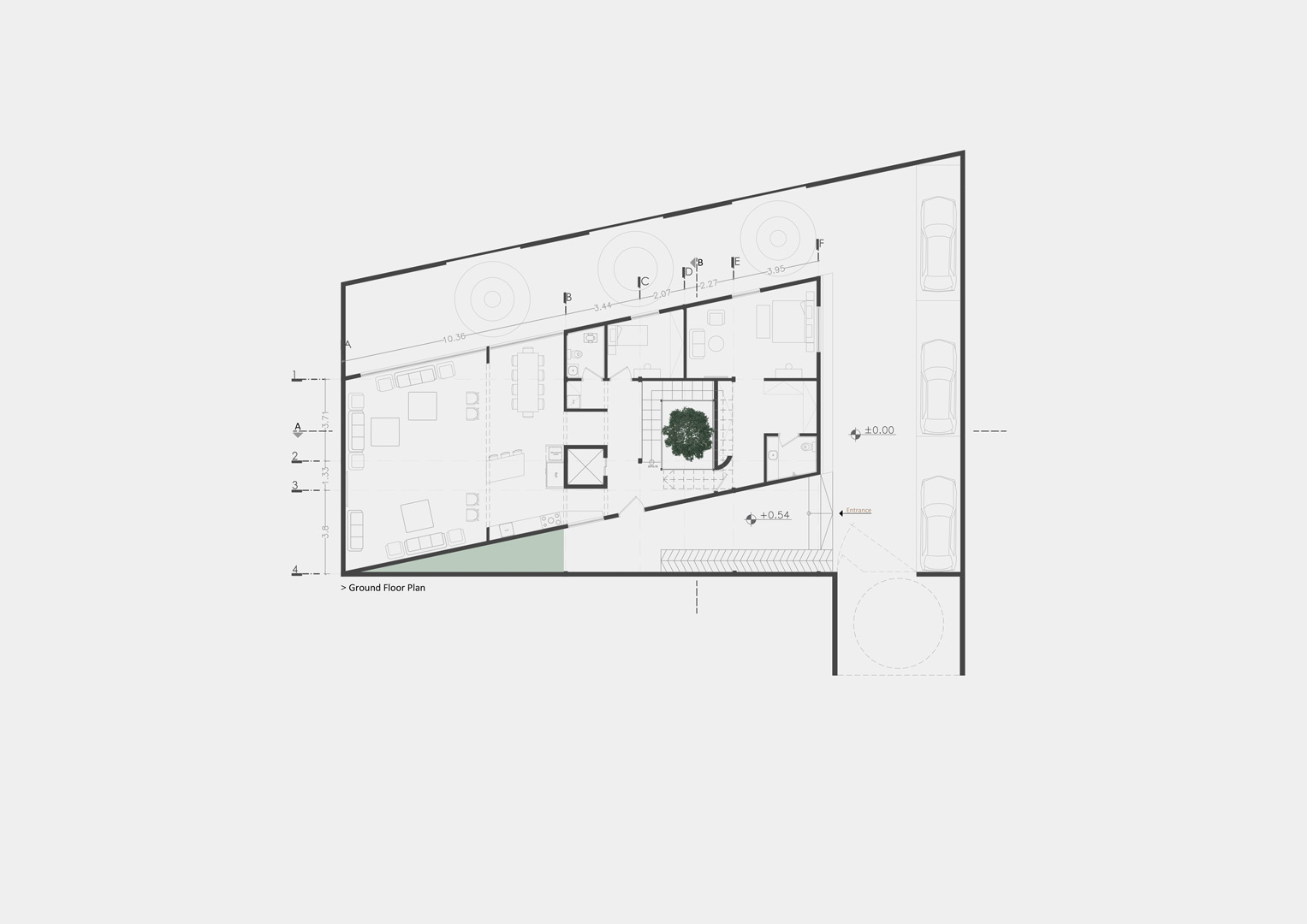
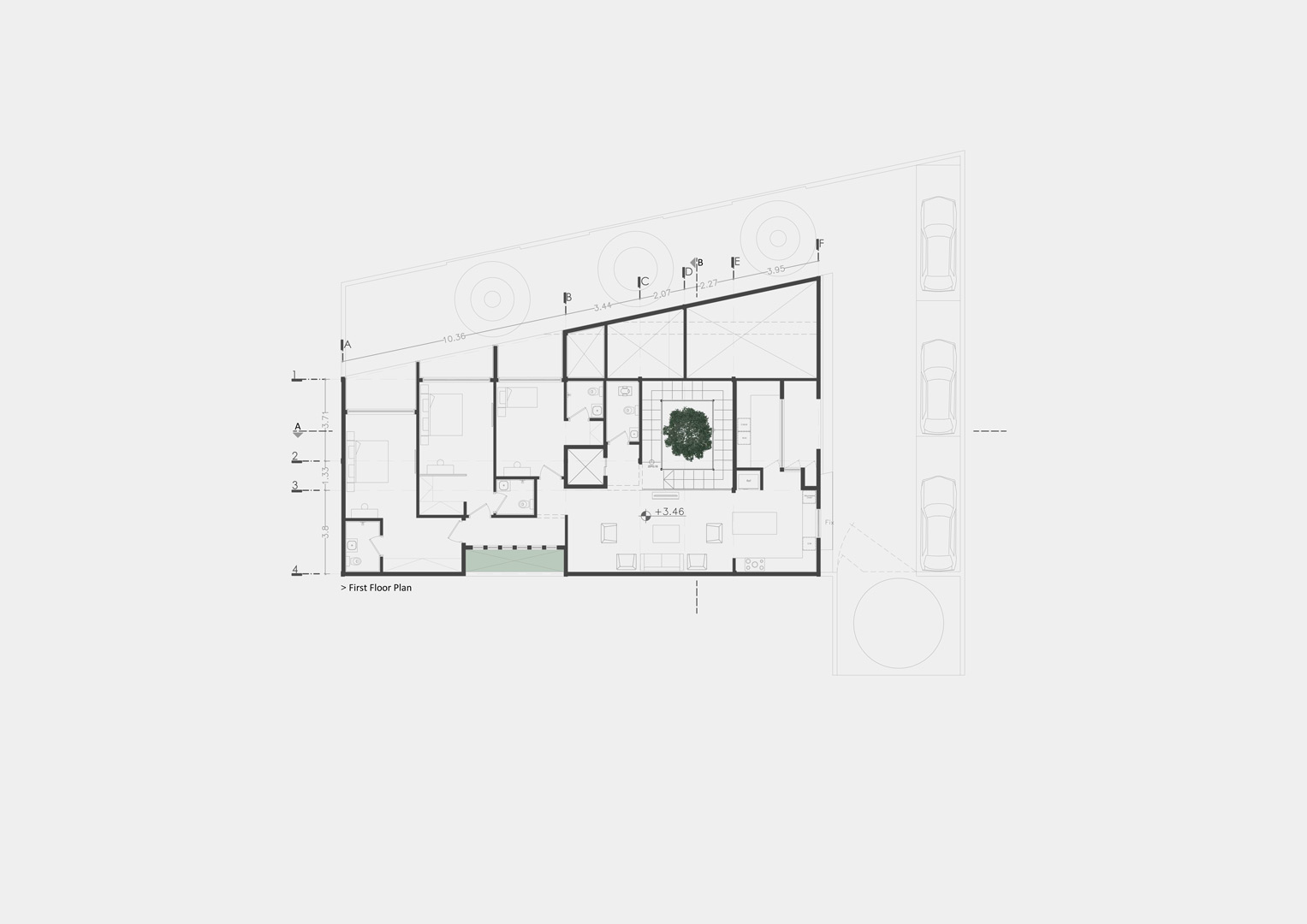
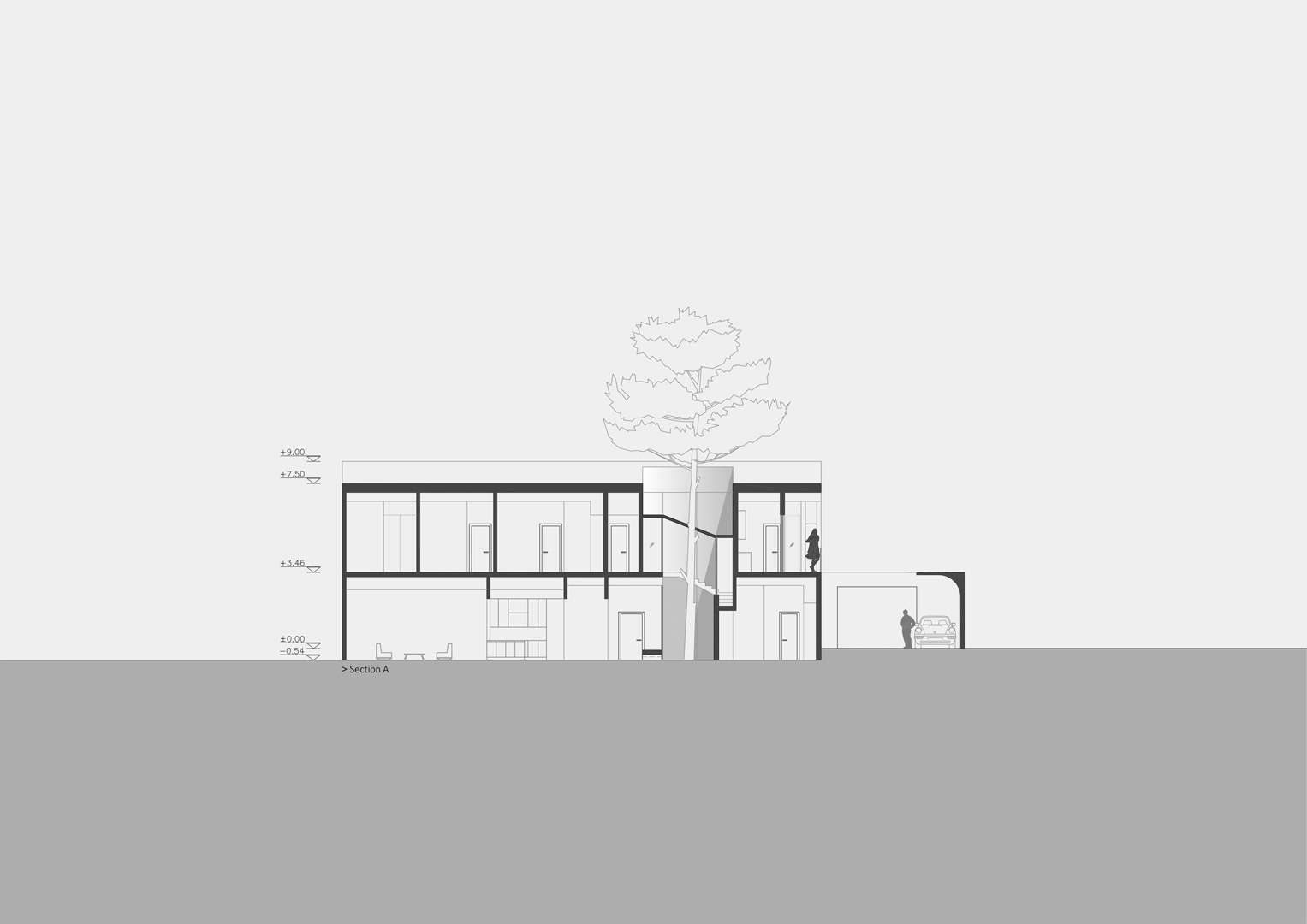
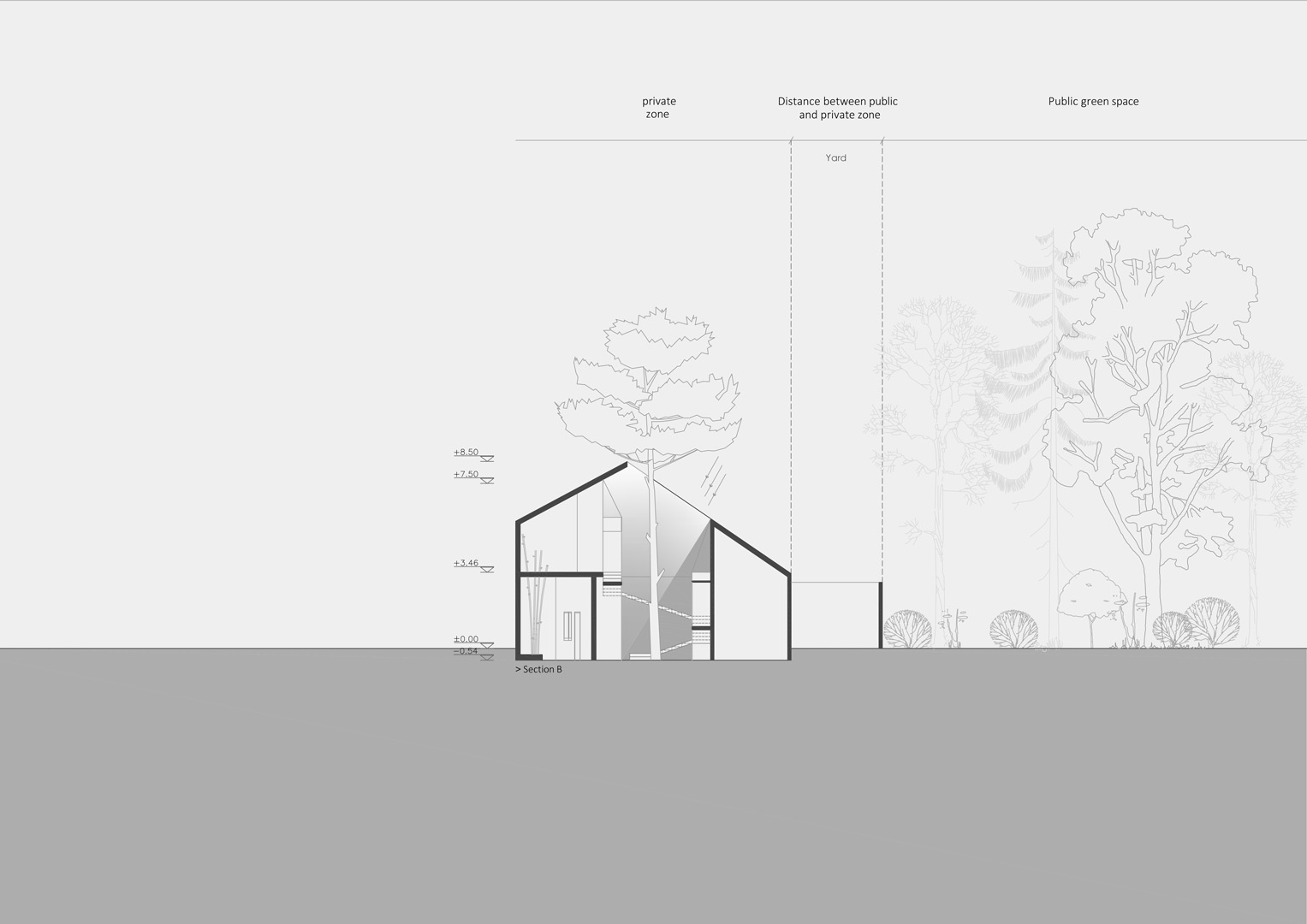
This project is designed for families of four including parents and their son and daughter whose grandmother will be their guest periodically in the center of Mashhad.
The functional responses of the project have been formed in order to fulfill the family lifestyle and their requests which the mains were the separation of the boy’s room from other rooms and the possibility of separating the guest space from their private spaces as well.
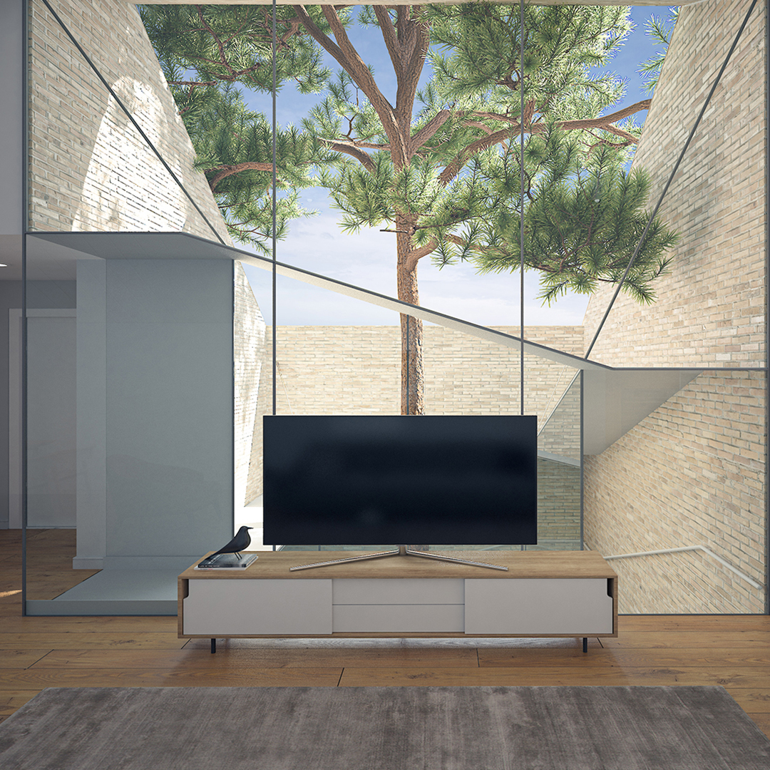
Not only the old pine tree in the center of the site (within the project occupancy area) dictated the formation of spaces around itself, but also as a central element in the house, was the biggest space attractiveness as well.
Due to the proximity of the northeast side of the project to a linear park and the legal limitations, it was necessary to keep a linear open space without overlooking in this side of project.
Also, according to the Mashhad Municipality Law on not having visual access to public spaces including green spaces, the lighting of the upper floor has been providing indirectly.
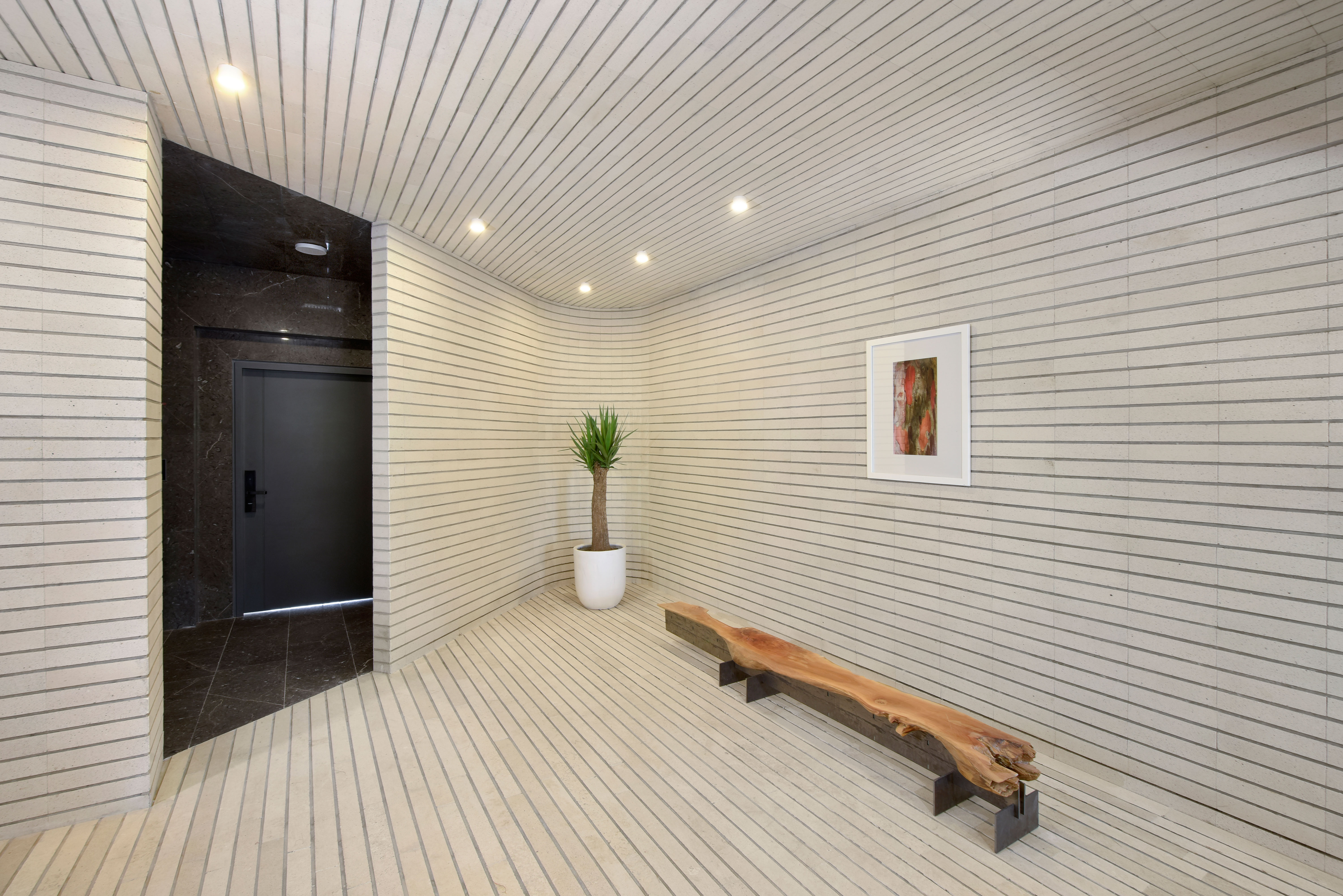
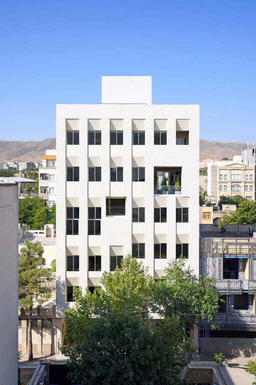
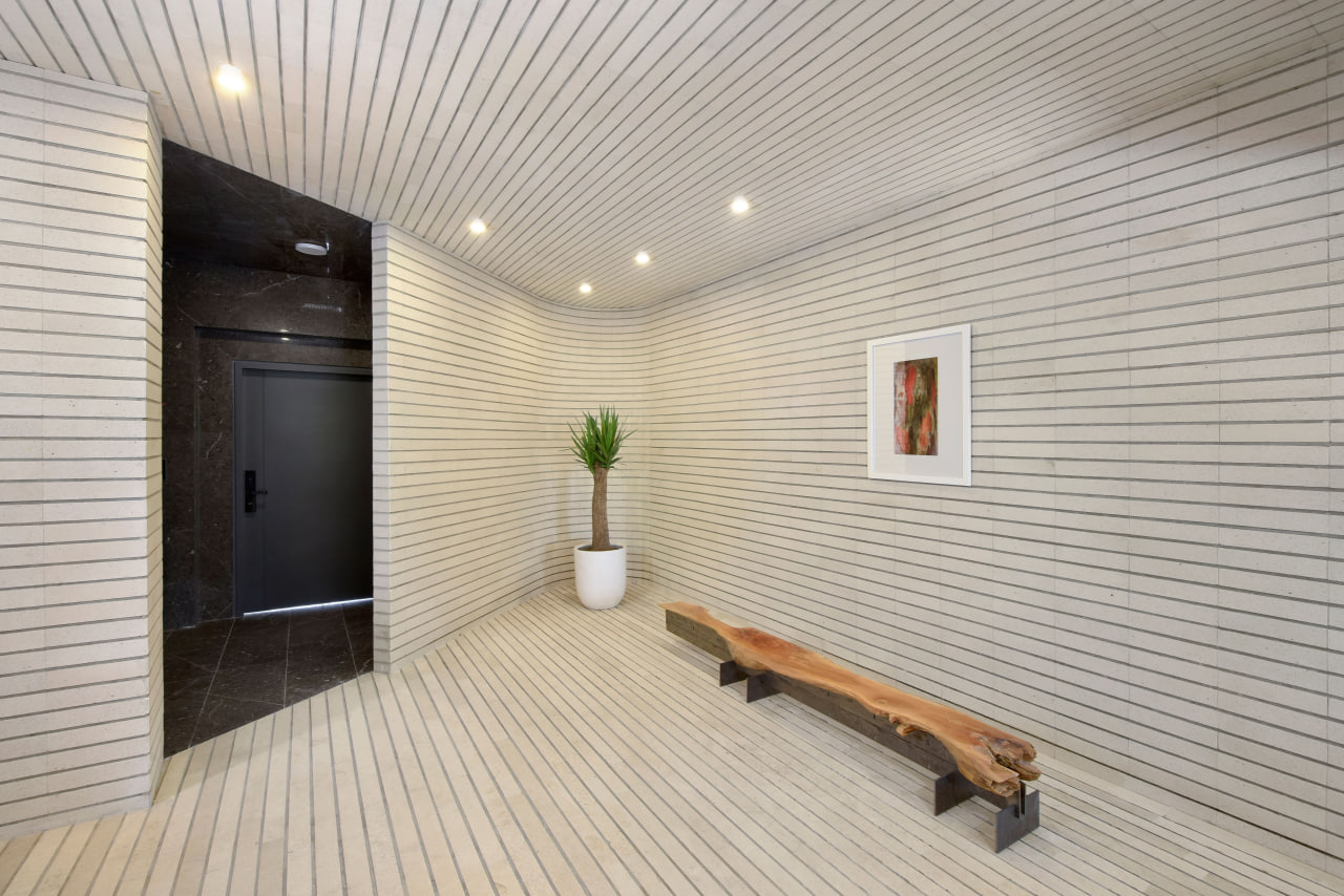
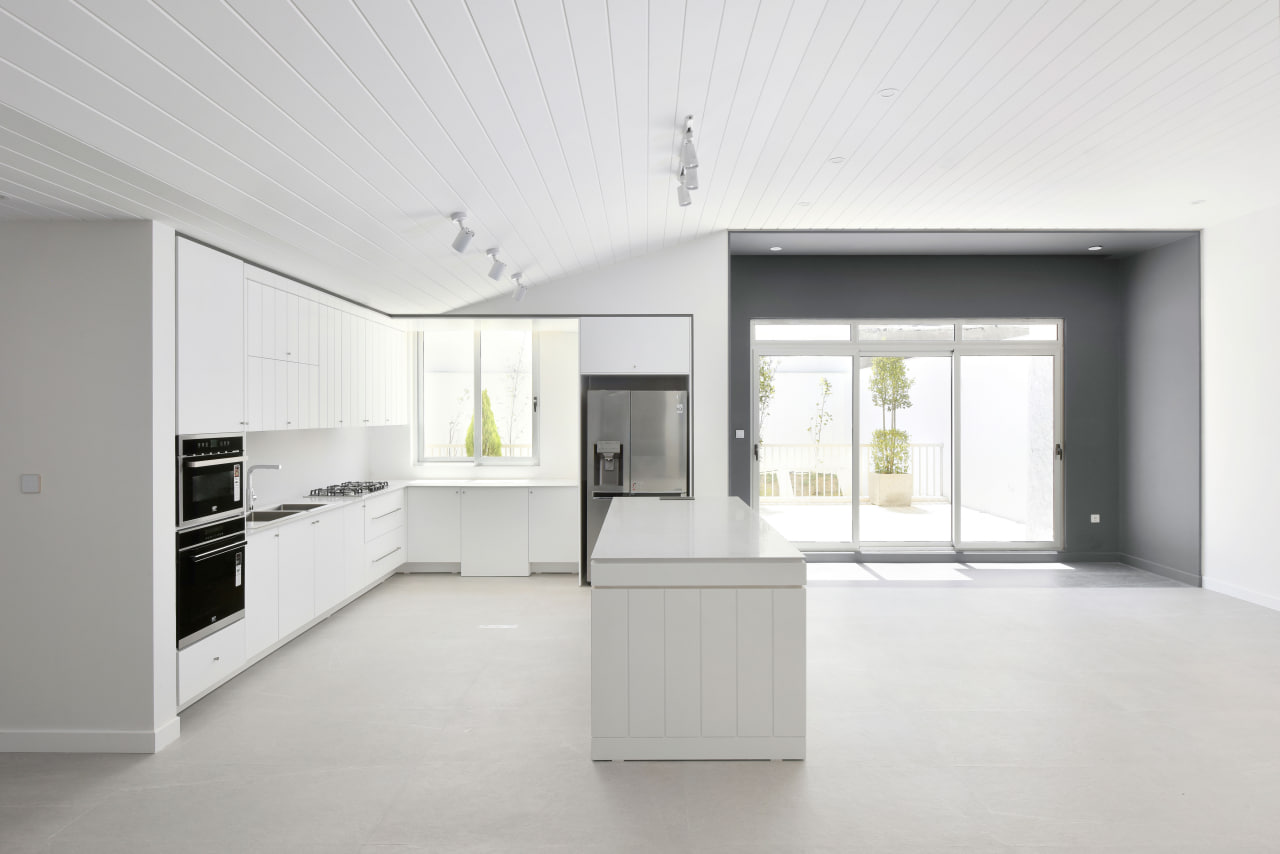
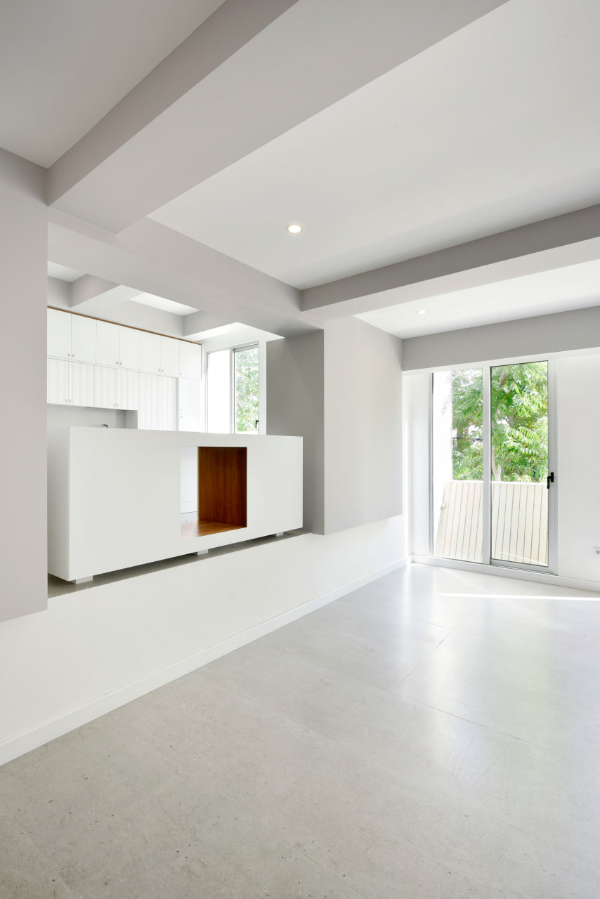
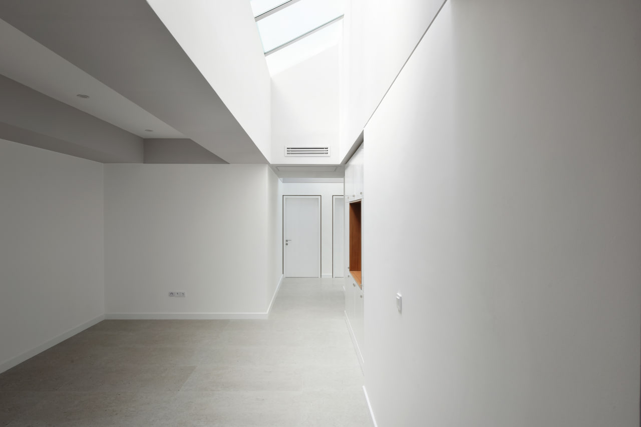
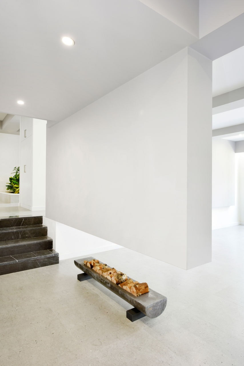
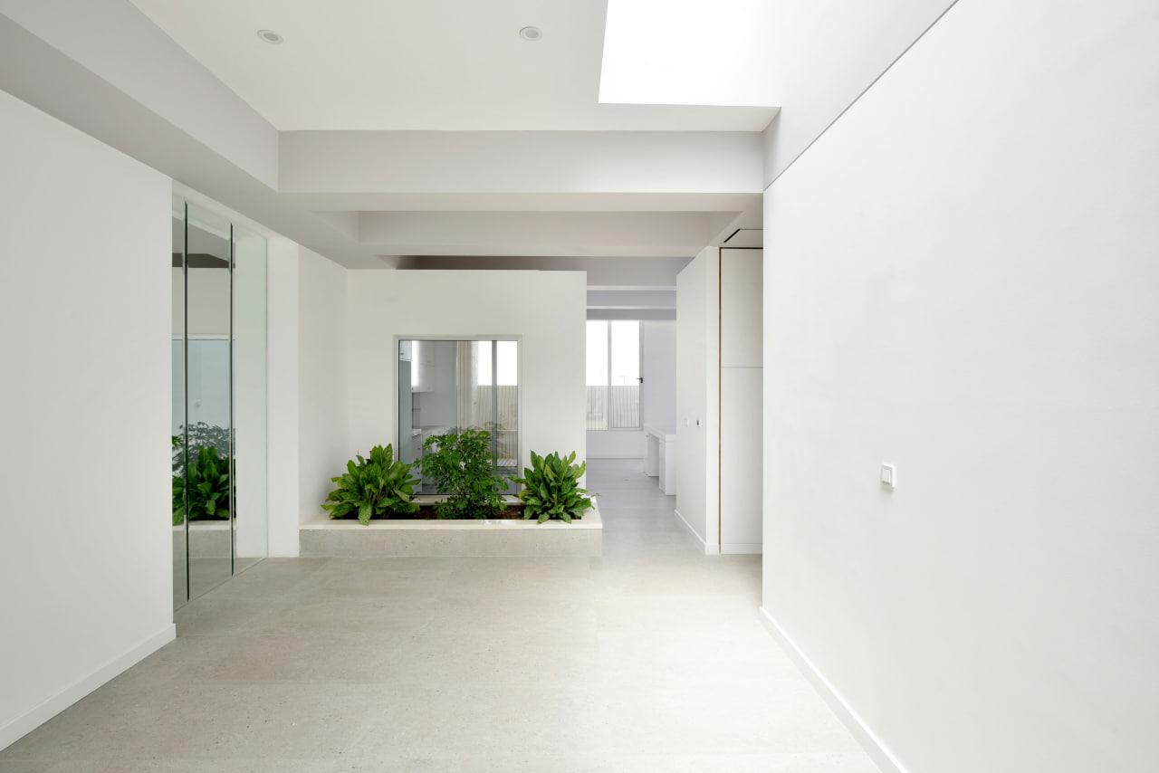
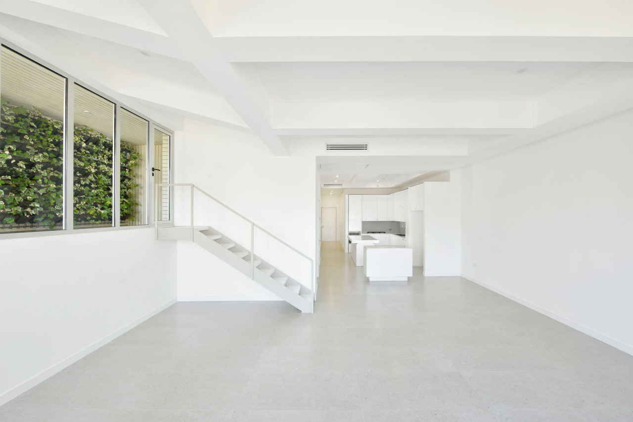
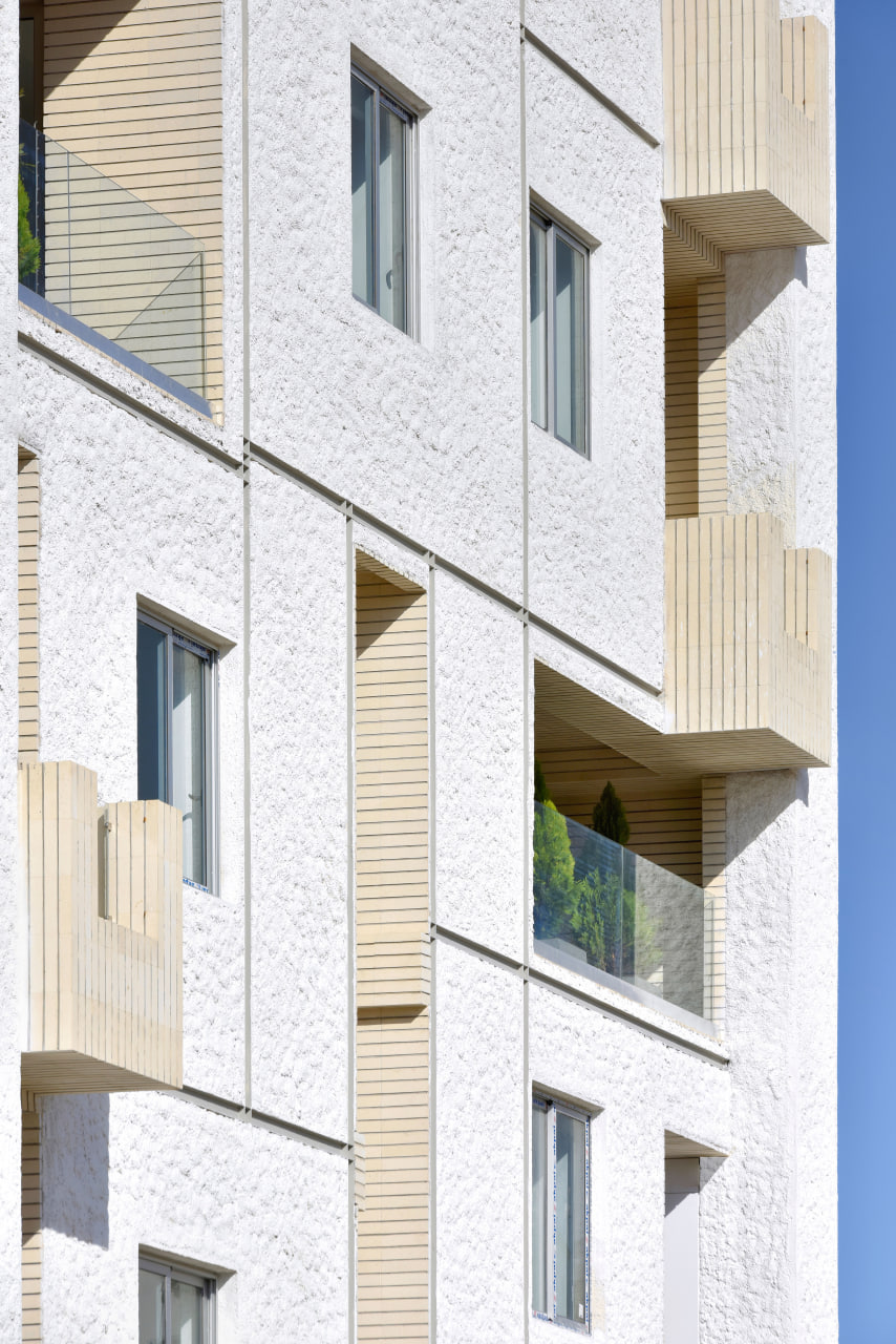
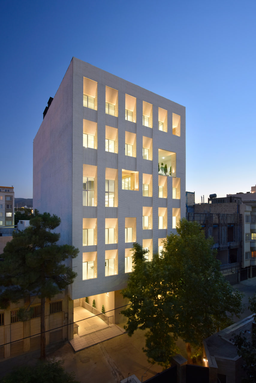
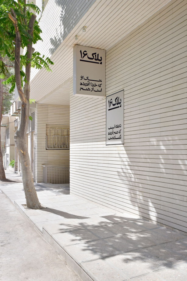
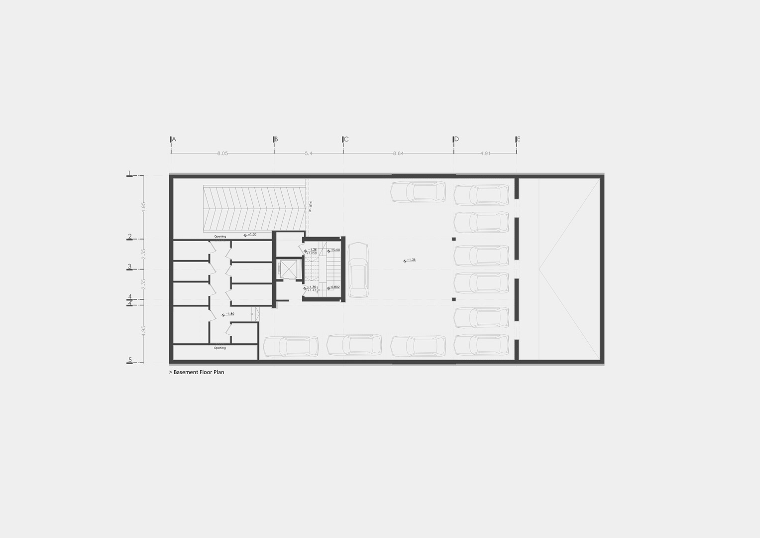
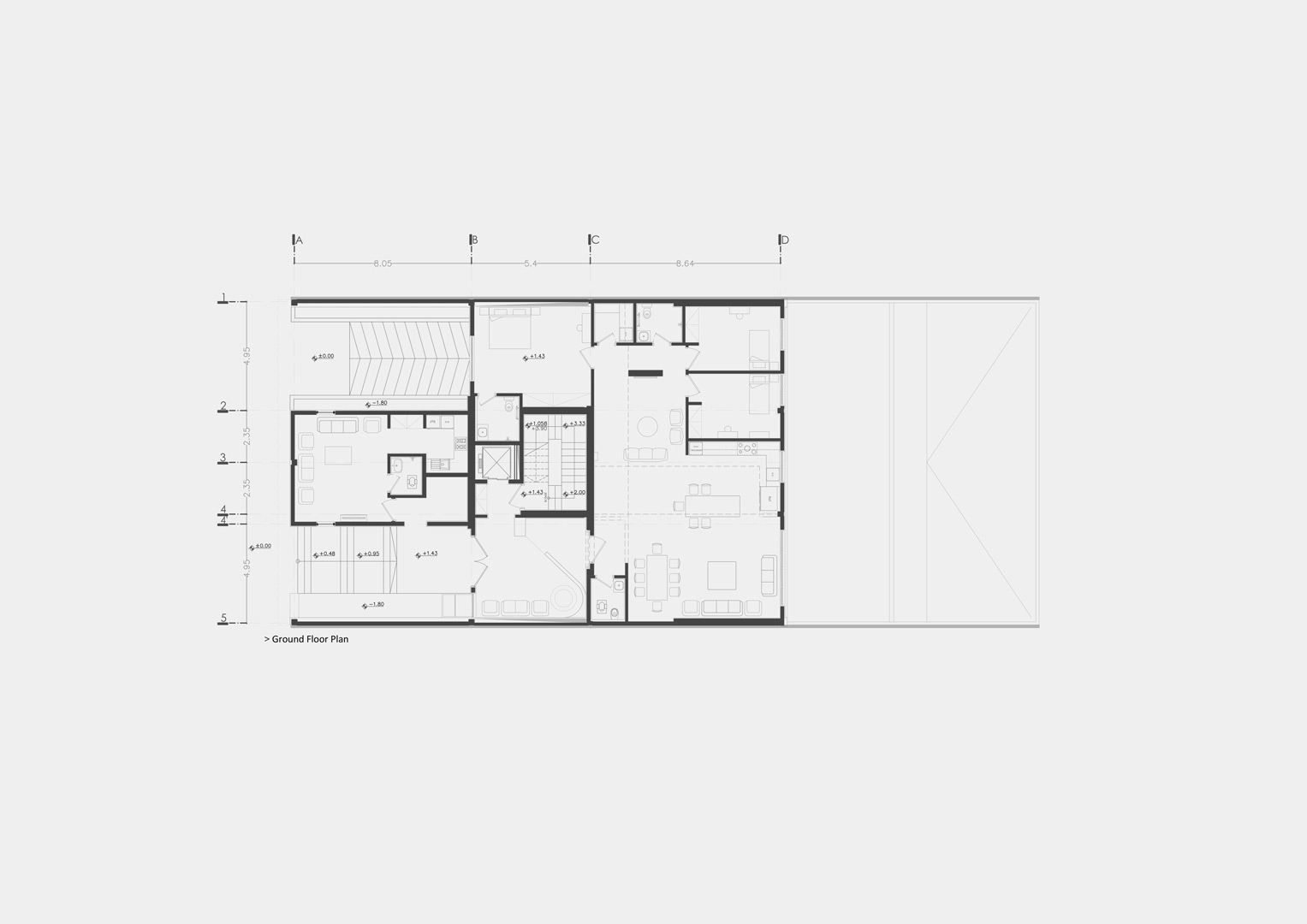
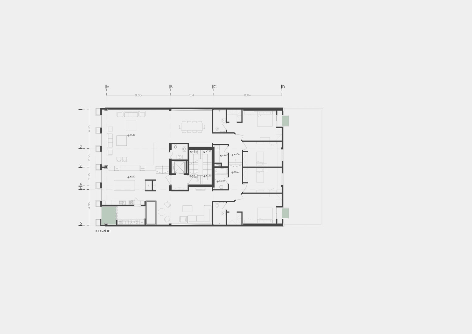
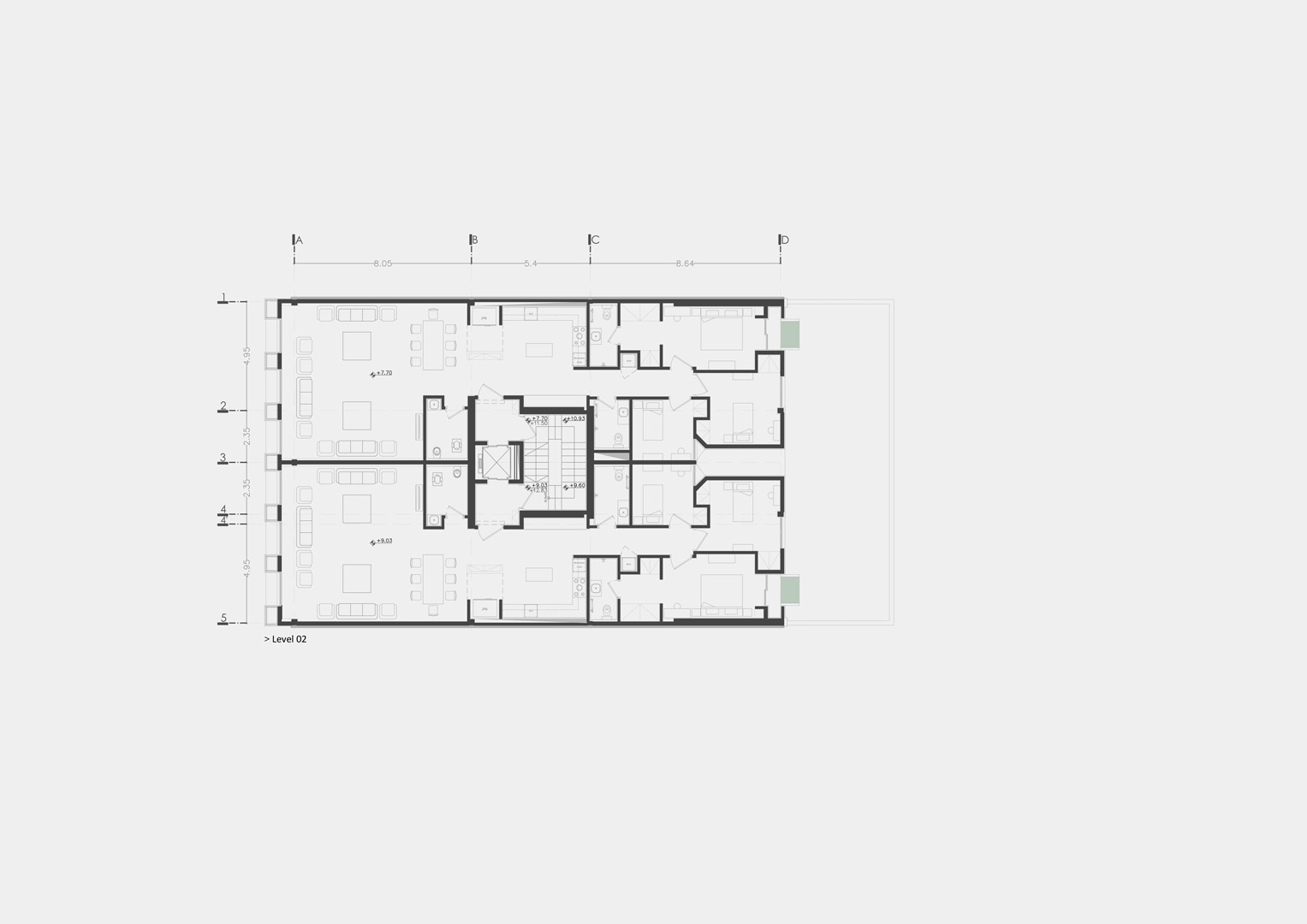
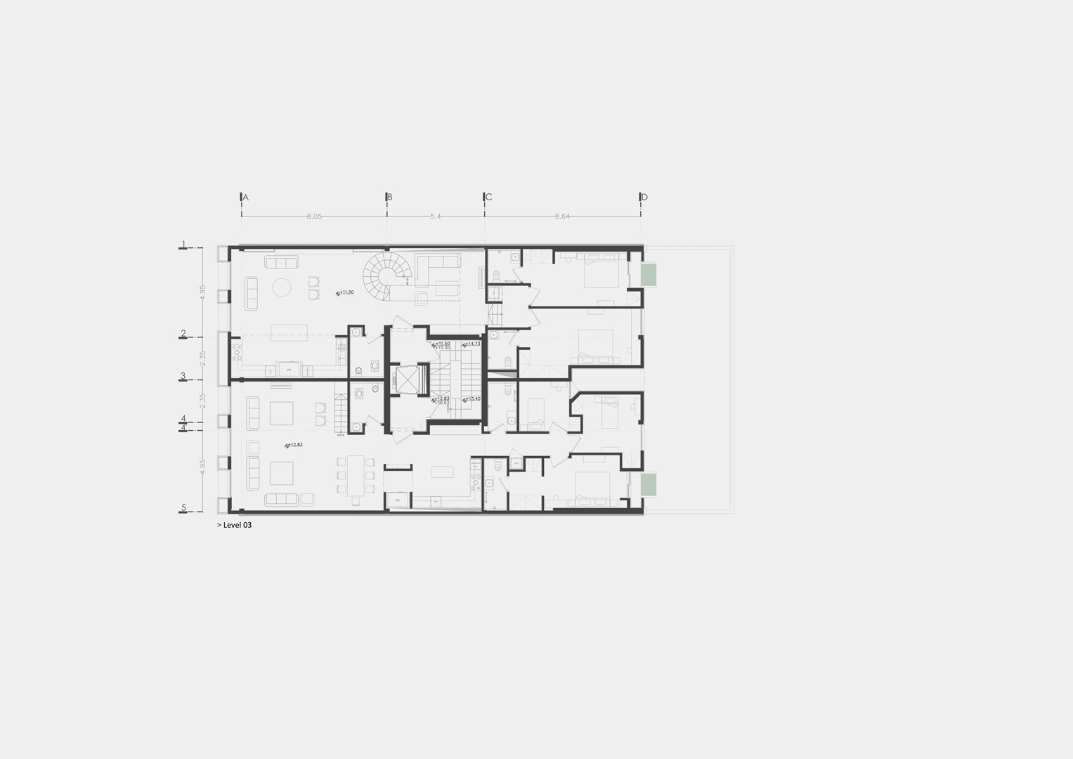
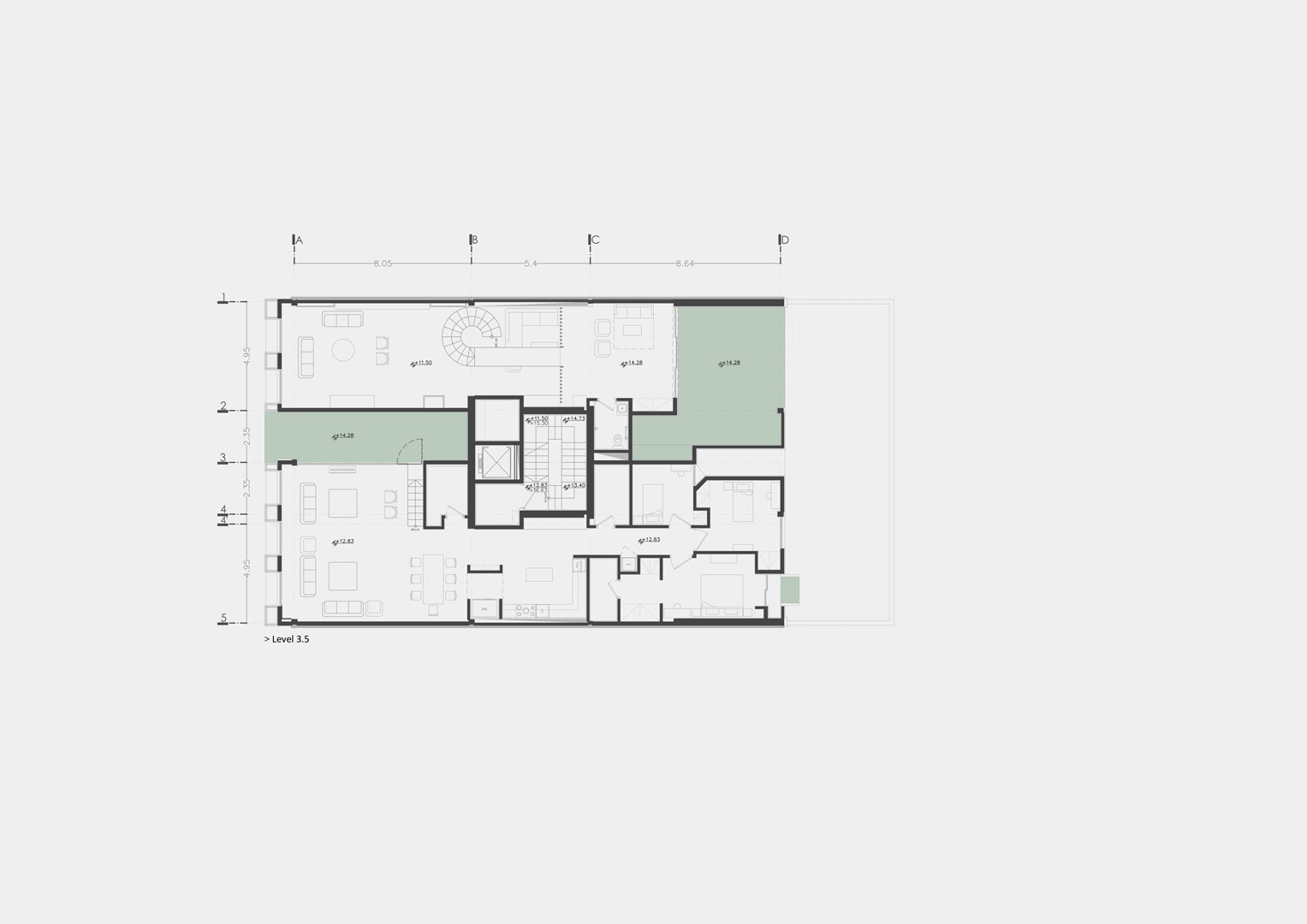
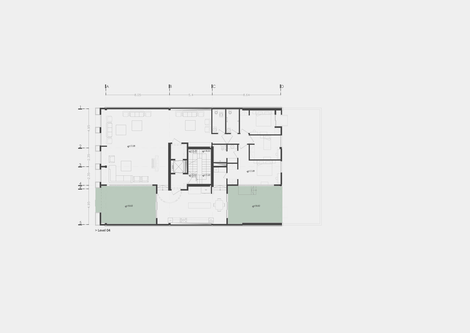
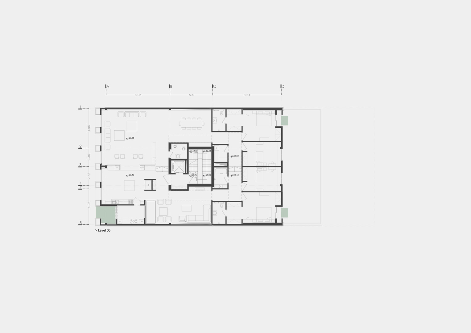
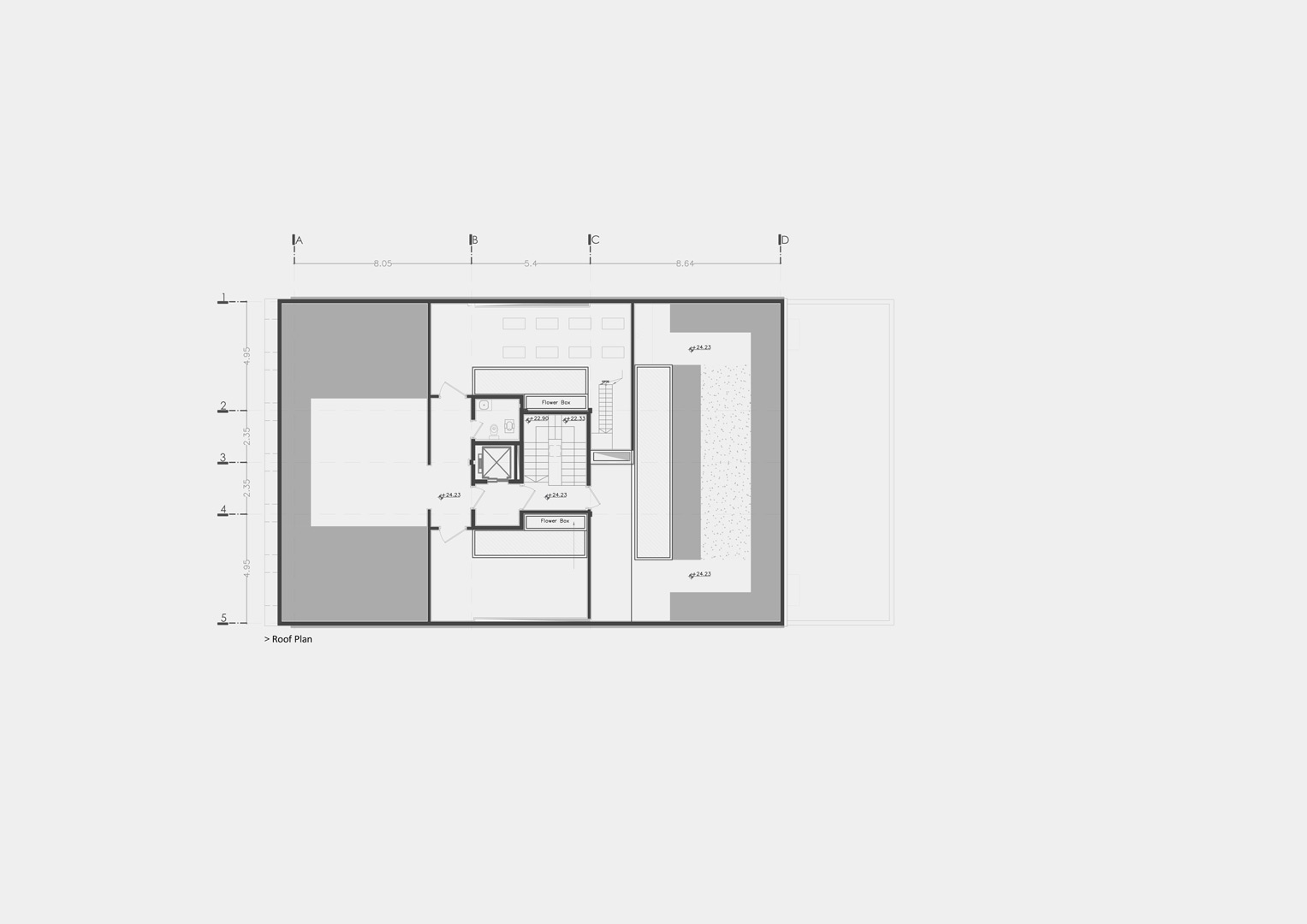
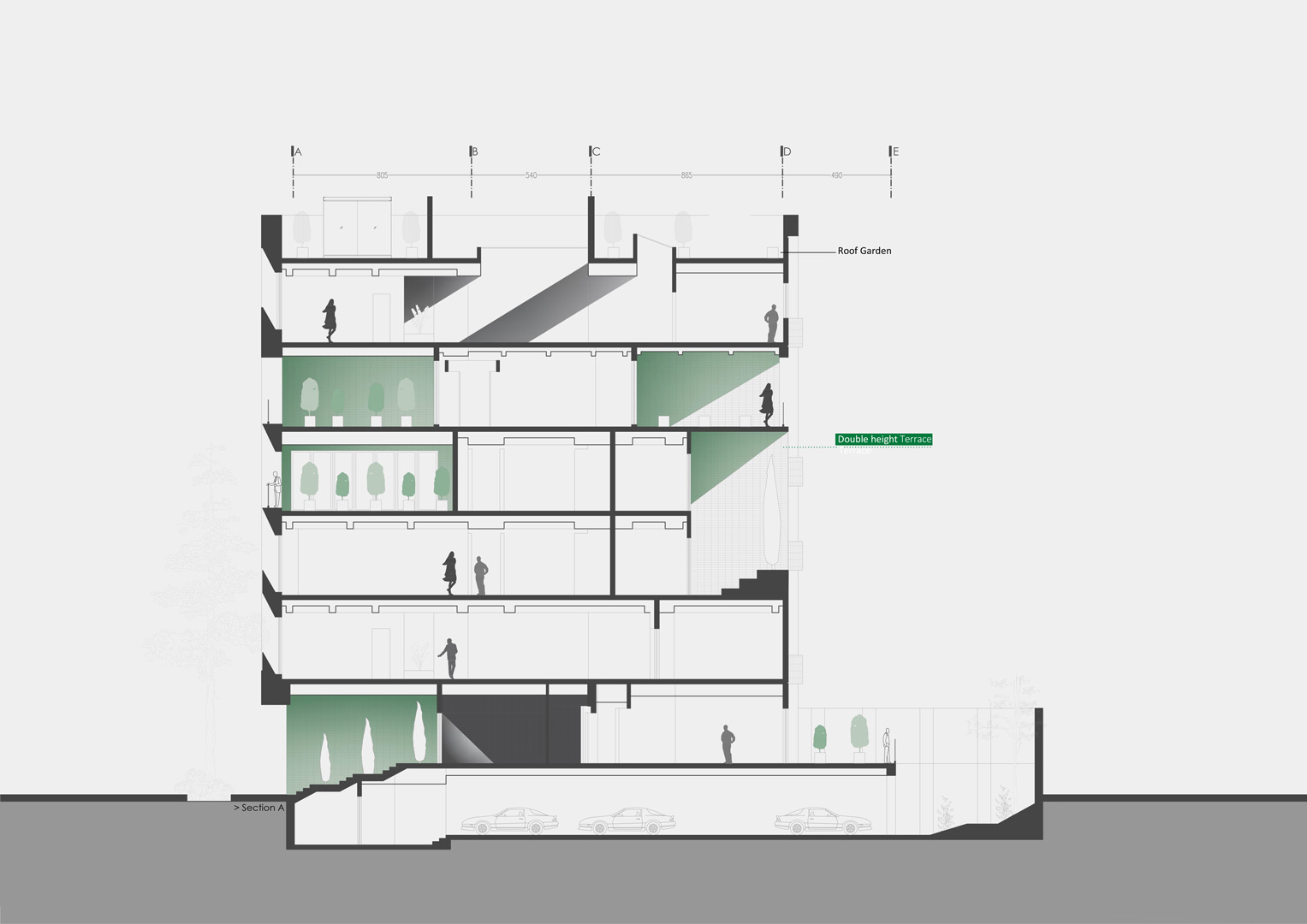
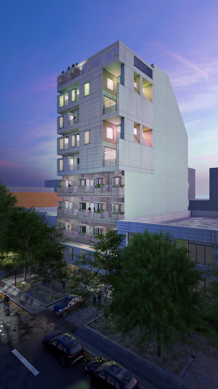
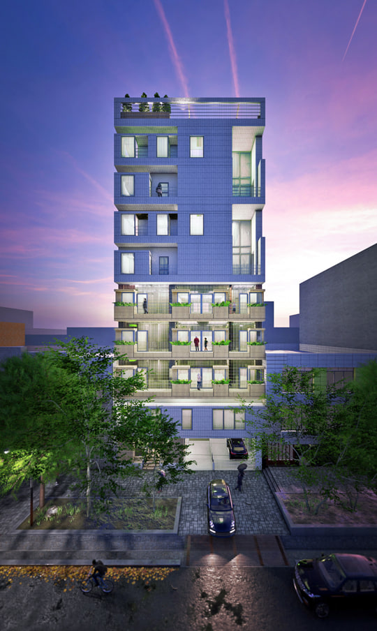
The subject of the project was the designing of a residential unit of approximately 300 square meters area for the parents of a family, and four units of 150 square meters area for children and a possible surplus in the construction license on a 510 square meter land for sale. Proper separation of two-unit floors from each other and the rebuilding of a common front space of elevator without damaging single-unit floors were considered as the main design challenges. Therefore, the prevalent pattern of residential apartments of endemic modernism of Tehran in the fifties and sixties, which is known as the “Khorjini” design in Mashhad, was considered as the framework of the project. Later, in order to reduce this level difference in single-story floors, increasing and decreasing the height of the floors led to the creation of a duplex unit of eighty square meters in the middle of the building with of surplus marketable space which compensated for the reduction of the middle void area in the yard view and the increase of the common front space of the elevator. Afterwards an attempt was made to recreate this above mentioned pattern by applying the other parameters of the current modern apartment pattern such as designing semi-open space in floors, positive and negative spaces in facades, and separation of private and public spaces in architecture plans.
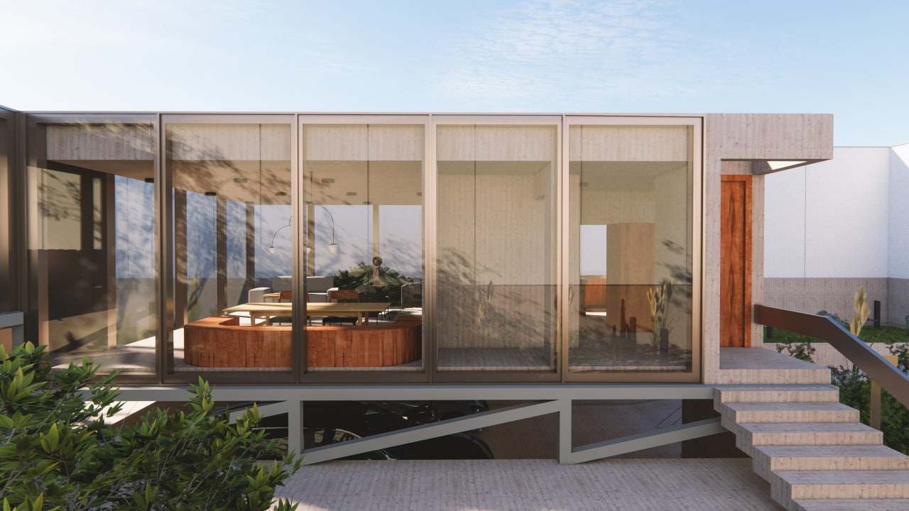
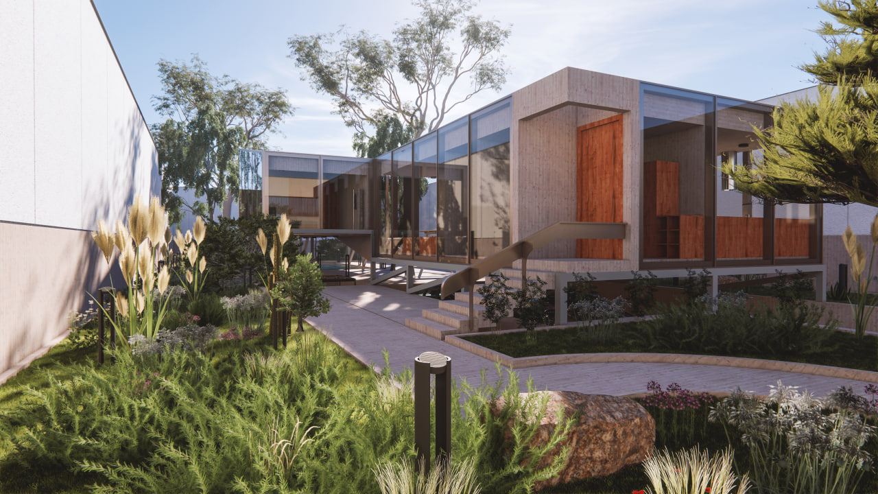
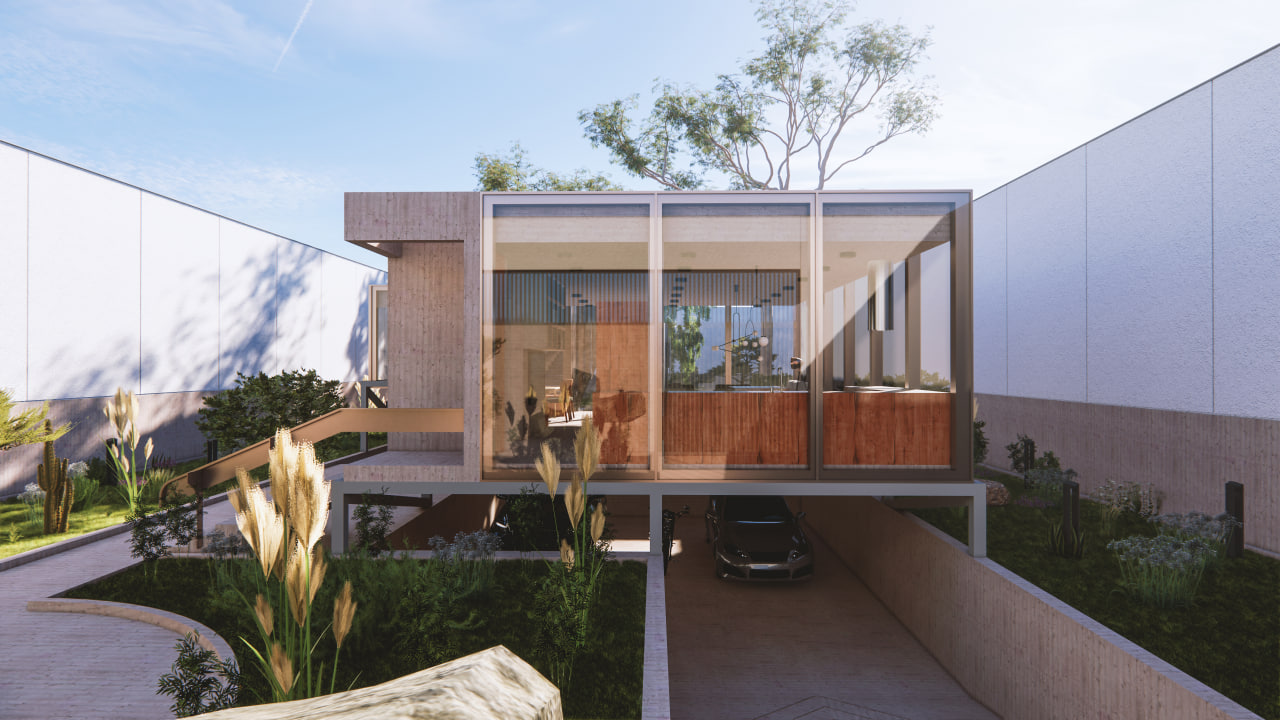
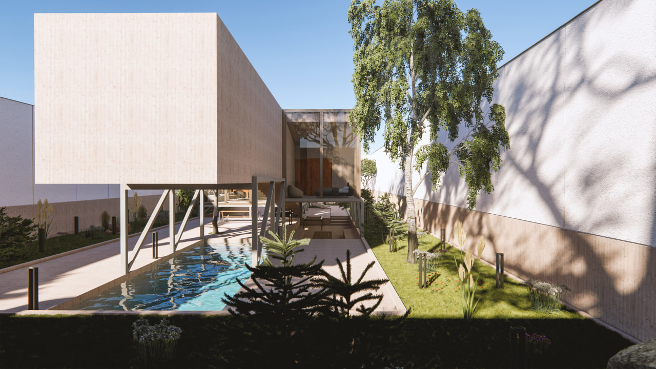
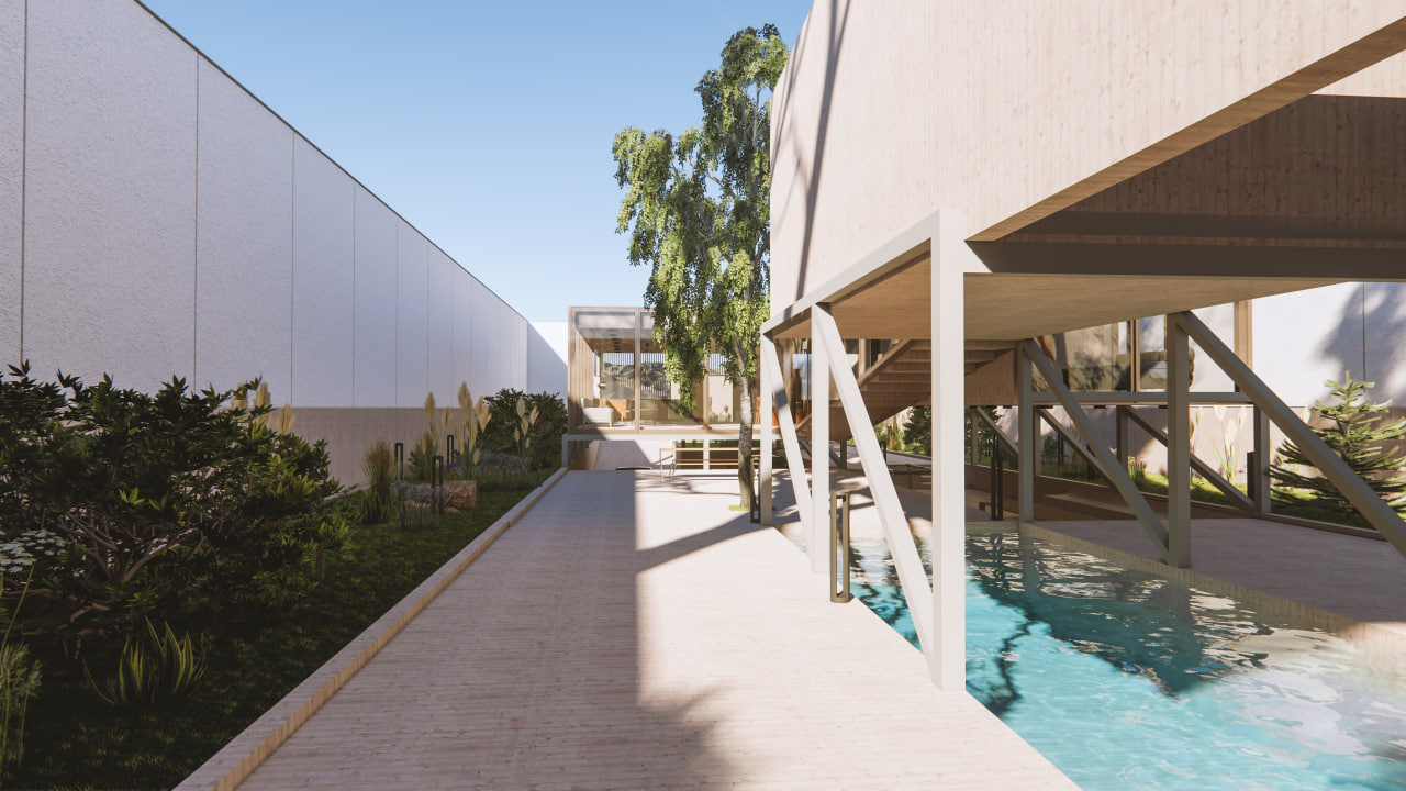
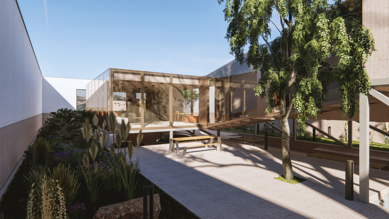
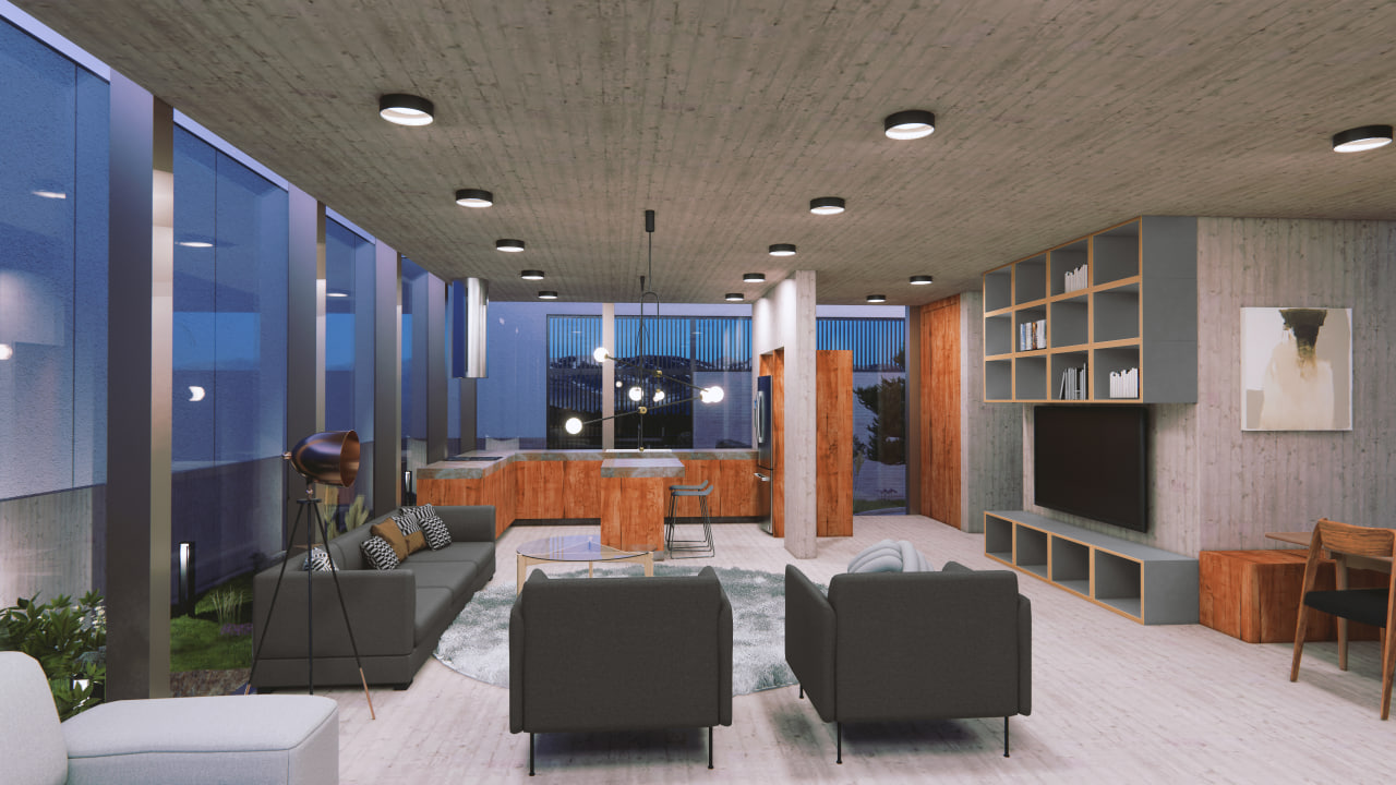
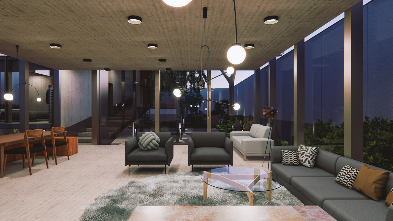
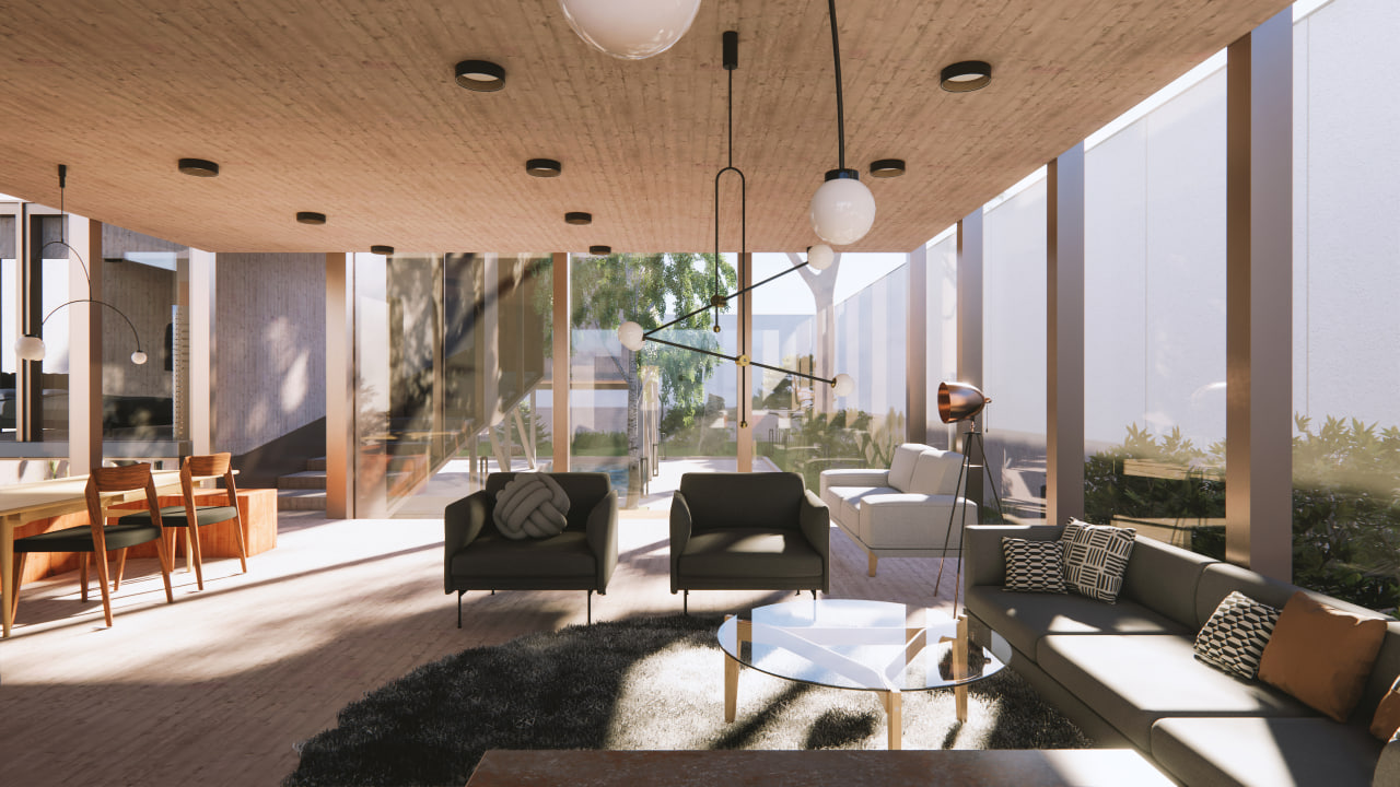
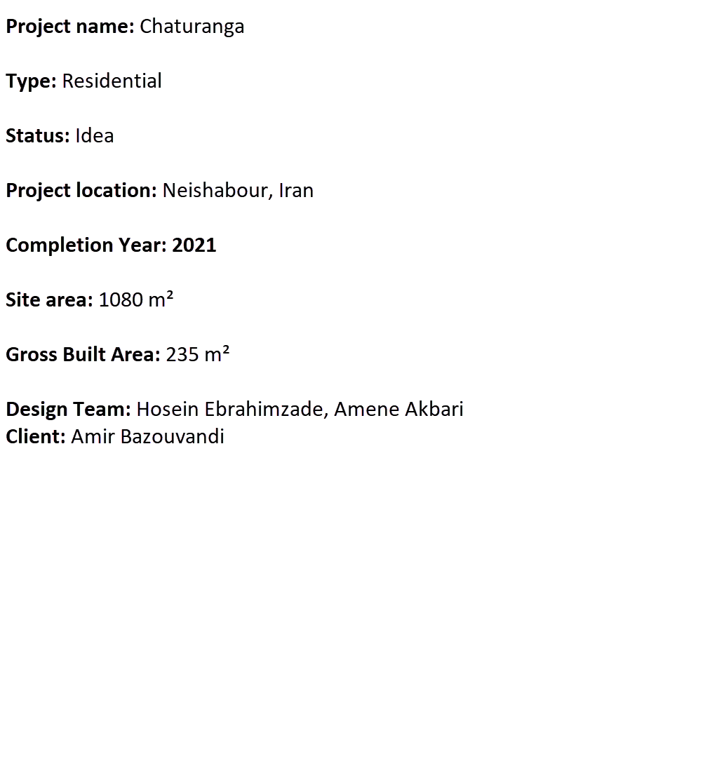
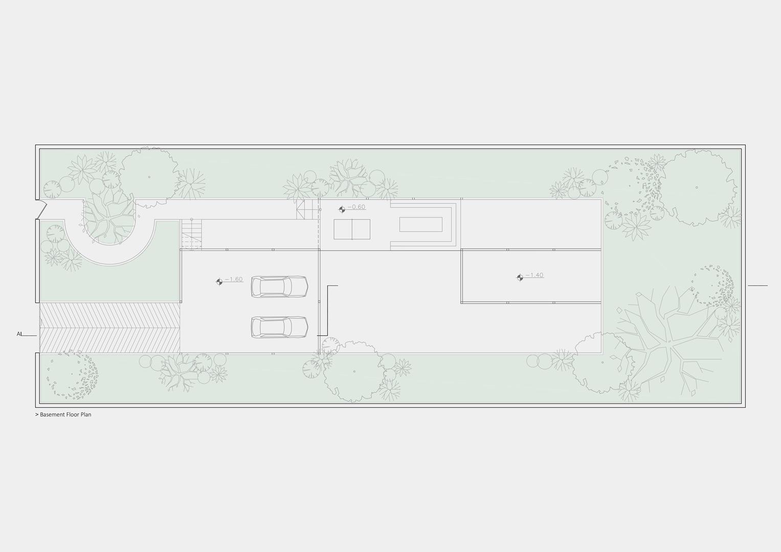
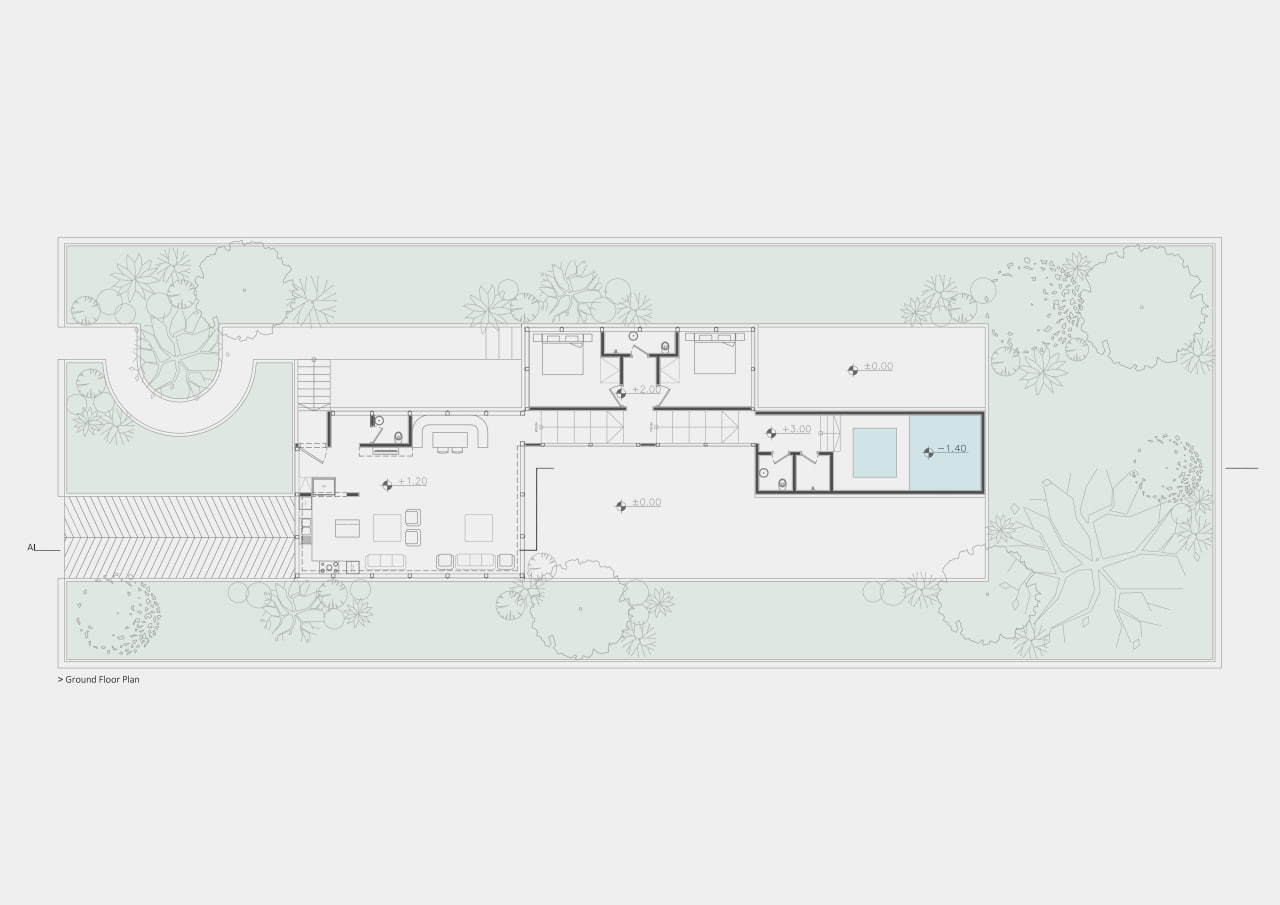
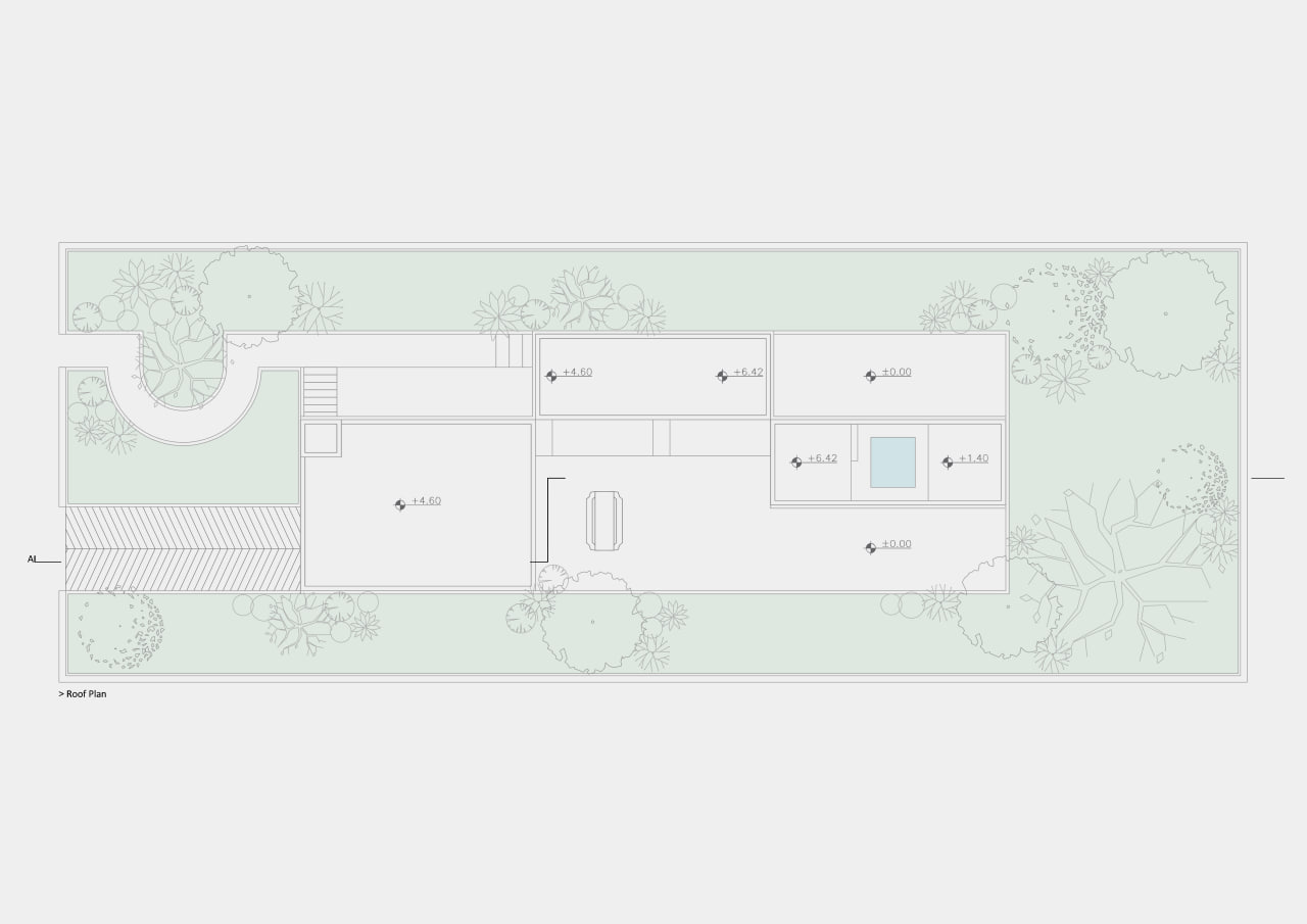
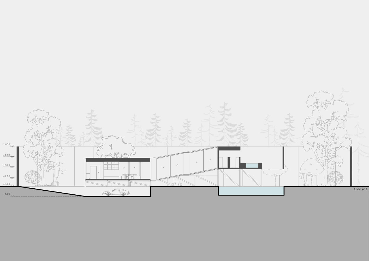
This villa is an imaginary project for a friend whose dating history ends up in three to four meetings.
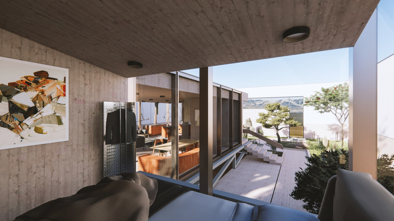
Amir who has 40 years old is from Baghroud city, Neishabour. He lives alone and serves as a cook one month a year at a Buddhist gathering (held annually in random countries). He does martial arts and earns a living from family real estate (his family has lived in the United States for many years). He is fascinated by nature as he wakes up daily before dawn, walks until the sunrise, and swims in the pool in his villa which is located on top of the mountain for an hour and then meditates.
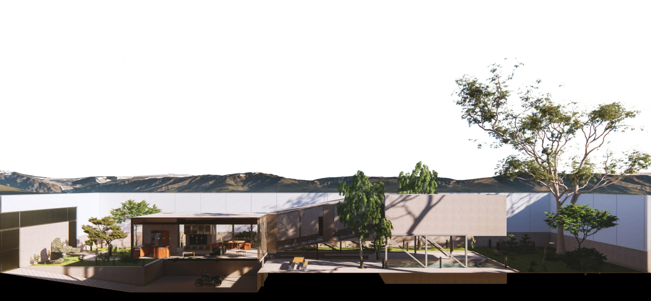
But now that the time of his martial arts classes in Neishabour city has increased, it has become difficult to get to the top of the mountain and he likes to build a villa on a thousand meters at the hillside. A villa that has no walls and is surrounded by nature.
Since our office is a design and construction office and only accepts projects that also take responsibility for construction, we thought of designing a villa that would require the less presence of us on site.

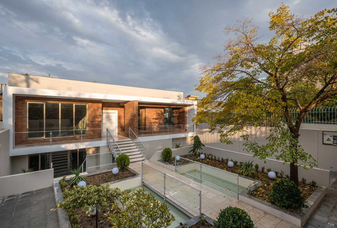
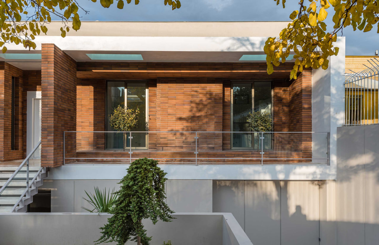
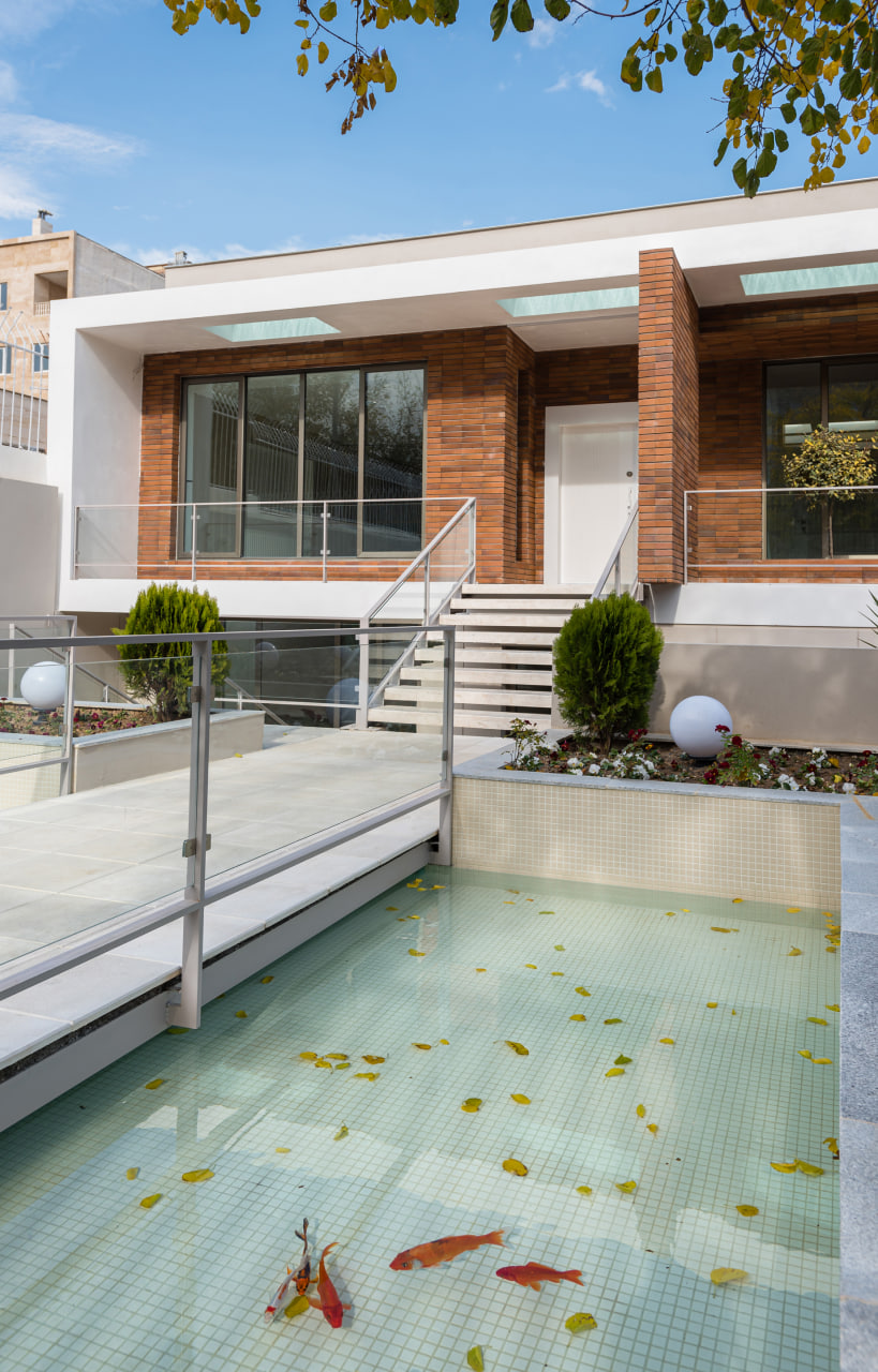
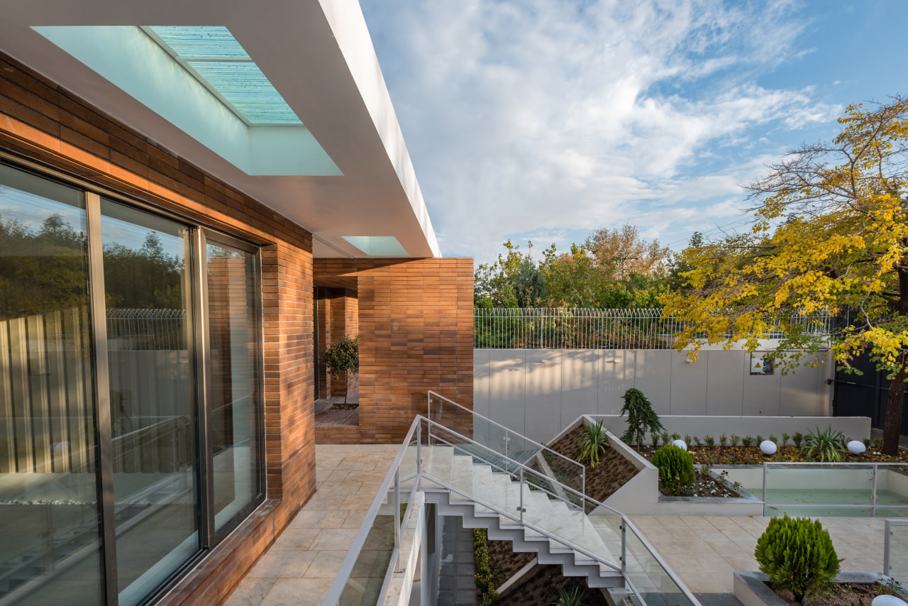
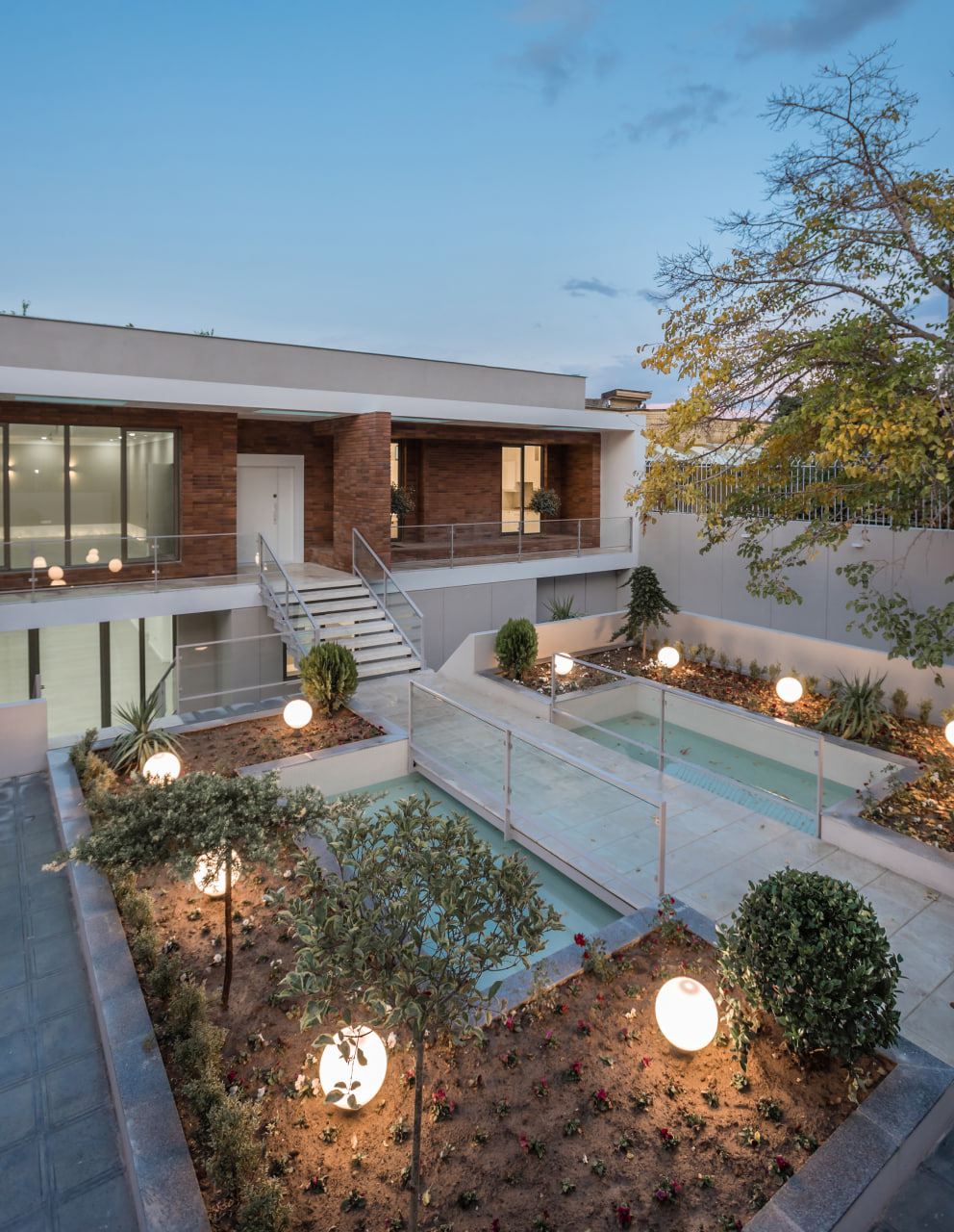
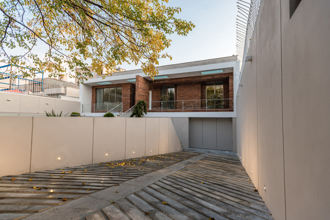
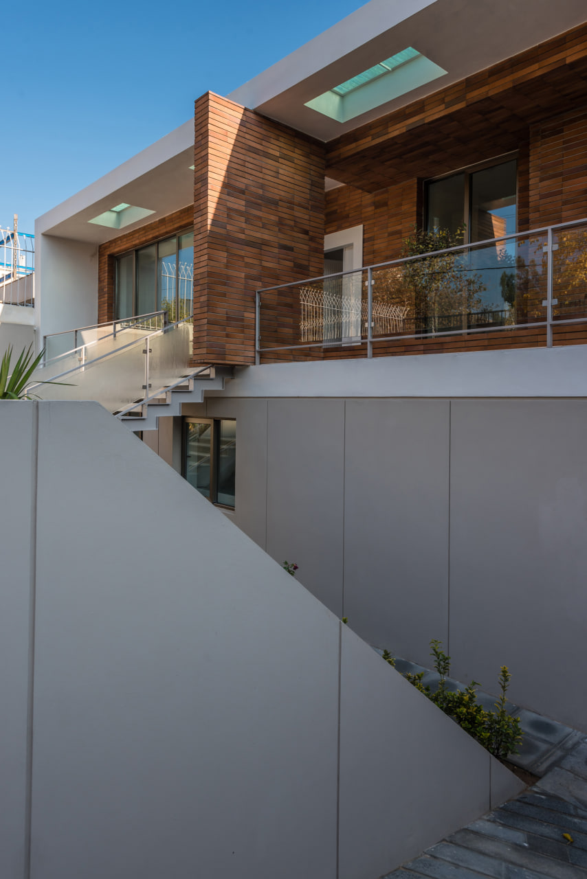
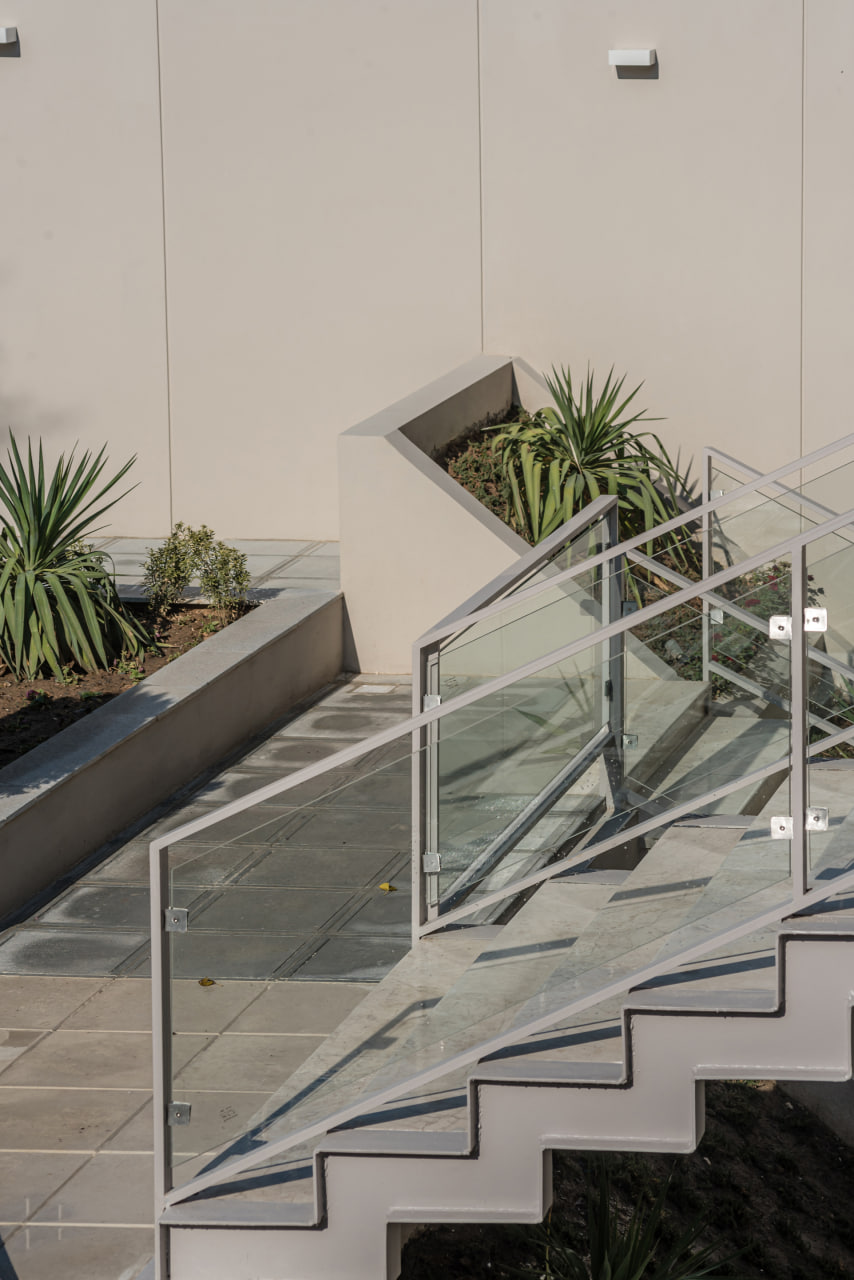
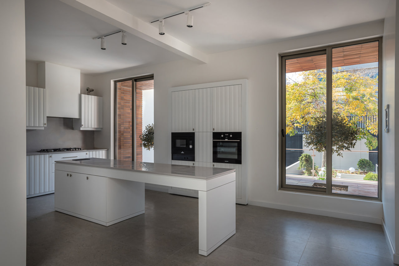
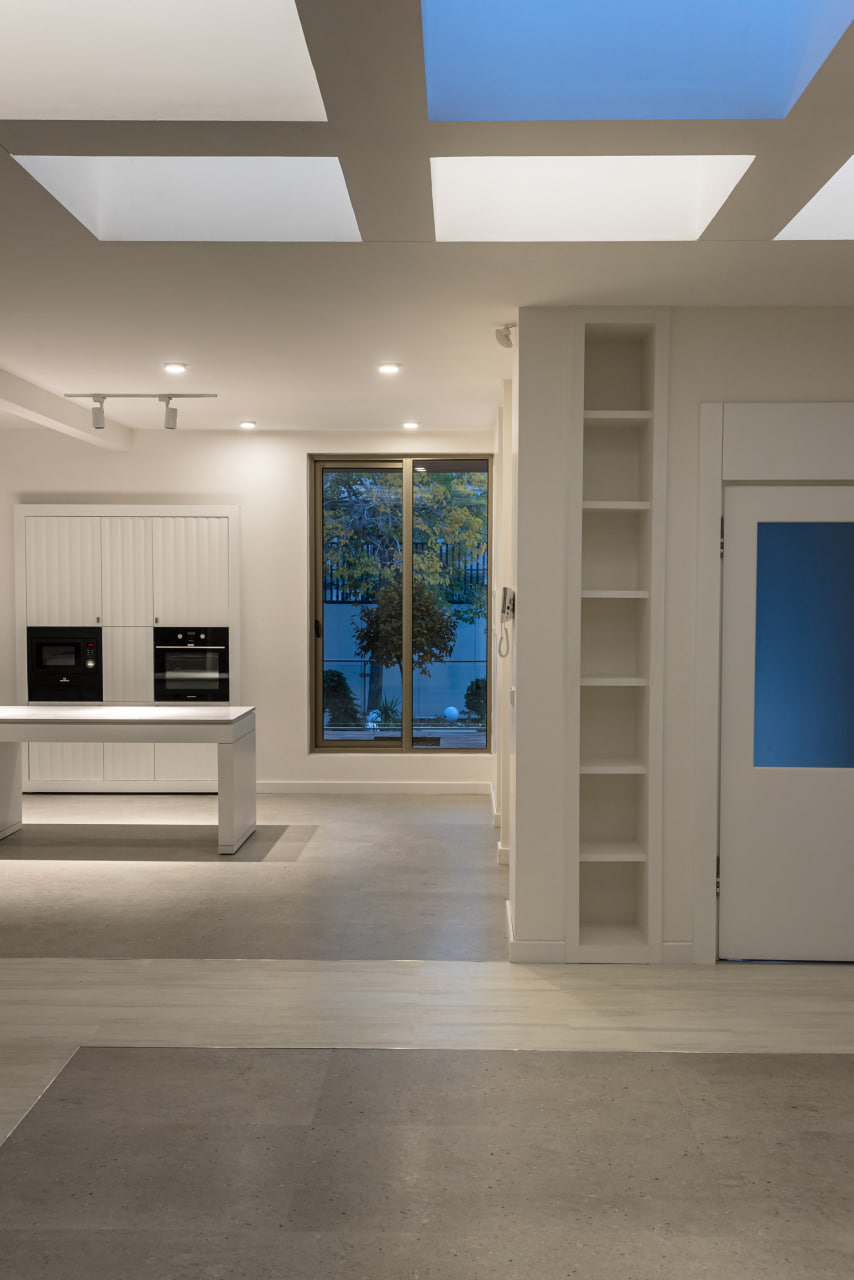
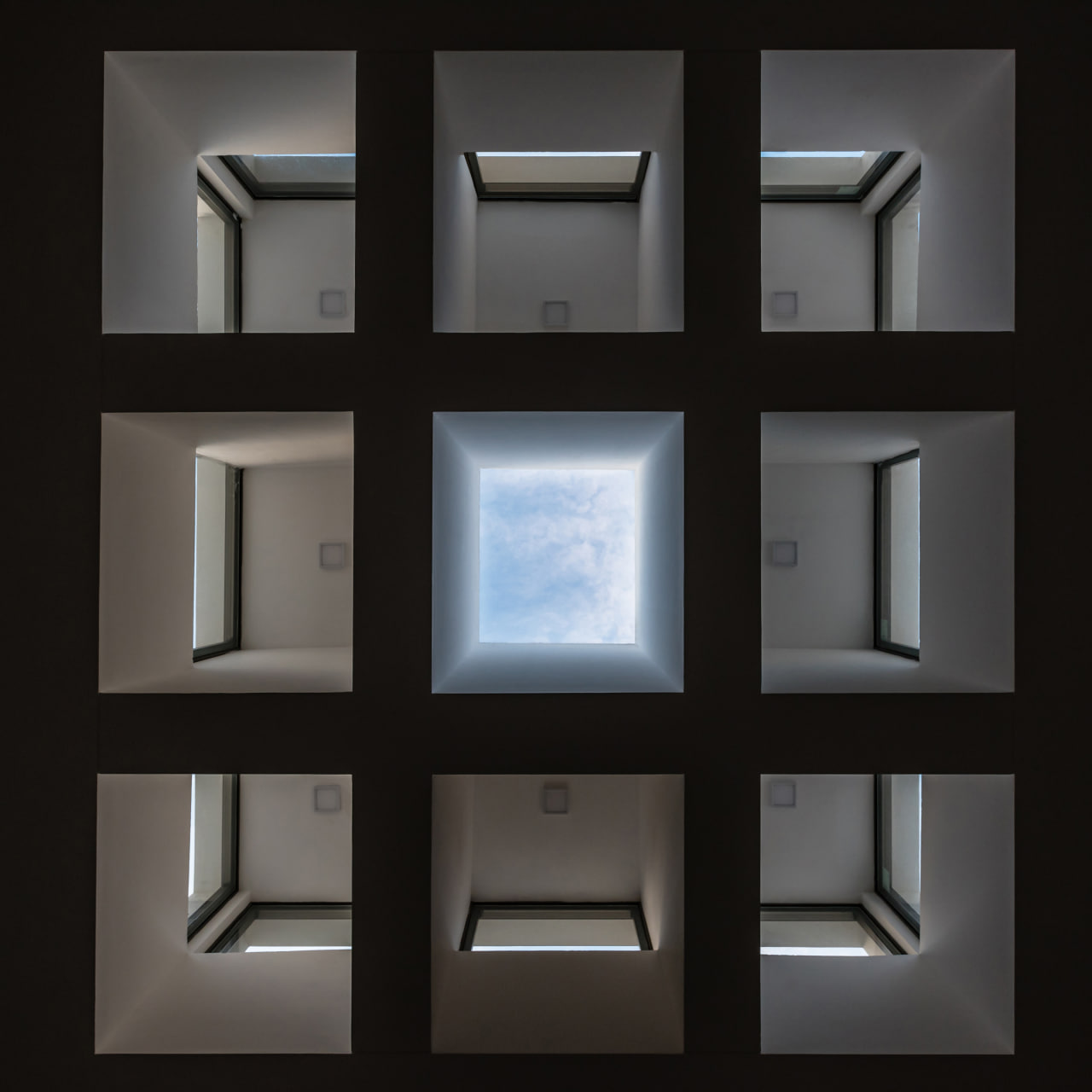
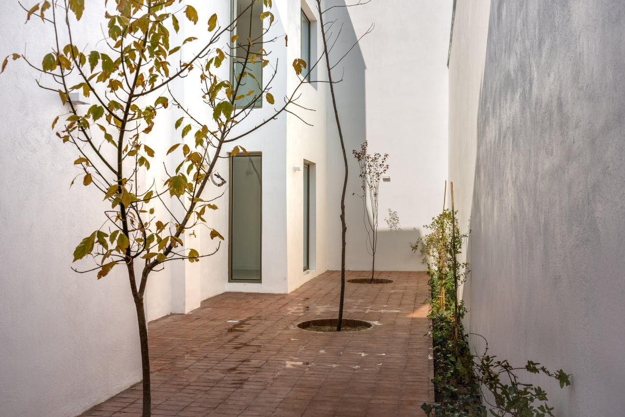
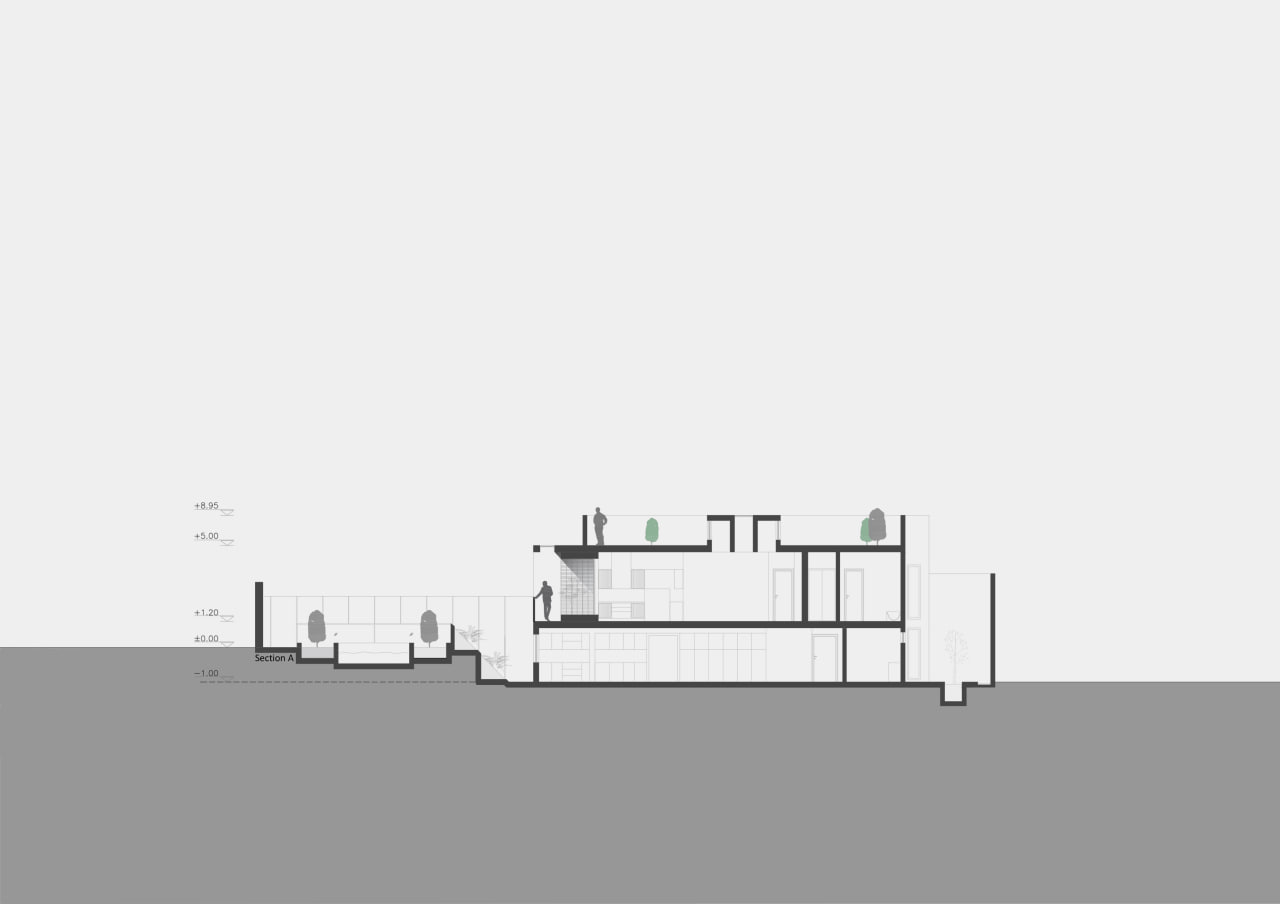
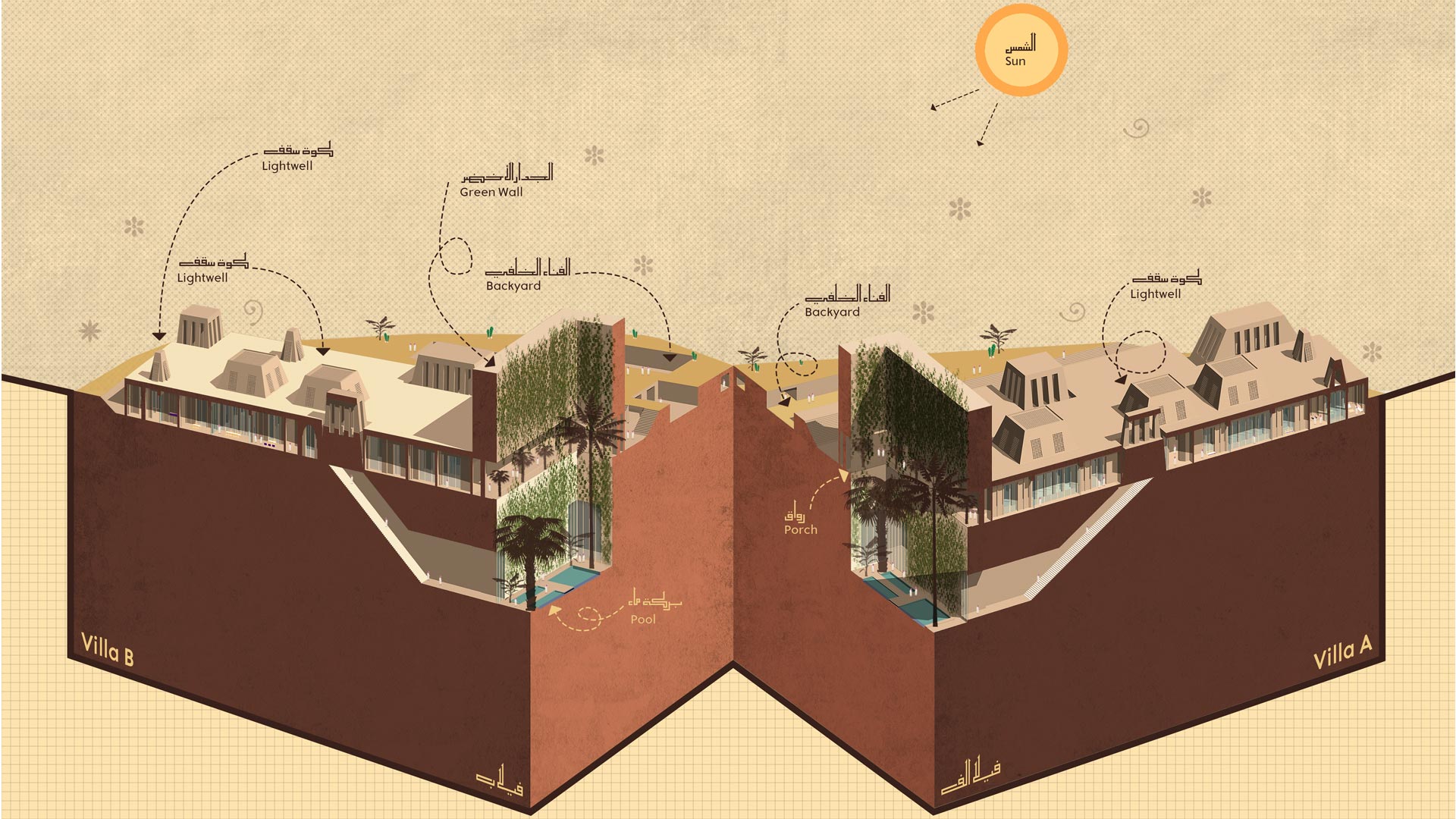
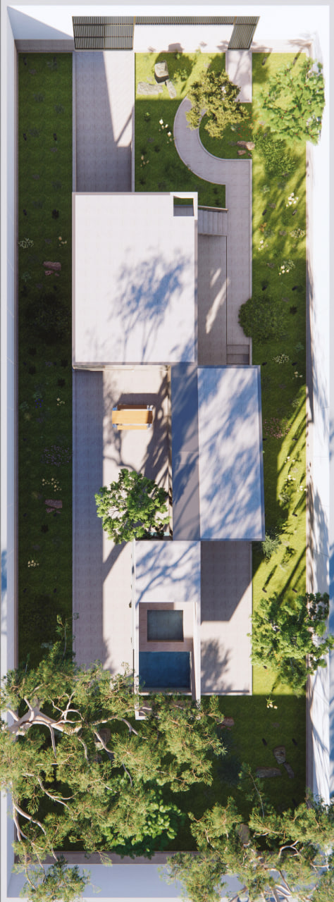
Connection between two entrance doors through a path crossing over a shallow pool which has fish in; the path being surrounded by plants that are supposed to grow fully within next 5 to 7 years; a skylight letting in the tonality of a color minutely in time leading to sunset; a backyard providing a suitable place for retreating through its high walls; reception room that should be closed space preventing energy loss according to client lived experience (two times guests of four within a year); glasses installed in ceiling holding a beautiful game of light and shadow; failure to convince the client to apply the patented brick are the part of goings-on in this project.
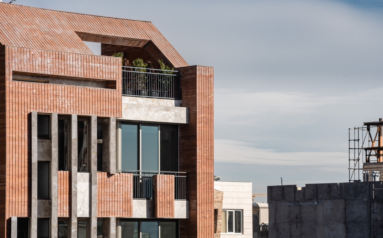
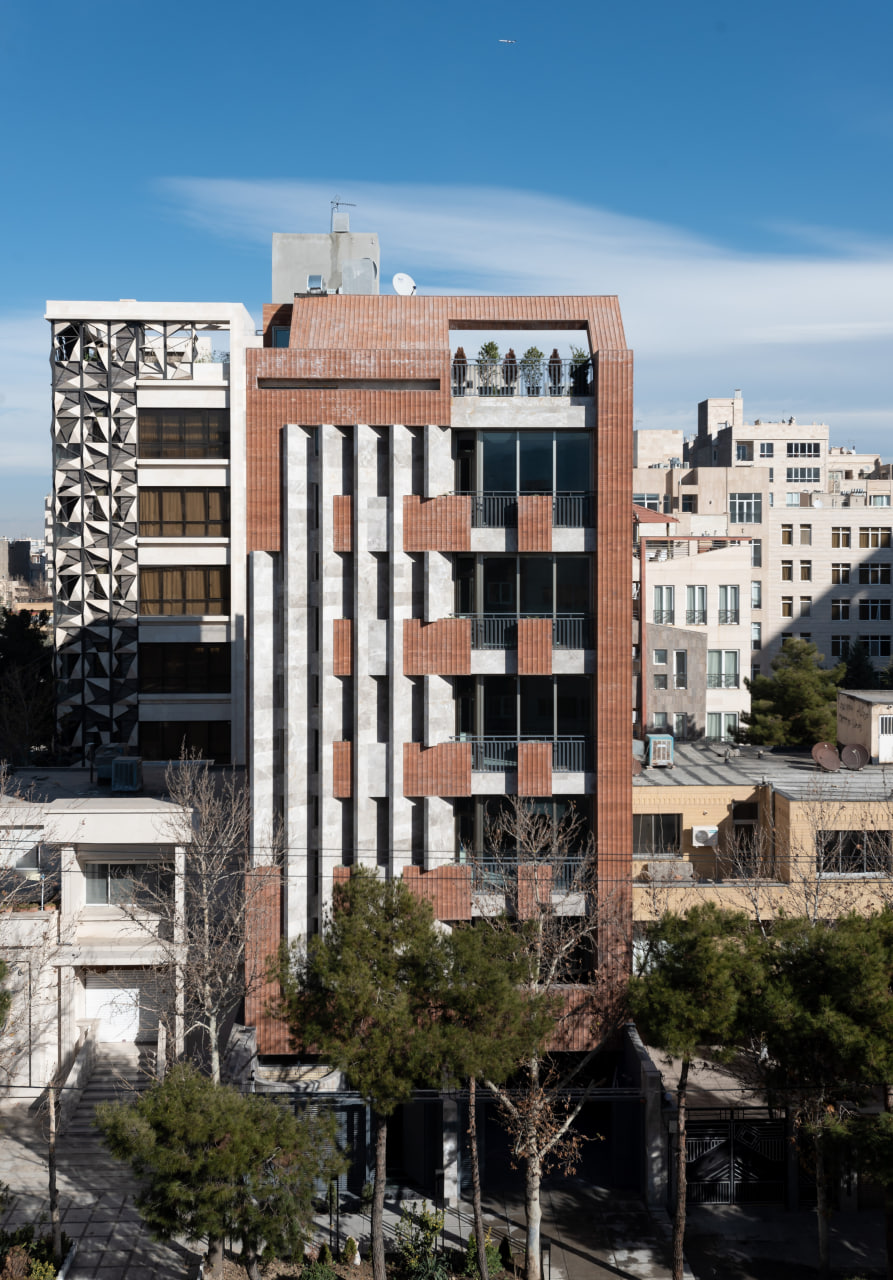
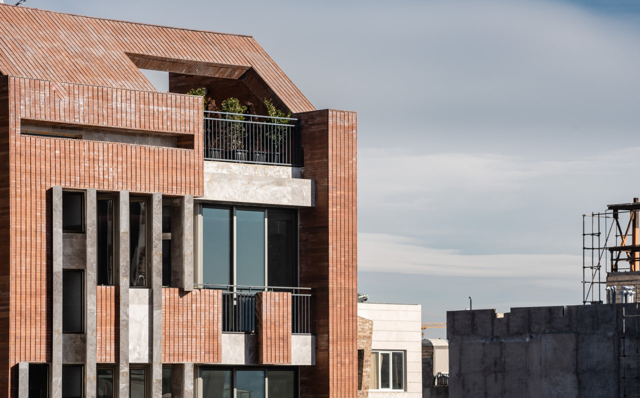
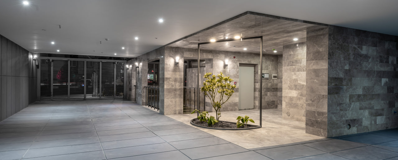
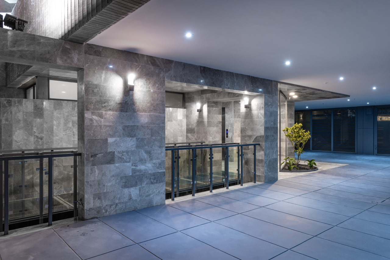
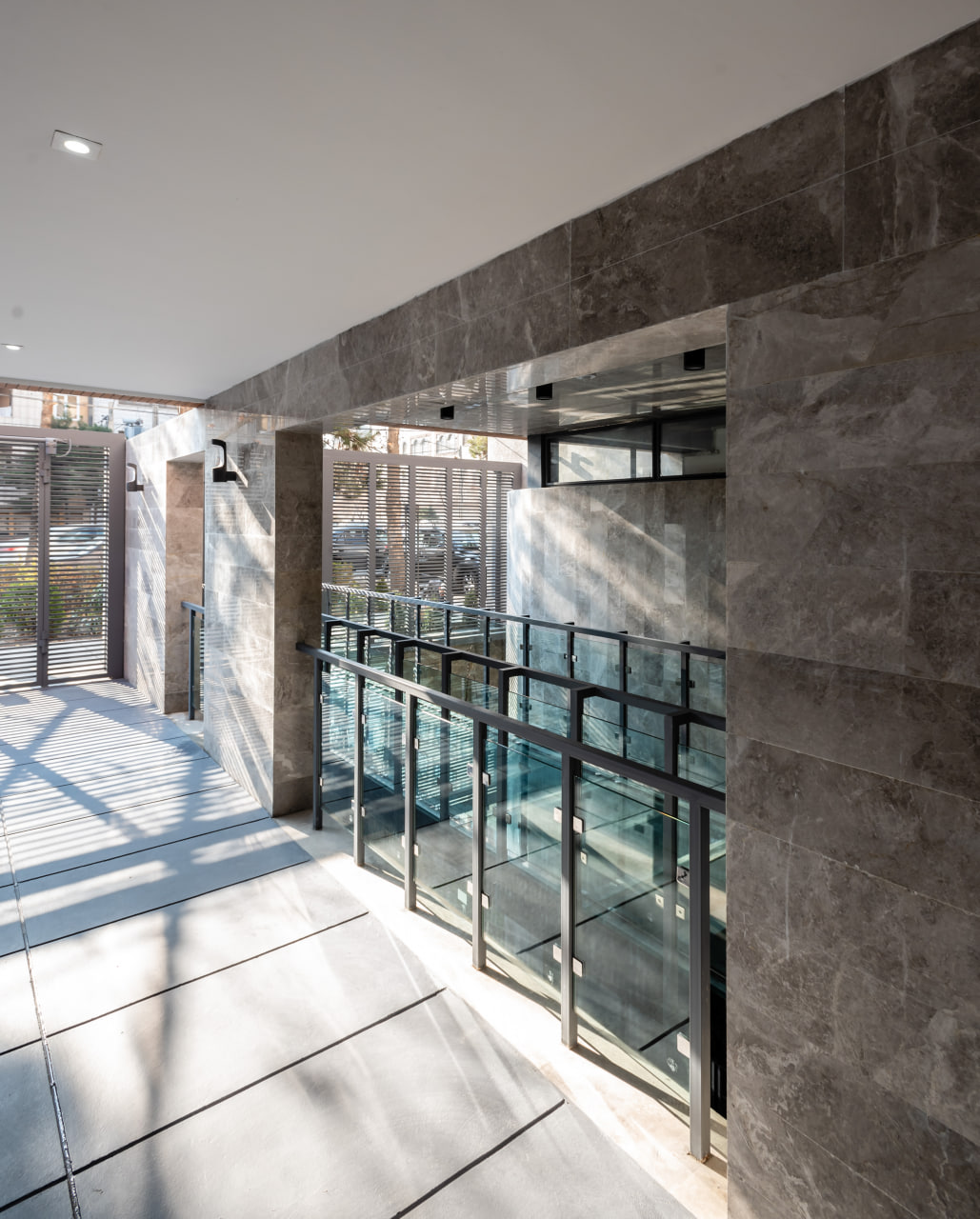
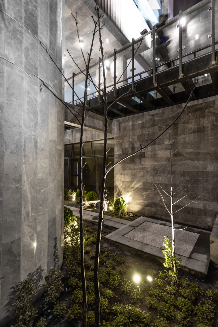
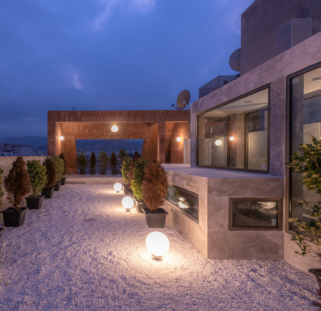
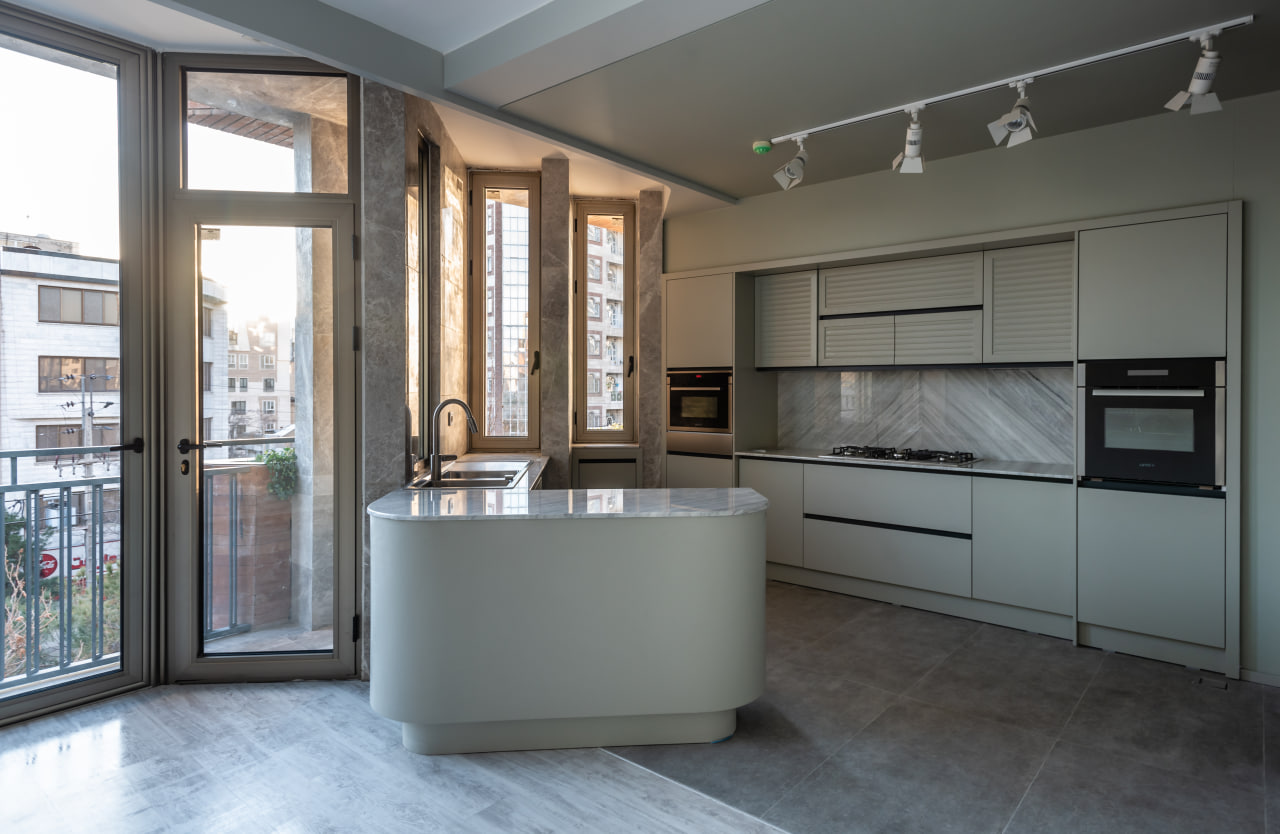
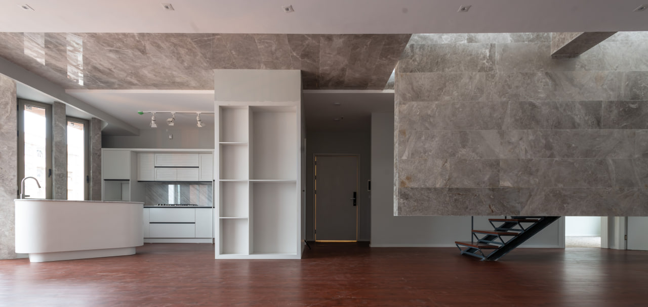
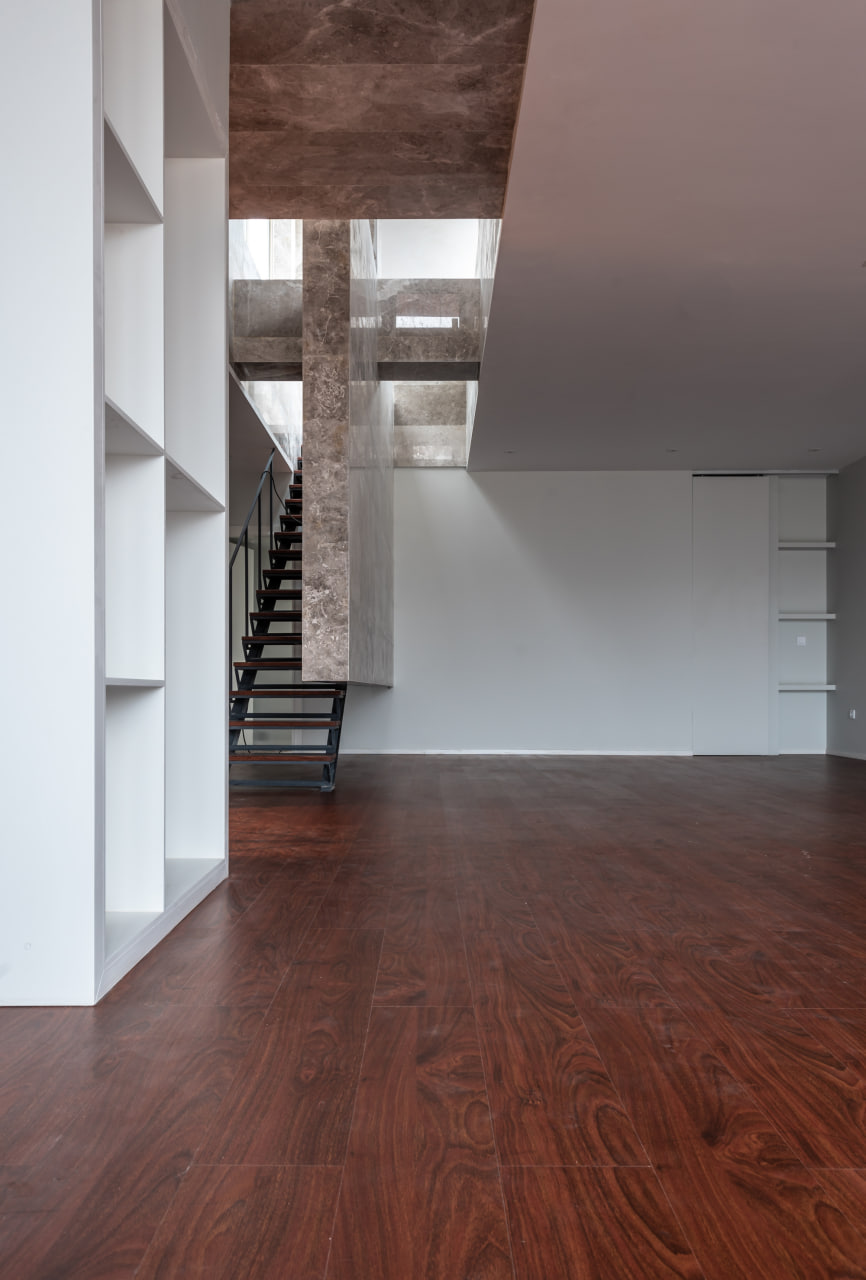
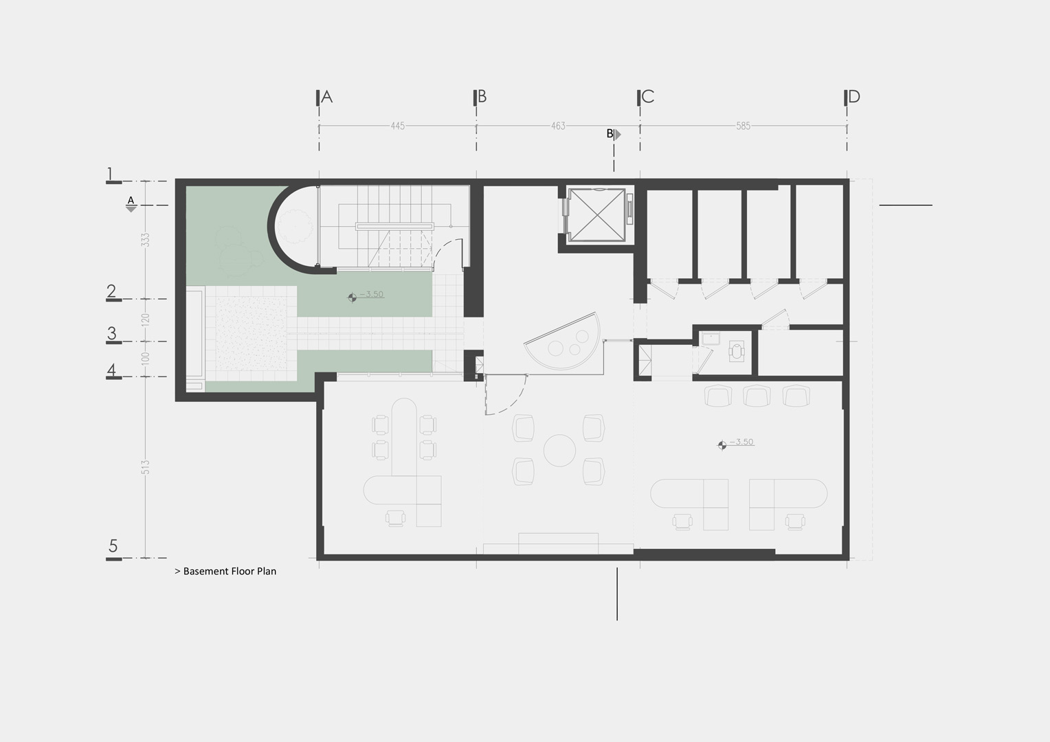
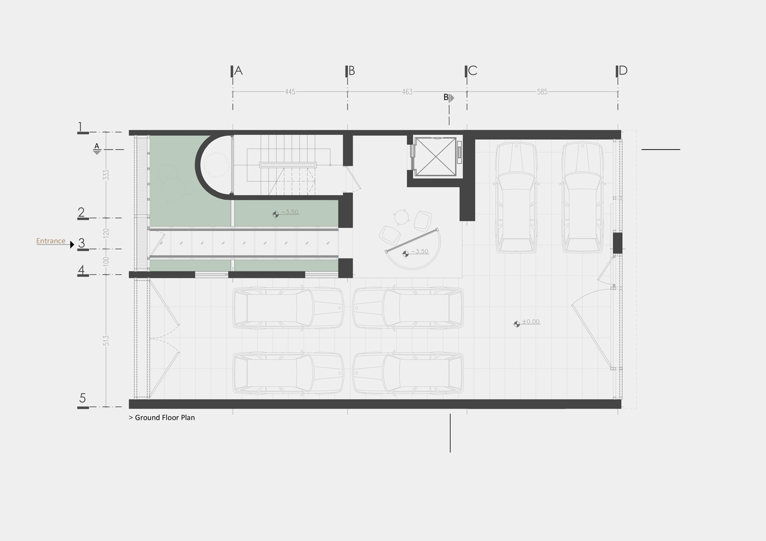
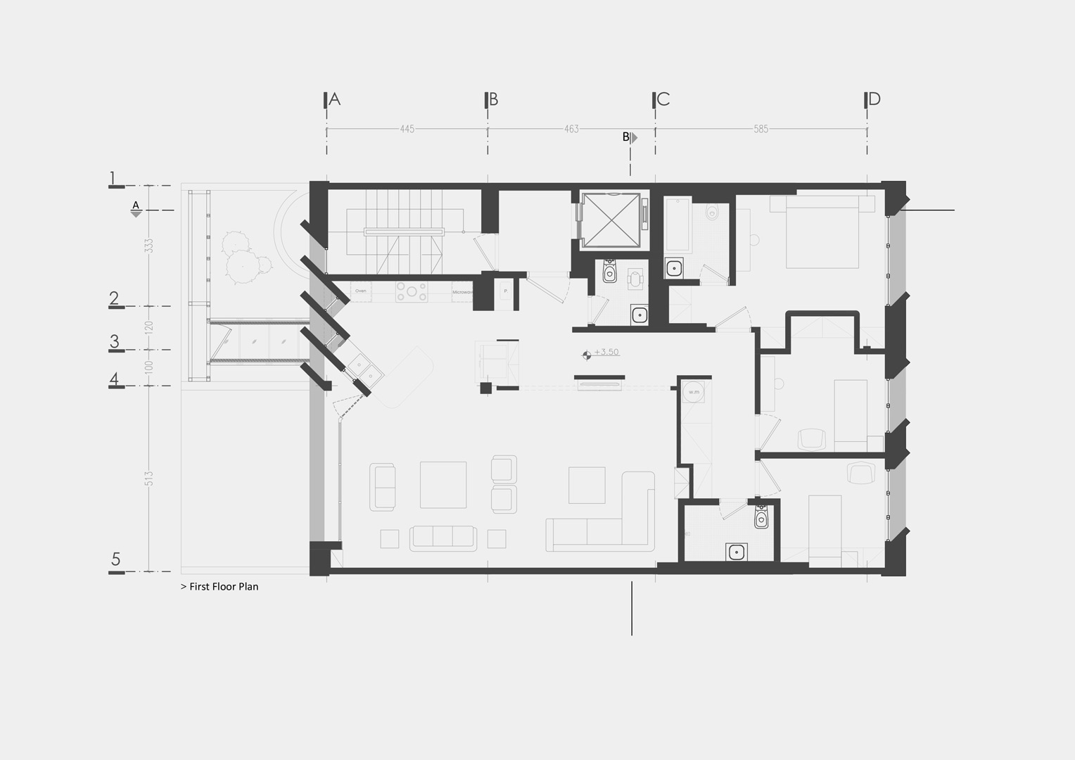
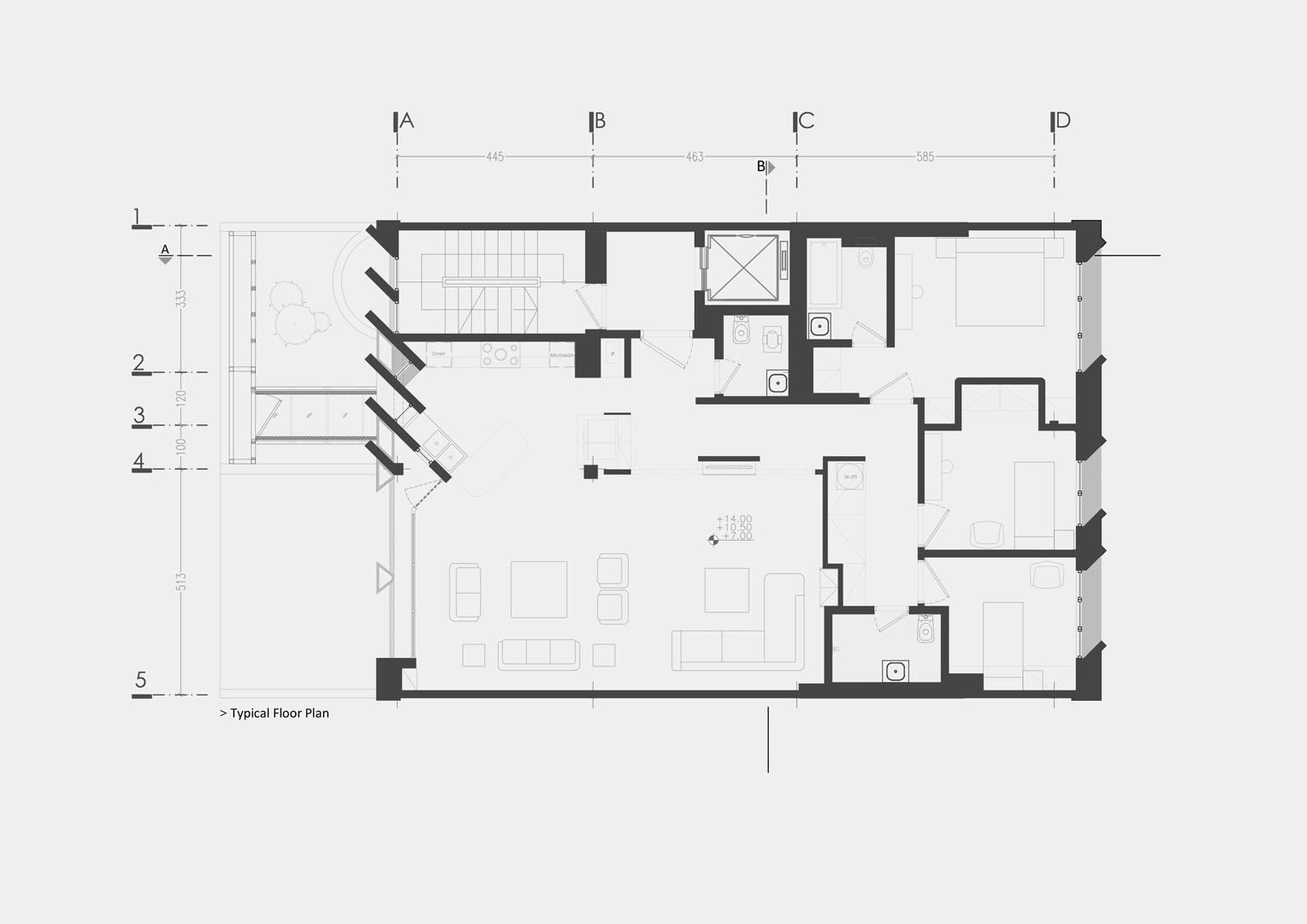
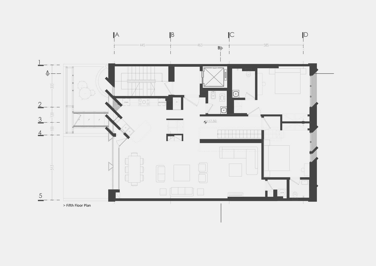
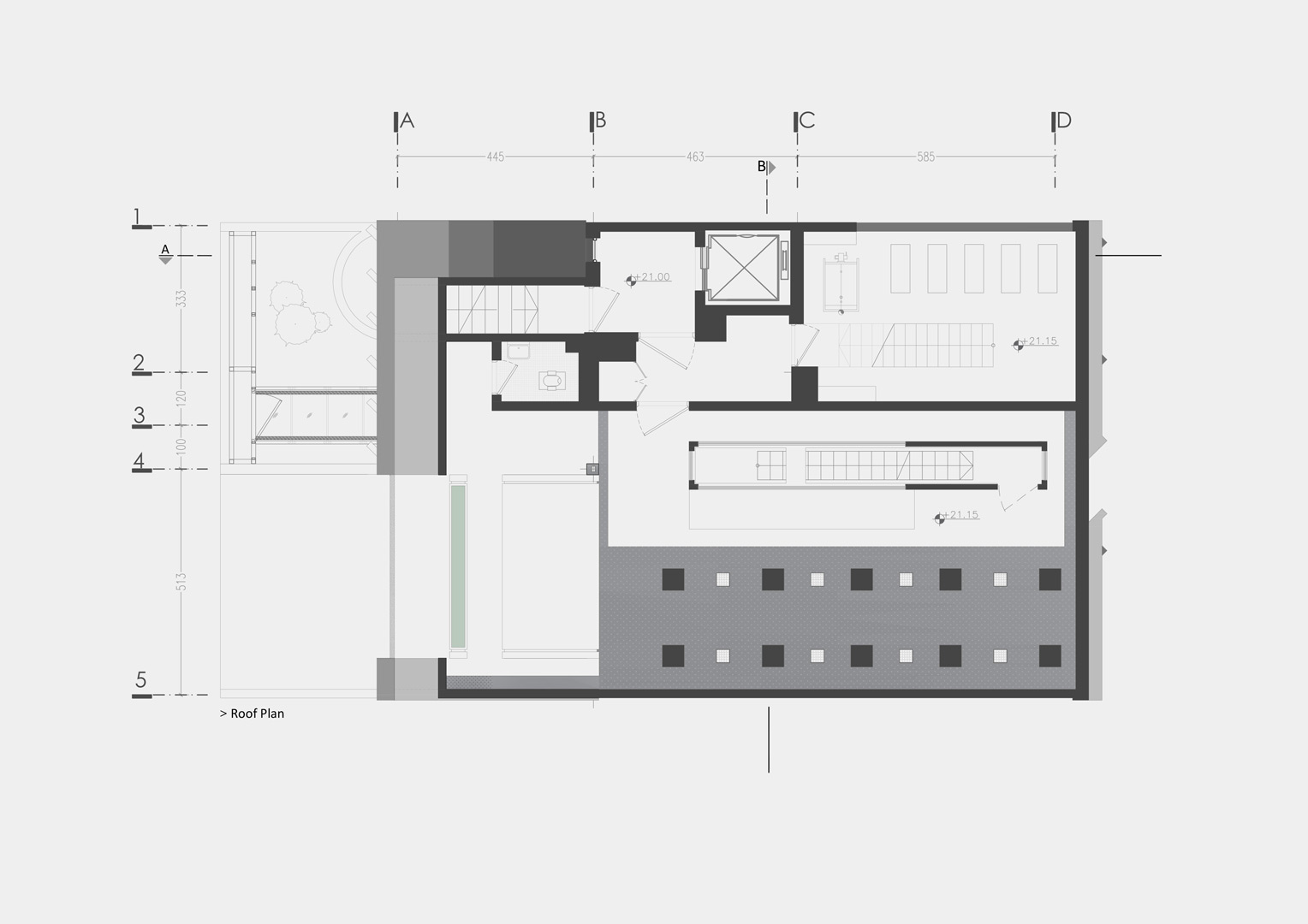
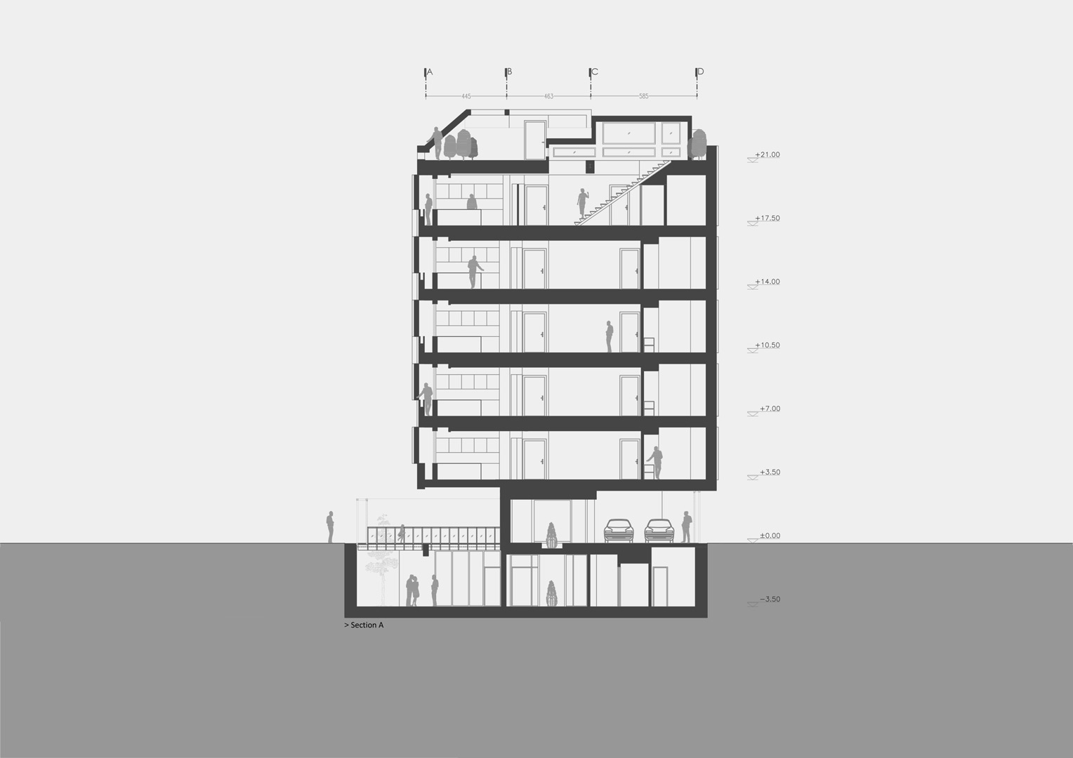
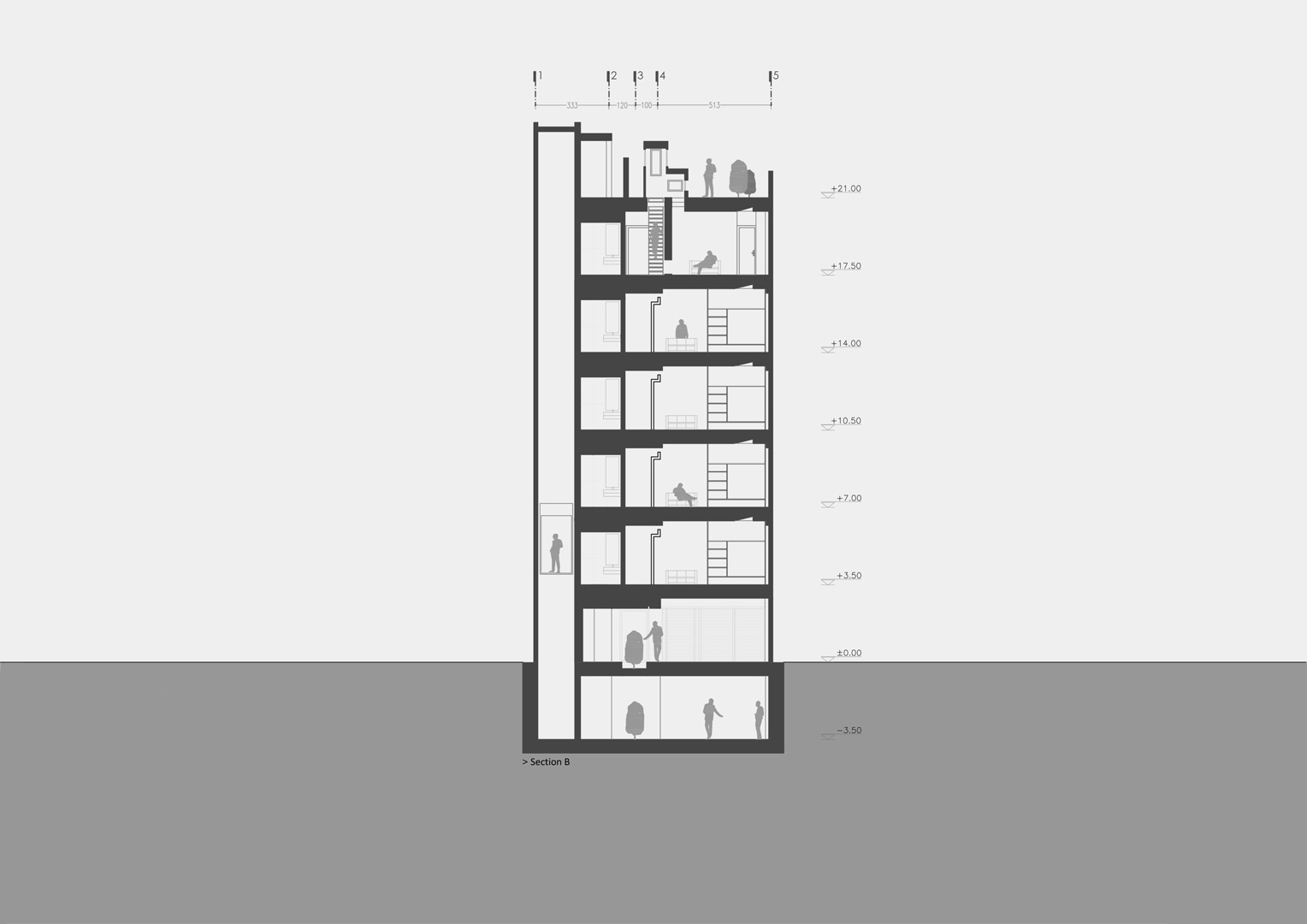
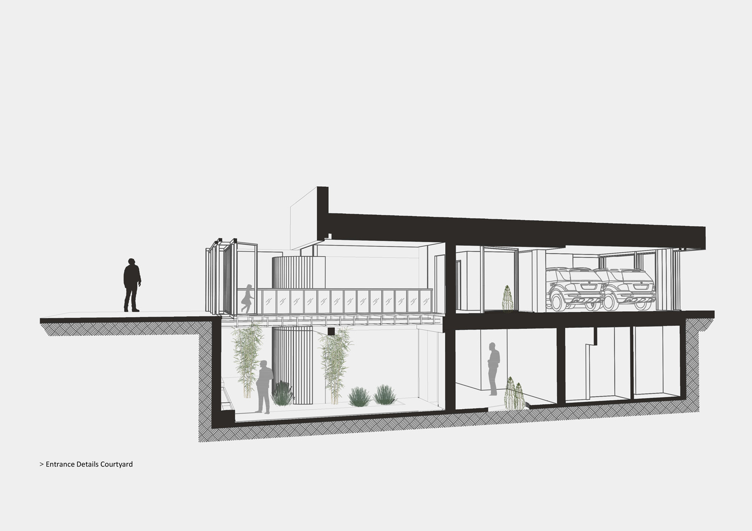
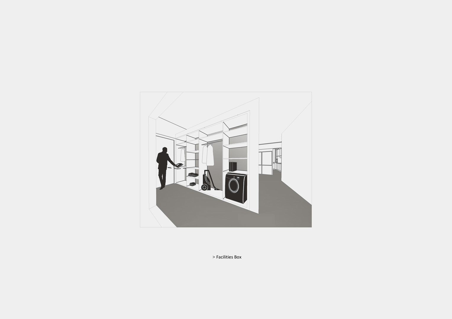
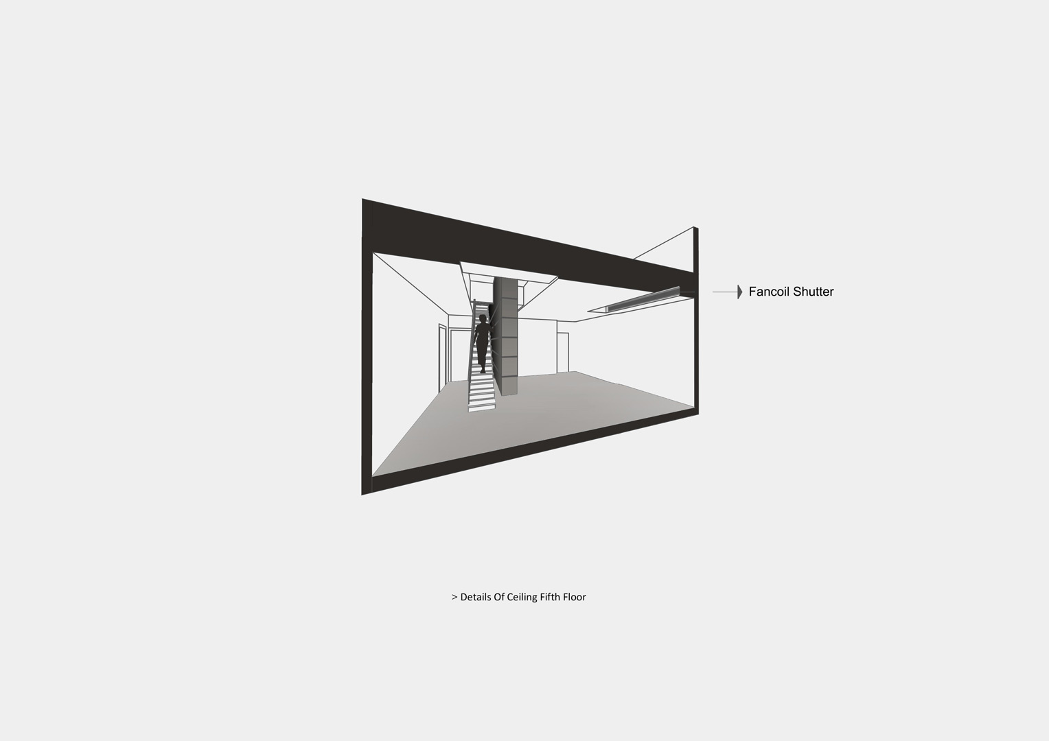
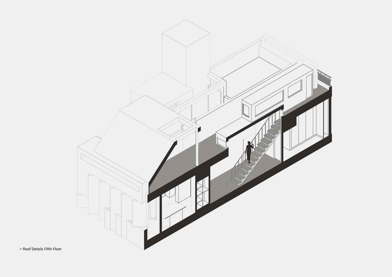
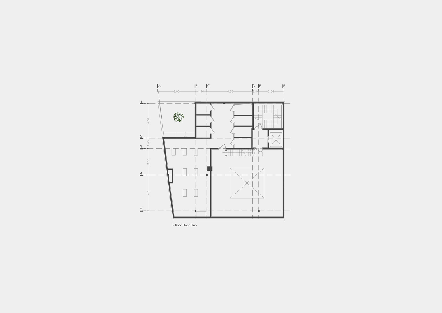
The groundwork of this project is based on an attempt to revive three areas in apartment life; the yard, entrance, corridor (within the unit) and the roof. Spaces which, in spite of their importance, are overlooked due to two reasons: firstly, because in terms of functionality, they have fewer functions compared to other spaces; secondly, because (regarding the yard and roof), they are not considered as salable living space. Furthermore, when it comes to the yard and the roof, we can claim that common areas are not usually well-kept, since in small apartments it is not possible to hire a janitor. Therefore, these spaces are often dead and unusable spaces.
The yard and entrance:
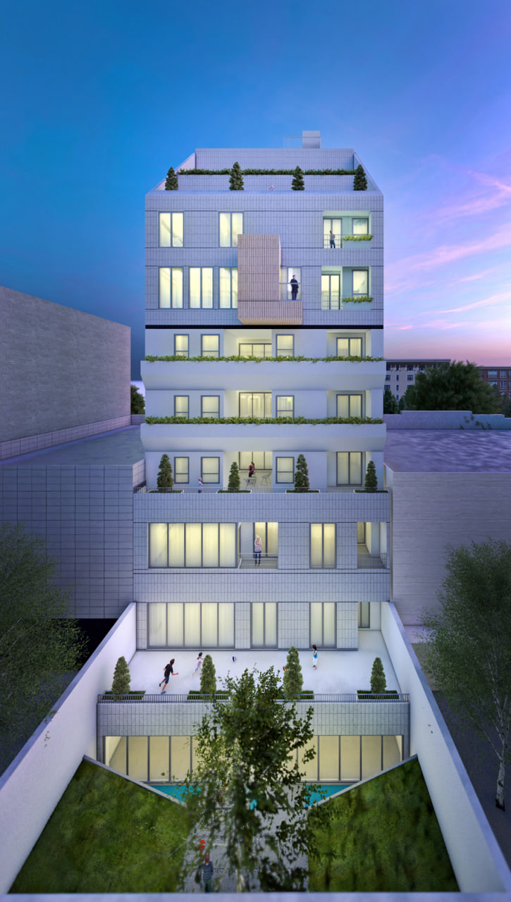
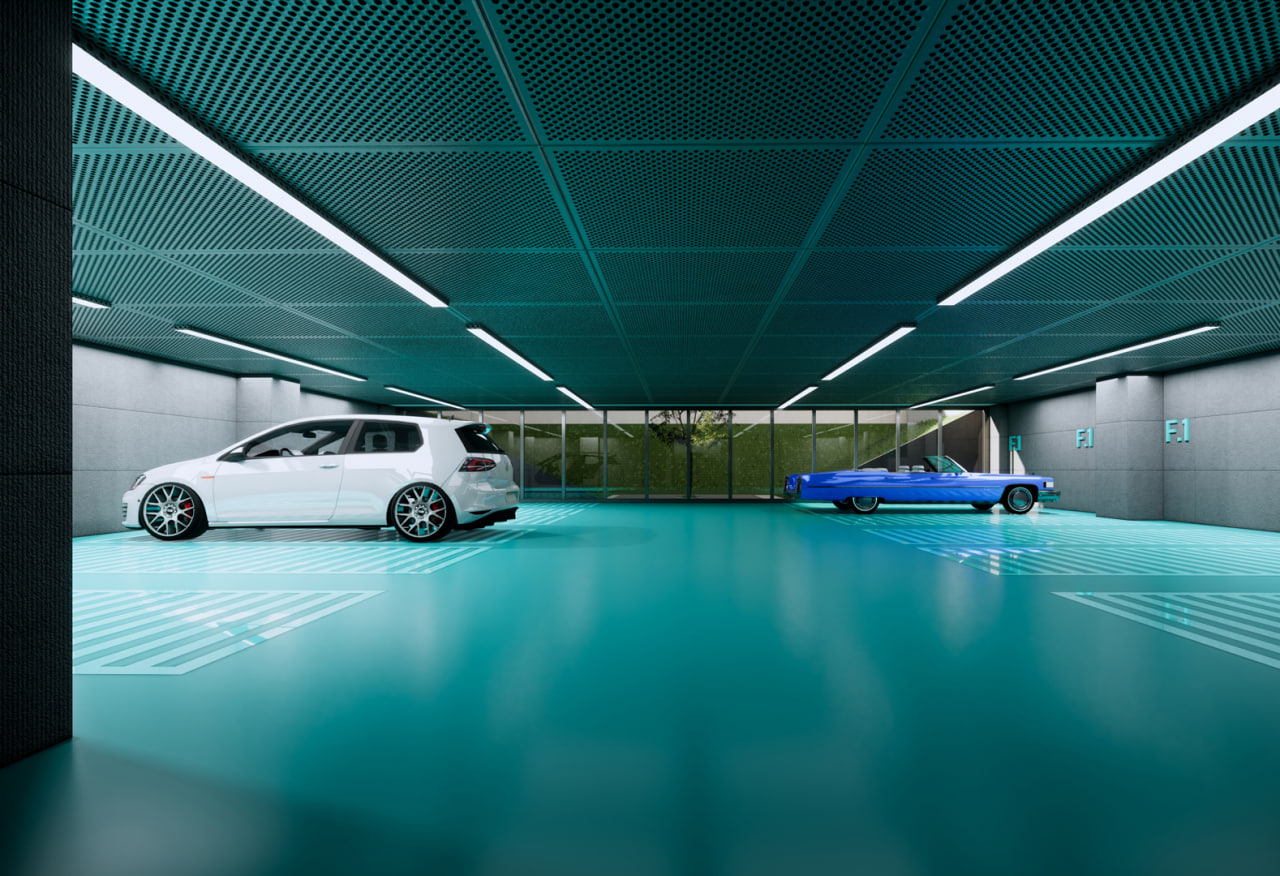
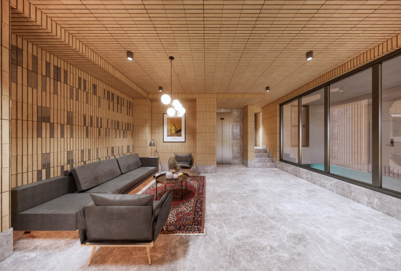
Despite the fact that the entrance has always been of great importance in traditional Iranian architecture, it lacks proper planning nowadays in apartment dwellings. To solve this problem, we segregated the entrance for automobiles and for the pedestrians. Then, we change the position of the yard in the underground and formed the pedestrian entrance space, segregating the threshold in two areas as well as keeping the interaction between them. One area standing as the visual threshold with the space and the outdoor pavement, using a glass bridge passing over the yard, reaches the second space. The second space is a semi-closed space which makes accessing vertical accsess possible. Green space, the sound of the water whirling (flowing from under the entrance to the whirlpool in the yard) and being placed in a vertical axis are among the qualitative elements of the building. Furthermore, moving the yard to the underground has made supplying light, view and natural ventilation for a multipurpose salon possible; a salon for sports, reception and so on, which is considered a common area in the building.
Roof:
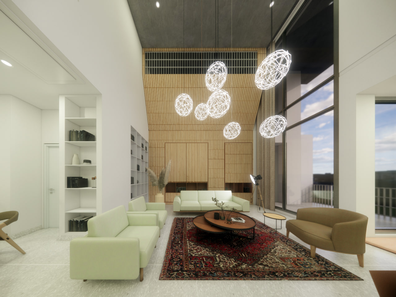
The roofs of Buildings with a small living area usually face this challenge that building green space and maintaining it is not economically justified. Furthermore, not having a single custodian leads to a gradual destruction of these places. Therefore, we decided to divide the roof space into two sections: one part for building installations accessible to all apartment units and the other, a yard adorned with vases and a place for sitting, which is accessible exclusively to the fifth unit, with an separate access from within the unit. This approach taken, the different quality of the fifth unit by using a skylight and taking proper care of the roof can be guaranteed.
The corridor:
For the corridors within the units not to be only a passageway, a functional, linear space has been placed between the living room and the rooms so that it can guarantee the privacy of the rooms and make up for the lack of laundry rooms in small buildings. Placing washing machines and related appliances, the ironing board and closets for keeping necessary items for living in a one hundred and fifty meters apartment in this space, has turned the corridor into a multipurpose space.
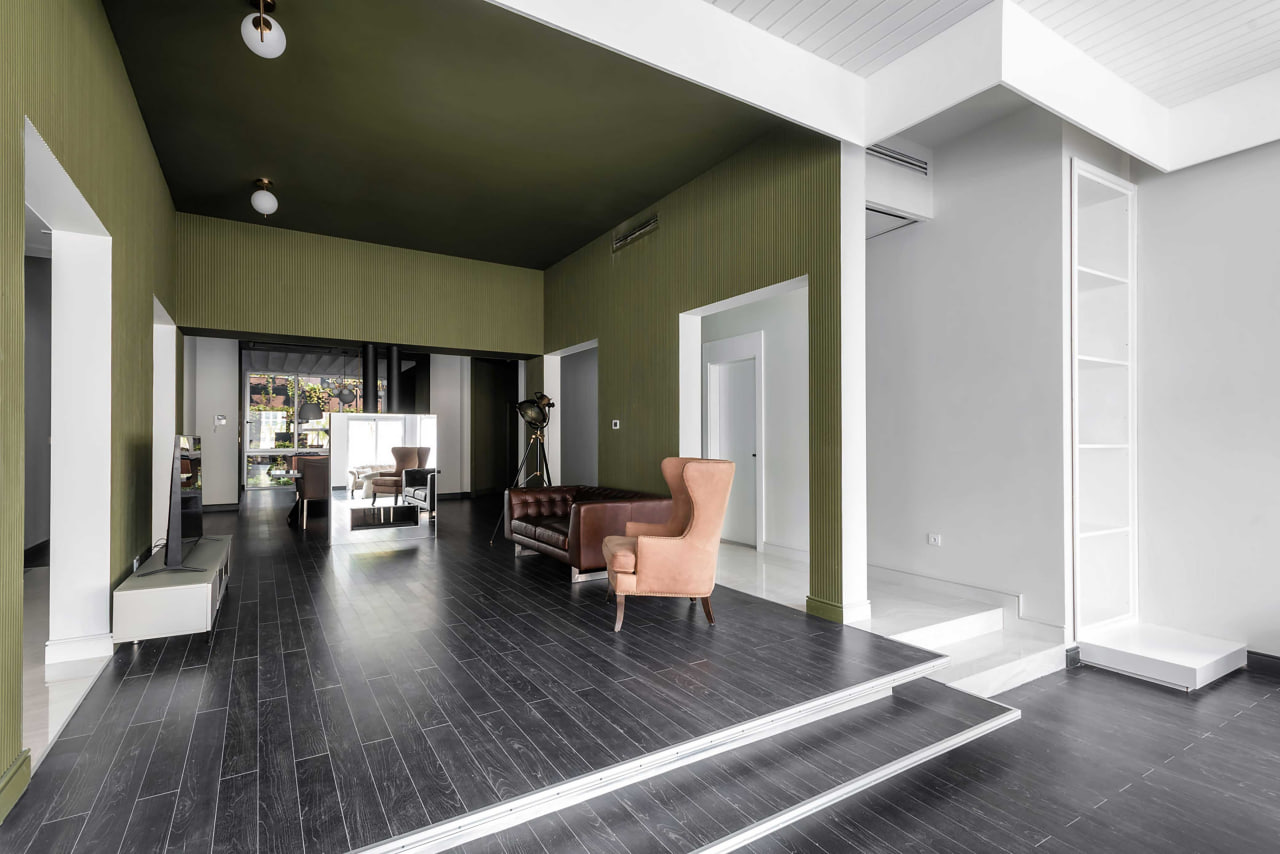
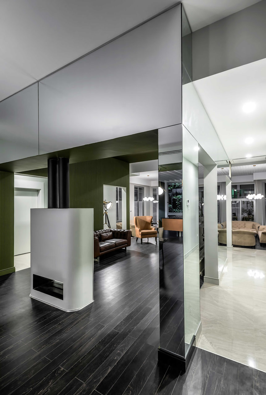
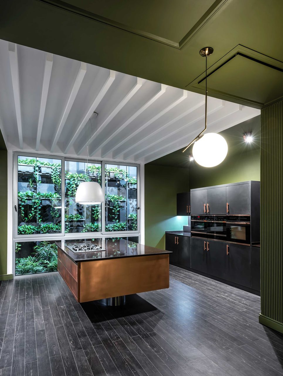
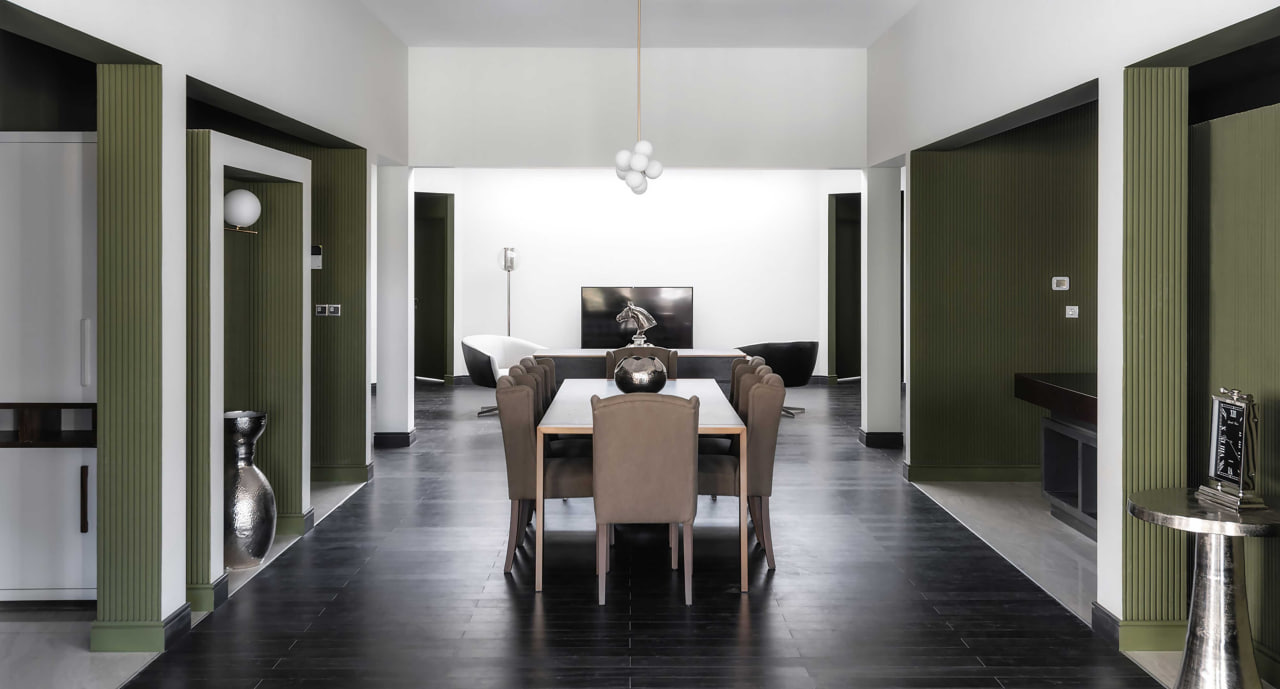
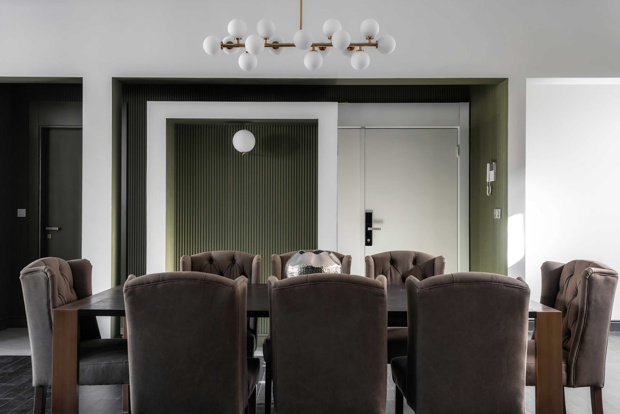
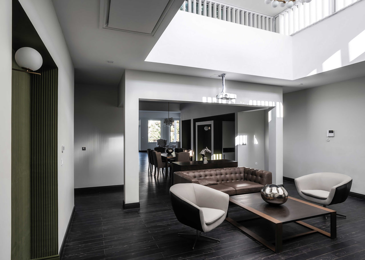
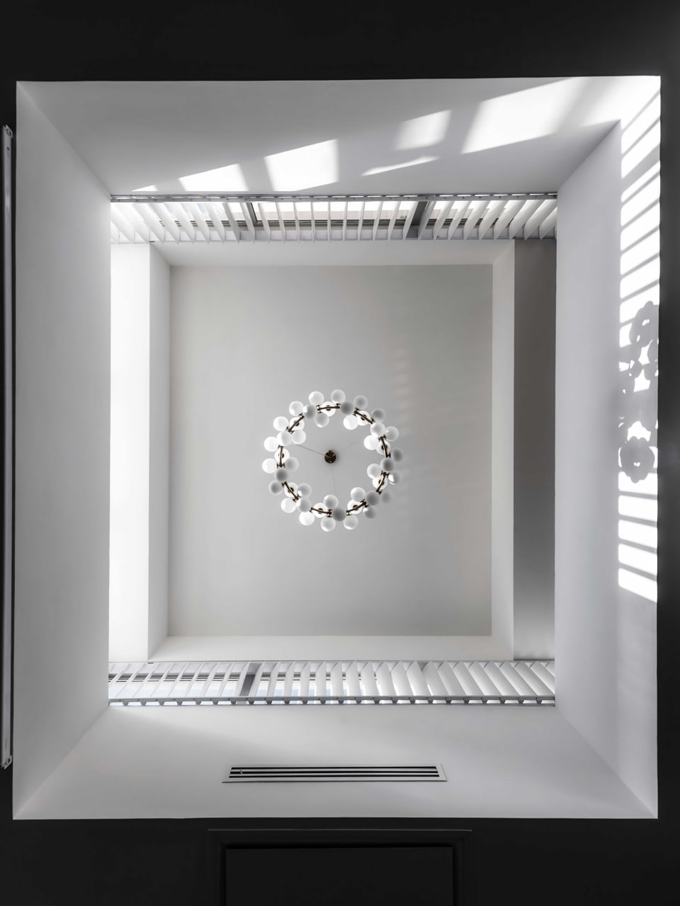
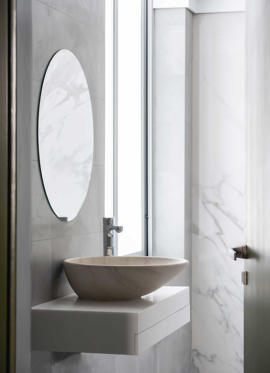
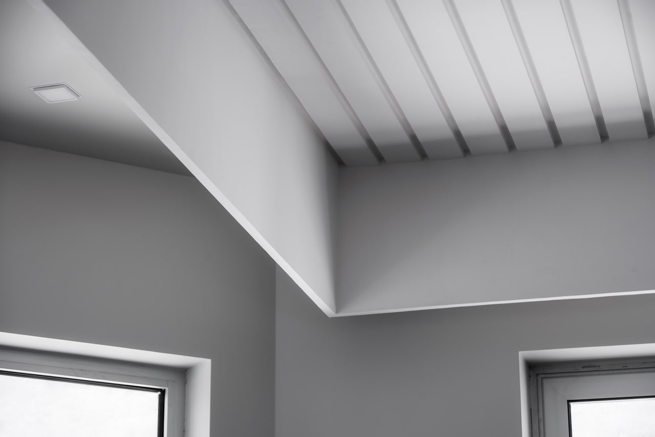
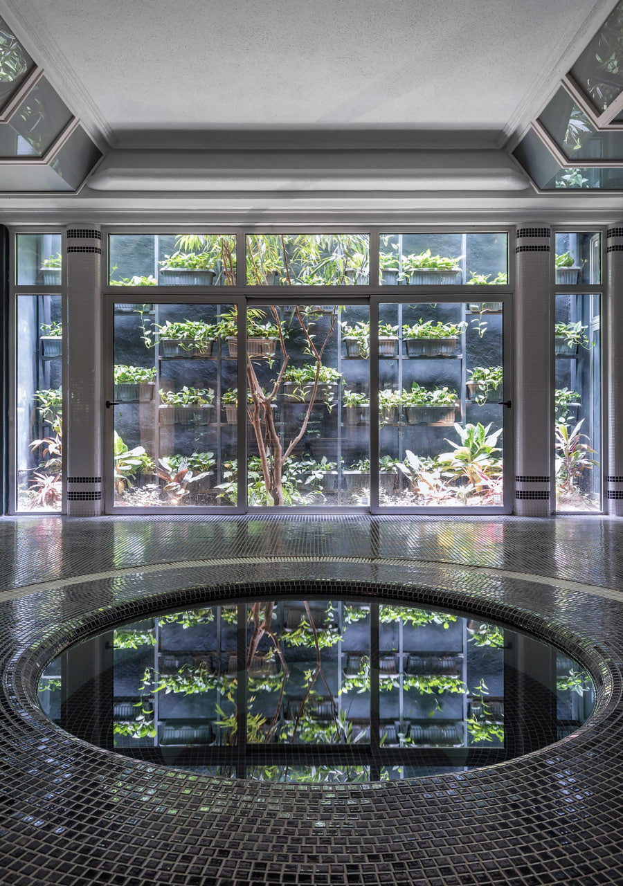
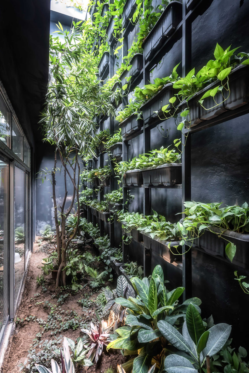
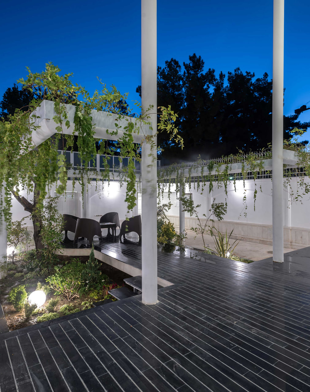
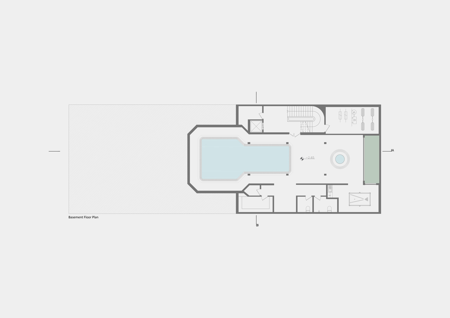
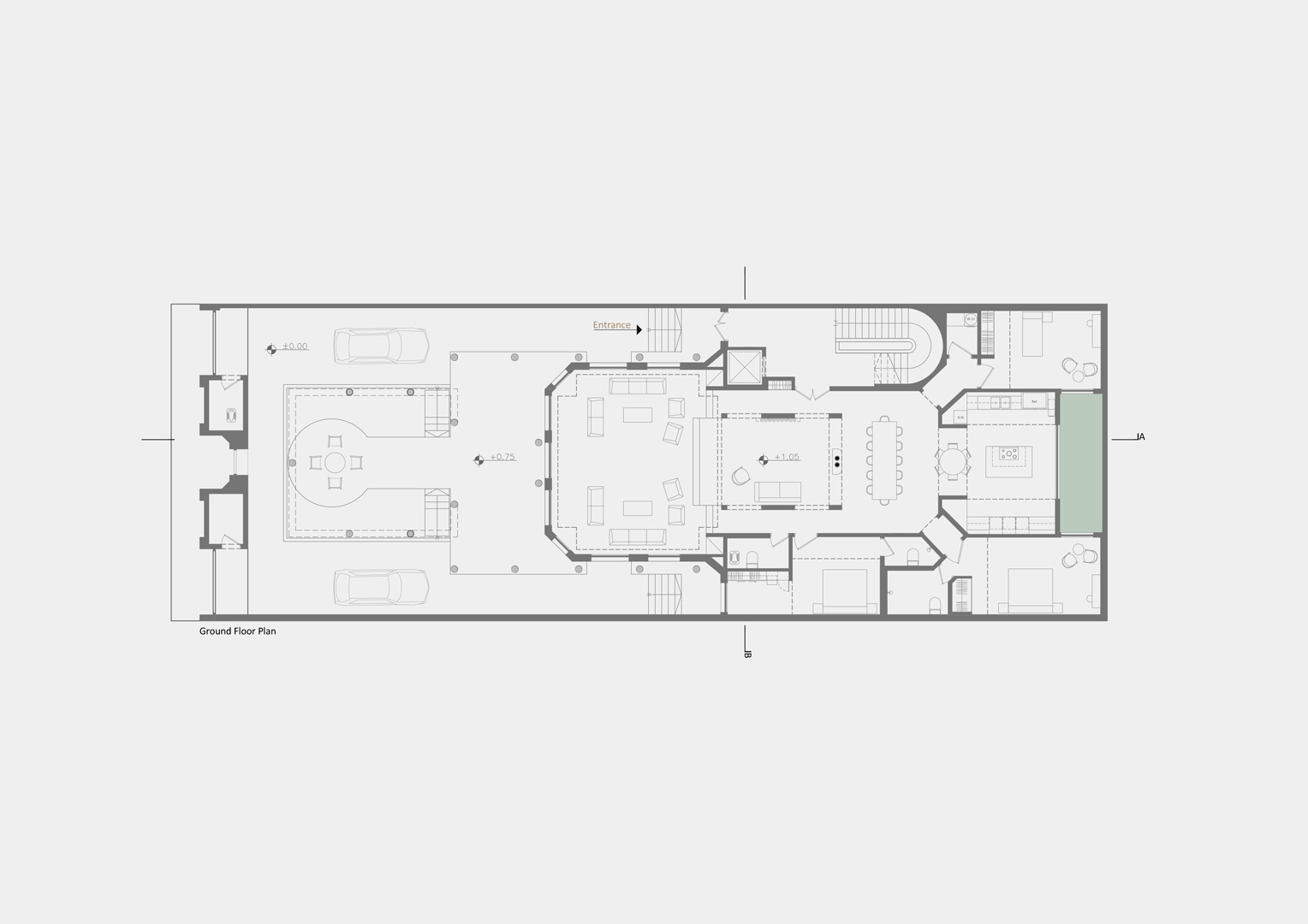
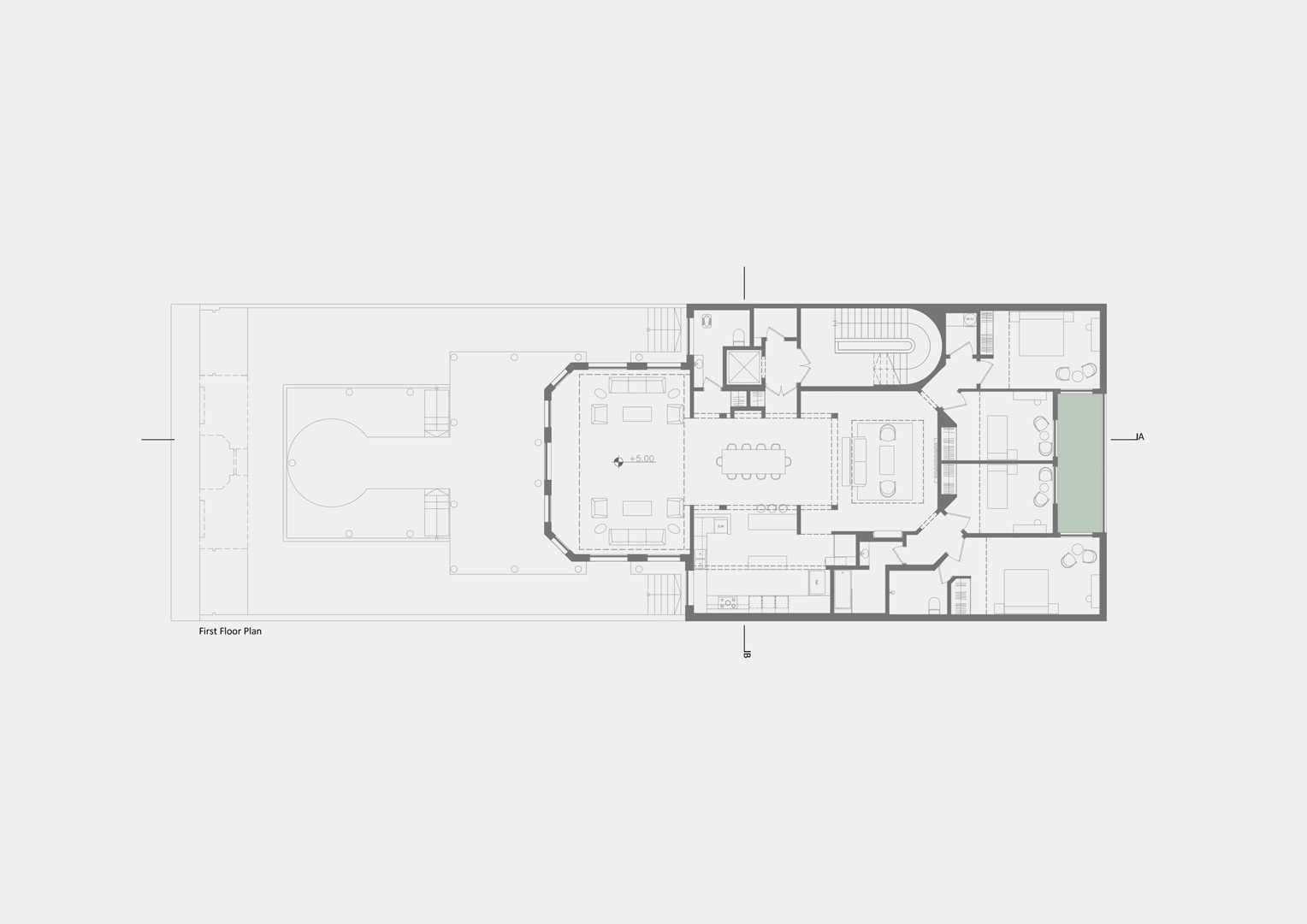
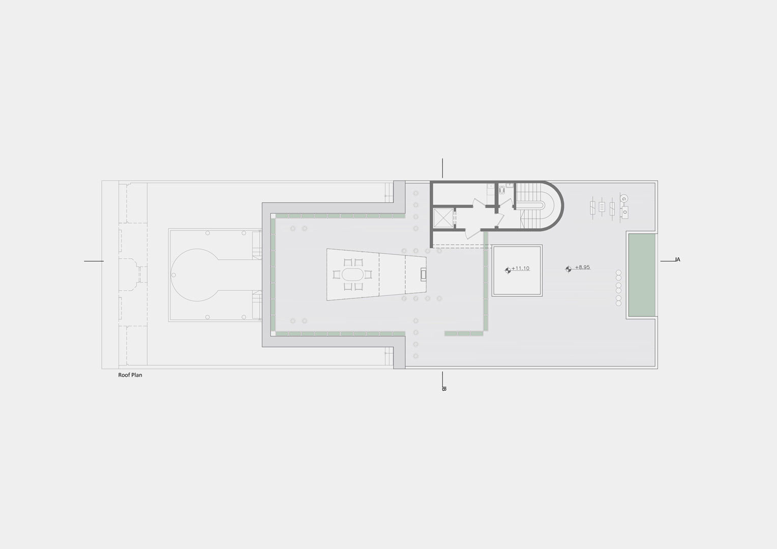
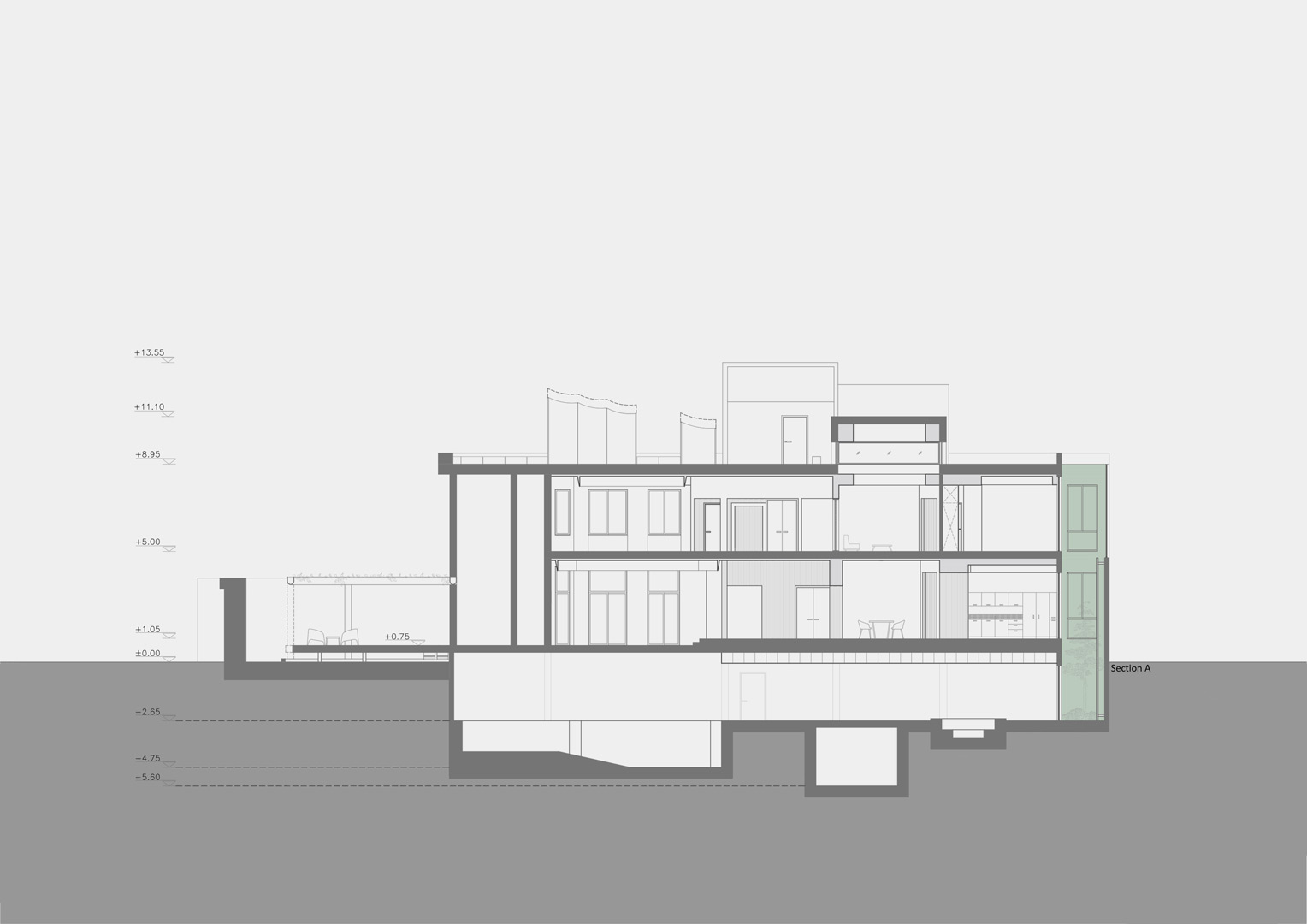
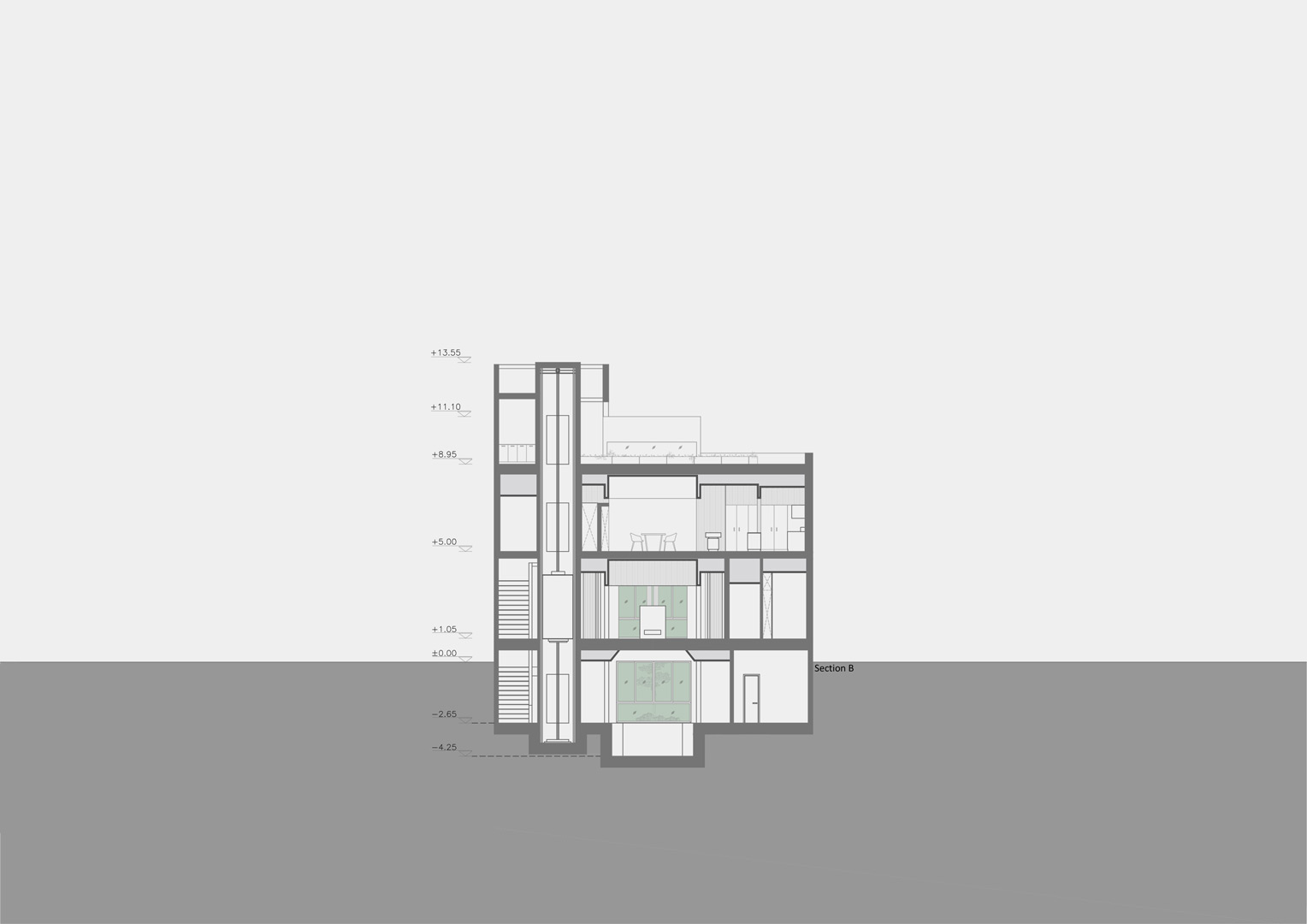
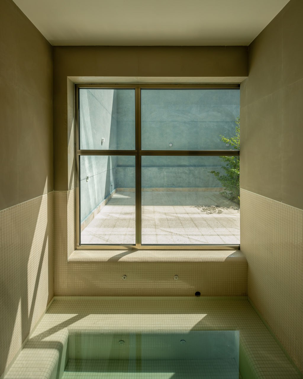
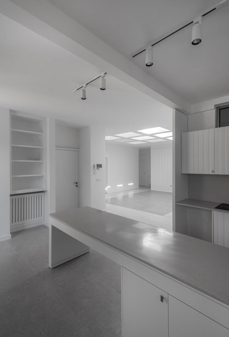
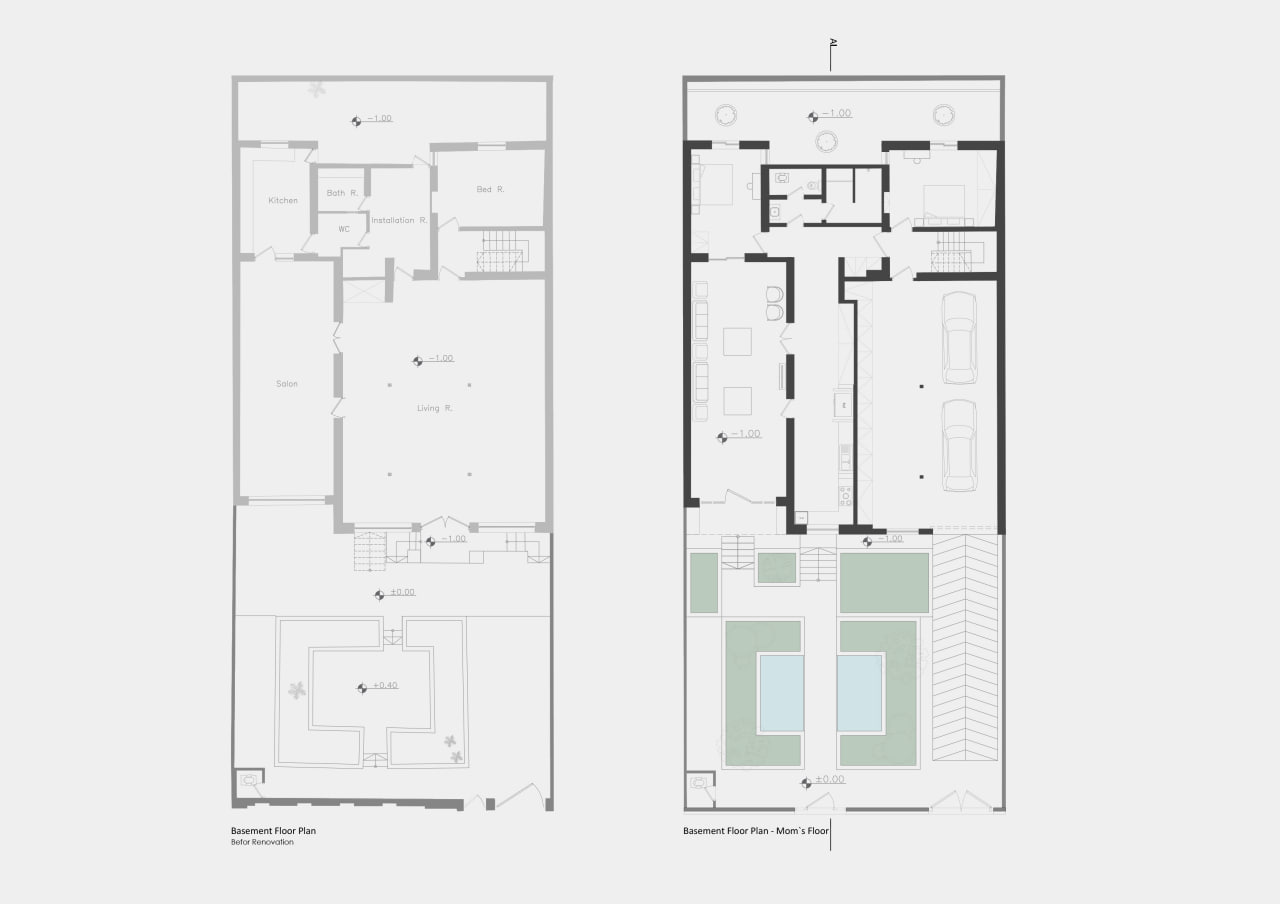
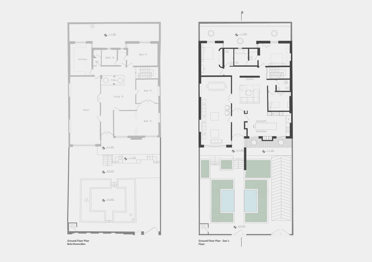
This project is based in a residential building in Mashhad whose construction dates back to approximately twenty years ago. The building has two residential floors and a basement where a Jacuzzi, a pool and a sauna are located. The client has requested that we transform the ground floor into a place suitable for his mother and sister, and the first floor into a comfortable dwelling for his wife and children. He believes that the facade is acceptable and does not need changing. A symmetrical structure is what he looks for. This structure of the building was already designed accordingly. Symmetrical axis spaces accompanied with classic ratios are prominent features of this building. As a result of this, this project focuses on preserving the current classic ratios and structural symmetries, as well as modifying the properties of X and Y axis. Also, the Z axis is paid special attention to in this regard. In addition to this, the concepts of indoors, outdoors and identity are significant features which have been taken in to consideration.
In this project, the main objective has been rebuilding the architectural structures of invaluable houses of previous periods in Kashan. A closer look into Abbasian’s homes in Kashan as well as the analysis of spaces and programs for different hours during the day have been of main issues dealt with in this project. It is attempted to view the issues in six different aspects, which means each space, based on its function and attributions, stresses one major issues concerning its decoration and design. It can be said that all spatial elements, such as lighting, hierarchies, ratios etc., are employed for axis and directions. The stress is on dichotomies such as stability-movement and silence-sounds for internal spaces extending from the skylight to the yard. This emphasis is associated with the concepts of habitancy as well as In-Out identity. To put this idea into practice, certain measures are to be taken, for example the sky light is to be the green vertical axis of the building which is accommodated with the sound of birds and movements. Besides, the yard is to be amended with two levels of garden.
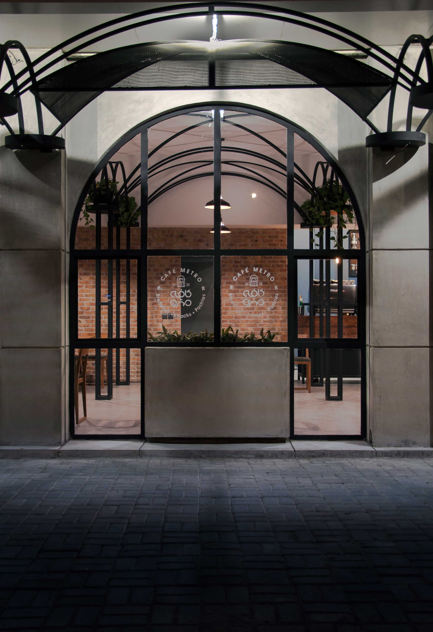
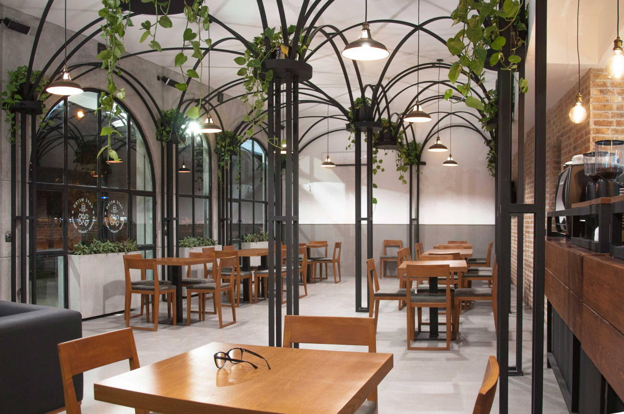
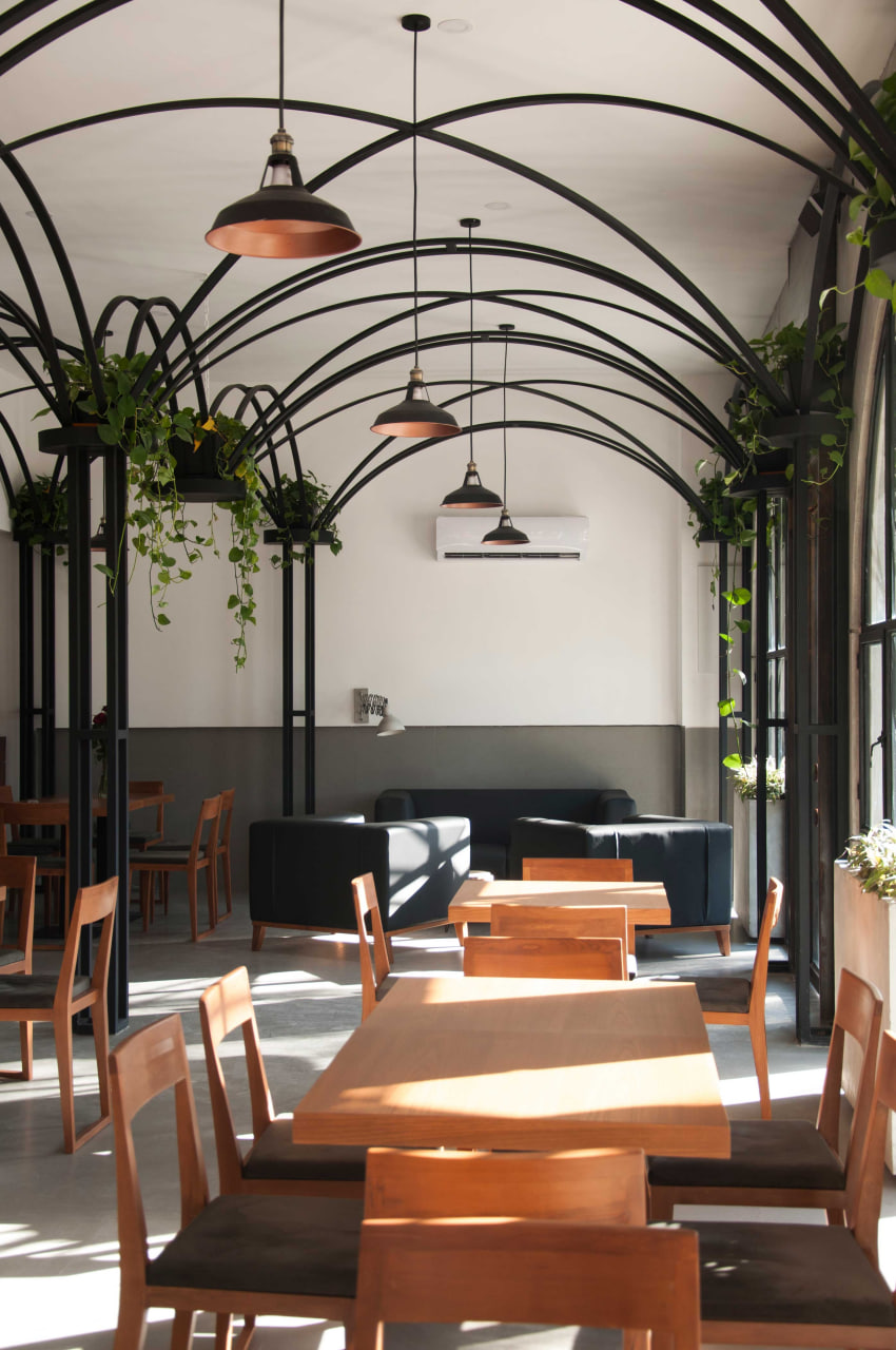
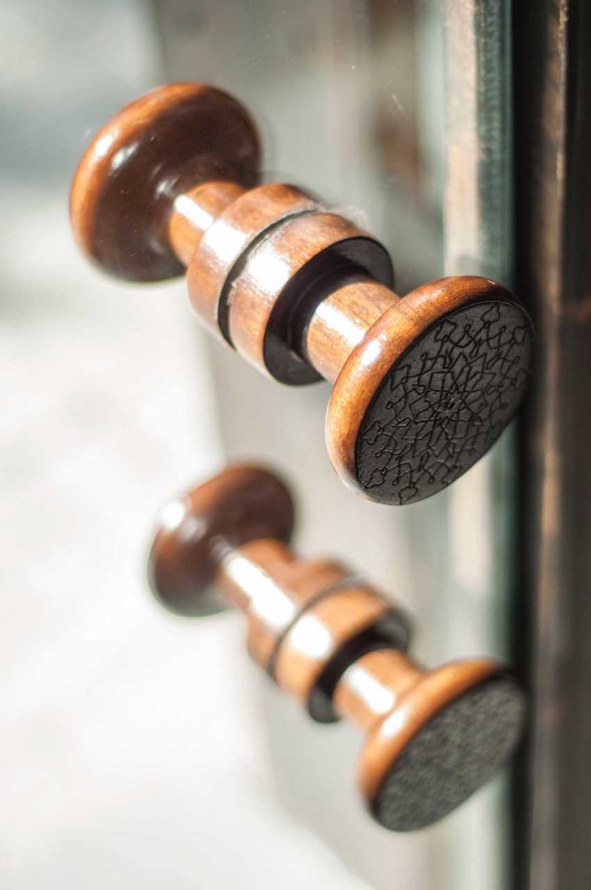
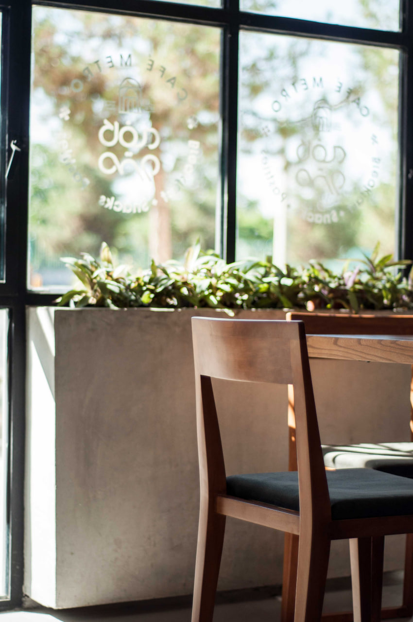
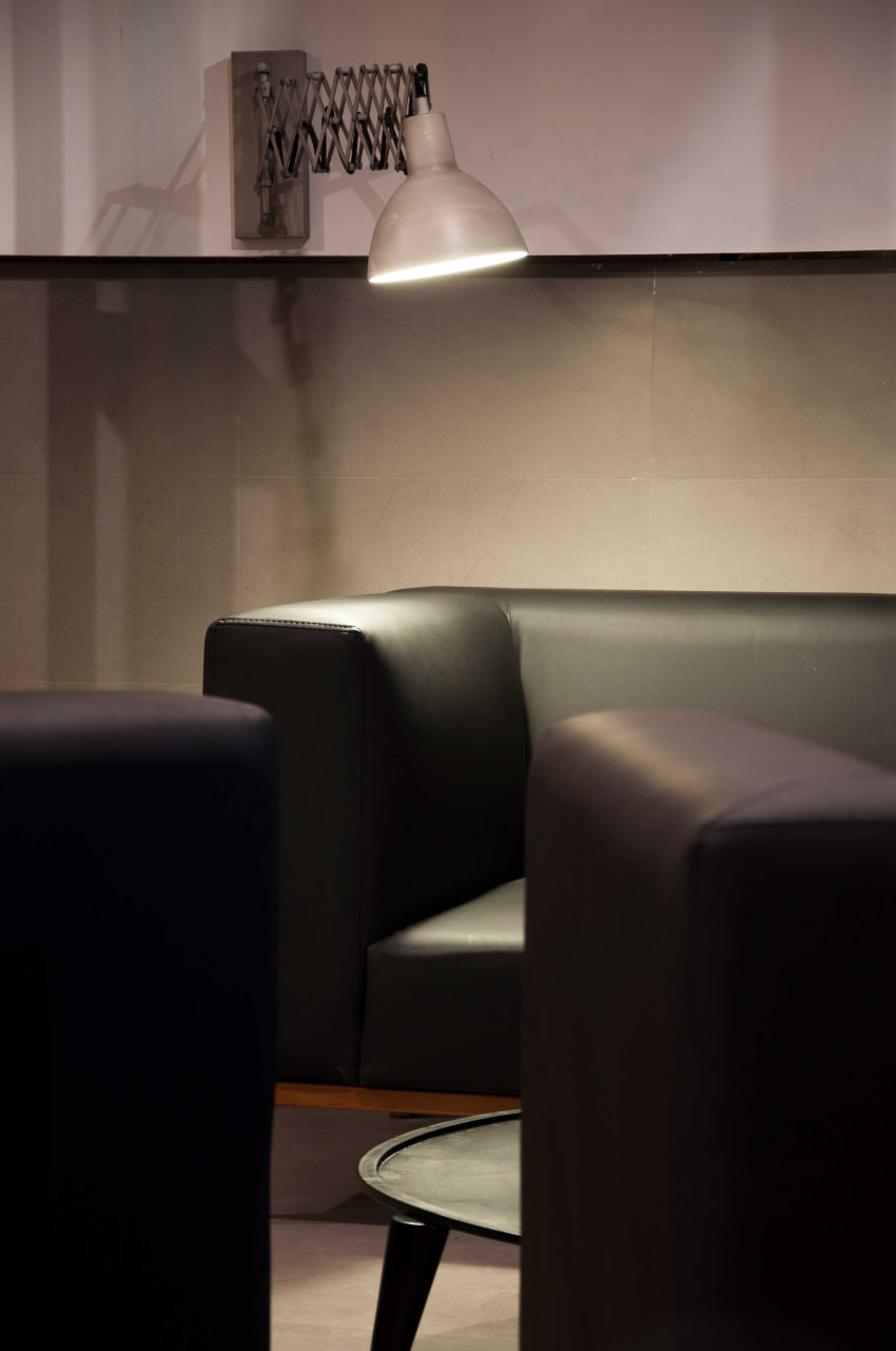
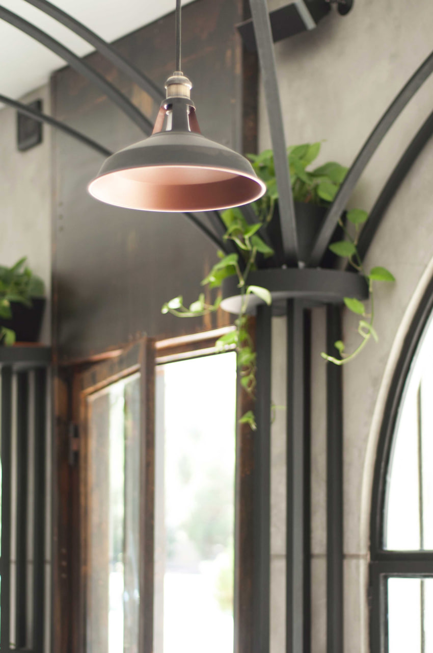
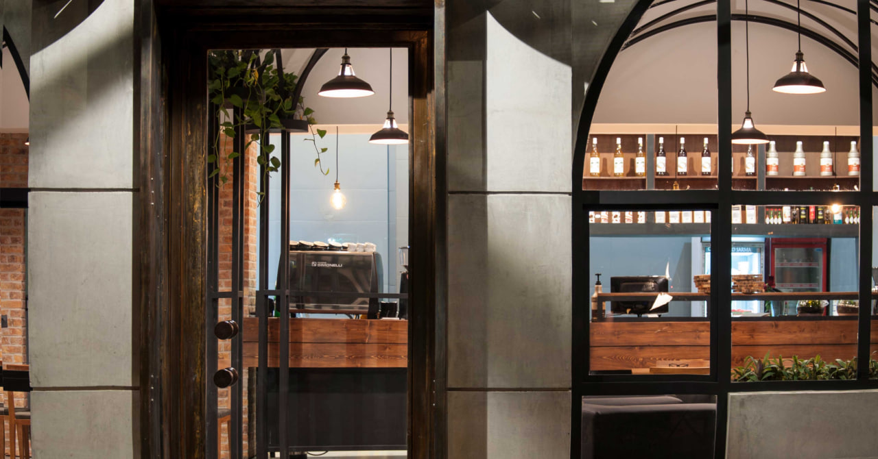
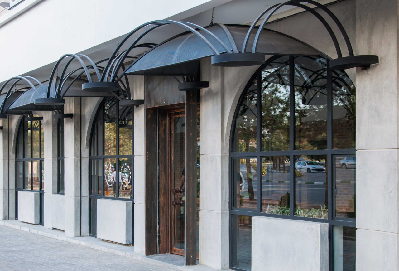
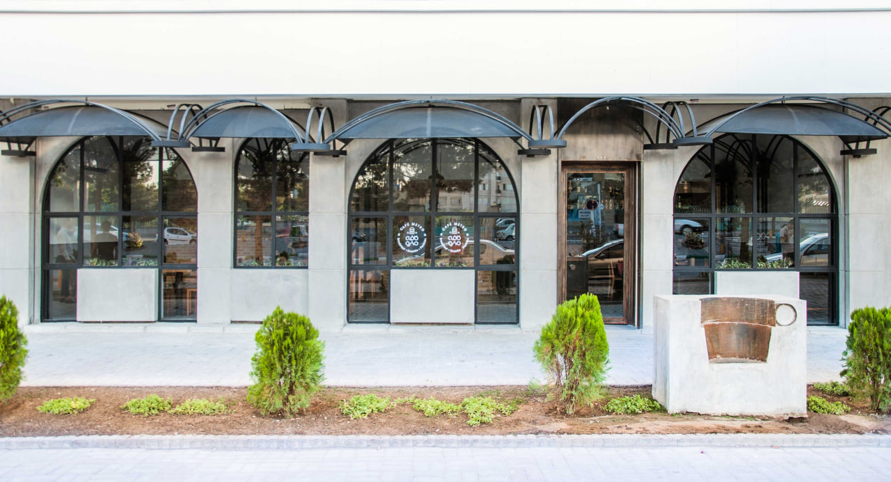
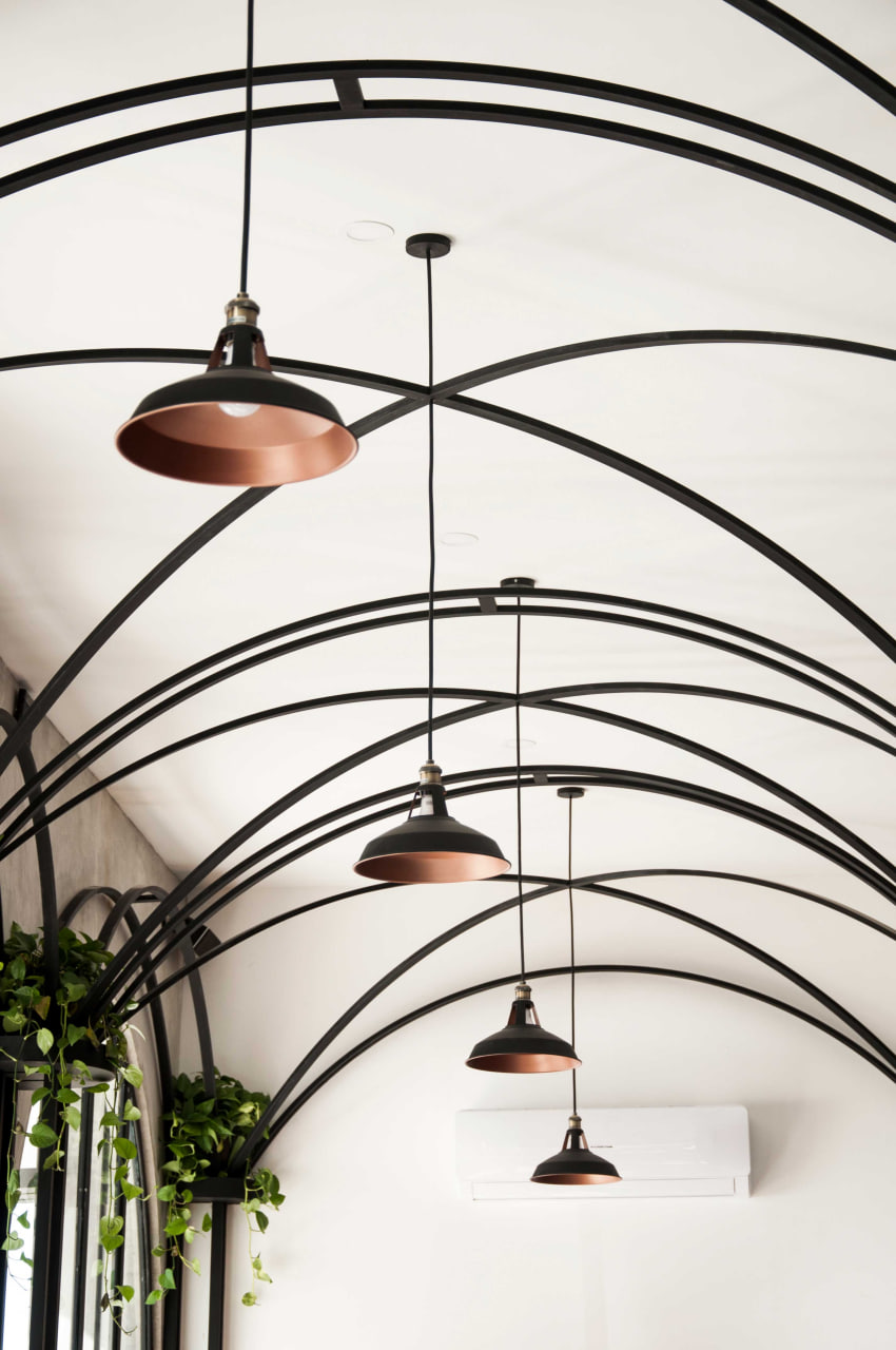
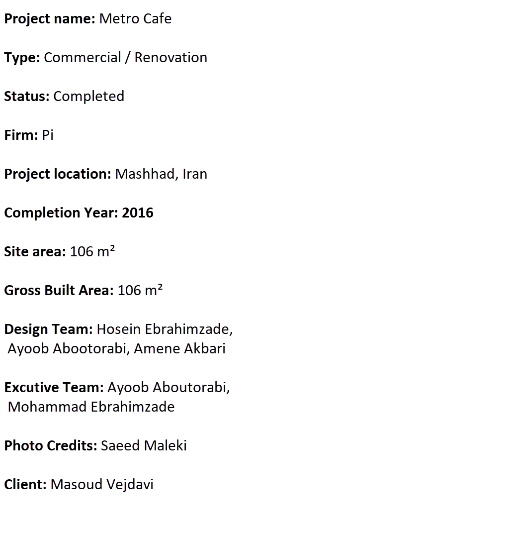
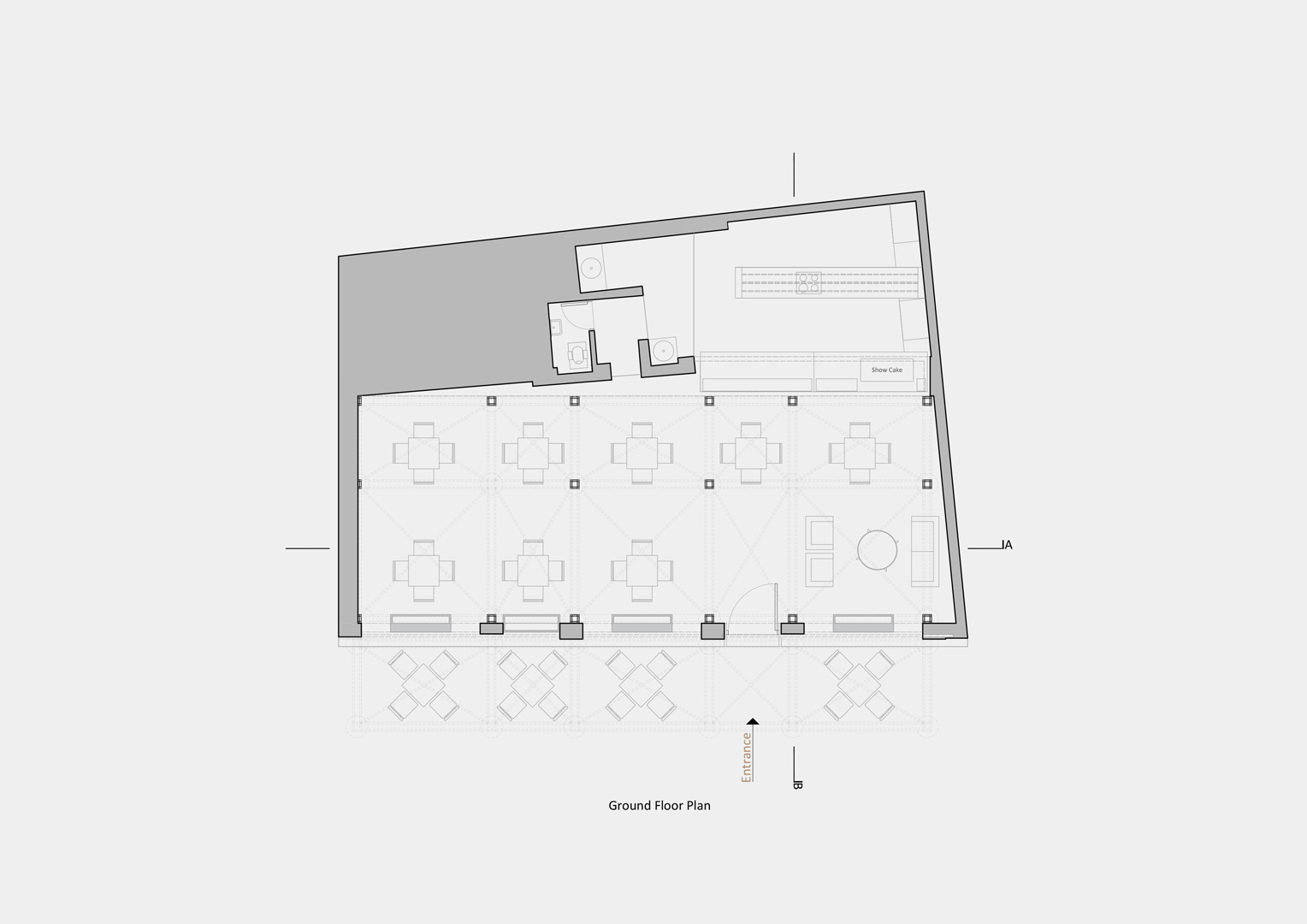
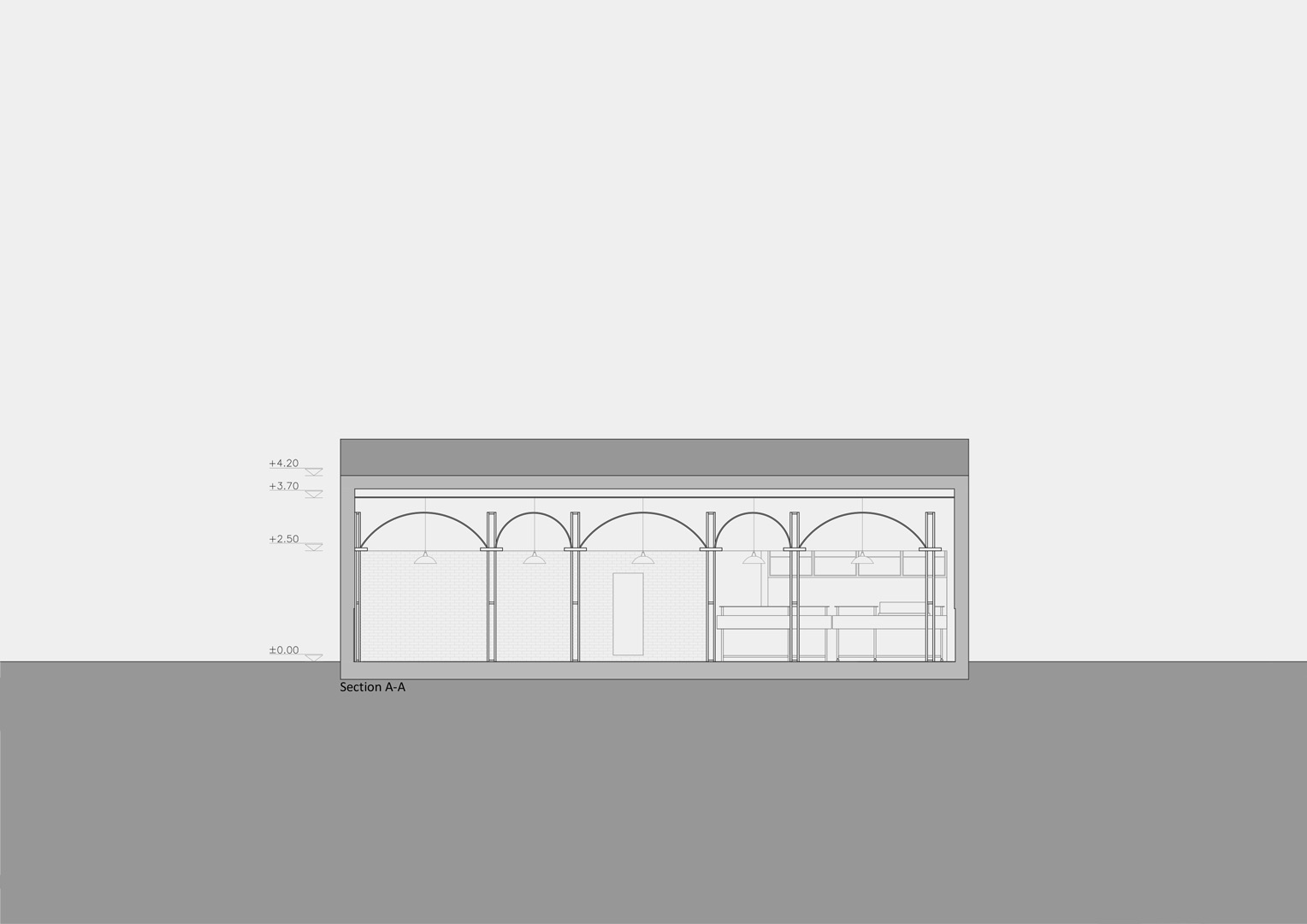
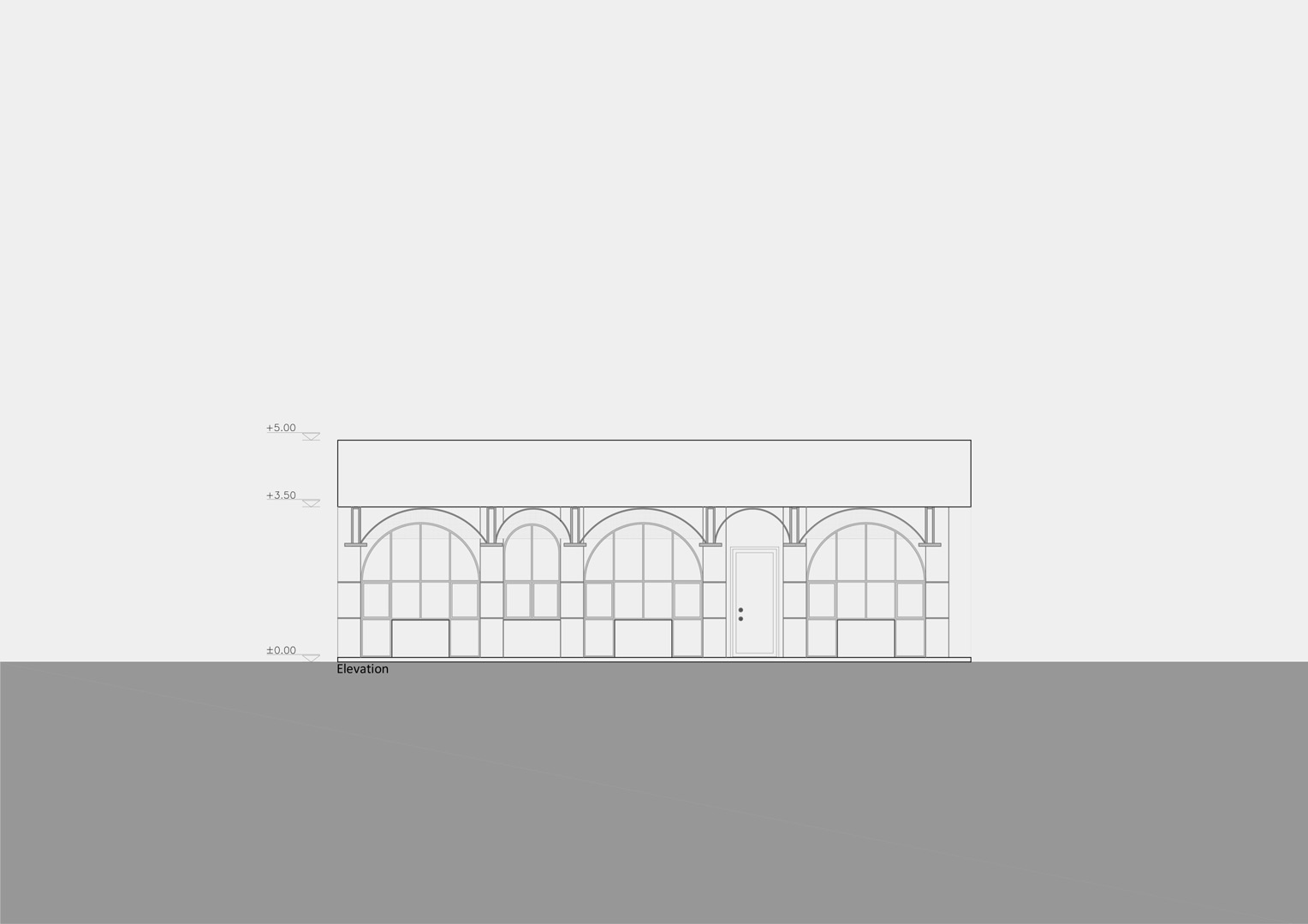
“I want it to be a bright place; a place that lets the breakfast give a real buzz”. It was in these sentences that the client summarised for us his vision about the design of his cafe. Since having breakfast is traditionally a domestic affair in our native culture, we strove to incorporate domestic forms into the cafe environment. Going out for breakfast is still regarded a luxurious practice, therefore it seemed essential for it to allude users to the most iconic element of luxurious spaces, i.e., arch. To achieve such effect, it was decided to reduce arch down to its basic structural lines, hence develop an innovative economically feasible form.
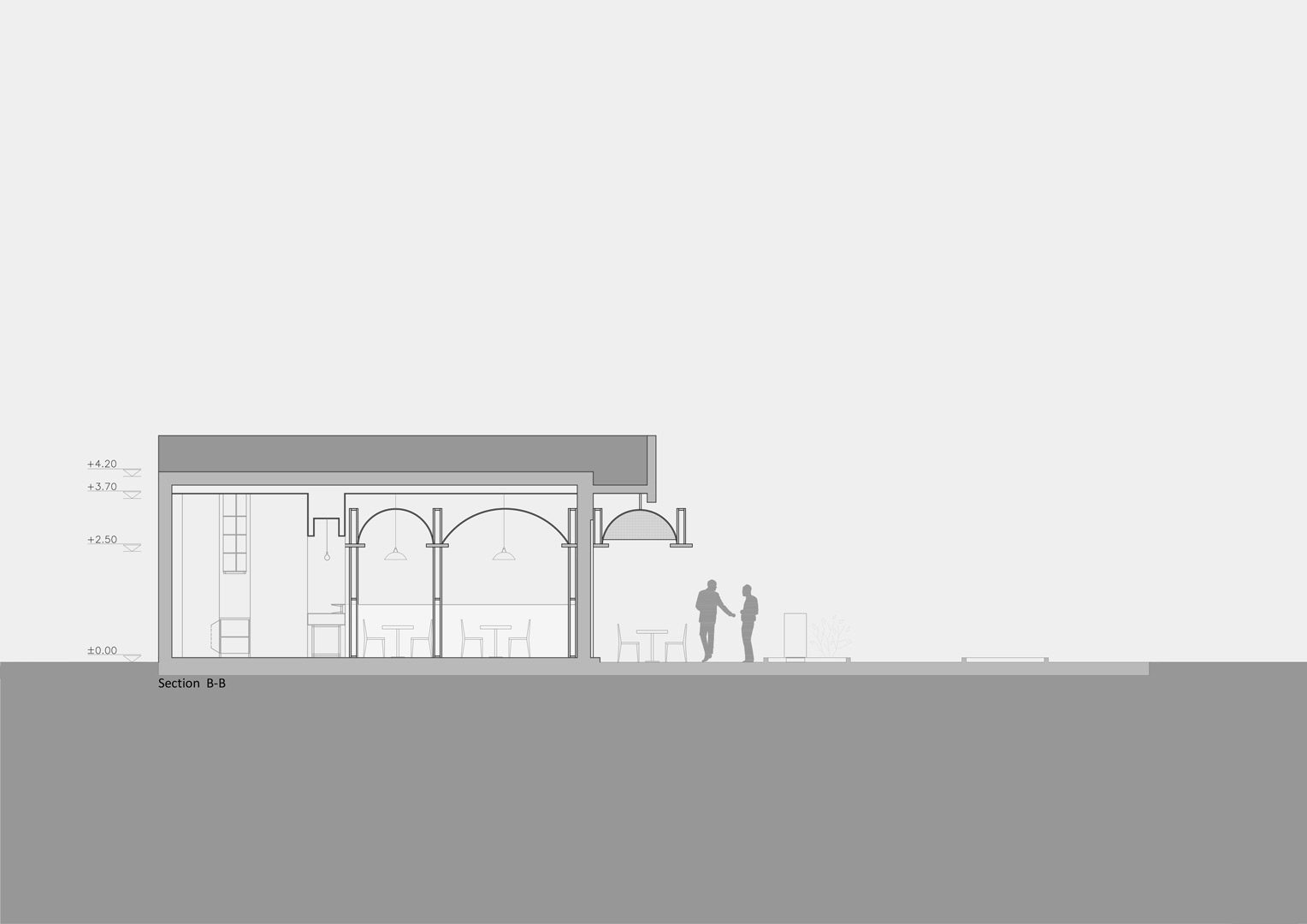
The functional separation between kitchen and seating yielded a homogeneous hall space that had its own problems, specifically the lack of privacy for the tables. A major restriction in providing such privacy was the Office of Public Spaces’ strict law that prohibits blocking outside-to-inside view of public spaces by any obstruction. Therefore, it was decided to include a transparent structure which proved to satisfy a lot of requirements, namely, providing privacy for seats without violating outside-to-inside visibility, and the owner’s interest in putting tables outside. In fact, the outer arch would intensify the sense of ownership of the sidewalk and would make it possible to control flow of light by netted shaders. A large part of cafe life in fact is spent during evening and night. Westward orientation of the light absorbent wall allowed us to adorn the charm of the space with the romantic mood of the sunset; however it was done with filtering the west light in order to prevent inconvenience.
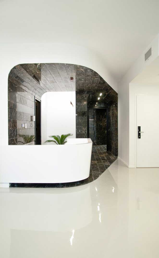
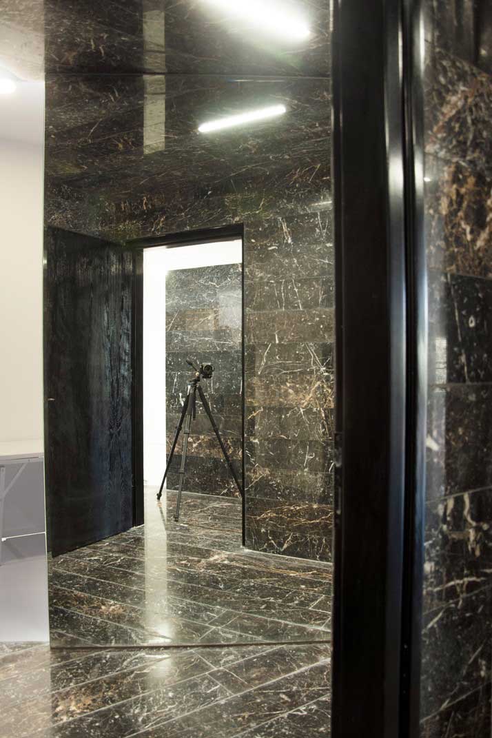
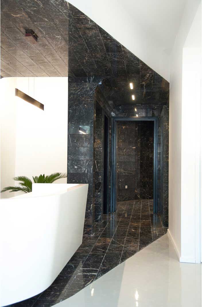
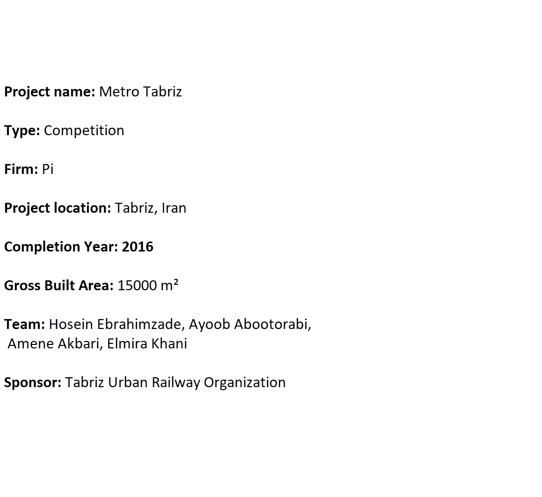
Historical review
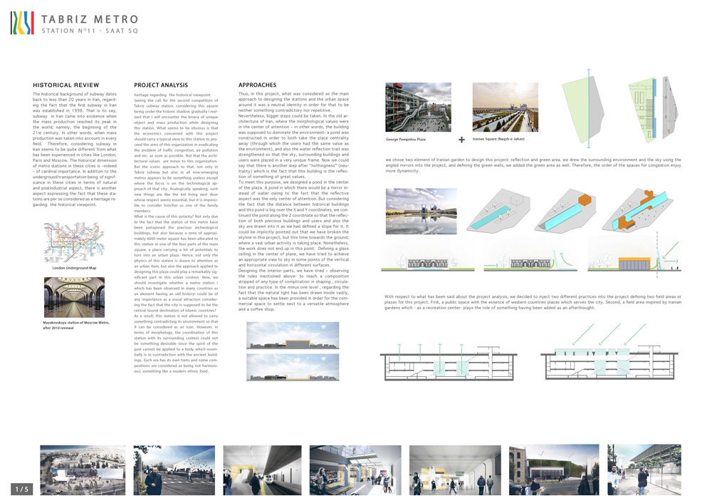
The historical background of subway dates back to less than 20 years in Iran, regarding the fact that the first subway in Iran was established in 1998. That is to say, subway in Iran came into existence when the mass production reached its peak in the world; namely, the beginning of the 21st century. In other words, when mass production was taken into account in every field. Therefore, considering subway in Iran seems to be quite different from what has been experienced in cities like London, Paris and Moscow. The historical dimension of metro stations in these cities is –indeed – of cardinal importance. In addition to the underground transportation being of significance in these cities in terms of natural and postindustrial aspect, there is another aspect expressing the fact that these stations are per se considered as a heritage regarding the historical viewpoint.
project Analysis
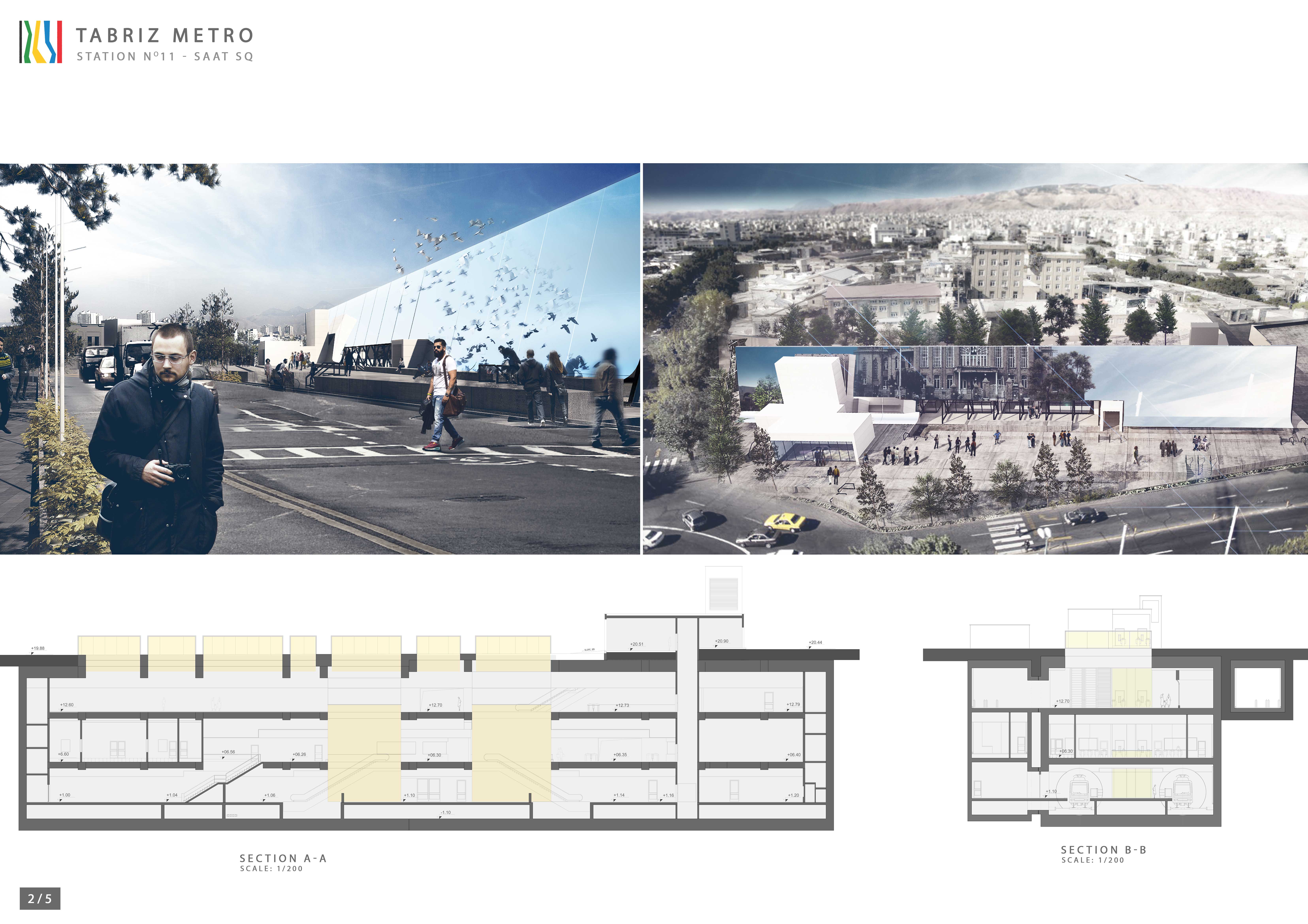
Seeing the call for the second competition of Tabriz subway station, considering this square being under the historic shadow, gradually I realized that I will encounter the binary of unique object and mass production while designing this station. What seems to be obvious is that the economics concerned with this project should carry a typical view to this station to proceed the aims of this organization in eradicating the problem of traffic congestion, air pollution and etc. as soon as possible. Not that the architectural values are minor to this organization. But the iconic approach to that, not only in Tabriz subway but also in all new-emerging metros appears to be something useless except where the focus is on the technological approach of that city. Analogically speaking, such new things are like the kid living next door whose respect seems essential, but it is impossible to consider him/her as one of the family members.
What is the cause of this polarity? Not only due to the fact that the station of this metro have been juxtaposed the precious archeological buildings, but also because a zone of approximately 6000 meter square has been allocated to this station in one of the four parts of the main square; a place carrying a lot of potentials to turn into an urban plaza. Hence, not only the physics of this station is drawn to attention as an urban item, but also the approach applied to designing this plaza could play a remarkably significant part in this urban context. Now, we should investigate whether a metro station ( which has been observed in many countries as an element having an old history) could be of any importance as a visual attraction considering the fact that the city is supposed to be the central tourist destination of Islamic countries?
As a result, this station is not allowed to carry something contradicting its environment so that it can be considered as an icon. However, in terms of morphology, the coordination of this station with its surrounding context could not be something desirable since the spirit of the past cannot be applied to a body which essentially is in contradiction with the ancient buildings. Each era has its own traits and some compositions are considered as being not harmonious; something like a modern ethnic food.
Approaches
Thus, in this project, what was considered as the main approach to designing the stations and the urban space around it was a neutral identity in order for that to be neither something contradictory nor repetitive.
Nevertheless, bigger steps could be taken. In the old architecture of Iran, where the morphological values were in the center of attention – in other words, the building was supposed to dominate the environment- a pond was constructed in order to both take the place centrality away (through which the users had the same value as the environment), and also the water reflection trait was strengthened so that the sky, surrounding buildings and users were placed in a very unique frame. Now we could say that there is another step after “nothingness” (neutrality) which is the fact that this building is the reflection of something of great values.
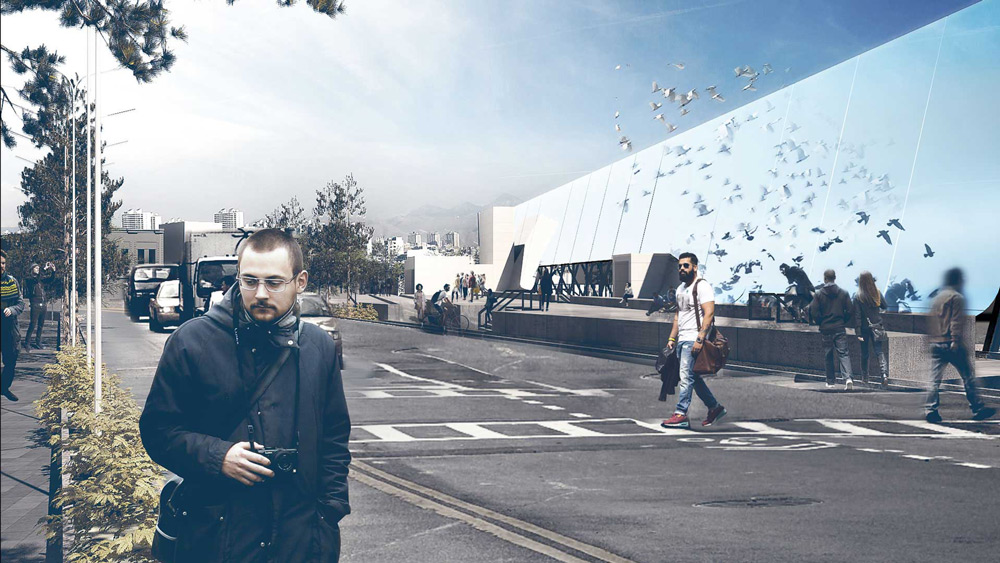
To meet this purpose, we designed a pond in the center of the plaza. A pond in which there would be a mirror instead of water owing to the fact that the reflective aspect was the only center of attention. But considering the fact that the distance between historical buildings and this pond is big over the X and Y coordinates, we continued the pond along the Z coordinate so that the reflection of both precious buildings and users and also the sky are drawn into it as we had defined a slope for it. It could be implicitly pointed out that we have broken the skyline in this project, but this time towards the ground; where a vast urban activity is taking place. Nonetheless, the work does not end up in this point. Defining a glass ceiling in the center of plane, we have tried to achieve an appropriate view to sky in some points of the vertical and horizontal circulation in different surfaces.
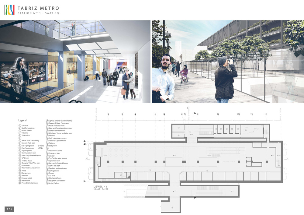
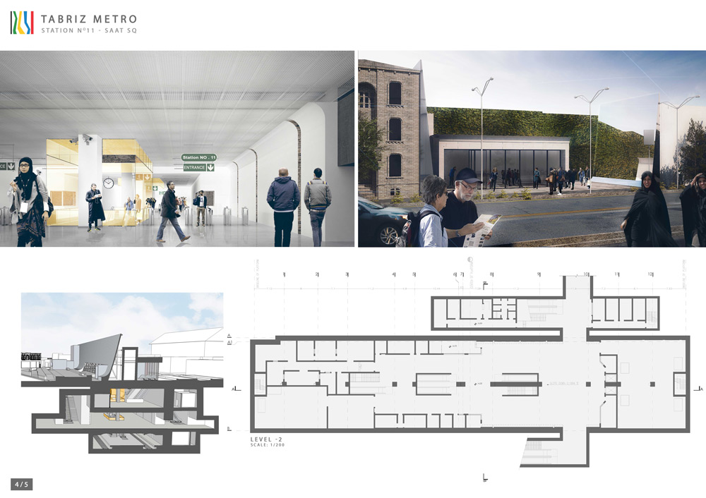
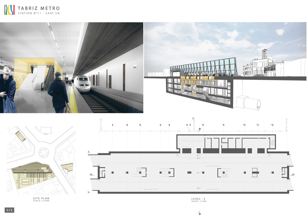
Designing the interior parts, we have tried – observing the rules mentioned above- to reach a composition stripped of any type of complication in shaping , circulation and practice. In the minus one level , regarding the fact that the natural light has been drawn inside vastly, a suitable space has been provided in order for the commercial space to settle next to a versatile atmosphere and a coffee shop.
